



 AI
AI







Monday, October 08, 2012 7:53:39 PM
The Kaplan-Meier Survival Curve (KM) is not an overly complex thing at all, IMO, once you get over the terminology and its underlying moa. I spent some time here http://cancerguide.org/scurve_km.html , and then just did some thinking on how it MUST Work, and I believe I’ve finally got it right. Repeat, I BELIEVE I’ve finally got it right.
Let’s look at K-M for the Bavi/3mg n=41 arm in the 2nd-Line NSCLC Trial…
PRIMARY PURPOSE OF KM: TO DEAL WITH STAGGERED TRIALS
If ALL 41 pts were treated at the same time on Day1, we wouldn’t need KM. MOS would be a snap: just wait for the 21st patient to expire and his Survival Mos. would me MOS.
But, treatment went from Oct’10 to Oct’11 – at any point, you’ve got a mixture of Earliers & Laters and a mixture of Survival Months for indiv. patients. How do you “estimate” MOS on an interim basis while the staggered trial is still ongoing (ie, pts still alive)? KM, enter stage left…
The KM Curve’s purpose is to fairly ESTIMATE MOS on an “interim” basis, and do it only based on FACTS KNOWN at the (latest) point in time when it is being constructed.
Best at this point to look at a simple example of a KM Chart (see Bavi Sept7 KM below, but with this one it’s easier to see the tick marks):
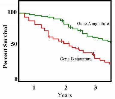
KEYS FOR UNDERSTANDING:
1. The X-axis (horz.) runs from 0 – 3years – that’s from TIME OF TREATMENT (of each indiv. pt), not from start of trial – probably the most important thing to get right in your mind,
2. This KM being “SURVIVAL”, the ONLY thing that triggers a vertical drop segment in the graph is CONFIRMED DEATH. If you count the #downward drops (some may rep. 2 deaths = twice as vertical drop), that’s the # of CONFIRMED DEATHS at that point in time. IMPORTANT/CRITICAL: the 50% point in the KM Curve is based on the #CONFIRMED DEATHS known when KM is done, NOT the Total number of pts Treated in the trial thus far.
3. The “x” tick marks, so-called “Censored” patients represent pts who WERE ALIVE the last time they were followed up and confirmed. The “x” mark is put at the Months spot horizontally representing the #Months they were alive at that point. Too bad they chose the word, “Censored” – misleading – a better word would have been “Pending” or “Last-known-Alive” (there’s nothing subjective or devious about the ‘censoring’ process). So, look at each “X” mark – those rep. pts ALIVE at that point – nothing to do but check them later and see if still Alive. When/if they are later CONFIRMED DEAD, then they will switch from “X” to a vertical drop and officially “enter” the KM Curve, with one more pt in the graph to est. the 50% median MOS point.
****CRITICAL TO GRASP THIS: KM says, ONLY DEATH “Triggers” a vertical drop & expansion of the Curve – until the pts dies they will remain a “censored “X” with a “X” put on the graph at the #Months spot in the Curve when LAST-CONFIRMED Alive.
Said another way, the ONLY thing that affects the “shape” of the Curve is Confirmed Deaths. ALIVE patients are “censored” and “X” marks places on the graph at the #Months Survival point as of their last Confirmation. When a Alive (censored) pt is Confirmed Alive at a later date, their “X” is moved to the right in the graph.
Once you get the technique in your mind, you can move to IMPLICATIONS:
1. The total #pts Treated thus far (at the time the KM graph was created) is the #Vertical Drops + the number of “X” censors. As time marches on, the #Vertical-drops (Confirmed Deaths) increases and the # of X’s (Still Alives) decreases.
2. X’s towards Left End of the graph are pts who as of last Confirmation were Alive the least # of months. Pts treated late in the trial tend to show as censored (still alive) towards the left side, until sufficient survival time elapses to move them over towards the right. If a pt drops out of the trial, or cannot be located for Life/Death confirmation, that “X” just sits there forever (unless later they are found & status confirmed)
3. X’s towards Right End of the graph are pts who as of their last Confirmation were Alive the most # of months. When confirmed Alive at a later date, the new KM Curve will have their “X” moved over further to the right, or if they have Died, then they create a vertical drop in the graph.
4. The purpose of K-M is to fairly Est. MOS based on Confirmed Deaths – as time marches on in an ongoing trial, #DEATHS becomes lager & larger, making the Est. more accurate. While #DEATHS (vert.drops) increases as time-from-1st-treatment increases, the running MOS est. may go UP or DOWN slightly. If the newest Confirmed-Deaths’ indiv. Survival-Months is less than the “running avg./prev.K-M” was, the new K-M MOS Est. will go Down. Conversely, if the newest Confirmed-Deaths’ indiv. Survival-Months is more than the “running avg./prev. K-M” was, the new K-M MOS Est. will go Up. As more & more Deaths are added to the curve, the K-M Est. MOS adjusts to the newer, larger set of deceased Pts. …You’re just adjusting to more actual Survival data being known (ie, confirmed Deaths), until you reach a point where it can’t change anymore.
If this isn’t how K-M works, I’ll be a Monkey’s Uncle, but I’ve been a Monkey’s Uncle before – so, keep that in mind.

= = = = = = = = = = = = = = = = = = = = = = = = = = =
FOLLOWUP THOUGHTS:
The key to remember is that Only CONFIRMED DEATHS contribute to the overall shape of a K-M Curve, including Peregrine’s 2nd-Line NSCLC K-M Curve presented 9-7-12 by Dr. Gerber.
ALL other (Still Aliveat last followup) pts in the trial are “Censored” with their last-known #Months Survival noted with an “X” tick mark places on the graph. Then those Still-Alive pts are re-confirmed as Alive, their “X” moves to the right to shows the updated #Months since 1st-treatment that they have survived. In a mature trial like our 2nd-Line NSCLC trial is at this point, “X” censors way over to the Left in the graph were probably lost to followup for some reason. “X” censors way over to the Right in the graph can either still be alive or also lost to followup for some reason.
The term “censored” in KM-speak is unfortunate as I see it – they is nothing sinister or subjective about it – it just means “the last time we confirmed them they were Alive” and they are not put into the K-M graph (as vertical drops) since only with Confirmed-Deaths do we know the actual time they survived before death.
A K-M Curve is continually updated in a staggered trial like Bavi’s 2nd-Line NSCLC (enrolled Oct’10 – Oct’11). As more pts are confirmed deceased, their Months-Survival are dropped into the graph – during that period, the “running Est.” of MOS will go up or down based on the new entries. Eventually, when more than ½ of the pts die, and no remaining (later-treated) Alive pt can affect MOS, final MOS is “triggered” and it can no longer change.
Let’s look at K-M for the Bavi/3mg n=41 arm in the 2nd-Line NSCLC Trial…
PRIMARY PURPOSE OF KM: TO DEAL WITH STAGGERED TRIALS
If ALL 41 pts were treated at the same time on Day1, we wouldn’t need KM. MOS would be a snap: just wait for the 21st patient to expire and his Survival Mos. would me MOS.
But, treatment went from Oct’10 to Oct’11 – at any point, you’ve got a mixture of Earliers & Laters and a mixture of Survival Months for indiv. patients. How do you “estimate” MOS on an interim basis while the staggered trial is still ongoing (ie, pts still alive)? KM, enter stage left…
The KM Curve’s purpose is to fairly ESTIMATE MOS on an “interim” basis, and do it only based on FACTS KNOWN at the (latest) point in time when it is being constructed.
Best at this point to look at a simple example of a KM Chart (see Bavi Sept7 KM below, but with this one it’s easier to see the tick marks):
KEYS FOR UNDERSTANDING:
1. The X-axis (horz.) runs from 0 – 3years – that’s from TIME OF TREATMENT (of each indiv. pt), not from start of trial – probably the most important thing to get right in your mind,
2. This KM being “SURVIVAL”, the ONLY thing that triggers a vertical drop segment in the graph is CONFIRMED DEATH. If you count the #downward drops (some may rep. 2 deaths = twice as vertical drop), that’s the # of CONFIRMED DEATHS at that point in time. IMPORTANT/CRITICAL: the 50% point in the KM Curve is based on the #CONFIRMED DEATHS known when KM is done, NOT the Total number of pts Treated in the trial thus far.
3. The “x” tick marks, so-called “Censored” patients represent pts who WERE ALIVE the last time they were followed up and confirmed. The “x” mark is put at the Months spot horizontally representing the #Months they were alive at that point. Too bad they chose the word, “Censored” – misleading – a better word would have been “Pending” or “Last-known-Alive” (there’s nothing subjective or devious about the ‘censoring’ process). So, look at each “X” mark – those rep. pts ALIVE at that point – nothing to do but check them later and see if still Alive. When/if they are later CONFIRMED DEAD, then they will switch from “X” to a vertical drop and officially “enter” the KM Curve, with one more pt in the graph to est. the 50% median MOS point.
****CRITICAL TO GRASP THIS: KM says, ONLY DEATH “Triggers” a vertical drop & expansion of the Curve – until the pts dies they will remain a “censored “X” with a “X” put on the graph at the #Months spot in the Curve when LAST-CONFIRMED Alive.
Said another way, the ONLY thing that affects the “shape” of the Curve is Confirmed Deaths. ALIVE patients are “censored” and “X” marks places on the graph at the #Months Survival point as of their last Confirmation. When a Alive (censored) pt is Confirmed Alive at a later date, their “X” is moved to the right in the graph.
Once you get the technique in your mind, you can move to IMPLICATIONS:
1. The total #pts Treated thus far (at the time the KM graph was created) is the #Vertical Drops + the number of “X” censors. As time marches on, the #Vertical-drops (Confirmed Deaths) increases and the # of X’s (Still Alives) decreases.
2. X’s towards Left End of the graph are pts who as of last Confirmation were Alive the least # of months. Pts treated late in the trial tend to show as censored (still alive) towards the left side, until sufficient survival time elapses to move them over towards the right. If a pt drops out of the trial, or cannot be located for Life/Death confirmation, that “X” just sits there forever (unless later they are found & status confirmed)
3. X’s towards Right End of the graph are pts who as of their last Confirmation were Alive the most # of months. When confirmed Alive at a later date, the new KM Curve will have their “X” moved over further to the right, or if they have Died, then they create a vertical drop in the graph.
4. The purpose of K-M is to fairly Est. MOS based on Confirmed Deaths – as time marches on in an ongoing trial, #DEATHS becomes lager & larger, making the Est. more accurate. While #DEATHS (vert.drops) increases as time-from-1st-treatment increases, the running MOS est. may go UP or DOWN slightly. If the newest Confirmed-Deaths’ indiv. Survival-Months is less than the “running avg./prev.K-M” was, the new K-M MOS Est. will go Down. Conversely, if the newest Confirmed-Deaths’ indiv. Survival-Months is more than the “running avg./prev. K-M” was, the new K-M MOS Est. will go Up. As more & more Deaths are added to the curve, the K-M Est. MOS adjusts to the newer, larger set of deceased Pts. …You’re just adjusting to more actual Survival data being known (ie, confirmed Deaths), until you reach a point where it can’t change anymore.
If this isn’t how K-M works, I’ll be a Monkey’s Uncle, but I’ve been a Monkey’s Uncle before – so, keep that in mind.

= = = = = = = = = = = = = = = = = = = = = = = = = = =
FOLLOWUP THOUGHTS:
The key to remember is that Only CONFIRMED DEATHS contribute to the overall shape of a K-M Curve, including Peregrine’s 2nd-Line NSCLC K-M Curve presented 9-7-12 by Dr. Gerber.
ALL other (Still Aliveat last followup) pts in the trial are “Censored” with their last-known #Months Survival noted with an “X” tick mark places on the graph. Then those Still-Alive pts are re-confirmed as Alive, their “X” moves to the right to shows the updated #Months since 1st-treatment that they have survived. In a mature trial like our 2nd-Line NSCLC trial is at this point, “X” censors way over to the Left in the graph were probably lost to followup for some reason. “X” censors way over to the Right in the graph can either still be alive or also lost to followup for some reason.
The term “censored” in KM-speak is unfortunate as I see it – they is nothing sinister or subjective about it – it just means “the last time we confirmed them they were Alive” and they are not put into the K-M graph (as vertical drops) since only with Confirmed-Deaths do we know the actual time they survived before death.
A K-M Curve is continually updated in a staggered trial like Bavi’s 2nd-Line NSCLC (enrolled Oct’10 – Oct’11). As more pts are confirmed deceased, their Months-Survival are dropped into the graph – during that period, the “running Est.” of MOS will go up or down based on the new entries. Eventually, when more than ½ of the pts die, and no remaining (later-treated) Alive pt can affect MOS, final MOS is “triggered” and it can no longer change.



