We know you are a person who is willfully ignorant and refuses to look at what is presented to you but one more time as you seem to be rather thick.
Curry is like you delusional and cherry picking. She picked her data and should have excluded some data that skewed her numbers but then deceitful people and global warming deniers tend to be deceitful. Maybe they were raised and rewarded to be that way by their parents. But if you look at April and May of 2010 data it only represented 47 stations collected all in Antarctica. Do you think that might skew data considering there were 14,488 stations that they normally collected data from? If you look at the very last chart even you might able to discern the effect of being fracking stupid might have on reasoning capability but then I must know who I'm posting too don't I.
Hiding the Incline
The Daily Mail article containing the Curry interview includes a graph of BEST data originating from serial misinformation source GWPF, with a cherrypicked starting point of January 2001, through the final BEST data point in May 2010 (a period shy of a decade). Figure 1 highlights the magnitude of the cherrypick by comparing the full BEST record to the fraction of the record included in the article.
Figure 1: Entire BEST record vs. the data examined in the Judith Curry Daily Mail article
Eagle-eyed readers may notice a problem towards the end of the record, as tamino did: the April 2010 BEST anomaly is -1.04°C, which represents a sharp cooling of 1.9°C from the previous month, and is followed by a 2.1°C warming the following month (Figure 2).
Figure 2: BEST record since January 2001, with the April 2010 anomaly highlighted in red
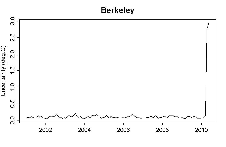
Was there really such a large temperature drop and rise between March and May 2010? It doesn't show up in any other surface temperature record. When we examine the BEST data, the problem is immediately apparent. The uncertainty levels in April and May 2010 are 2.8°C and 2.9°C, respectively. Going back to January 2001, the next-largest uncertainty level is 0.21°C, and the average uncertainty is less than 0.1°C. Tamino plots the monthly data hockey stick-like uncertainties (Figure 3).
Figure 3: BEST monthly uncertainties since 2001, with a huge spike in April and May 2010
So what happened with the April and May 2010 data? While the March 2010 anomaly was based on 14,488 stations, April and May were based on only 47 stations, all in the Antarctic (h/t Nick Stokes). In other words, April and May 2010 should be excluded from BEST data analysis because they are incomplete, their uncertainties are just too large, and April 2010 is quite obviously an anomalous outlier. Frankly they should not have been published in their current state
Here is what using that data that should not be used does to the the trend lines. Notice the difference?
 Market Data
  Markets