What is REALLY Rising/Falling in Price: Items +/- 5.0
By Barry Ritholtz April 13th, 2011, 12:00PM
The link to John Melloy’s post in our early reads caused a bit of a stir. Sure John Williams is a bit controversial, but he has been hammering on the “Official Data Understates Inflation” for decades now.
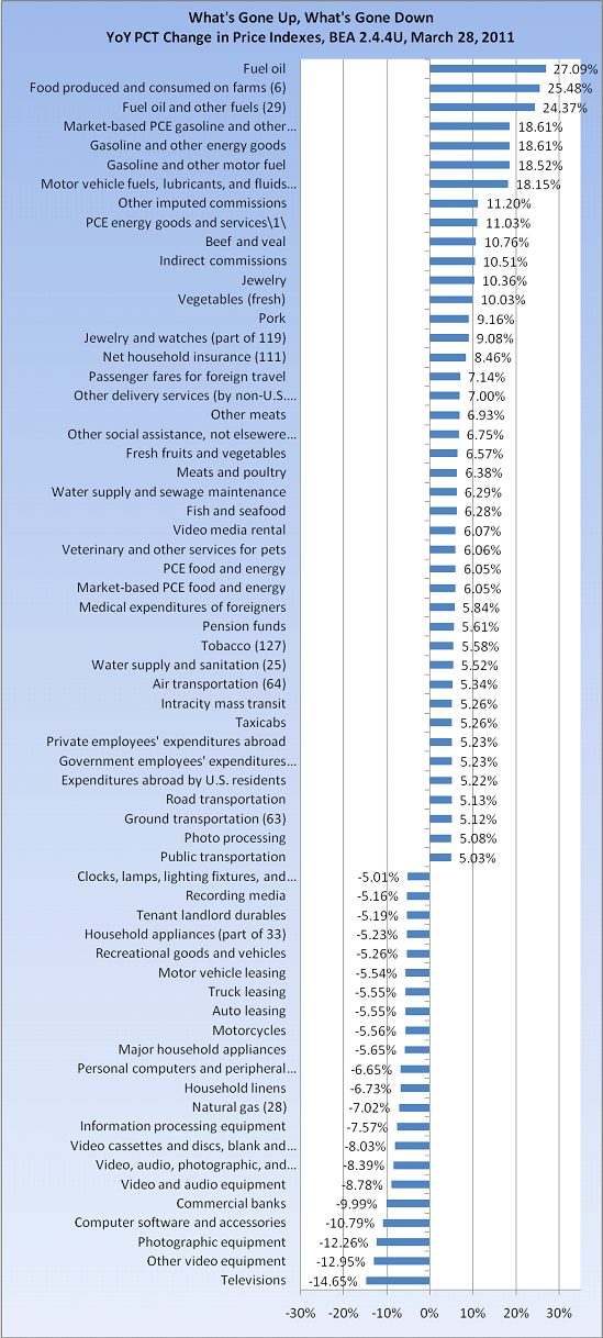
Sometimes, it helps to shift your perspective ever so slightly to get a better view on things. The chart below, which only looks at price rises greater than +/- 5%, will do that. (Mad props to Invictus for the chart work)
It is clearly the high-frequency items – primarily food and fuel – are creating most of the angst (Household insurance at 8.5% is one of my peeves).
But we typically don’t buy motorcycles, major household appliances, computers, or televisions on a weekly or monthly basis, and they have been deflating hard. (See Hackonomics take down of Hedonics as to why)
YoY Changes in Price Index Categories (+/- 5%) Data source BEA
Note: We get fresh numbers Friday, so this is an early glimpse of where we are . . .
 Market Data
  Markets