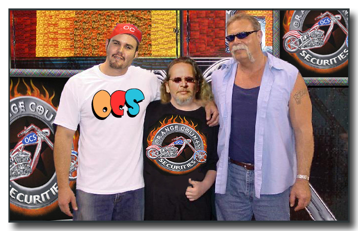
I disagree. This logo is being designed for a securities firm, not the MTV Malibu Beach House, so I think that the priorities are different.
Your logo and your letterhead are your "frontlines" to the general public. They will be on your website, your monthly statements and all correspondence. Therefore, they should be as classic and classy as they can.
Should a "financial" company be concerned that their logo can be easily and cheaply printed on baseball caps, tote-bags, tea-cozies and banana-warmers? I don't think that Matt has paid many bills from the sale of iHub t-shirts.
After the initial rush of investors from here, OCS will be looking to attract clients who may be unfamiliar with iHub. And I believe that the best way to accomplish that is to look as responsible and stable as possible.
Even though this will be advertised as a "discount" service, there is no excuse to be represented by chintzy graphics reminiscent of Carnival Cruise Lines.