 News
News  Market Data
  Discover
Support: 888-992-3836
Copyright © 2023 InvestorsHub Inc.


Register for free to join our community of investors and share your ideas. You will also get access to streaming quotes, interactive charts, trades, portfolio, live options flow and more tools.
Peek Into Future Through Futures
* January 30, 2016
The following are futures positions of non-commercials as of January 26, 2016. Change is week-over-week.
E-mini S&P 500: As of Wednesday, another $1.2 billion came out of U.S.-based equity funds (courtesy of Lipper). Year-to-date, outflows have now totaled north of $27 billion. Since September 30th, $36 billion has left.
This pretty much explains the 5.1-percent decline in the S&P 500 in January (was down as much as 11.3 percent at one point).
That said, there are some signs of buying interest. For the week ended Thursday, $1.9 billion moved into SPY, the SPDR S&P 500 ETF (courtesy of ETF.com). The ETF rose 1.7 percent for the week.
The path of least resistance on the S&P 500 continues to be 1990.
Shorts obviously have done well, and as of mid-January were not rushing to cover. Rather, on both the NYSE and Nasdaq, as well as several leading ETFs, short interest rose in the latest period – potential recipe for mini squeeze. We probably saw some of that on Friday.
Non-commercials, too, had raised net shorts to a 13-week high last week, and cut those down by 30 percent this week.
Currently net short 131.9k, down 56.7k.

Nasdaq 100 index (mini): It was only up 0.5 percent for the week, substantially underperforming its peers. Apple (AAPL) and Amazon (AMZN) are the primary culprits – down four percent and 1.6 percent, respectively.
Apple (AAPL), with a 11-percent weighting in the Nasdaq 100 and a relative underperformer for a while, has been hurting the index. Post-CY4Q15 earnings, the stock lost 6.6 percent on Wednesday. Once the apple of investors’ eye, Apple suffers from too big a reliance on iPhones.
In the just concluded quarter, iPhones comprised 63 percent of total revenue. The company sold 74.78 million phones. Gargantuan on an absolute basis, but growth is stalling, up a mere one percent year-over-year.
AAPL’s March-quarter revenue guidance of $50 to $53 billion would represent the first quarterly drop since 2003. Even more worrisome, this is what Tim Cook, CEO, said: “We began to see some signs of economic softness in Greater China earlier this month, most notably in Hong Kong.”
Despite AAPL-induced Wednesday sell-off, the Nasdaq 100 is trying to repair damage, with two back-to-back weekly hammers. In an ideal scenario near-term, it has a shot at 4350.
That said, non-commercials are lukewarm to these prospects.
Currently net long 30.3k, up 1.2k.

Russell 2000 mini-index: In the week ended Thursday, $1.4 billion moved into IWM, the iShares Russell 2000 ETF (courtesy of ETF.com).
As is the case with the Nasdaq 100, damage repair is in progress. As things stand, the best the bulls can hope for is a move toward 1080.
Two weeks ago, non-commercials had the highest net longs since October 2014. They have since cut those down by 11 percent. If bulls can get their act together, there is room for squeeze.
Currently net short 48.7k, down 6.1k.

US Dollar Index: In March and November last year, the US dollar index rallied just north of 100, only to retreat. This level is now important technically.
Prior to the BoJ action, the index looked to be wanting to go lower, with the 50-day moving average pointing lower and weekly momentum indicators weakening.
Friday, on the coattails of the BoJ action, the dollar index rallied one percent, but still not enough to push it past the afore-mentioned resistance.
Once again, judging by non-commercials’ holdings, no breakout is imminent. They have been grudgingly adding to net longs the past five weeks… holdings pale in comparison to what they had leading to the March high last year.
Currently net long 44.2k, up 1.5k.

VIX: For the first time since August 25th, non-commercials went net long last week. This week, they added.
If past is prelude, non-commercials shifting from net short to net long coincides with a peak in the spot. So far, this is precisely how things have unfolded.
If there is a spot for volatility bulls to put their foot down, this is it. The spot (20.20) is sitting at support, which also approximates its 50-day moving average.
Currently net long 14.2k, up 4.7k.

Hedgopia Risk Reward Index

http://www.hedgopia.com/cot-peek-into-future-through-futures-28/
• George.
Click on "In reply to", for Authors past commentaries.
ETF Performance (%)
* January 29, 2016
Well, that was some month. After what was just a miserable start to the year for risk assets in the first three weeks of January, a late month rally helped to avert a complete disaster. As shown in our ETF Matrix below, with the exception of Utilities (XLU) and Consumer Staples (XLP), equity related ETFs were down across the board. Since the Fed hiked rates last December, only XLU is up! In the words of Warner Wolf, if you had equities rallying after the Fed hiked rates, you lose! As one might expect, in an environment when risk assets fall out of bed, the relative safe-haven of fixed income has rallied. In fact, all six fixed income ETFs are up since the Fed hike in December, up on the year, and up since the January lows.
Since the January 20th market low, we have seen some interesting action. Small cap stocks have seen mixed returns with the Russell 2000 ETF (IWM) underperforming the S&P 500, while the S&P 600 ETF (IJR) has outperformed slightly. Sector returns off the January lows are even more interesting. While you would expect cyclicals to lead the way higher, three of the five sector ETFs that are up 5% since the 1/20 low are all defensive (Consumer Staples- XLP, Telecom Services- IYZ, and Utilities- XLU).

https://www.bespokepremium.com/bespoke-report/bespoke-report-12916/
• George.
Trading Notes: Friday, January 29th
By Brett Steenbarger, Ph.D.
* January 29, 2016
* Easy to get burned out sitting in front of screens all day and trying to stay disciplined. Here is an important antidote to burnout.
* I've been offline for a couple of days, swamped with coaching work with traders. Whenever that happens, it's a sure sign that markets are tricky and people are having trouble making money. We had a real risk off start to the year, with oil, stocks, and emerging markets lower and firmness in the U.S. dollar. Late last week we saw a sharp rebound and these posts talked about having put in a momentum low for this market cycle. Evidence was also suggesting that this cycle was not like ones we had seen in 2014 and 2015, with far more persistence of weakness in stocks. This week we have generally continued the bounce, but in a highly choppy fashion, making it difficult to make money from either the bull or bear side. Hence the recent frustration of traders.
* A momentum low implies the possibility that further price lows could remain ahead, albeit with breadth divergences. That is what we saw in the trade following May, 2010; August, 2011; and certainly January, 2008. Thus far, this has been a low Sharpe ratio bounce; not the kind of resumption of uptrend that we saw following, say, the October, 2014 low. That uneven bounce increases the likelihood in my estimation of those retests of lows.
* Which brings us to today's trade. With the move to negative rates in Japan, we saw a sharp rally in stocks, followed by a sharp dip, followed by more rangy behavior in the ES futures. Oil has rallied significantly from its lows; VIX has remained above 20. I'm concerned that we're having trouble making fresh highs in ES in pre-market trade even with the Japan easing and oil strength. That has me looking to sell strength as long as we can remain below the post BOJ highs.
* Note that there is a difference between a retest of lows and the start of a fresh bear market leg. When we had extended bottoming processes in May, 2010; August, 2011; and even that January, 2008 period, there was a two-way trade and rallies interspersing the declines. My leaning will be to take profits opportunistically on short trades and not necessarily assume a resumption of a high Sharpe downtrend.
http://traderfeed.blogspot.com/2016/01/trading-notes-week-of-january-25-2016.html
• George.
Click on "In reply to", for Authors past commentaries.
Margin Debt Continues To Shrink — Repercussions For Equities, C&I Loans
* January 29, 2016
NYSE margin debt dropped 2.5 percent month-over-month in December, to $461.2 billion. The S&P 500 declined 1.8 percent in the month.
Regardless if margin debt followed stocks lower or it was the other way round, what matters is that momentum is coming out of the former.
Margin debt peaked in April last year at $507.2 billion, and by December was down 9.1 percent from that peak.
Here are two observations in this regard:
First, as stated earlier, momentum is waning. If it sustains, this obviously is no good news for equities. In all probability, margin debt will be down in January as well. With one session to go, the S&P 500 is down 7.4 percent for the month.
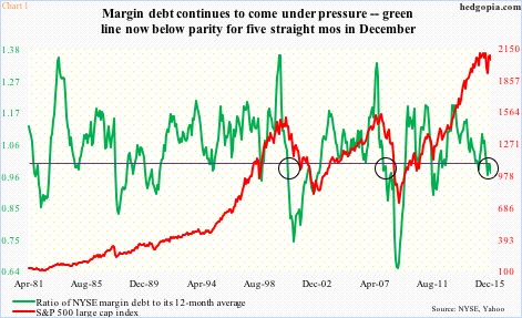
This is important, as it can be self-fulfilling, putting pressure on the green line in Chart 1. It represents a ratio of margin debt to its 12-month moving average. Once margin debt crosses below the average, it indicates waning momentum… which is already in progress.
Since August, the green line has been below parity. This streak likely continues in January. Historically, once the momentum sustains, stocks suffer. The most prominent crossovers took place in 2000 and 2007 (circles in the chart).
Second, for whatever reason, margin debt tends to lead banks’ commercial & industrial loans. At least in 2000 and 2008, the 12-month rolling average of margin debt peaked about a year before C&I loans (Chart 2). The correlation coefficient between the two is a near-perfect 0.96.
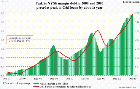
In the chart above, the 12-month average of margin debt stood at $476.5 billion, versus $476.1 billion in November. Since the April ’15 peak, margin debt has declined by $46 billion. Unless it is able to snap right back – unlikely given how 2016 has started – the 12-month average likely begins to lose momentum. And, if past is prelude, that would eventually mean C&I loans begin to come under pressure.
These loans – at a seasonally adjusted annual rate of $1.98 trillion last December – have witnessed very healthy growth. Notice the green bars in Chart 3.
Alongside this growth in loans has come growth in inventory. The chart uses inventory and sales in U.S. manufacturing and trade – $1.81 trillion and $1.31 trillion, respectively, in November.
Particularly since July 2014, the inventories-to-sales ratio has spiked. The November reading of 1.378 is the highest since June 2009.
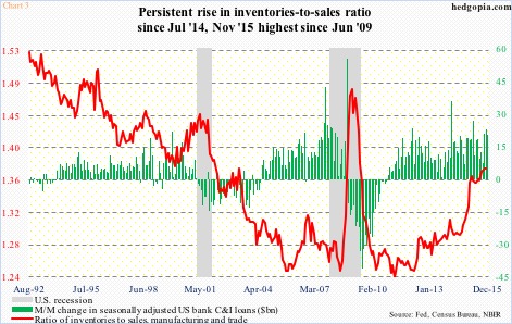
One cannot help but wonder if at least a good portion of the growth in C&I loans has gone toward inventory build. If so, as this inventory gets consumed, C&I loans should begin to lose momentum… which is what margin debt seems to be suggesting as well.
Ironically, should the green line in Chart 1 begin a rapid descent, dragging the red line along, which can then adversely impact the economy, odds grow the green bars in Chart 3 begin to shrink faster.
http://www.hedgopia.com/margin-debt-continues-to-shrink-repercussions-for-equities-ci-loans/
• George.
Click on "In reply to", for Authors past commentaries.
ETF Performance Screens
* January 28, 2016
>> Best Performing ETFs Today
http://www.dogsofthedow.com/best-performing-etfs-today.htm
>> Best Performing ETFs: 12 Months
http://www.dogsofthedow.com/best-performing-etfs-12-months.htm
>> Highest Dividend Paying ETFs Today
http://www.dogsofthedow.com/highest-dividend-paying-etfs.htm
• George.
ETFs Sector Performance Today
* January 28, 2016
>> Best Performing Technolgy ETFs Today
http://www.dogsofthedow.com/best-performing-technology-etfs-today.htm
>> Best Performing Healthcare ETFs Today
http://www.dogsofthedow.com/best-performing-healthcare-etfs-today.htm
>> Best Performing Energy ETFs Today
http://www.dogsofthedow.com/best-performing-energy-etfs-today.htm
>> Best Performing Financial ETFs Today
http://www.dogsofthedow.com/best-performing-financial-etfs-today.htm
>> Best Performing Real Estate ETFs Today
http://www.dogsofthedow.com/best-performing-real-estate-etfs-today.htm
>> Best Performing Commodity ETFs Today
http://www.dogsofthedow.com/best-performing-commodity-etfs-today.htm
• George.
Upgrades/Downgrades
* Updated: January 27, 2016 07:11 a.m. ET

Equity ratings changes direct from brokerage firms.
http://online.wsj.com/mdc/public/page/2_3024-UpgradesDowngrades.html?mod=topnav_2_3022
• George.
The Nine MAJOR SECTORS - Daily Charts, defined by Standard and Poors
* January 26, 2016
• George.
Jeffrey Saut: The call for this week
* January 25, 2016
Saved by the bell
As well, last Wednesday was session 15 in the envisioned “selling stampede” that tends to last 17 – 25 sessions before exhausting itself, which was close enough for government work. Still, so far we have only experienced a two-session “throwback rally.” As stated, such stampedes are only interrupted by one- to three-session pauses/rally attempts, making today extremely important, yet it certainly feels like this rally could last for a while with the SPX’s first target 1940 – 1950.
Trading Notes: Monday, January 25th
By Brett Steenbarger, Ph.D.
* January 25, 2016
* Friday saw a continuation of the rebound from momentum lows, with breadth finally touching short-term overbought levels. Over 80% of SPX shares closed above their 3 and 5-day moving averages; that's the first time we've seen that since December 24th. (Data from Index Indicators). The rally took the great majority of stocks off their lows. Across all exchanges, we had 139 monthly highs against 208 lows. Compare that with 44 monthly highs and 3250 lows just two days previous. (Data from Barchart).
* One sign of continued strength on Friday was that significant negative readings in the uptick/downtick measure (NYSE TICK) could not stop us from making higher price lows and higher price highs. I will be watching for that dynamic in early trading today. A drop below the Friday afternoon and overnight lows would likely break that pattern and signal fresh selling interest.
* I will also be watching this week to see if the bearish market themes (weak oil; weak emerging market shares; strong dollar versus EM and commodity currencies) reassert themselves. I'm also watching to see if we can print fresh price highs for this rebound with continued strong breadth.
* A nice view of the market's cyclical behavior is provided by the number of NYSE shares giving buy vs. sell signals for the Parabolic-SAR measure. That cumulative total has tracked market cycles well over the past two years. (Data from Stock Charts). As you can see from the chart below, we've bounced, but are not yet near levels that have corresponded to intermediate-term cycle tops.

http://traderfeed.blogspot.com/2016/01/trading-notes-week-of-january-25-2016.html
• George.
Click on "In reply to", for Authors past commentaries.
Upgrades/Downgrades
* Updated: January 25, 2016 07:23 a.m. ET
Equity ratings changes direct from brokerage firms.
http://online.wsj.com/mdc/public/page/2_3024-UpgradesDowngrades.html?mod=topnav_2_3022
• George.
Stocks With the Largest Short Interest
* Friday, January 22, 2016
> nyse
http://bigcharts.marketwatch.com/reports/bigmovers.asp?data=1&start=1&report=10&report_country_code=US&date=20160122
• George.
Click on "In reply to", to see reports from prior weeks.
Clive Maund: CHARTING THE CRASH - HOW FAR WILL THE BOUNCE GET?...
* January 24, 2016
The purpose of this update is to define exactly where we are on the market clock, because if we know where we are, broadly speaking we will know where we are going.
Before going any further I want to point out that so far we have tracked this nascent market crash well, first looking for the market to cave in last Summer, in the Preparing for the Crash series, calling for the Biotech sector to plunge before Christmas in Biotech Inverse ETFs update – Perfect Entry Point for New Shorts, for China to crater at the end of December in the China update and more recently calling for a waterfall decline in the US stockmarket right at the start of the year in Broad US Stockmarket Still Perched Atop a Cliff
Last week the market plunged to arrive at the last ditch support level in the 1800 – 1850 zone on the S&P500 index that we had earlier defined as marking the lower boundary of the giant Head-and-Shoulders top. Once this level is breached, the full-on crash starts. Because it arrived at this support level in an even more oversold state than it was at the depths of the plunge last August, and because Smart Money has become bullish, it made it unlikely that it would break down and crash just yet, and sure enough the market has started to bounce, which means that the danger has probably abated, for now. The stabilization of the market here is expected to generate a short covering bounce, regardless of the rotten fundamentals, and as it unfolds the “reasons” for it will be presented in the mainstream financial media as “Market responds to stimulus talk” etc. The big question now is how far this bounce is likely to get, and that is what we are going to attempt to determine here, because it is crucial for the purpose of piling on short positions at the optimum juncture at the best prices in the future.

Smart Money is looking for a bounce…
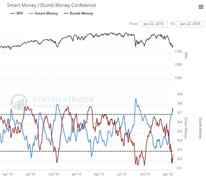
Chart courtesy of www.sentimentrader.com
Whilst no-one can be sure how far this bounce will get, possibilities vary from it being over already to it making it all the way back up to the Dome boundary shown on our charts, as it did after the August plunge, it will likely be sufficient to substantially alleviate the current extremely oversold condition and so create the conditions for the full-on crash phase, which means that it is likely to rally at least to the resistance in the 1980 – 2000 area shown on the 2-year chart for the S&P500 index, and it could even make it all the way back up to the Dome boundary again, although this is considered highly unlikely, the reason being that we are not looking for symmetry on the way down - since markets drop on average twice as fast in bearmarkets as they rise in bullmarkets, the market should not keep rising up to the Dome boundary on rallies, certainly not after it breaks down from the Head-and-Shoulders top.
So, the relief rally should take the S&P500 index somewhere into the red box shown on our chart, probably to the resistance level, but perhaps a little higher or lower. We will be watching in an effort to gauge where it is going to stop, which is where we will ditch any short-term long trades and pile on the shorts again.
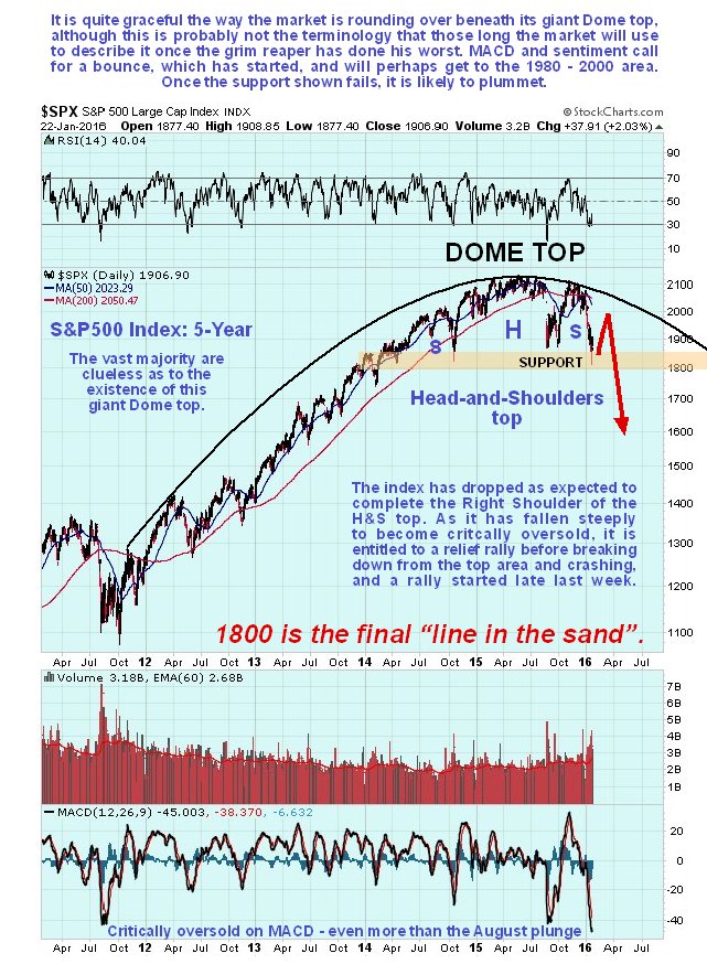
The longer-term 5-year chart provides more perspective and enables us to see the origin point of the Dome top and better appreciate the downside risk should the support at the lower boundary of the Head-and-Shoulders fail in due course as expected. Actually, you need to go back a lot further than this to understand just how far this market can drop, which is better understood on the long-term chart for the Dow Jones Industrials shown below which goes back to 1980. This chart gives a downside target in the 5,500 area (it’s now at almost 17,000), achievable within a year or so, which might seem incredible to many, but is certainly well within the bounds of possibility, as this chart makes plain, and if ever the conditions existed for such a devastating decline, it’s now. This means that the market should lose two-thirds of its value. Note that the Dow Jones Industrials are used in preference to our normal S&P500 index here because they fit the Bullhorn pattern better.
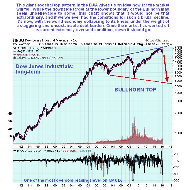
Remember that we are at the end of an era, with the entire debt-wracked Ponzi scheme that the world economy has now become set to go down in a ball of flames like the Hindenburg, a reset that will involve unprecedented devastation including wars and revolutions, yet from an evolutionary standpoint is an absolute necessity. Fiscal restraint and discipline, having been abandoned for decades now, will be imposed by force, the force of the markets, and discredited Keynesian economics will be consigned to the garbage can of history where it belongs, and some sort of gold standard re-introduced.
http://www.clivemaund.com/article.php?art_id=3694
• George.
Click on "In reply to", for Authors past commentaries.
Amateur Investors: Weekend Analysis
* Saturday, January 23, 2016
The S&P 500 fell 13% from late December until a short term low was made on Wednesday. Since 2009 each time the S&P 500 has corrected 10% or more the 5 Day Average of the Put to Call Ratio has risen above the 1.25 level (points A). With the latest drop of 13% the 5 Day Average of the Put to Call Ratio didn't reach the 1.25 level. Of course that doesn't mean it has to reach the 1.25 level to signal a major bottom. However I would be more confident that Wednesday's low was a major bottom if the 1.25 level had been reached based on past history.

Meanwhile the S&P 500 held support this week along its long term upward trend line from the 2009 low. Also notice the 23.6% Retrace from the 2009 low of 667 to the 2015 high of 2135 is at 1788 so there is a major support area near the 1800 level. If the 1800 area fails to hold in the weeks ahead the next major support level appears to be just below the 1600 level. Notice this is the 38.2% Retrace from 667 to 2135 and coincides with the 2007 high (point B).

Finally for those wondering about the price of Oil the chart below shows prices since the mid 1940's in terms of Real Dollars. The first thing to notice is that the action since late 2008 appears to be a large "ABC" correction. The worst case scenario is that "C" will bottom around $20. Also notice since the mid 1940's that Oil has always found support near the $20 level so this is a major long term support area.

http://www.amateur-investors.com/AII_Weekend_AnalysisJan_23_16.htm
• George.
Click on "In reply to", for Authors past commentaries.
Urban Carmel: Weekly Market Summary
* Saturday, January 23, 2016
Summary: Equities fell to their August/September lows this week and then reversed higher. A retest of the low would be normal, something to keep in mind in the event of an uncorrected rise from here. Any number of breadth and sentiment indicators strongly suggest that prices should rise further in the weeks ahead. The risk comes from oil prices, which remain too volatile to predict and which have been highly correlated to equities for several weeks.
* * *
After falling 3 weeks in a row, US indices closed higher. SPY and RUT gained 1.4% and the leader, NDX, gained 3%.
Equities continue to follow oil, and oil closed the week 5% higher. During the course of most days, the correlation between oil and SPY has been uncanny, with the two making daily highs and lows within minutes of each other. This relationship will eventually fade, but for now it remains the main storyline in the markets.

While the relationship is clear, oil is far more volatile. From December 29 (the recent high in equities and oil), the price of oil dropped 27% into Wednesday's close; SPX dropped 10%. Since Wednesday, oil gained 13%; SPX gained 3%.
Why are oil and equities tied together? It most likely has to do with perceptions that high yield defaults will soar, bankruptcies will rise and SPX earnings will drop; together this would seem to indicate that a recession is imminent. It's therefore important to recognize that contagion from energy remains minimal (post).
There is also a false perception that oil is crashing due to weak demand and that this is emblematic of a faltering global economy. This is incorrect; oil demand has recently surged to a new high (data from Yardeni).

The US economy continues to grow; in December, real retail sales reached a new high. It would have been even stronger if gas station sales hadn't dropped 15% yoy. The pattern before prior recessions has been for retail sales to at least stall, if not drop. This is clearly not the case at present (arrows).

If oil prices start to rise, will this hit corporate margins that have benefitted from cheap energy? Maybe, but history suggests that margins rise and fall with energy prices; meaning, overall margins (blue line) are best when energy companies are doing well and oil prices (red line) are rising.


Have oil prices bottomed? Maybe, but prices hit a 13 year low just this week so, despite the rebound, it is too early to say the bottom is in. We do know that the current fall is on par with prior significant drops in oil over the past 30 years. Those lows have corresponded mostly with positive returns in SPX going forward (lower panel). A low in oil would likely be a significant tailwind for equities.

Importantly, further weakness in oil prices after this week's bounce is the most obvious risk to equities. As we have said over the past two weeks, equities are "oversold" with respect to breadth and sentiment but these will mean little so long as oil is weak and the relationship to equities remains tight. That is still the case.
2016 is off to bad start. SPX has already experienced a 9% drawdown. But this is not unusual. The average annual drawdown since 1980 has been 14%. It's been normal for drawdowns of the current magnitude to take place within the context of an uptrend. Even in the current bull market, drawdowns of 10% or more have taken place in most years: 2010, 2011, 2012 and 2015 (data from JPM).

SPY and NDX both retested their August/September lows with a long pierce on Wednesday. SPY rose 2.5% intraday from the low into the close. Sometimes triple bottoms don't hold, and sometimes they do. This week's held.

However, the more times that green area is tested, the more likely it is to fail. In the case of SPY, that would imply a fall to the October 2014 low near 178, a 6% drop from Friday's close.
Support at this week's low is much stronger for NDX. This wasn't just the August/September 2015 support area but also the prior highs from late 2014 and the prior lows from early 2015 (left side of the chart). That's a meaty area of support that would probably withstand another retest in the weeks ahead.

The reversal Wednesday and follow through on Thursday and Friday put in what appear to be stairs that now lead higher. Ideally, the next low will be above 188 (bottom of step) and the next high will reach 193-195 (top of the next step).

(In the chart above, note that there's also a possible inverted head and shoulders pattern that targets the 198-199 area. The head is highlighted in green).
Using Fibonacci ratios, targets for a retrace of the recent fall are 193 (38%), 196 (50%) and 199 (68%). These levels correspond to gains from here of 1%, 3% and 4.5%, respectively. If SPY repeats the pattern from August, it will rise to $200, which was an important area of support during most of 2015 (yellow shaded section two charts earlier). That would equate to an 8% gain from Wednesday's close. Is this a reasonable target? Yes.
Over the past 8 weeks, $46.5b has flowed out of equity mutual funds and ETFs. In the last 13 years, the only comparable periods were early 2008 and mid-2011. The 2011 low marked the start of a new bull leg. Even in 2008, SPY rose 8% over the next several weeks before faltering. Another 8% from Wednesday's close targets 200 on SPY (data from Lipper and Sentimentrader).

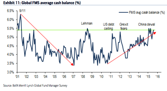
The sell off has rattled investors. Fund managers surveyed by BAML now have the third largest allocation to cash since 2009. Global allocations to equities dropped in half in the past month. Since 2009, equity allocations have only been lower in mid-2010, mid-2011, mid-2012 and mid-2015; all of these periods were notable lows for equity prices during this bull market. Allocations to US equities remain near an 8 year low. These factors are normally very bullish for equities. A new post on this is here.

Similarly, breadth is washed out to a degree that most often leads to higher equity prices. One example is the number of new lows, which reached 40% of all issues on the NYSE this week. In 14 of the 15 prior situations like this since 1970, SPX has traded higher over the next 1-2 months and also over the next one year (data from Dana Lyons).

Will the recent low be retested? Most often (but not always) large falls retest their lows, even if the "retest" is a "higher low". The chart below looks at 2 week falls in SPX of greater than 5%; a high proportion retested their low (closing basis), although the lag could be weeks apart.

The data in the chart above is from the 1990s. The next chart looks at the past 6 years; falls of 10% are circled. In each case, the low was retested. Note: the blue line is the equity exposure of active investors polled by NAAIM; you can see that current sentiment is consistent with prior lows after a similar drops in SPX (green line; data from NAAIM).

In summary, equities fell to their August/September lows this week and then reversed higher. A retest of the low would be normal, something to keep in mind in the event of an uncorrected rise from here. Any number of breadth and sentiment indicators strongly suggest that prices should rise further in the weeks ahead. The risk comes from oil prices, which remain too volatile to predict and which have been highly correlated to equities for several weeks.
The upcoming week could be strongly affected by news. It is the biggest week of the 4Q 2015 earnings season, with Apple reporting on Tuesday. The FOMC meets and releases a statement on Wednesday. Durable goods and GDP/ECI are on Thursday and Friday, respectively.

Companies can engage in buybacks after reports are issued, meaning that significant corporate buying may resume after this week and next.
Further reading: Bear markets rarely take place outside of an economic recession. In the post-World War II era, only two bear markets have occurred outside a recession. A new post on this is here.
http://fat-pitch.blogspot.com/2016/01/weekly-market-summary_23.html?spref=tw
• George.
Click on "In reply to", for Authors past commentaries.
ETF Performance Screens
* January 23, 2016
>> Best Performing ETFs Today
http://www.dogsofthedow.com/best-performing-etfs-today.htm
>> Best Performing ETFs: 12 Months
http://www.dogsofthedow.com/best-performing-etfs-12-months.htm
>> Highest Dividend Paying ETFs Today
http://www.dogsofthedow.com/highest-dividend-paying-etfs.htm
• George.
ETFs Sector Performance Today
* January 23, 2016
>> Best Performing Technolgy ETFs Today
http://www.dogsofthedow.com/best-performing-technology-etfs-today.htm
>> Best Performing Healthcare ETFs Today
http://www.dogsofthedow.com/best-performing-healthcare-etfs-today.htm
>> Best Performing Energy ETFs Today
http://www.dogsofthedow.com/best-performing-energy-etfs-today.htm
>> Best Performing Financial ETFs Today
http://www.dogsofthedow.com/best-performing-financial-etfs-today.htm
>> Best Performing Real Estate ETFs Today
http://www.dogsofthedow.com/best-performing-real-estate-etfs-today.htm
>> Best Performing Commodity ETFs Today
http://www.dogsofthedow.com/best-performing-commodity-etfs-today.htm
• George.
Peek Into Future Through Futures
* January 23, 2016
The following are futures positions of non-commercials as of January 19, 2016. Change is week-over-week.
E-mini S&P 500: Here we go again! The usual sell-side optimism. The S&P just published 2017 operating earnings estimates for S&P 500 companies, and they are rosier than rosy.
As of January 21st, the consensus expects $140.69 next year, down from last week’s $141.11. Next year would be up 14.4 percent over this year, which, at $123, would be up 15.3 percent over 2015.
In all likelihood, next year’s estimates will meet the same fate as did estimates for 2015 and 2016. At the end of 2Q14, 2015 was expected to come in at $137.50, which has now been slashed to $106.65. Similarly, 2016 was at $137.50 in February last year.
The persistent downward revision is probably one reason why foreigners have been exiting U.S. stocks. In August through November last year, they sold $66 billion in equities. The last time the 12-month running total was positive was back in October 2013. And November last year was minus $107 billion – the highest monthly total ever.
Of late, domestic flows have not been cooperating either. From September 30th through Wednesday, nearly $35 billion left U.S.-based equity funds… just north of $26 billion in the year’s first three weeks alone (courtesy of Lipper).
Further, in the week ended Tuesday, $368 million came out of SPY, the SPDR S&P 500 ETF (courtesy of ETF.com).
No wonder stocks have been taken to the woodshed. But this very factor is a reason to expect a reprieve – at least near term.
On Wednesday, the S&P 500 found support off of April/October 2014 lows, and staged a massive reversal, further building on it on both Thursday and Friday.
The path of least resistance is up, with the nearest major resistance at 1990.
Right before the Wednesday reversal, non-commercials raised net shorts to a 13-week high, and could get squeezed.
Currently net short 188.5k, up 26.3k.

Nasdaq 100 index (mini): The Wednesday reversal was impressive – down 3.7 percent at one point but ended the session down 0.26 percent.
In a larger scheme of things, the index is still down 10 percent off December’s all-time highs. In many ways, the two-week drop has ominous look to it. The only way it is negated is if flows improve.
In the week ended Tuesday, $428 million came out of QQQ, the PowerShares QQQ ETF, (courtesy of ETF.com). That was just before the Wednesday reversal. Would this advance tempt inflows? This will hold the key as to how far this rally goes.
For them to be taken seriously, bulls need to clear resistance at 4350, which goes back to November 2014.
Non-commercials reduced net longs further, to a 14-week low.
Currently net long 29.1k, down 4.2k.

Russell 2000 mini-index: In the midst of the sell-off on Wednesday, small-caps were one of the areas that began to attract bids. Bio-techs were another. When it was all said and done, the Russell 2000 ended up 0.45 percent, reversing an earlier 3.7-percent drop.
In the following two sessions, the Russell 2000 struggled to garner the same momentum.
In the week ended Tuesday, $1.3 billion came out of IWM, the iShares Russell 2000 ETF, (courtesy of ETF.com). In all likelihood, these sellers will take their time to put their toes back into the water, if at all.
Sentiment can improve a whole lot if the index can conquer two-year resistance at 1080.
Currently net short 54.9k, down 159.

US Dollar Index: Has hugged the 50-day moving average since early December. The average is now beginning to flatten out.
Having failed to appreciably rally during the recent market mayhem, the path of least resistance near-term is probably down.
That said, the index is not that far away from the highs of March and November last year. And non-commercials continue to act like they do not anticipate a breakout. Holdings are substantially less versus back then.
Currently net long 42.8k, up 56.

VIX: Several times in the past week or so, spot VIX would repeatedly spike intra-day only to close substantially off sessions highs. This was once again in evidence on Wednesday when the spot shot up to 32.09, only to close at 27.59.
This inability to hang on to gains was a big tell. Friday, VIX fell out of a three-week rising channel. More weakness probably lies ahead. The 50- and 200-day moving averages lie at 19.38 and 17.28, in that order.
And this! Non-commercials went net long. The last time they shifted from net short to net long was on August 25th; the S&P 500 bottomed a day earlier.
Currently net long 9.5k, up 16.1k.

Hedgopia Risk Reward Index

http://www.hedgopia.com/cot-peek-into-future-through-futures-27/
• George.
Click on "In reply to", for Authors past commentaries.
ETF Screener
* Friday, January 22, 2016
Select from:
» Gold ETFs
» Oil ETFs
» REIT ETFs
» Inverse (Short) ETFs
» Double 2X ETFs
» Triple 3X ETFs
» International ETFs
» SPDR ETFs
» PowerShares
» iShares
http://www.barchart.com/etf/screener.php?menus=2-0;&filters=textinput-profile.name-contains-gold;&types=7
• George.
Earnings Week of 1/25 – 1/29
* January 22, 2016

http://www.cboeoptionshub.com/2016/01/22/earnings-week-125-129/
• George.
eagleviewtrading.com. Anyone have reviews?
Trading Notes: Thursday, January 21st
By Brett Steenbarger, Ph.D.
* January 21, 2016
* We saw concentrated selling early in the day followed by a vigorous rally with significant buying strength that erased much of the day's losses. The breadth numbers were particularly extreme with 44 stocks registering fresh monthly highs against 3250 new lows. The depth of the oversold condition, combined with the vigor of the buying, opens to the door to the hypothesis that we've put in a momentum low for this downward cycle. With the reaction to the ECB meeting most recently, we've moved higher in trading. We should see further upside follow through and divergences in the breadth data on further weakness if, indeed, we've put in a momentum low.
* That being said, to reiterate a point made for a while now, this cycle has been deeper on the downside than cycles over the past two years and is more consistent with downward moves in 2010 and 2011 than 2014 and 2015. These deeply oversold declines in 2008, 2010, and 2011 eventually went on to make further price lows well after the momentum point at which we'd maxed out the number of shares making new lows.

* Here is an overbought/oversold measure that I track based on event bars rather than time-based bars. What I look for in a bear market is overbought levels at lower price highs; those are often good regions for shorting. In a bull market, you look for oversold levels at higher price lows. Those are often good areas for buying. In a range market, you'll see successive overbought and oversold levels at similar price extremes.

http://traderfeed.blogspot.com/2016/01/trading-notes-week-of-january-18-2016.html
• George.
Click on "In reply to", for Authors past commentaries.
Urban Carmel: Fund Managers' Current Asset Allocation - January
* Wednesday, January 20, 2016
Summary: Fund managers' cash in January rose to the third highest level since the bear market low in 2009. This is bullish for equities.
Global allocations to equities dropped in half in the past month. Since 2009, equity allocations have only been lower in mid-2010, mid-2011, mid-2012 and mid-2015; all of these periods were notable lows for equity prices during this bull market. This is bullish for equities.
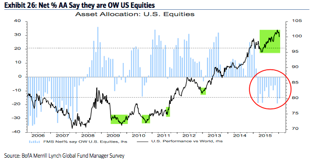
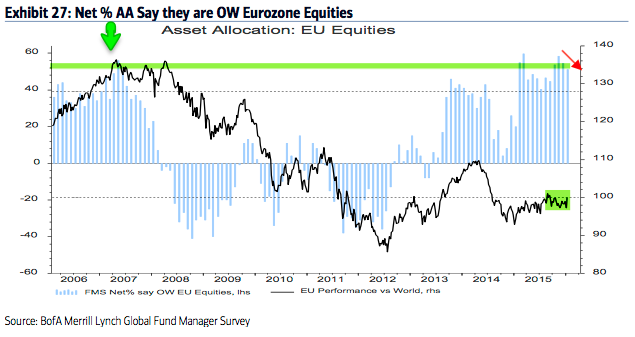
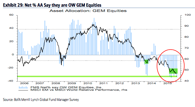
Allocations to US equities remain near an 8 year low, a level from which the US should continue to outperform as it has during the past 9 months. Europe remains very overweight. Emerging markets are near a record underweight.
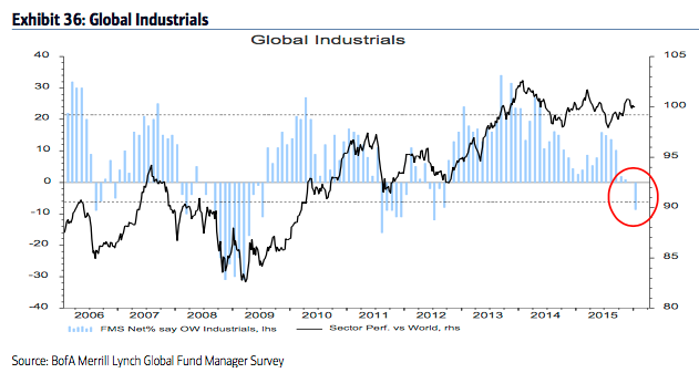
Among sectors, exposure to industrials fell to the lowest level since mid-2012 and mid-2011. From a contrarian perspective, the sector may be set up to outperform.
* * *
Among the various ways of measuring investor sentiment, the BAML survey of global fund managers is one of the better as the results reflect how managers are allocated in various asset classes. These managers oversee a combined $600b in assets.
The data should be viewed mostly from a contrarian perspective; that is, when equities fall in price, allocations to cash go higher and allocations to equities go lower as investors become bearish, setting up a buy signal. When prices rise, the opposite occurs, setting up a sell signal. We did a recap of this pattern in December 2014 (post).
Let's review the highlights from the past month.
Fund managers cash levels jumped to 5.4%, the third highest level since 2009. Cash has been over 5% six of the past seven months, the first time it has been this high for this long since late-2008 and early-2009. Current levels are an extreme that is normally very bullish for equities. Similar periods were market lows in mid-2010, mid-2011 and mid-2015.
Fund managers are +21% overweight equities, a huge drop from +42% overweight last month (which was near a 7-month high). Equity allocations since 2009 have only been lower in mid-2010, mid-2011, mid-2012 and mid-2015; all of these periods were notable lows for equity prices during this bull market.
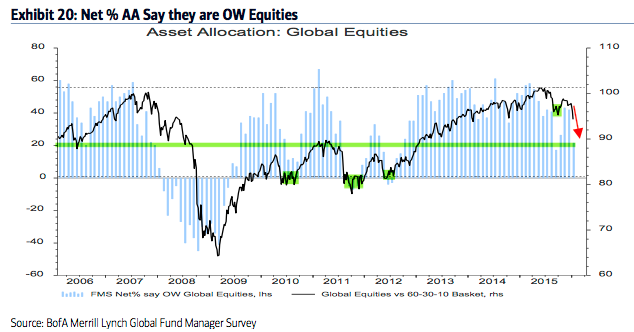
US exposure remains near an 8 year low (-15% underweight; it was -19% underweight in December, an 8 year low). Despite low exposure, US equities have outperformed the past 9 months. US equities have been under-owned and should continue to outperform those in Europe and Japan on a relative basis (see below).
Eurozone exposure fell slightly but remains near the highest levels in 8 years (and 1.3 standard deviations above the long term mean). Judging from 2006, European equities are at risk of continuing to underperform.
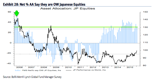
Allocations to Japan dropped to +31% overweight, which is still 1.0 standard deviations above the long term mean. In the 10 months prior to September, allocations were the highest since April 2006. The region has been outperforming since early 2014.
Emerging markets exposure fell to the second lowest in the survey's history (-33% underweight). Fund managers have been right to underweight this region, but note that recent allocations are an extreme comparable only to early 2014, from which the region began to strongly outperform for the next half a year.
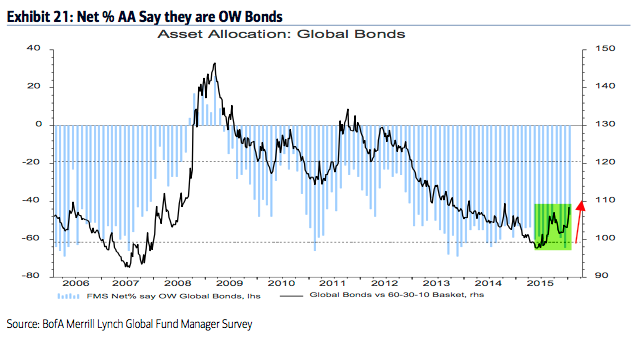
Fund managers are -47% underweight bonds, a big rise from -64% underweight in December, a 2-year low. Bonds continue to be the most underweighted asset class and this, in large part, explains why cash balances have not been lower than 4.5% in two years. Note that bonds have outperformed in the past 9 months.
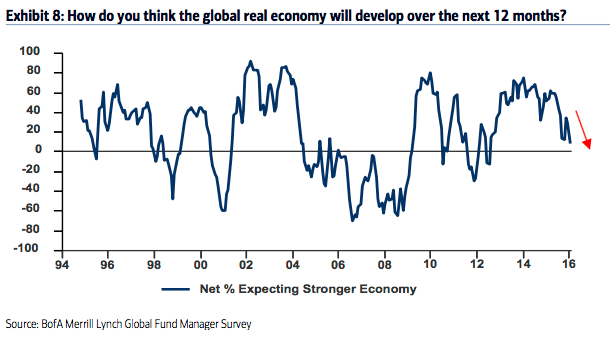
The drop in equity allocations and the outperformance of bonds come as fund managers have become less optimistic about the global economy. Only 8% expect a stronger economy in the next 12 months, the lowest since mid-2012.
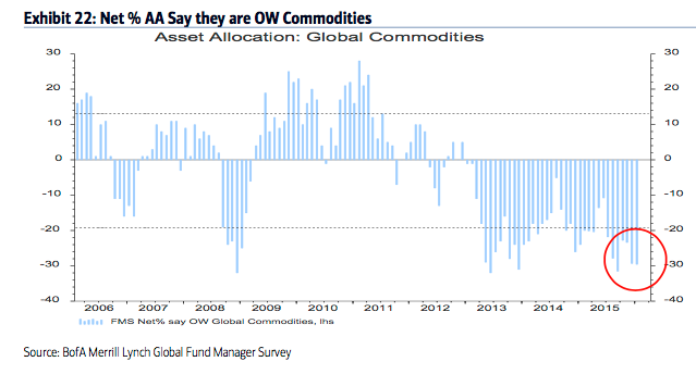
Allocations to commodities fell to one of the lowest levels in the survey's history (-30% underweight). This is 1.7 standard deviations below the long term mean. The low allocation to commodities goes together with pessimism towards the global economy and emerging markets and also explains why cash balances are high.
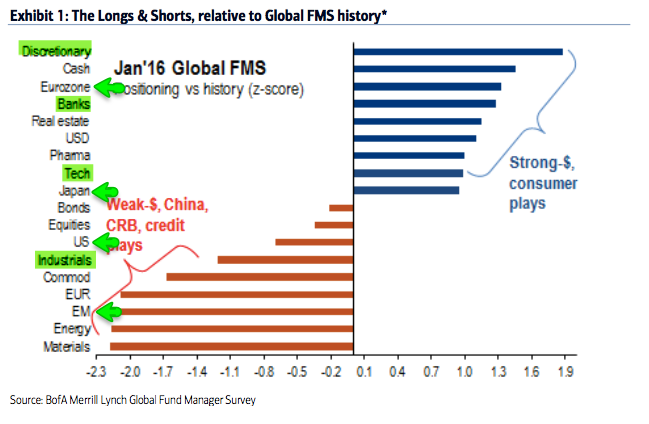
Managers remain overweight the highest beta equities (discretionary, banks, tech). The largest underweights are in commodities (including energy and materials).
Fund managers' allocation to banks was among the largest ever in December; they're still overweight, but allocations are now at a 9 month low. Banks have pretty consistently underperformed the past 3 years.
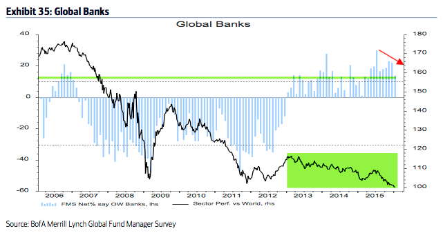
Fund managers' allocation to industrials fell to the lowest level since mid-2012 and mid-2011 (1.2 standard deviations below the mean). From a contrarian perspective, the sector may be set up to outperform.
Survey details are below...
http://fat-pitch.blogspot.com/2016/01/fund-managers-current-asset-allocation.html?spref=tw
• George.
Click on "In reply to", for Authors past commentaries.
Jeffrey Saut: The call for this week
* January 19, 2016
Assassins, hunters, and rabbits . . . oh my
Both the SPX and INDU did not close below their respective August closing lows, so what we have according to Dow Theory is a downside non-confirmation; and stocks are very oversold. Look for some kind of rally attempt this week. This question remains, “Will it be just a 1.5 – 3 session affair, or something more?” This morning it is looking like “something more” as China’s weak economic data bring on hope of more stimulus and Iran’s pledge to produce 500,000 barrels of crude oil per day didn’t rattle the oil market, leaving the February future contract up 1.6% this morning. Accordingly, the S&P 500 futures are better by 30-points at 5:30 a.m. But the question remains, “Is it just another one of these 1.5 – 3 day affairs or something more?”
Trading Notes: Tuesday, January 19th
By Brett Steenbarger, Ph.D.
* January 19, 2016
* Everyone wants to trade with confidence and conviction, but that means that we have to keep mind and body in peak conditioning, especially during busy markets.
* We traded to new lows for this move on Friday, but interestingly we saw the first evidence of divergences in the new lows data for SPX stocks. For example, we had 129 more new 100-day lows than new highs on Friday, surprisingly short of the 167 differential on Wednesday. Only 8.96% of SPX stocks traded above their 10-day moving averages on Friday, but that was still higher than Wednesday's level of 4.98%. (Data from Index Indicators). Among SPX sectors failing to make new lows on Friday were XLU, XLE, and XLV. The relative strength of the XLE shares is notable, given the recent weakness in oil. We've bounced well off Friday's lows in holiday and pre-market trade.
* Last week's trading notes observed evidence that the current market downturn has been more persistent than recent corrections. When we've had significant declines in August, 2011 and May, 2010, we saw follow-through weakness even after a momentum low was reached. I am open to that possibility in the present market. If, however, we have indeed put in a momentum low, we should see more of a two-way trade going forward than what we've seen thus far in 2016.
* My intermediate term strength measure, which takes into account 5, 20, and 100-day new highs vs. lows among SPX shares, opens the week in unusually oversold territory. With VIX closing above 25 on Friday, we should continue to see meaningful volatility.

http://traderfeed.blogspot.com/2016/01/trading-notes-week-of-january-18-2016.html
• George.
Click on "In reply to", for Authors past commentaries.
Upgrades/Downgrades
* Updated: January 19, 2016 07:24 a.m. ET
Equity ratings changes direct from brokerage firms.
http://online.wsj.com/mdc/public/page/2_3024-UpgradesDowngrades.html?mod=topnav_2_3022
• George.
Urban Carmel: Weekly Market Summary
* Sunday, January 18, 2016
Summary: US equities have dropped some 10% in the past two weeks, returning to their August/September lows. This has triggered a bearish technical pattern. Is the stock market signaling a recession and the start of a bear market? Risk has clearly increased, but on balance, the evidence suggests the answer remains no.
* * *
It was another week of steep selling: SPY lost 2%, NDX lost 3% and RUT lost nearly 4%. Small caps are still leading to the downside, with large caps holding up the best.
The biggest loser continues to be oil. After losing 11% last week it fell another 10% this week. This is not a sideshow. Oil and equities are usually, but not always, correlated. Between 1985 and 2000, the relationship was muddled and inconsistent; since 2000, however, oil and equities have moved mostly in the same direction (more on this here).
For the time being, the correlation between oil (red line) and equities (blue line) is unusually tight. It's a fair guess that equities will have a hard time rising until oil stabilizes or an event occurs that supersedes this relationship.

The sell off over the past 2 weeks has pushed the major indices right back to their August/September lows. It's cold comfort that this was prior support, as prior support levels have been shredded on the way down.


There is no bottoming pattern in either of the charts above: indices are pushing to new lows and losses on Friday were 2% and 3%, respectively. Big buyers have not notably taken a bite at these levels.
Equities have been stair stepping lower. The bounce on Thursday looked promising: a big rise (+2%) on good volume. But it failed miserably on Friday. What we are looking for now is for the stairs to overlap higher up (green shading). That will be the first signal that the downtrend may be changing direction.

"Oversold" conditions are abundant. Most of the time, that means the trend has exhausted itself and is set to reverse. But nothing works perfectly and this is one of those times where "oversold" has yet to mean anything.
Why? Market indicators summarize the actions of millions of investors; by definition, this can be unpredictable. At times the negative (or positive) psychology of the market is overwhelming.
On Friday, for example, the equity-only put/call ratio reached 1.14x; among the few times this has happened in the past was September 15, 2008, the day Lehman Brothers went bust. These are panic conditions that swamp "oversold" readings and price support levels.
It's not just put/call ratios that are at extremes. A full listing would be redundant; here are four examples:
• The percentage of AAII investors that are bullish is just 18%; it has only been lower once in the past 20 years (the April 2005 low in SPY).
• An average of more than $6b has flowed out of equity funds in the past 5 weeks; since 2003, the only times outflows have been greater were in 2008 and at the market lows in March 2009 and late August 2011.
• Only 20% of S&P companies are above their 200-ema; in the past 16 years, the only times it has been lower was during the 2002 and 2008 bear markets and at the market lows in August 2011 and 2015.
• In the past 20 years, the daily MACD for SPY and NDX has only been lower once, during the late-2008 meltdown.
While it's true that bear markets feature in the list above, most of these extremes occur within the context of a bull market. Take the AAII bull ratio, for example. Over the past 25 years when the ratio is less than 30% (like now), the S&P has been higher both 3 months and 12 months later 90% of the time.
Similarly, the Citibank Panic/Euphoria model is now at a level where equities over the past 30 years have always been higher a year later. A nice feature of this model is that it has not been fooled by any bear market.

But the market is still at risk of a much larger fall. Among other reasons, we said that a bear market was unlikely at the August 2015 low because the technical pattern was incomplete. Bear markets (vertical lines) don't start with the first fall of 10% from a new high (arrows); a rebound to a failed new high followed by another fall of 10% would be bearish. Unfortunately, that's now the pattern being formed by the S&P.

So the key question now is this: outside of the market technicals, is there a convincing case that a bear market has started?
The rest of this post attempts to answer that question. Much of the data that follows is taken from an investment outlook presentation by Goldman Sachs Investment Management; it's a useful report that we recommend reading in full (here).
Since the second quarter of 2009, the real GDP of the US has increased at an annualized growth rate of 2.2%. The recovery is now in its seventh year, making it the fourth-longest recovery since World War II.

One of the knocks against the current economic background is that growth has been lethargic. Why has growth been slower than previously? There are 4 main reasons.
First, the working age population has grown markedly slower as baby boomer retire (red line, left chart). Second, households have deleveraged by 18 percentage points (blue line, right chart). Combining these two facts (slower employment and higher saving) means lower spending, and this leads to lower growth in the economy.

Third, the financial sector and the government have also deleveraged, in sharp contrast to past recoveries. Total debt-to-GDP has decreased by 34.7 percentage points in this cycle (red line), compared with a median increase of 35.4 percentage points in past recoveries. So, again, lower non-consumer spending has dampened growth during this cycle.

Fourth, a steady barrage of global shocks since the financial crisis have impacted growth. In contrast, the 1990s and 2000s benefited from the economic unification of Europe and the steady emergence of less developed economies, especially in Asia.

So, there are a number of non-cyclical reasons why economic growth in the US has been slower than in the past. Slow growth itself does not suggest the imminent end of the current positive cycle.
Equities have had positive price returns over a 12-month period 72% of the time historically. Of the remaining 28% of the time when the S&P 500 has posted a negative return, more than half of those periods have been associated with a recession.
The first question then is: has the Fed triggered a bear market and a recession? Probably not.
It is notable that the first year of Federal Reserve tightening cycles has been surprisingly propitious for both the economy and equity returns. Every one of the 14 post-WWII tightening cycles saw higher GDP and earnings a year later, with equities showing price gains 71% of the time.

In those tightening cycles that triggered a recession and a downdraft in equities, the average lead time from the first rate hike to the onset of recession was 30 months. In this set of tightening episodes, the S&P peaked an average of 20 months after the first rate hike.

Economic growth has been better than average during the first year of tightening cycles historically, with real GDP growing 3.2% and non-farm payrolls increasing 220,000 per month.

So it would be completely unique for the recent rate hike to have marked a significant economic and market top. It's a fair point that this cycle (and Fed actions) has been different from those in the past, but that could also imply a much longer positive cycle.
In fact, that is what the balance of evidence suggests, a point we have made in our monthly economic data reviews (here). The US economy is on more solid footing than generally believed.
For example, real final sales to private domestic purchasers (which removes the effects of inventory shifts, government spending and net trade from GDP) have remained a consistent driver of US growth in the post-crisis period. There has been no marked weakening in private consumption growth.

Moreover, there is ample dry powder for increased future spending given above-average levels of private sector cash flow.

The upturn in wages should further boost consumption. Average hourly earnings growth has increased from its trough of 1.5% to 2.3% in late 2015. Leading wage indicators, such as the survey of small business compensation plans, also suggest accelerating wage growth in coming quarters.

Business fixed investment and consumer durable spending are still recovering from depressed levels. There are no clear cyclical excesses in the economy, a typical harbinger of recession. If anything, there is scope for spending in cyclical parts of the US economy to increase toward the long-term average.

Residential investment was a much larger share of GDP at higher interest rates historically, suggesting there is significant potential for continued growth despite gradual Federal Reserve tightening.

Outside the US, growth is non-recessionary. The most important region is the Eurozone, where estimated real GDP growth was 1.5% last year. Economic momentum should persist in 2016; the pace of money growth is quickening, which has proven to be a leading indicator of stronger economic activity historically.

China is an oft-stated risk to the global economy, but the importance of China to the US and Europe is overstated (the next chart shows the impact of a 1% change in GDP on other economies' growth). What matters most to the US, by far, is the US economy, followed by Europe. China and other developing economies grab headlines, but are of relatively minor importance.

Which is why, for example, metrics like the Baltic Dry Index (BDI) are useless barometers for the US economy. If anything, a higher BDI (blue line) has corresponded to peaks in the US stock markets (black line), and low levels like today's have corresponded to the start of a new upturn.

It's also worth pointing out that for all it's notoriety, the price of copper has also been a poor barometer for the US: declines in copper price (red line and arrows) have most often been associated with higher equity prices (blue line and arrows). Copper prices might be important for emerging economies, but not for the US.

Which bring us to the most important commodity of all: oil. The affect of falling oil prices on growth has been great. It is estimated that the collapse in oil prices could have subtracted up to 1% from global GDP last year by hobbling the third of capital spending that is commodity-related.
The supply-demand imbalance in the oil market is being driven primarily by an increase in world production rather than a decline in trend consumption growth. The US and Saudi Arabia are the main contributors to the boom in supply. Oil supply and demand may start to come back into balance later this year.

Based on a survey of the 47 largest international oil and gas companies, capital expenditures were
cut by 28% last year. Large amounts of oil production remain uneconomic below $55–60 per barrel. In addition, current production levels are coming under pressure from natural decline rates. The annual change in US production is now close to flat, a marked deceleration from its 20% growth a year ago. Similarly, production growth is now slightly negative year over year in the rest of non-OPEC countries.

In the past, oil prices have rebounded strongly after a downdraft like that seen in 2015. To be clear, that's a statement on what has previously transpired, not a forecast for 2016.

The current fall in oil, while substantial, is actually comparable to many other episodes in the past 30 years. Most of the lows in oil corresponded to higher equities in the months and years ahead (lower panel).

The fall in oil prices subtracted 2.4 percentage points from headline capital spending growth in 2015 in the US alone. Obviously, stabilization in oil prices would reduce the drag from energy-related investment.

Slow growth in corporate earnings has been another concern among investors. But note that the collapse in energy sector profits subtracted almost $15 from S&P 500 earnings per share last year.

The decline in headline profits and margins in recent quarters belies resilient ex-energy fundamentals. Stated differently: there's no profit recession outside of the 10% of the S&P earnings that comes from energy.

The dollar has also had a strong influence on earnings. Dollar strength alone is estimated to have cost the average US multinational almost seven percentage points in revenue growth in 2015. For the core of the S&P 500, that suggests the third quarter’s anemic 2% revenue growth would have been closer to 5% when adjusted for currency translation effects.

A similarly rare “profit recession” occurred in the mid-1980s on the back of dollar strength and collapsing oil prices.

Another concern for investors has been widening spreads in high yield bonds. High yield mutual fund and ETF outflows were $12b last year—representing 6% of assets under management. High yield bonds registered their first annual loss since 2008, ending a six-year streak of consecutive gains.
Is high yield credit sending a warning sign of broader economic deterioration? Most likely not. It may seem lackadaisical to blame the bulk of high yield’s woes on oversupplied commodity markets, but there is a bounty of evidence to support that view
Commodity sectors represented nearly three-fourths of 2015’s total high yield default volume and a similar percentage of currently distressed credits. Excluding these sectors, only 15 companies totaling $10.9 billion defaulted last year, implying a healthy ex-commodity default rate of just 0.54%. Note the entire increase in last year’s default rate can be traced to commodity areas (lhs). Default rates have shown few signs of contagion in recent quarters (rhs).

Similarly, leading indicators of defaults, such as Moody’s Liquidity Stress Index, show little stress and ample liquidity for non-commodity credits despite significant stress in oil and gas areas (lhs). Par-weighted leverage ratios for non-commodity credits are not deteriorating or worrisome (rhs).

Martin Fridson, an authority on high yield, has reached a similar conclusion (read here):
"I am inclined to be a little bit more optimistic than the calculation taken at face value, in particular because the spread is inflated by the very distressed state of the energy and metals and mining sectors. You could say that if you take out energy, the rest of the market is not indicating a particularly high recession risk."
A final concern for investors has been the outperformance of large capitalization stocks. The outperformance of the largest-market-capitalization stocks last year is said to reflect the kind of narrowing participation typically seen at market tops. Is this a valid concern? No.
The relative returns of the largest 100 stocks has virtually no bearing on the subsequent one-year performance of the S&P 500. Moreover, market breadth has been an unreliable indicator of a recession or market peak. Of the 11 historical narrow-breadth episodes, seven resulted in higher S&P 500 prices one year later, with a median gain of 9%.

The US economy is still expanding. The historical odds of a positive annual stock market return outside a recession have been more than 85% in the post-WWII period. Over this same time period, nearly three-fourths of the bear markets occurred during recessions. With few signs of an economic contraction on the horizon, these odds continue to work in investors’ favor.
http://fat-pitch.blogspot.com/2016/01/weekly-market-summary_18.html?spref=tw
• George.
Click on "In reply to", for Authors past commentaries.
Is the Market Oversold Enough Yet?
By Carl Swenlin
* January 17, 2016
It was an unbelievably choppy week, with Friday delivering a stunning reversal from the strong advance of the previous day. Intraday SPY was down -12% from its all-time high last July, and with Friday's intraday low, SPY may have found support at the September low. The market is oversold in all time frames, but is it oversold enough to end the selloff? The quick answer is "yes" with reservations.

To answer this question in more depth let's skip over the shorter-term indicators and go right to the longer-term ones, because that is where we will find signs that a significant bottom may be at hand. The indicators on the next chart are primary DecisionPoint indicators that we review daily in the DecisionPoint Alert. I am using a 10-year chart so that we can compare current readings with prior periods of stress. Except for the PMO, all these indicators are lower than they were during the summer selloff; however, they are still not as low as they were during the period of 2008 to 2011.

Here is another set of price-driven indicators that I favor. They express results in percentages with a range between zero and 100, and we can see that none of them are currently as oversold as they were last summer. Nevertheless, they are at their second lowest points in the last three years. Still, there is room for them to go lower if prices continue downward.

CONCLUSION: The market condition is oversold in relation to the historical range of some of our primary indicators, but these indicators will accommodate further decline if that is where prices are headed. In a bull market, oversold readings can be interpreted to mean that internal compression is building up that will provide the power for the next big rally; however, we are in a bear market, and, under those conditions, oversold readings imply probable weakness that could exacerbate continued selling. If we do get a bounce, I will view it as being a counter trend rally, subject to immediate reversal.
http://stockcharts.com/articles/decisionpoint/2016/01/is-the-market-oversold-enough-yet.html
• George.
Click on "In reply to", for Authors past commentaries.
Stocks With the Largest Short Interest
* Friday, January 15, 2016
> nyse
http://bigcharts.marketwatch.com/reports/bigmovers.asp?data=1&start=1&report=10&report_country_code=US&date=20160115
• George.
Click on "In reply to", to see reports from prior weeks.
Peek Into Future Through Futures
* January 16, 2016
The following are futures positions of non-commercials as of January 12, 2016. Change is week-over-week.
E-mini S&P 500: Through Wednesday, $21 billion left U.S.-based equity funds this year – $9 billion in the latest week (courtesy of Lipper). No wonder stocks have taken a shellacking.
That said, at the risk of sounding desperate, here is a silver lining in the cloud. Major indices are near/slightly past September lows. Since September 30th (the S&P 500 bottomed on the 29th), nearly $30 billion has been withdrawn. Despite these huge outflows, stocks have only gone sideways.
At least in the near-term, the path of least resistance is probably up. However, unlike in late September from where major U.S. indices all rallied double digits, this time around stocks may not be as lucky. The difference between then and now is short interest.
On the Nasdaq, end-December short interest stood at 8.7 billion shares, versus 9.5 billion three months ago. On the NYSE, this was 17.4 billion and 18.4 billion, in that order. This is true across sector/industry ETFs, with energy being the major exception. Potential short-squeeze fuel is lacking.
After a six-percent collapse in the prior week, the S&P 500 lost another 2.2 percent this week.
Non-commercials played it perfectly, having raised net shorts to an 11-week high. That said, holdings are substantially less than during September/October last year.
Currently net short 162.3k, up 58.1k.

Nasdaq 100 index (mini): After an incessant rally, the Nasdaq 100 produced a doji in November, followed by a red candle in December. So far this month/year, it is down 9.8 percent.
The decline is coming in the wake of a relatively strong 8.4-percent rally last year, driven primarily by the likes of Facebook (FB), Amazon (AMZN), Netflix (NFLX) and Alphabet (GOOGL, formerly Google). The so-called FANG.
Interestingly, of the four, AMZN, FB and GOOGL had a monthly doji in December, while NFLX had what looks like a shooting star. These are all exhaustion signs, and could signal a sharp shift in sentiment.
Month/year-to-date, NFLX is down nine percent, AMZN down 15.6 percent, GOOGL down 8.7 percent, and FB down 9.3 percent.
The index is grossly oversold on a daily basis. Bulls need to first clear resistance at 4350, which goes back to November 2014.
Non-commercials reduced net longs further, to a 12-week low.
Currently net long 33.2k, down 2.7k.

Russell 2000 mini-index: Small-caps get no love. In fact, they have been shunned for a while now.
In the current market mayhem, the Russell 2000 is one of the two major U.S. indices to have undercut October 2014 lows. The S&P 400 mid-cap index is the other.
In the process, the Russell 2000 now faces strong resistance at 1080, which goes back two-plus years. On its way to losing this support, the index faced strong resistance at 1210-1215, which goes back nearly two years, and then 1170.
Kudos to how well non-commercials played the downdraft in small-caps. They held firm even when the Russell 2000 rallied strongly to test the 1210-1215 resistance early December.
Net shorts are at the highest since October 2014.
Currently net short 55k, up 4.6k.

US Dollar Index: The Treasury yield curve is flattening. The two-year bill is now yielding 0.85 percent, down from 1.09 percent in late December. Lower yields, plus the Japanese yen’s perceived safe-haven status, is robbing the dollar index of an opportunity to rally during this time of uncertainty and risk-off.
This is probably as good a sign as any that the index is in the process of peaking.
After rallying 25 percent since the middle of 2014, it backed off after reaching 100-plus, a level that was retested in November. No breakout, but the index continues to hover near those highs.
Non-commercials are not anticipating a breakout either. Holdings are substantially less versus during the afore-mentioned highs.
Currently net long 42.7k, up 2k.

VIX: The S&P 500 yesterday undercut August/September 2015 lows, yet spot VIX was nowhere near its level back then.
That said, back in 2010, 2011 and of course last August, VIX peaked in the high 40s/low 50s, before stocks could hammer out an important bottom.
The odds of a similar spike are looking slim. The spot keeps squandering opportunities to hang on to intra-day gains. On Friday, it shot up to just under 31, but closed up only 12.8 percent to 27.02 – flat for the week.
A reversal may be round the corner.
Concurrently, for the second week, the VIX:VXV ratio closed north of one – 1.03 and 1.01, respectively.
Currently net short 6.6k, down 3.2k.

Hedgopia Risk Reward Index

http://www.hedgopia.com/cot-peek-into-future-through-futures-26/
• George.
Click on "In reply to", for Authors past commentaries.
ETF Performance Screens
* January 15, 2016
>> Best Performing ETFs Today
http://www.dogsofthedow.com/best-performing-etfs-today.htm
>> Best Performing ETFs: 12 Months
http://www.dogsofthedow.com/best-performing-etfs-12-months.htm
>> Highest Dividend Paying ETFs Today
http://www.dogsofthedow.com/highest-dividend-paying-etfs.htm
• George.
ETFs Sector Performance Today
* January 15, 2016
>> Best Performing Technolgy ETFs Today
http://www.dogsofthedow.com/best-performing-technology-etfs-today.htm
>> Best Performing Healthcare ETFs Today
http://www.dogsofthedow.com/best-performing-healthcare-etfs-today.htm
>> Best Performing Energy ETFs Today
http://www.dogsofthedow.com/best-performing-energy-etfs-today.htm
>> Best Performing Financial ETFs Today
http://www.dogsofthedow.com/best-performing-financial-etfs-today.htm
>> Best Performing Real Estate ETFs Today
http://www.dogsofthedow.com/best-performing-real-estate-etfs-today.htm
>> Best Performing Commodity ETFs Today
http://www.dogsofthedow.com/best-performing-commodity-etfs-today.htm
• George.
SPY Daily & 5 min Charts TY Axeled
* January 15, 2016
• George.
Martin Armstrong: The Dow and 15940
* January 15, 2016

The key level to watch today is 15940 for the close. This is our Weekly Bearish and if it hold for the closing, then we may see a bounce next week. We have Directional Changes every week now into the week of Feb 8th and the week thereafter appears to be the main target.
http://www.armstrongeconomics.com/archives/41935
• George.
Click on "In reply to", for Authors past commentaries.
Weekly Charts = SPY, $INDU, $NDX
* January 14, 2016
http://stockcharts.com/public/1107832/chartbook/308233788;
http://stockcharts.com/public/1107832/chartbook/308234275;
http://stockcharts.com/public/1107832/chartbook/405292385;
• George.
Daily Charts = SPY, $INDU, QQQ, IWM
* January 14, 2016
http://stockcharts.com/public/1107832/chartbook/308233753;
http://stockcharts.com/public/1107832/chartbook/308234274;
http://stockcharts.com/public/1107832/chartbook/308234284;
http://stockcharts.com/public/1107832/chartbook/308234291;
• George.
Room For Stocks To Rally, Although Potential Short-Squeeze Fuel Not As Flammable As In Late Sep
* January 14, 2016
U.S stocks are off to a stumbling start in 2016.
In the year’s first eight sessions through intra-day lows yesterday, the Dow Industrials lost 7.3 percent, the S&P 500 large cap index 7.5 percent, the Nasdaq composite 9.6 percent, and the Russell 200 small-cap index 11 percent!
Using yesterday’s lows, major U.S. indices are not that far away from late-September 2015 lows, with the S&P 500 a mere 0.8 percent away, the Nasdaq composite 0.7 percent, and the Dow Industrials 1.1 percent. The Russell 2000 small-cap index has gone on to undercut the September low by 6.8 percent.
The late-September lows are a good reference point in that the indices all rallied vigorously since that bottom. From September lows through early December, the Nasdaq composite and the Russell 2000 jumped 15 percent and 12 percent respectively. And through early November, the S&P 500 and the Dow Industrials each rallied 13 percent.
Back then, indices were deeply oversold. That is also the case now. Back then, spot VIX shot up to just north of 28, before reversing. That is also the case now. The so-called fear index jumped to just north of 27 on Monday, before coming under pressure, although it rallied 12-plus percent yesterday.

Also back then, the percent of Nasdaq stocks above the 50-day moving average bottomed on the 29th (September) at just under 16 percent. This time around, it sunk to below 10 percent yesterday (Chart 1). Historically, whenever readings are this low, a rally follows.
But what are the odds stocks rally with the same vigor as back in September?
Flows remain a suspect. In the week ended Wednesday last week, $12 billion flew out of U.S.-based equity funds (courtesy of Lipper). This more than offset the prior week’s $10-billion inflows. In five weeks, north of $32 billion have been withdrawn, and since September 30th $20.6 billion.
In the meantime, earnings expectations have further taken a hit. On September 30th, operating earnings estimates of S&P 500 companies were $111 and $129.40 for 2015 and 2016 respectively. As of December 31st, this had dropped to $106.38 and $125.56 in that order. At current estimates, earnings would have dropped 5.9 percent in 2015 over 2014, but are expected to jump 18 percent this year over 2015! With this late in the cycle, the number of investors/traders taking this optimism with a grain of salt has probably gone up.
A bigger stumbling block to the potential of a powerful rally probably comes from short interest.
End-December data was published Tuesday, and there is distinct contrast between how it stands now versus how it was in late September

On the Nasdaq, end-September short interest stood at 9.5 billion, which dropped to 8.9 billion by mid-November and further to 8.8 billion by mid-December (Chart 2). The latest count is 8.7 billion – nowhere near as high as three months ago to potentially cause a squeeze.
Over on the NYSE composite, it is the same phenomenon at work, with the latest count of 17.4 billion much lower than the end-September tally of 18.4 billion (Chart 3).

That said, short interest remains high on both these indices. But the fact remains that it is weaker than three months ago when a major rally (in stocks) began.
Breaking this down further along sectors and industries, the picture becomes even clearer.
Chart 4 highlights the percent change in short interest in several ETFs from three months ago. It is a sea of red. Of the 10 S&P sectors, energy is the only one that is higher versus September 30th. The other is the S&P 400 mid-cap index, which is essentially unchanged. The rest are all down, it is just a matter of by how much.

This definitely weakens the odds of a squeeze similar to the one that followed the late-September bottom in stocks, let alone a major one.
http://www.hedgopia.com/room-for-stocks-to-rally-although-potential-short-squeeze-fuel-not-as-flammable-as-in-late-sep/
• George.
Click on "In reply to", for Authors past commentaries.
Trading Notes: Wednesday, January 13th
By Brett Steenbarger, Ph.D.
* January 13, 2016
* Tuesday was the first day in which we saw the number of stocks making fresh new lows decline day over day. To this point, it has been quite a broad decline, with fewer than 10% of SPX stocks trading above their 50-day moving averages and only about a quarter of the stocks trading above their 200-day moving averages. Indeed, yesterday was the first day in nearly two weeks in which we've seen more than half of stocks closing above their 3-day moving averages. That is unusually consistent weakness and is but one of the things leading me to believe that this is more than a mere correction in a bull market.
* Below is a breadth measure I keep for SPX stocks, capturing the percentages closing above short-term moving averages (data from Index Indicators). We can see that we have stayed oversold far longer than is usual in a normal correction.

* Yet another look at market weakness is a running total of buy vs. sell signals for all NYSE stocks across various technical measures, such as Bollinger Bands (data from Stock Charts). The quality of the bounce we can muster from these oversold levels will tell us a lot about whether this is part of a multi-year range or a first leg in a larger bear market move. My cycle measures are at lower levels than we have seen during recent corrective moves, which once again opens my thinking to the possibility that we are in a different regime, not the rangy corrective mode of much of 2014 and 2015.

http://traderfeed.blogspot.com/2016/01/trading-notes-week-of-january-11-2016.html
• George.
Click on "In reply to", for Authors past commentaries.
Upgrades/Downgrades
* Updated: January 13, 2016 07:39 a.m. ET
Equity ratings changes direct from brokerage firms.
http://online.wsj.com/mdc/public/page/2_3024-UpgradesDowngrades.html?mod=topnav_2_3022
• George.
Jeffrey Saut: The call for this week
* January 11, 2016
Albert Einstein
This week should tell us if we are in a 17- to 25-session “selling stampede,” or if we are making a sustainable low. I would note that in election years there is a tendency to sink a low in the January/February timeframe leading to a rally into the spring. The set-up in the eighth year of the election cycle also calls for two selling waves. That would be consistent with a 1.5- to three-session throwback rally sometime this week followed by another selling wave into the normal 17- to 25-session duration of a “selling stampede” and today would be day 8. This morning China’s currency has stabilized, but its stock market “melts” again. However at 5:30 a.m. our preopening S&P futures are better by 5 points, so I will leave you with two other quotes from Albert Einstein: “A person who never made a mistake never tried anything new” and “If we knew what it was we were doing, it would not be called research, would it?”
Urban Carmel: Weekly Market Summary
* Sunday, January 10, 2016
Summary: Momentum should carry equities lower, at least intra-week. Important support levels have been broken; these are now first resistance. Breadth is washed out, similar to past lows, and investor sentiment is now very bearish. It's time to be on the lookout for the formation of a base and at least a temporary bounce higher.
* * *
2016 is off to rough start. In fact, equities have never had a worse start to the year than they have so far in 2016. For the week, SPX fell 6%. NDX and Europe both fell 7%. Volatility (VIX) rose nearly 50% to its highest weekly close since the August low in equities.
Choose whatever narrative you like for the fall in equities: rate hikes, China, oil or valuations. For the week, oil fell 11% to its lowest level in more than 10 years. This certainly contributed to the pressure on equities.
That equites fell more than 5% is not that surprising. In our final post of 2015, we warned that US equities have sold off by more than 5% after each of the last 4 rate hike cycles began (read: If Santa Comes, Fade Him).
But, while the sell off itself is not atypical, the speed with which it has taken place has been astounding. 6% falls in one week are relatively rare. Outside of the depths of the 2008-09 bear market, falls like the past week have happened only 5 other times in the past 10 years...
* * *
In summary, momentum should carry equities lower, at least intra-week. Important support levels have been broken; these are now first resistance. Breadth is washed out, similar to past lows, and investor sentiment is now very bearish. It's time to be on the lookout for the formation of a base and at least a temporary bounce higher.
http://fat-pitch.blogspot.com/2016/01/weekly-market-summary.html?spref=tw
• George.
Click on "In reply to", for Authors past commentaries.
ETF Performance Screens
* January 11, 2016
>> Best Performing ETFs Today
http://www.dogsofthedow.com/best-performing-etfs-today.htm
>> Best Performing ETFs: 12 Months
http://www.dogsofthedow.com/best-performing-etfs-12-months.htm
>> Highest Dividend Paying ETFs Today
http://www.dogsofthedow.com/highest-dividend-paying-etfs.htm
• George.
ETFs Sector Performance Last Week
* January 11, 2016
>> Best Performing Technolgy ETFs Today
http://www.dogsofthedow.com/best-performing-technology-etfs-today.htm
>> Best Performing Healthcare ETFs Today
http://www.dogsofthedow.com/best-performing-healthcare-etfs-today.htm
>> Best Performing Energy ETFs Today
http://www.dogsofthedow.com/best-performing-energy-etfs-today.htm
>> Best Performing Financial ETFs Today
http://www.dogsofthedow.com/best-performing-financial-etfs-today.htm
>> Best Performing Real Estate ETFs Today
http://www.dogsofthedow.com/best-performing-real-estate-etfs-today.htm
>> Best Performing Commodity ETFs Today
http://www.dogsofthedow.com/best-performing-commodity-etfs-today.htm
• George.
Stocks With the Largest Short Interest
* Friday, January 08, 2016
> nyse
http://bigcharts.marketwatch.com/reports/bigmovers.asp?data=1&start=1&report=10&report_country_code=US&date=20160108
• George.
Click on "In reply to", to see reports from prior weeks.
Are We There Yet?
By Carl Swenlin
* January 9, 2016
After a particularly brutal week, a lot of people are wondering if the correction is about over. The first place I look is the daily chart to see if there are any obvious support levels coming into play. We can see where price fell through support this week, and the next obvious level of support is still a lot farther down. So, no, there is no nearby price support to possibly get things bouncing next week.

The next area to look would be market internals. Is the market oversold? For this let's look at a set of medium-term indicators. Except for the PMO, these indicators are at levels that have resulted in oversold bounces over the last year, so there is some hope here that the decline could end soon. But now let's get a look at the historical range of these indicators.

Here is a 10-Year chart of the same set of indicators, and it is obvious that they all have the plenty of room to fall before they begin to challenge the lower limits of their historical ranges. They are oversold, but not painfully so.

CONCLUSION: It is my assessment that the decline is not over yet. There is no obvious price support, and the internal condition is not so oversold that prices can't go lower. A PMO bottom on the daily chart would be the first sign that a price bottom could be forming, but remember that this is a short-term indication.
http://stockcharts.com/articles/decisionpoint/2016/01/are-we-there-yet.html
• George.
Click on "In reply to", for Authors past commentaries.
Peek Into Future Through Futures
* January 9, 2016
The following are futures positions of non-commercials as of January 5, 2016. Change is week-over-week.
E-mini S&P 500: Flows continued their recent downward trend. In the week ended Wednesday, $12 billion flew out of U.S.-based equity funds (courtesy of Lipper). This more than offset last week’s $10-billion inflows. In the past five weeks, north of $32 billion have been withdrawn.
No wonder December was a down month. Going back to the September 30th, when the S&P 500 was in the process of bottoming, nearly $21 billion have come out of these funds. Not surprisingly, the index is not that far away from those lows.
With the rout this week, there has been technical damage wrought on the index. It fell out of a two-plus-month descending channel as well as lost 1990. The sooner it regains that level, the better. In a worse-case scenario, August and September lows could be in play. Alternatively, it drops to 1900 and finds support at the trend line drawn from the August low.
On a weekly basis, there is room for the index to continue lower, even as daily momentum indicators are in/approaching oversold territory. Near-term, a reprieve is possible. Medium- to long-term, the index can head a lot lower.
Non-commercials added a little to net shorts, but holdings are substantially less than during September/October last year.
Currently net short 104.2k, up 7k.

Nasdaq 100 index (mini): Last week, the Nasdaq 100 lost 4560, which has proven to be an important line in the sand between bulls and bears. This week, it lost the 200-day moving average.
Importantly, Apple (AAPL), which makes up nearly 13 percent of the index, lost crucial support at $105-plus, completing a head-and-shoulders pattern.
More importantly, the Nasdaq 100 rallied a very strong 8.4 percent – relatively speaking – last year. But this was driven primarily by the likes of Facebook (FB), Amazon (AMZN), Netflix (NFLX) and Alphabet (GOOGL, formerly Google). Otherwise, breadth was much weaker.
Non-commercials reduced net longs to an 11-week low – timely.
Currently net long 36k, down 25k.

Russell 2000 mini-index: Back in late September when the S&P 500 successfully tested the August low, the Russell 2000 index, along with the S&P 400 mid-cap index, was one of the major U.S. indices to have undercut those lows.
Investors/traders were avoiding small-caps then, and they are avoiding them now. This week, the Russell 2000 undercut the September low as well.
And once again, kudos to non-commercials for having so doggedly remained bearish Russell 2000 futures. They have been rewarded.
Net shorts are at the highest since October 2014.
Currently net short 50.4k, up 852.

US Dollar Index: Rather uncharacteristically, the dollar index failed to rally on the coattails of this week’s market turmoil.
Yes, the Japanese yen is the pre-eminent risk-averse currency and yes the euro has become a safe-haven proxy along with the yen, but the index’s inability to break out is probably one more sign of waning momentum.
Judging by their holdings, non-commercials have been hinting at this for a while now. Two weeks ago, they cut back net longs to a nine-week low. This week, they added some.
A peak in the dollar is music to the ears of U.S. exporters.
Currently net long 40.7k, up 7.1k.

VIX: On December 14th, spot VIX shot up to 26.81 before reversing hard. The S&P 500 this week undercut the intra-day low in that session by 3.8 percent, yet VIX could barely surpass the intra-day high back then.
Also, the S&P 500 is less than three percent from testing the August low, yet VIX has to nearly double to reach the intra-day high back then.
It is so uncharacteristic of VIX – not able to rally when the S&P 500 is taking it on the chin.
Investors/traders were either already protected or do not anticipate a bigger decline in stocks. That is one way to look at this. Using this logic, the time is perhaps right to look for signs of a spike-reversal. Not there yet.
The VIX:VXV ratio is now overbought – 1.03 – ripe enough to begin to unwind, which, should it happen, should bode well for stocks. But it needs to begin to drop.
Currently net short 9.8k, up 1.4k.

Hedgopia Risk Reward Index

http://www.hedgopia.com/cot-peek-into-future-through-futures-25/
• George.
Click on "In reply to", for Authors past commentaries.
Ten Investment Themes For 2016
* January 8, 2016
Our Global Investment Strategy service recently published their Annual Outlook, which discusses the ten themes they expect to drive global financial markets throughout the year:
Theme #1: U.S. Growth Continues To Disappoint
The U.S. economy is likely to underwhelm, prompting the Fed to stand down from its ill-conceived plan to raise rates four times this year.
Theme #2: Euro Area: The Calm Before The Storm
The euro area continues to benefit from a weaker currency and a loosening in bank lending standards, but these tailwinds will ebb later this year.
Theme #3: Japan: Treading Water
Efforts by Japanese policymakers to bring inflation up to 2% look increasingly elusive. Ultimately, some degree of debt monetization may be necessary to reflate Japan’s economy.
Theme #4: Emerging Markets: Out Of The Frying Pan And Into The Fire
The situation in many emerging markets is dire and could get worse as flagging growth causes financial stresses to surface.
Theme #5: The Call Of The Trumpists Reverberates Around The World
Globally, the political backdrop remains fraught with uncertainty, not just in the usual hotspots such as in the Middle East, but increasingly in developed economies as well, where populist politicians are finding a receptive audience for their message.
Theme #6: Safe-Haven Bond Yields Remain Depressed
One of our highest conviction calls over the past few years has been that safe-haven bond yields would stay depressed, even in the face of the tentative economic recovery in much of the developed world. Treasury yields could drift higher over the next few months, as the Fed starts to prep the market for a second rate hike, but we ultimately expect the 10-year yield to finish the year at around 2%.
Theme #7: Credit: Too Soon To Enter The Junkyard
Last year’s selloff in high-yield credit has made this asset class more attractive from a valuation perspective. However, with U.S. corporate balance sheets still deteriorating, spreads could continue to widen.
Theme #8: Global Equities Struggle To Defy Gravity
The Global investment Strategy service downgraded global equites from overweight to neutral last month, after having been overweight this asset class since April 2009.They continue to favor DM over EM equities and defensive sectors over cyclical ones. Within the DM equity universe, they have a modest preference for the euro area and Japan over the U.S.: The Fed is hiking rates, U.S. stocks are considerably more expensive, and there is less scope for profit margins to increase. Within EM, they advocate avoiding countries such as Brazil, South Africa and Turkey, which are vulnerable to sudden stops in capital flows, preferring instead economies such as China, which have the policy tools to deal with weaker growth.
Theme #9: Commodities: The Bear Market Persists
While a variety of geopolitical developments could give crude prices a temporary lift, ongoing technological progress in shale will continue to push down breakeven costs, and ultimately, prices. Likewise, rising mining supply, combined with China’s transition to a more service-oriented economy, should cap any rally in bulk and base metals. Gold will remain in a prolonged bear market.
Theme #10: An Increasingly Narrow Dollar Rally
The dollar will continue to strengthen this year, but mainly against EM and commodity currencies.
http://blog.bcaresearch.com/ten-investment-themes-for-2016
• George.
Trading Notes: Friday, January 8th
By Brett Steenbarger, Ph.D.
* January 8, 2016
We finished Thursday with very weak breadth, as over 2000 stocks across all exchanges registered fresh monthly lows. Moreover, fewer than 10% of SPX shares closed below their 3, 5, and 10-day moving averages. In a correction, such oversold levels generally lead to relatively quick bounces. During bear moves, weakness can beget further weakness before any bounce materializes. Early August, 2011 was a notable case in point. We saw buying enter the market with the China fix overnight and then again with the strong payrolls number. Still, we're registering lower price highs and so I can't conclude we're out of the woods simply because we're oversold.
* My primary cycle measure is in oversold territory, but not yet at levels that have recently corresponded to intermediate-term market lows.

* Note the rise in VIX; my pure volatility measure is also elevated, which means that we are not only likely to see heavy volume, but also more movement per unit of volume. That has important implications for sizing of positions, stop placement, etc.
http://traderfeed.blogspot.com/2016/01/trading-notes-week-of-january-4th-2016.html
• George.
Click on "In reply to", for Authors past commentaries.
Breadth Indicators - Charts
* January 8, 2016
>> Dow Jones Industrial Average vs % of DJIA Stocks Above 5-Day Moving Average Chart
http://www.indexindicators.com/charts/djia-vs-djia-stocks-above-5d-sma-params-x-x-x-x/
>> S&P 500 vs % of S&P 500 Stocks Above 5-Day Moving Average Chart
http://www.indexindicators.com/charts/sp500-vs-sp500-stocks-above-5d-sma-params-x-x-x-x/
>> Nasdaq 100 vs % Nasdaq 100 Stocks Above 5-Day Moving Average Chart
http://www.indexindicators.com/charts/nasdaq100-vs-nasdaq100-stocks-above-5d-sma-params-x-x-x-x/
• George.
Put/Call - Charts
* January 8, 2016
>> S&P 500 vs Equity Put/Call
http://www.indexindicators.com/charts/sp500-vs-put-call-ratio-equity-1d-sma-params-x-x-x-x/
>> S&P 500 vs Index Put/Call
http://www.indexindicators.com/charts/sp500-vs-put-call-ratio-index-1d-sma-params-x-x-x-x/
>> S&P 500 vs Total Put/Call
http://www.indexindicators.com/charts/sp500-vs-put-call-ratio-total-1d-sma-params-x-x-x-x/
• George.
|
Followers
|
38
|
Posters
|
|
|
Posts (Today)
|
0
|
Posts (Total)
|
2987
|
|
Created
|
11/04/07
|
Type
|
Free
|
| Moderators | |||
* SSO - ProShares Ultra S&P500 (the Fund), formerly Ultra S&P500 ProShares, seeks daily investment results that correspond to twice
the daily performance of the S&P 500 Index.
* UPRO - ProShares UltraPro S&P500 (the Fund), seeks daily investment results that correspond to three times the daily performance of the S&P 500 Index.
* The S&P 500 Index is a measure of large-cap United States stock market performance. It is a capitalization weighted index of 500
United States operating companies and real estate investment trusts (REITs) selected by an S&P committee through a non-
mechanical process that factors criteria, such as liquidity, price, market capitalization, financial viability and public float.
Reconstitution occurs both on a quarterly and on an ongoing basis.
* The Funds take positions in securities and/or financial instruments that, in combination, should have similar daily return
characteristics as 200% for the SSO and 300% for the UPRO of the daily return of the SPDR (SPY) Index. The Fund’s investment
advisor is ProShare Advisors LLC.
http://finviz.com/quote.ashx?t=sso
| SPY [NYSE] SSO [NYSE] UPRO [NYSE] |
| SPDR S&P 500 ETF |
| Financial - Exchange Traded Fund - USA |
All information posted on this board is not meant to suggest any specific action, but to point out the technical signs that can help our readers make their own specific decisions. Your Due Diligence is a must!
| Volume | |
| Day Range: | |
| Bid Price | |
| Ask Price | |
| Last Trade Time: |


