 News
News  Market Data
  Discover
Support: 888-992-3836
Copyright © 2023 InvestorsHub Inc.


Long on AVXL since 2011. Loaded up on AVXL in early spring 2015.
wildcard235
![]()
Long on AVXL since 2011. Loaded up on AVXL in early spring 2015.
Register for free to join our community of investors and share your ideas. You will also get access to streaming quotes, interactive charts, trades, portfolio, live options flow and more tools.
Register for free to join our community of investors and share your ideas. You will also get access to streaming quotes, interactive charts, trades, portfolio, live options flow and more tools.
Long on AVXL since 2011. Loaded up on AVXL in early spring 2015.
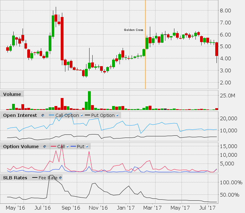
SLB chart, updated EOD 9Aug2017, no significant change in SLB rate from last post.
If I forget to post an update, note the volume traded since my last update. SLB cannot change dramatically without large trading volume.
SLB stands for Stock Loan Borrow, and is a fee rate that indicates current demand for shorting vs the known available supply.
This SLB fee rate data is from Interactive Brokers, the most comprehensive source available.
Every share legally sold short must be backed by a borrowed share, and the account that is shorting pays interest on the borrowed share.
This fee rate is annualized, and applies every day including non-trading days, until a share is bought-to-close the short share.
The higher the fee rate, the greater the demand for shorting; The lower the fee rate, the lower the demand for shorting.
As long as the SLB fee rate does not go over 125% in a short period of time, a Short & Distort attack is probably not imminent, although normal shorting should be expected whenever a consensus forms that a peak in price-per-share has been reached.
SLB has no ability to predict price manipulation by high-freqency trading (HFT) or similar techniques.
For weeks dating back to NASDAQ uplisting, see copies of this chart posted in May2017.
The last candlestick is only for the part of the week that has transpired so far.
Green candle = closing price higher than open; Red candle = closing price lower than open.
The Golden Cross is based on the most common formula which uses 200 & 50-day simple moving averages.
Option volume and options Open Interest is included. Buying long Puts or selling short Calls can act as a substitute for short-selling.
The top of this SLB graph is actually clipped, the top line is 120%, and twice it went way above that (once in this chart).
The bottom of this SLB graph is about 15%.

SLB chart, updated EOD 8Aug2017, no significant change in SLB rate from last post.
If I forget to post an update, note the volume traded since my last update. SLB cannot change dramatically without large trading volume.
SLB stands for Stock Loan Borrow, and is a fee rate that indicates current demand for shorting vs the known available supply.
This SLB fee rate data is from Interactive Brokers, the most comprehensive source available.
Every share legally sold short must be backed by a borrowed share, and the account that is shorting pays interest on the borrowed share.
This fee rate is annualized, and applies every day including non-trading days, until a share is bought-to-close the short share.
The higher the fee rate, the greater the demand for shorting; The lower the fee rate, the lower the demand for shorting.
As long as the SLB fee rate does not go over 125% in a short period of time, a Short & Distort attack is probably not imminent, although normal shorting should be expected whenever a consensus forms that a peak in price-per-share has been reached.
SLB has no ability to predict price manipulation by high-freqency trading (HFT) or similar techniques.
For weeks dating back to NASDAQ uplisting, see copies of this chart posted in May2017.
The last candlestick is only for the part of the week that has transpired so far.
Green candle = closing price higher than open; Red candle = closing price lower than open.
The Golden Cross is based on the most common formula which uses 200 & 50-day simple moving averages.
Option volume and options Open Interest is included. Buying long Puts or selling short Calls can act as a substitute for short-selling.
The top of this SLB graph is actually clipped, the top line is 120%, and twice it went way above that (once in this chart).
The bottom of this SLB graph is about 15%.

SLB chart, updated EOD 7Aug2017, no significant change in SLB rate from last post.
If I forget to post an update, note the volume traded since my last update. SLB cannot change dramatically without large trading volume.
SLB stands for Stock Loan Borrow, and is a fee rate that indicates current demand for shorting vs the known available supply.
This SLB fee rate data is from Interactive Brokers, the most comprehensive source available.
Every share legally sold short must be backed by a borrowed share, and the account that is shorting pays interest on the borrowed share.
This fee rate is annualized, and applies every day including non-trading days, until a share is bought-to-close the short share.
The higher the fee rate, the greater the demand for shorting; The lower the fee rate, the lower the demand for shorting.
As long as the SLB fee rate does not go over 125% in a short period of time, a Short & Distort attack is probably not imminent, although normal shorting should be expected whenever a consensus forms that a peak in price-per-share has been reached.
SLB has no ability to predict price manipulation by high-freqency trading (HFT) or similar techniques.
For weeks dating back to NASDAQ uplisting, see copies of this chart posted in May2017.
The last candlestick is only for the part of the week that has transpired so far.
Green candle = closing price higher than open; Red candle = closing price lower than open.
The Golden Cross is based on the most common formula which uses 200 & 50-day simple moving averages.
Option volume and options Open Interest is included. Buying long Puts or selling short Calls can act as a substitute for short-selling.
The top of this SLB graph is actually clipped, the top line is 120%, and twice it went way above that (once in this chart).
The bottom of this SLB graph is about 15%.

SLB chart, updated EOD 4Aug2017, no significant change in SLB rate from last post.
If I forget to post an update, note the volume traded since my last update. SLB cannot change dramatically without large trading volume.
SLB stands for Stock Loan Borrow, and is a fee rate that indicates current demand for shorting vs the known available supply.
This SLB fee rate data is from Interactive Brokers, the most comprehensive source available.
Every share legally sold short must be backed by a borrowed share, and the account that is shorting pays interest on the borrowed share.
This fee rate is annualized, and applies every day including non-trading days, until a share is bought-to-close the short share.
The higher the fee rate, the greater the demand for shorting; The lower the fee rate, the lower the demand for shorting.
As long as the SLB fee rate does not go over 125% in a short period of time, a Short & Distort attack is probably not imminent, although normal shorting should be expected whenever a consensus forms that a peak in price-per-share has been reached.
SLB has no ability to predict price manipulation by high-freqency trading (HFT) or similar techniques.
For weeks dating back to NASDAQ uplisting, see copies of this chart posted in May2017.
Green candle = closing price higher than open; Red candle = closing price lower than open.
The Golden Cross is based on the most common formula which uses 200 & 50-day simple moving averages.
Option volume and options Open Interest is included. Buying long Puts or selling short Calls can act as a substitute for short-selling.
The top of this SLB graph is actually clipped, the top line is 120%, and twice it went way above that (once in this chart).
The bottom of this SLB graph is about 15%.

SLB chart, updated EOD 3Aug2017, no significant change in SLB rate from last post.
If I forget to post an update, note the volume traded since my last update. SLB cannot change dramatically without large trading volume.
SLB stands for Stock Loan Borrow, and is a fee rate that indicates current demand for shorting vs the known available supply.
This SLB fee rate data is from Interactive Brokers, the most comprehensive source available.
Every share legally sold short must be backed by a borrowed share, and the account that is shorting pays interest on the borrowed share.
This fee rate is annualized, and applies every day including non-trading days, until a share is bought-to-close the short share.
The higher the fee rate, the greater the demand for shorting; The lower the fee rate, the lower the demand for shorting.
As long as the SLB fee rate does not go over 125% in a short period of time, a Short & Distort attack is probably not imminent, although normal shorting should be expected whenever a consensus forms that a peak in price-per-share has been reached.
SLB has no ability to predict price manipulation by high-freqency trading (HFT) or similar techniques.
For weeks dating back to NASDAQ uplisting, see copies of this chart posted in May2017.
The last candlestick is only for the part of the week that has transpired so far.
Green candle = closing price higher than open; Red candle = closing price lower than open.
The Golden Cross is based on the most common formula which uses 200 & 50-day simple moving averages.
Option volume and options Open Interest is included. Buying long Puts or selling short Calls can act as a substitute for short-selling.
The top of this SLB graph is actually clipped, the top line is 120%, and twice it went way above that (once in this chart).
The bottom of this SLB graph is about 15%.

SLB chart, updated EOD 2Aug2017, no significant change in SLB rate from last post.
If I forget to post an update, note the volume traded since my last update. SLB cannot change dramatically without large trading volume.
SLB stands for Stock Loan Borrow, and is a fee rate that indicates current demand for shorting vs the known available supply.
This SLB fee rate data is from Interactive Brokers, the most comprehensive source available.
Every share legally sold short must be backed by a borrowed share, and the account that is shorting pays interest on the borrowed share.
This fee rate is annualized, and applies every day including non-trading days, until a share is bought-to-close the short share.
The higher the fee rate, the greater the demand for shorting; The lower the fee rate, the lower the demand for shorting.
As long as the SLB fee rate does not go over 125% in a short period of time, a Short & Distort attack is probably not imminent, although normal shorting should be expected whenever a consensus forms that a peak in price-per-share has been reached.
SLB has no ability to predict price manipulation by high-freqency trading (HFT) or similar techniques.
For weeks dating back to NASDAQ uplisting, see copies of this chart posted in May2017.
The last candlestick is only for the part of the week that has transpired so far.
Green candle = closing price higher than open; Red candle = closing price lower than open.
The Golden Cross is based on the most common formula which uses 200 & 50-day simple moving averages.
Option volume and options Open Interest is included. Buying long Puts or selling short Calls can act as a substitute for short-selling.
The top of this SLB graph is actually clipped, the top line is 120%, and twice it went way above that (once in this chart).
The bottom of this SLB graph is about 15%.

SLB chart, updated EOD 1Aug2017, no significant change in SLB rate from last post.
If I forget to post an update, note the volume traded since my last update. SLB cannot change dramatically without large trading volume.
SLB stands for Stock Loan Borrow, and is a fee rate that indicates current demand for shorting vs the known available supply.
This SLB fee rate data is from Interactive Brokers, the most comprehensive source available.
Every share legally sold short must be backed by a borrowed share, and the account that is shorting pays interest on the borrowed share.
This fee rate is annualized, and applies every day including non-trading days, until a share is bought-to-close the short share.
The higher the fee rate, the greater the demand for shorting; The lower the fee rate, the lower the demand for shorting.
As long as the SLB fee rate does not go over 125% in a short period of time, a Short & Distort attack is probably not imminent, although normal shorting should be expected whenever a consensus forms that a peak in price-per-share has been reached.
SLB has no ability to predict price manipulation by high-freqency trading (HFT) or similar techniques.
For weeks dating back to NASDAQ uplisting, see copies of this chart posted in May2017.
The last candlestick is only for the part of the week that has transpired so far.
Green candle = closing price higher than open; Red candle = closing price lower than open.
The Golden Cross is based on the most common formula which uses 200 & 50-day simple moving averages.
Option volume and options Open Interest is included. Buying long Puts or selling short Calls can act as a substitute for short-selling.
The top of this SLB graph is actually clipped, the top line is 120%, and twice it went way above that (once in this chart).
The bottom of this SLB graph is about 15%.

SLB chart, updated EOD 31Jul2017, no significant change in SLB rate from last post.
If I forget to post an update, note the volume traded since my last update. SLB cannot change dramatically without large trading volume.
SLB stands for Stock Loan Borrow, and is a fee rate that indicates current demand for shorting vs the known available supply.
This SLB fee rate data is from Interactive Brokers, the most comprehensive source available.
Every share legally sold short must be backed by a borrowed share, and the account that is shorting pays interest on the borrowed share.
This fee rate is annualized, and applies every day including non-trading days, until a share is bought-to-close the short share.
The higher the fee rate, the greater the demand for shorting; The lower the fee rate, the lower the demand for shorting.
As long as the SLB fee rate does not go over 125% in a short period of time, a Short & Distort attack is probably not imminent, although normal shorting should be expected whenever a consensus forms that a peak in price-per-share has been reached.
SLB has no ability to predict price manipulation by high-freqency trading (HFT) or similar techniques.
For weeks dating back to NASDAQ uplisting, see copies of this chart posted in May2017.
The last candlestick is only for the part of the week that has transpired so far.
Green candle = closing price higher than open; Red candle = closing price lower than open.
The Golden Cross is based on the most common formula which uses 200 & 50-day simple moving averages.
Option volume and options Open Interest is included. Buying long Puts or selling short Calls can act as a substitute for short-selling.
The top of this SLB graph is actually clipped, the top line is 120%, and twice it went way above that (once in this chart).
The bottom of this SLB graph is about 15%.

SLB chart, updated EOD 28Jul2017, no significant change in SLB rate from last post.
If I forget to post an update, note the volume traded since my last update. SLB cannot change dramatically without large trading volume.
SLB stands for Stock Loan Borrow, and is a fee rate that indicates current demand for shorting vs the known available supply.
This SLB fee rate data is from Interactive Brokers, the most comprehensive source available.
Every share legally sold short must be backed by a borrowed share, and the account that is shorting pays interest on the borrowed share.
This fee rate is annualized, and applies every day including non-trading days, until a share is bought-to-close the short share.
The higher the fee rate, the greater the demand for shorting; The lower the fee rate, the lower the demand for shorting.
As long as the SLB fee rate does not go over 125% in a short period of time, a Short & Distort attack is probably not imminent, although normal shorting should be expected whenever a consensus forms that a peak in price-per-share has been reached.
SLB has no ability to predict price manipulation by high-freqency trading (HFT) or similar techniques.
For weeks dating back to NASDAQ uplisting, see copies of this chart posted in May2017.
Green candle = closing price higher than open; Red candle = closing price lower than open.
The Golden Cross is based on the most common formula which uses 200 & 50-day simple moving averages.
Option volume and options Open Interest is included. Buying long Puts or selling short Calls can act as a substitute for short-selling.
The top of this SLB graph is actually clipped, the top line is 120%, and twice it went way above that (once in this chart).
The bottom of this SLB graph is about 15%.

SLB chart, updated EOD 27Jul2017, no significant change in SLB rate from last post.
If I forget to post an update, note the volume traded since my last update. SLB cannot change dramatically without large trading volume.
SLB stands for Stock Loan Borrow, and is a fee rate that indicates current demand for shorting vs the known available supply.
This SLB fee rate data is from Interactive Brokers, the most comprehensive source available.
Every share legally sold short must be backed by a borrowed share, and the account that is shorting pays interest on the borrowed share.
This fee rate is annualized, and applies every day including non-trading days, until a share is bought-to-close the short share.
The higher the fee rate, the greater the demand for shorting; The lower the fee rate, the lower the demand for shorting.
As long as the SLB fee rate does not go over 125% in a short period of time, a Short & Distort attack is probably not imminent, although normal shorting should be expected whenever a consensus forms that a peak in price-per-share has been reached.
SLB has no ability to predict price manipulation by high-freqency trading (HFT) or similar techniques.
For weeks dating back to NASDAQ uplisting, see copies of this chart posted in May2017.
The last candlestick is only for the part of the week that has transpired so far.
Green candle = closing price higher than open; Red candle = closing price lower than open.
The Golden Cross is based on the most common formula which uses 200 & 50-day simple moving averages.
Option volume and options Open Interest is included. Buying long Puts or selling short Calls can act as a substitute for short-selling.
The top of this SLB graph is actually clipped, the top line is 120%, and twice it went way above that (once in this chart).
The bottom of this SLB graph is about 15%.

SLB chart, updated EOD 26Jul2017, no significant change in SLB rate from last post.
If I forget to post an update, note the volume traded since my last update. SLB cannot change dramatically without large trading volume.
SLB stands for Stock Loan Borrow, and is a fee rate that indicates current demand for shorting vs the known available supply.
This SLB fee rate data is from Interactive Brokers, the most comprehensive source available.
Every share legally sold short must be backed by a borrowed share, and the account that is shorting pays interest on the borrowed share.
This fee rate is annualized, and applies every day including non-trading days, until a share is bought-to-close the short share.
The higher the fee rate, the greater the demand for shorting; The lower the fee rate, the lower the demand for shorting.
As long as the SLB fee rate does not go over 125% in a short period of time, a Short & Distort attack is probably not imminent, although normal shorting should be expected whenever a consensus forms that a peak in price-per-share has been reached.
SLB has no ability to predict price manipulation by high-freqency trading (HFT) or similar techniques.
For weeks dating back to NASDAQ uplisting, see copies of this chart posted in May2017.
The last candlestick is only for the part of the week that has transpired so far.
Green candle = closing price higher than open; Red candle = closing price lower than open.
The Golden Cross is based on the most common formula which uses 200 & 50-day simple moving averages.
Option volume and options Open Interest is included. Buying long Puts or selling short Calls can act as a substitute for short-selling.
The top of this SLB graph is actually clipped, the top line is 120%, and twice it went way above that (once in this chart).
The bottom of this SLB graph is about 15%.

SLB chart, updated EOD 25Jul2017, no significant change in SLB rate from last post.
If I forget to post an update, note the volume traded since my last update. SLB cannot change dramatically without large trading volume.
SLB stands for Stock Loan Borrow, and is a fee rate that indicates current demand for shorting vs the known available supply.
This SLB fee rate data is from Interactive Brokers, the most comprehensive source available.
Every share legally sold short must be backed by a borrowed share, and the account that is shorting pays interest on the borrowed share.
This fee rate is annualized, and applies every day including non-trading days, until a share is bought-to-close the short share.
The higher the fee rate, the greater the demand for shorting; The lower the fee rate, the lower the demand for shorting.
As long as the SLB fee rate does not go over 125% in a short period of time, a Short & Distort attack is probably not imminent, although normal shorting should be expected whenever a consensus forms that a peak in price-per-share has been reached.
SLB has no ability to predict price manipulation by high-freqency trading (HFT) or similar techniques.
For weeks dating back to NASDAQ uplisting, see copies of this chart posted in May2017.
The last candlestick is only for the part of the week that has transpired so far.
Green candle = closing price higher than open; Red candle = closing price lower than open.
The Golden Cross is based on the most common formula which uses 200 & 50-day simple moving averages.
Option volume and options Open Interest is included. Buying long Puts or selling short Calls can act as a substitute for short-selling.
The top of this SLB graph is actually clipped, the top line is 120%, and twice it went way above that (once in this chart).
The bottom of this SLB graph is about 15%.

SLB chart, updated EOD 24Jul2017, no significant change in SLB rate from last post.
If I forget to post an update, note the volume traded since my last update. SLB cannot change dramatically without large trading volume.
SLB stands for Stock Loan Borrow, and is a fee rate that indicates current demand for shorting vs the known available supply.
This SLB fee rate data is from Interactive Brokers, the most comprehensive source available.
Every share legally sold short must be backed by a borrowed share, and the account that is shorting pays interest on the borrowed share.
This fee rate is annualized, and applies every day including non-trading days, until a share is bought-to-close the short share.
The higher the fee rate, the greater the demand for shorting; The lower the fee rate, the lower the demand for shorting.
As long as the SLB fee rate does not go over 125% in a short period of time, a Short & Distort attack is probably not imminent, although normal shorting should be expected whenever a consensus forms that a peak in price-per-share has been reached.
SLB has no ability to predict price manipulation by high-freqency trading (HFT) or similar techniques.
For weeks dating back to NASDAQ uplisting, see copies of this chart posted in May2017.
The last candlestick is only for the part of the week that has transpired so far.
Green candle = closing price higher than open; Red candle = closing price lower than open.
The Golden Cross is based on the most common formula which uses 200 & 50-day simple moving averages.
Option volume and options Open Interest is included. Buying long Puts or selling short Calls can act as a substitute for short-selling.
The top of this SLB graph is actually clipped, the top line is 120%, and twice it went way above that (once in this chart).
The bottom of this SLB graph is about 15%.

SLB chart, updated EOD 21Jun2017, no significant change in SLB rate from last post.
If I forget to post an update, note the volume traded since my last update. SLB cannot change dramatically without large trading volume.
SLB stands for Stock Loan Borrow, and is a fee rate that indicates current demand for shorting vs the known available supply.
This SLB fee rate data is from Interactive Brokers, the most comprehensive source available.
Every share legally sold short must be backed by a borrowed share, and the account that is shorting pays interest on the borrowed share.
This fee rate is annualized, and applies every day including non-trading days, until a share is bought-to-close the short share.
The higher the fee rate, the greater the demand for shorting; The lower the fee rate, the lower the demand for shorting.
As long as the SLB fee rate does not go over 125% in a short period of time, a Short & Distort attack is probably not imminent, although normal shorting should be expected whenever a consensus forms that a peak in price-per-share has been reached.
For weeks dating back to NASDAQ uplisting, see copies of this chart posted in May2017.
Green candle = closing price higher than open; Red candle = closing price lower than open.
The Golden Cross is based on the most common formula which uses 200 & 50-day simple moving averages.
Option volume and options Open Interest is included. Buying long Puts or selling short Calls can act as a substitute for short-selling.
The top of this SLB graph is actually clipped, the top line is 120%, and twice it went way above that (once in this chart).
The bottom of this SLB graph is about 15%.
SLB chart, updated EOD 20Jun2017, no significant change in SLB rate from last post.
If I forget to post an update, note the volume traded since my last update. SLB cannot change dramatically without large trading volume.
SLB stands for Stock Loan Borrow, and is a fee rate that indicates current demand for shorting vs the known available supply.
This SLB fee rate data is from Interactive Brokers, the most comprehensive source available.
Every share legally sold short must be backed by a borrowed share, and the account that is shorting pays interest on the borrowed share.
This fee rate is annualized, and applies every day including non-trading days, until a share is bought-to-close the short share.
The higher the fee rate, the greater the demand for shorting; The lower the fee rate, the lower the demand for shorting.
As long as the SLB fee rate does not go over 125% in a short period of time, a Short & Distort attack is probably not imminent, although normal shorting should be expected whenever a consensus forms that a peak in price-per-share has been reached.
For weeks dating back to NASDAQ uplisting, see copies of this chart posted in May2017.
The last candlestick is only for the part of the week that has transpired so far.
Green candle = closing price higher than open; Red candle = closing price lower than open.
The Golden Cross is based on the most common formula which uses 200 & 50-day simple moving averages.
Option volume and options Open Interest is included. Buying long Puts or selling short Calls can act as a substitute for short-selling.
The top of this SLB graph is actually clipped, the top line is 120%, and twice it went way above that (once in this chart).
The bottom of this SLB graph is about 15%.

SLB chart, updated EOD 19Jun2017, no significant change in SLB rate from last post.
If I forget to post an update, note the volume traded since my last update. SLB cannot change dramatically without large trading volume.
SLB stands for Stock Loan Borrow, and is a fee rate that indicates current demand for shorting vs the known available supply.
This SLB fee rate data is from Interactive Brokers, the most comprehensive source available.
Every share legally sold short must be backed by a borrowed share, and the account that is shorting pays interest on the borrowed share.
This fee rate is annualized, and applies every day including non-trading days, until a share is bought-to-close the short share.
The higher the fee rate, the greater the demand for shorting; The lower the fee rate, the lower the demand for shorting.
As long as the SLB fee rate does not go over 125% in a short period of time, a Short & Distort attack is probably not imminent, although normal shorting should be expected whenever a consensus forms that a peak in price-per-share has been reached.
For weeks dating back to NASDAQ uplisting, see copies of this chart posted in May2017.
The last candlestick is only for the part of the week that has transpired so far.
Green candle = closing price higher than open; Red candle = closing price lower than open.
The Golden Cross is based on the most common formula which uses 200 & 50-day simple moving averages.
Option volume and options Open Interest is included. Buying long Puts or selling short Calls can act as a substitute for short-selling.
The top of this SLB graph is actually clipped, the top line is 125%, and twice it went way above that (once in this chart).
The bottom of this SLB graph is about 15%.

SLB chart, updated EOD 18Jun2017, no significant change in SLB rate from last post.
If I forget to post an update, note the volume traded since my last update. SLB cannot change dramatically without large trading volume.
SLB stands for Stock Loan Borrow, and is a fee rate that indicates current demand for shorting vs the known available supply.
This SLB fee rate data is from Interactive Brokers, the most comprehensive source available.
Every share legally sold short must be backed by a borrowed share, and the account that is shorting pays interest on the borrowed share.
This fee rate is annualized, and applies every day including non-trading days, until a share is bought-to-close the short share.
The higher the fee rate, the greater the demand for shorting; The lower the fee rate, the lower the demand for shorting.
As long as the SLB fee rate does not go over 125% in a short period of time, a Short & Distort attack is probably not imminent, although normal shorting should be expected whenever a consensus forms that a peak in price-per-share has been reached.
For weeks dating back to NASDAQ uplisting, see copies of this chart posted in May2017.
The last candlestick is only for the part of the week that has transpired so far.
Green candle = closing price higher than open; Red candle = closing price lower than open.
The Golden Cross is based on the most common formula which uses 200 & 50-day simple moving averages.
Option volume and options Open Interest is included. Buying long Puts or selling short Calls can act as a substitute for short-selling.
The top of this SLB graph is actually clipped, the top line is 125%, and twice it went way above that (once in this chart).
The bottom of this SLB graph is about 20%.

SLB chart, updated EOD 17Jun2017, no significant change in SLB rate from last post.
If I forget to post an update, note the volume traded since my last update. SLB cannot change dramatically without large trading volume.
SLB stands for Stock Loan Borrow, and is a fee rate that indicates current demand for shorting vs the known available supply.
This SLB fee rate data is from Interactive Brokers, the most comprehensive source available.
Every share legally sold short must be backed by a borrowed share, and the account that is shorting pays interest on the borrowed share.
This fee rate is annualized, and applies every day including non-trading days, until a share is bought-to-close the short share.
The higher the fee rate, the greater the demand for shorting; The lower the fee rate, the lower the demand for shorting.
As long as the SLB fee rate does not go over 125% in a short period of time, a Short & Distort attack is probably not imminent, although normal shorting should be expected whenever a consensus forms that a peak in price-per-share has been reached.
For weeks dating back to NASDAQ uplisting, see copies of this chart posted in May2017.
The last candlestick is only for the part of the week that has transpired so far.
Green candle = closing price higher than open; Red candle = closing price lower than open.
The Golden Cross is based on the most common formula which uses 200 & 50-day simple moving averages.
Option volume and options Open Interest is included. Buying long Puts or selling short Calls can act as a substitute for short-selling.
The top of this SLB graph is actually clipped, the top line is 125%, and twice it went way above that (once in this chart).
The bottom of this SLB graph is about 20%.

SLB chart, updated EOD 14Jun2017, no significant change in SLB rate from last post.
If I forget to post an update, note the volume traded since my last update. SLB cannot change dramatically without large trading volume.
SLB stands for Stock Loan Borrow, and is a fee rate that indicates current demand for shorting vs the known available supply.
This SLB fee rate data is from Interactive Brokers, the most comprehensive source available.
Every share legally sold short must be backed by a borrowed share, and the account that is shorting pays interest on the borrowed share.
This fee rate is annualized, and applies every day including non-trading days, until a share is bought-to-close the short share.
The higher the fee rate, the greater the demand for shorting; The lower the fee rate, the lower the demand for shorting.
As long as the SLB fee rate does not go over 125% in a short period of time, a Short & Distort attack is probably not imminent, although normal shorting should be expected whenever a consensus forms that a peak in price-per-share has been reached.
For weeks dating back to NASDAQ uplisting, see copies of this chart posted in May2017.
Green candle = closing price higher than open; Red candle = closing price lower than open.
The Golden Cross is based on the most common formula which uses 200 & 50-day simple moving averages.
Option volume and options Open Interest is included. Buying long Puts or selling short Calls can act as a substitute for short-selling.
The top of this SLB graph is actually clipped, the top line is 125%, and twice it went way above that (once in this chart).
The bottom of this SLB graph is about 20%.

SLB chart, updated EOD 13Jun2017, no significant change in SLB rate from last post.
If I forget to post an update, note the volume traded since my last update. SLB cannot change dramatically without large trading volume.
SLB stands for Stock Loan Borrow, and is a fee rate that indicates current demand for shorting vs the known available supply.
This SLB fee rate data is from Interactive Brokers, the most comprehensive source available.
Every share legally sold short must be backed by a borrowed share, and the account that is shorting pays interest on the borrowed share.
This fee rate is annualized, and applies every day including non-trading days, until a share is bought-to-close the short share.
The higher the fee rate, the greater the demand for shorting; The lower the fee rate, the lower the demand for shorting.
As long as the SLB fee rate does not go over 125% in a short period of time, a Short & Distort attack is probably not imminent, although normal shorting should be expected whenever a consensus forms that a peak in price-per-share has been reached.
For weeks dating back to NASDAQ uplisting, see copies of this chart posted in May2017.
The last candlestick is only for the part of the week that has transpired so far.
Green candle = closing price higher than open; Red candle = closing price lower than open.
The Golden Cross is based on the most common formula which uses 200 & 50-day simple moving averages.
Option volume and options Open Interest is included. Buying long Puts or selling short Calls can act as a substitute for short-selling.
The top of this SLB graph is actually clipped, the top line is 125%, and twice it went way above that (once in this chart).
The bottom of this SLB graph is about 25%.

SLB chart, updated EOD 12Jun2017, no significant change in SLB rate from last post.
If I forget to post an update, note the volume traded since my last update. SLB cannot change dramatically without large trading volume.
SLB stands for Stock Loan Borrow, and is a fee rate that indicates current demand for shorting vs the known available supply.
This SLB fee rate data is from Interactive Brokers, the most comprehensive source available.
Every share legally sold short must be backed by a borrowed share, and the account that is shorting pays interest on the borrowed share.
This fee rate is annualized, and applies every day including non-trading days, until a share is bought-to-close the short share.
The higher the fee rate, the greater the demand for shorting; The lower the fee rate, the lower the demand for shorting.
As long as the SLB fee rate does not go over 125% in a short period of time, a Short & Distort attack is probably not imminent, although normal shorting should be expected whenever a consensus forms that a peak in price-per-share has been reached.
For weeks dating back to NASDAQ uplisting, see copies of this chart posted in May2017.
The last candlestick is only for the part of the week that has transpired so far.
Green candle = closing price higher than open; Red candle = closing price lower than open.
The Golden Cross is based on the most common formula which uses 200 & 50-day simple moving averages.
Option volume and options Open Interest is included. Buying long Puts or selling short Calls can act as a substitute for short-selling.
The top of this SLB graph is actually clipped, the top line is 125%, and twice it went way above that (once in this chart).
The bottom of this SLB graph is about 25%.

SLB chart, updated EOD 11Jun2017, no significant change in SLB rate from last post.
If I forget to post an update, note the volume traded since my last update. SLB cannot change dramatically without large trading volume.
SLB stands for Stock Loan Borrow, and is a fee rate that indicates current demand for shorting vs the known available supply.
This SLB fee rate data is from Interactive Brokers, the most comprehensive source available.
Every share legally sold short must be backed by a borrowed share, and the account that is shorting pays interest on the borrowed share.
This fee rate is annualized, and applies every day including non-trading days, until a share is bought-to-close the short share.
The higher the fee rate, the greater the demand for shorting; The lower the fee rate, the lower the demand for shorting.
As long as the SLB fee rate does not go over 125% in a short period of time, a Short & Distort attack is probably not imminent, although normal shorting should be expected whenever a consensus forms that a peak in price-per-share has been reached.
For weeks dating back to NASDAQ uplisting, see copies of this chart posted in May2017.
The last candlestick is only for the part of the week that has transpired so far.
Green candle = closing price higher than open; Red candle = closing price lower than open.
The Golden Cross is based on the most common formula which uses 200 & 50-day simple moving averages.
Option volume and options Open Interest is included. Buying long Puts or selling short Calls can act as a substitute for short-selling.
The top of this SLB graph is actually clipped, the top line is 125%, and twice it went way above that (once in this chart).
The bottom of this SLB graph is about 25%.

SLB chart, updated EOD 10Jun2017, no significant change in SLB rate from last post.
If I forget to post an update, note the volume traded since my last update. SLB cannot change dramatically without large trading volume.
SLB stands for Stock Loan Borrow, and is a fee rate that indicates current demand for shorting vs the known available supply.
This SLB fee rate data is from Interactive Brokers, the most comprehensive source available.
Every share legally sold short must be backed by a borrowed share, and the account that is shorting pays interest on the borrowed share.
This fee rate is annualized, and applies every day including non-trading days, until a share is bought-to-close the short share.
The higher the fee rate, the greater the demand for shorting; The lower the fee rate, the lower the demand for shorting.
As long as the SLB fee rate does not go over 125% in a short period of time, a Short & Distort attack is probably not imminent, although normal shorting should be expected whenever a consensus forms that a peak in price-per-share has been reached.
For weeks dating back to NASDAQ uplisting, see copies of this chart posted in May2017.
The last candlestick is only for the part of the week that has transpired so far.
Green candle = closing price higher than open; Red candle = closing price lower than open.
The Golden Cross is based on the most common formula which uses 200 & 50-day simple moving averages.
Option volume and options Open Interest is included. Buying long Puts or selling short Calls can act as a substitute for short-selling.
The top of this SLB graph is actually clipped, the top line is 125%, and twice it went way above that (once in this chart).
The bottom of this SLB graph is about 25%.

SLB chart, updated EOD 7Jun2017, no significant change in SLB rate from last post.
If I forget to post an update, note the volume traded since my last update. SLB cannot change dramatically without large trading volume.
SLB stands for Stock Loan Borrow, and is a fee rate that indicates current demand for shorting vs the known available supply.
This SLB fee rate data is from Interactive Brokers, the most comprehensive source available.
Every share legally sold short must be backed by a borrowed share, and the account that is shorting pays interest on the borrowed share.
This fee rate is annualized, and applies every day including non-trading days, until a share is bought-to-close the short share.
The higher the fee rate, the greater the demand for shorting; The lower the fee rate, the lower the demand for shorting.
As long as the SLB fee rate does not go over 125% in a short period of time, a Short & Distort attack is probably not imminent, although normal shorting should be expected whenever a consensus forms that a peak in price-per-share has been reached.
For weeks dating back to NASDAQ uplisting, see copies of this chart posted in May2017.
Green candle = closing price higher than open; Red candle = closing price lower than open.
The Golden Cross is based on the most common formula which uses 200 & 50-day simple moving averages.
Option volume and options Open Interest is included. Buying long Puts or selling short Calls can act as a substitute for short-selling.
The top of this SLB graph is actually clipped, the top line is 125%, and twice it went way above that (once in this chart).
The bottom of this SLB graph is about 25%.

SLB chart, updated EOD 6Jun2017, no significant change in SLB rate from last post.
If I forget to post an update, note the volume traded since my last update. SLB cannot change dramatically without large trading volume.
SLB stands for Stock Loan Borrow, and is a fee rate that indicates current demand for shorting vs the known available supply.
This SLB fee rate data is from Interactive Brokers, the most comprehensive source available.
Every share legally sold short must be backed by a borrowed share, and the account that is shorting pays interest on the borrowed share.
This fee rate is annualized, and applies every day including non-trading days, until a share is bought-to-close the short share.
The higher the fee rate, the greater the demand for shorting; The lower the fee rate, the lower the demand for shorting.
As long as the SLB fee rate does not go over 125% in a short period of time, a Short & Distort attack is probably not imminent, although normal shorting should be expected whenever a consensus forms that a peak in price-per-share has been reached.
For weeks dating back to NASDAQ uplisting, see copies of this chart posted in May2017.
The last candlestick is only for the part of the week that has transpired so far.
Green candle = closing price higher than open; Red candle = closing price lower than open.
The Golden Cross is based on the most common formula which uses 200 & 50-day simple moving averages.
Option volume and options Open Interest is included. Buying long Puts or selling short Calls can act as a substitute for short-selling.
The top of this SLB graph is actually clipped, the top line is 125%, and twice it went way above that (once in this chart).
The bottom of this SLB graph is about 25%.

SLB chart, updated EOD 5Jun2017, no significant change in SLB rate from last post.
If I forget to post an update, note the volume traded since my last update. SLB cannot change dramatically without large trading volume.
SLB stands for Stock Loan Borrow, and is a fee rate that indicates current demand for shorting vs the known available supply.
This SLB fee rate data is from Interactive Brokers, the most comprehensive source available.
Every share legally sold short must be backed by a borrowed share, and the account that is shorting pays interest on the borrowed share.
This fee rate is annualized, and applies every day including non-trading days, until a share is bought-to-close the short share.
The higher the fee rate, the greater the demand for shorting; The lower the fee rate, the lower the demand for shorting.
As long as the SLB fee rate does not go over 125% in a short period of time, a Short & Distort attack is probably not imminent, although normal shorting should be expected whenever a consensus forms that a peak in price-per-share has been reached.
For weeks dating back to NASDAQ uplisting, see copies of this chart posted in May2017.
The last candlestick is only for the part of the week that has transpired so far.
Green candle = closing price higher than open; Red candle = closing price lower than open.
The Golden Cross is based on the most common formula which uses 200 & 50-day simple moving averages.
Option volume and options Open Interest is included. Buying long Puts or selling short Calls can act as a substitute for short-selling.
The top of this SLB graph is actually clipped, the top line is 125%, and twice it went way above that (once in this chart).
The bottom of this SLB graph is about 25%.

SLB chart, updated EOD 3Jun2017, no significant change in SLB rate from last post.
If I forget to post an update, note the volume traded since my last update. SLB cannot change dramatically without large trading volume.
SLB stands for Stock Loan Borrow, and is a fee rate that indicates current demand for shorting vs the known available supply.
This SLB fee rate data is from Interactive Brokers, the most comprehensive source available.
Every share legally sold short must be backed by a borrowed share, and the account that is shorting pays interest on the borrowed share.
This fee rate is annualized, and applies every day including non-trading days, until a share is bought-to-close the short share.
The higher the fee rate, the greater the demand for shorting; The lower the fee rate, the lower the demand for shorting.
As long as the SLB fee rate does not go over 125% in a short period of time, a Short & Distort attack is probably not imminent, although normal shorting should be expected whenever a consensus forms that a peak in price-per-share has been reached.
For weeks dating back to NASDAQ uplisting, see copies of this chart posted in May2017.
The last candlestick is only for the part of the week that has transpired so far.
Green candle = closing price higher than open; Red candle = closing price lower than open.
The Golden Cross is based on the most common formula which uses 200 & 50-day simple moving averages.
Option volume and options Open Interest is included. Buying long Puts or selling short Calls can act as a substitute for short-selling.
The top of this SLB graph is actually clipped, the top line is 125%, and twice it went way above that (once in this chart).
The bottom of this SLB graph is about 25%.

SLB chart, updated EOD 30Jun2017, no significant change in SLB rate from last post.
If I forget to post an update, note the volume traded since my last update. SLB cannot change dramatically without large trading volume.
SLB stands for Stock Loan Borrow, and is a fee rate that indicates current demand for shorting vs the known available supply.
This SLB fee rate data is from Interactive Brokers, the most comprehensive source available.
Every share legally sold short must be backed by a borrowed share, and the account that is shorting pays interest on the borrowed share.
This fee rate is annualized, and applies every day including non-trading days, until a share is bought-to-close the short share.
The higher the fee rate, the greater the demand for shorting; The lower the fee rate, the lower the demand for shorting.
As long as the SLB fee rate does not go over 125% in a short period of time, a Short & Distort attack is probably not imminent, although normal shorting should be expected whenever a consensus forms that a peak in price-per-share has been reached.
For weeks dating back to NASDAQ uplisting, see copies of this chart posted in May2017.
Green candle = closing price higher than open; Red candle = closing price lower than open.
The Golden Cross is based on the most common formula which uses 200 & 50-day simple moving averages.
Option volume and options Open Interest is included. Buying long Puts or selling short Calls can act as a substitute for short-selling.
The top of this SLB graph is actually clipped, the top line is 125%, and twice it went way above that (once in this chart).
The bottom of this SLB graph is about 25%.

SLB chart, updated EOD 29Jun2017, no significant change in SLB rate from last post.
If I forget to post an update, note the volume traded since my last update. SLB cannot change dramatically without large trading volume.
SLB stands for Stock Loan Borrow, and is a fee rate that indicates current demand for shorting vs the known available supply.
This SLB fee rate data is from Interactive Brokers, the most comprehensive source available.
Every share legally sold short must be backed by a borrowed share, and the account that is shorting pays interest on the borrowed share.
This fee rate is annualized, and applies every day including non-trading days, until a share is bought-to-close the short share.
The higher the fee rate, the greater the demand for shorting; The lower the fee rate, the lower the demand for shorting.
As long as the SLB fee rate does not go over 125% in a short period of time, a Short & Distort attack is probably not imminent, although normal shorting should be expected whenever a consensus forms that a peak in price-per-share has been reached.
For weeks dating back to NASDAQ uplisting, see copies of this chart posted in May2017.
The last candlestick is only for the part of the week that has transpired so far.
Green candle = closing price higher than open; Red candle = closing price lower than open.
The Golden Cross is based on the most common formula which uses 200 & 50-day simple moving averages.
Option volume and options Open Interest is included. Buying long Puts or selling short Calls can act as a substitute for short-selling.
The top of this SLB graph is actually clipped, the top line is 125%, and twice it went way above that (once in this chart).
The bottom of this SLB graph is about 25%.

SLB chart, updated EOD 28Jun2017, no significant change in SLB rate from last post.
If I forget to post an update, note the volume traded since my last update. SLB cannot change dramatically without large trading volume.
SLB stands for Stock Loan Borrow, and is a fee rate that indicates current demand for shorting vs the known available supply.
This SLB fee rate data is from Interactive Brokers, the most comprehensive source available.
Every share legally sold short must be backed by a borrowed share, and the account that is shorting pays interest on the borrowed share.
This fee rate is annualized, and applies every day including non-trading days, until a share is bought-to-close the short share.
The higher the fee rate, the greater the demand for shorting; The lower the fee rate, the lower the demand for shorting.
As long as the SLB fee rate does not go over 125% in a short period of time, a Short & Distort attack is probably not imminent, although normal shorting should be expected whenever a consensus forms that a peak in price-per-share has been reached.
For weeks dating back to NASDAQ uplisting, see copies of this chart posted in May2017.
The last candlestick is only for the part of the week that has transpired so far.
Green candle = closing price higher than open; Red candle = closing price lower than open.
The Golden Cross is based on the most common formula which uses 200 & 50-day simple moving averages.
Option volume and options Open Interest is included. Buying long Puts or selling short Calls can act as a substitute for short-selling.
The top of this SLB graph is actually clipped, the top line is 125%, and twice it went way above that (once in this chart).
The bottom of this SLB graph is about 25%.

SLB chart, updated EOD 27Jun2017, no significant change in SLB rate from last post.
SLB stands for Stock Loan Borrow, and is a fee rate that indicates current demand for shorting vs the known available supply.
This SLB fee rate data is from Interactive Brokers, the most comprehensive source available.
Every share legally sold short must be backed by a borrowed share, and the account that is shorting pays interest on the borrowed share.
This fee rate is annualized, and applies every day including non-trading days, until a share is bought-to-close the short share.
The higher the fee rate, the greater the demand for shorting; The lower the fee rate, the lower the demand for shorting.
As long as the SLB fee rate does not go over 125% in a short period of time, a Short & Distort attack is probably not imminent, although normal shorting should be expected whenever a consensus forms that a peak in price-per-share has been reached.
For weeks dating back to NASDAQ uplisting, see copies of this chart posted in May2017.
The last candlestick is only for the part of the week that has transpired so far.
Green candle = closing price higher than open; Red candle = closing price lower than open.
The Golden Cross is based on the most common formula which uses 200 & 50-day simple moving averages.
Option volume and options Open Interest is included. Buying long Puts or selling short Calls can act as a substitute for short-selling.
The top of this SLB graph is actually clipped, the top line is 125%, and twice it went way above that (once in this chart).
The bottom of this SLB graph is about 25%.

SLB chart, updated EOD 26Jun2017, no significant change in SLB rate from last post.
SLB stands for Stock Loan Borrow, and is a fee rate that indicates current demand for shorting vs the known available supply.
This SLB fee rate data is from Interactive Brokers, the most comprehensive source available.
Every share legally sold short must be backed by a borrowed share, and the account that is shorting pays interest on the borrowed share.
This fee rate is annualized, and applies every day including non-trading days, until a share is bought-to-close the short share.
The higher the fee rate, the greater the demand for shorting; The lower the fee rate, the lower the demand for shorting.
As long as the SLB fee rate does not go over 125% in a short period of time, a Short & Distort attack is probably not imminent, although normal shorting should be expected whenever a consensus forms that a peak in price-per-share has been reached.
For weeks dating back to NASDAQ uplisting, see copies of this chart posted in May2017.
The last candlestick is only for the part of the week that has transpired so far.
Green candle = closing price higher than open; Red candle = closing price lower than open.
The Golden Cross is based on the most common formula which uses 200 & 50-day simple moving averages.
Option volume and options Open Interest is included. Buying long Puts or selling short Calls can act as a substitute for short-selling.
The top of this SLB graph is actually clipped, the top line is 125%, and twice it went way above that (once in this chart).
The bottom of this SLB graph is about 25%.

SLB chart, updated EOD 23Jun2017, no significant change in SLB rate from last post.
SLB stands for Stock Loan Borrow, and is a fee rate that indicates current demand for shorting vs the known available supply.
This SLB fee rate data is from Interactive Brokers, the most comprehensive source available.
Every share legally sold short must be backed by a borrowed share, and the account that is shorting pays interest on the borrowed share.
This fee rate is annualized, and applies every day including non-trading days, until a share is bought-to-close the short share.
The higher the fee rate, the greater the demand for shorting; The lower the fee rate, the lower the demand for shorting.
As long as the SLB fee rate does not go over 125% in a short period of time, a Short & Distort attack is probably not imminent, although normal shorting should be expected whenever a consensus forms that a peak in price-per-share has been reached.
For weeks dating back to NASDAQ uplisting, see copies of this chart posted in May2017.
Green candle = closing price higher than open; Red candle = closing price lower than open.
The Golden Cross is based on the most common formula which uses 200 & 50-day simple moving averages.
Option volume and options Open Interest is included. Buying long Puts or selling short Calls can act as a substitute for short-selling.
The top of this SLB graph is actually clipped, the top line is 125%, and twice it went way above that (once in this chart).
The bottom of this SLB graph is about 25%.

SLB chart, updated EOD 22Jun2017, no significant change in SLB rate from last post.
SLB stands for Stock Loan Borrow, and is a fee rate that indicates current demand for shorting vs the known available supply.
This SLB fee rate data is from Interactive Brokers, the most comprehensive source available.
Every share legally sold short must be backed by a borrowed share, and the account that is shorting pays interest on the borrowed share.
This fee rate is annualized, and applies every day including non-trading days, until a share is bought-to-close the short share.
The higher the fee rate, the greater the demand for shorting; The lower the fee rate, the lower the demand for shorting.
As long as the SLB fee rate does not go over 125% in a short period of time, a Short & Distort attack is probably not imminent, although normal shorting should be expected whenever a consensus forms that a peak in price-per-share has been reached.
For weeks dating back to NASDAQ uplisting, see copies of this chart posted in May2017.
The last candlestick is only for the part of the week that has transpired so far.
Green candle = closing price higher than open; Red candle = closing price lower than open.
The Golden Cross is based on the most common formula which uses 200 & 50-day simple moving averages.
Option volume and options Open Interest is included. Buying long Puts or selling short Calls can act as a substitute for short-selling.
The top of this SLB graph is actually clipped, the top line is 125%, and twice it went way above that (once in this chart).
The bottom of this SLB graph is about 25%.

SLB chart today will be late or skipped due to doctor appointment out of town. No significant change in first half hour today.
SLB chart, updated EOD 21Jun2017, no significant change in SLB rate from last post.
SLB stands for Stock Loan Borrow, and is a fee rate that indicates current demand for shorting vs the known available supply.
This SLB fee rate data is from Interactive Brokers, the most comprehensive source available.
Every share legally sold short must be backed by a borrowed share, and the account that is shorting pays interest on the borrowed share.
This fee rate is annualized, and applies every day including non-trading days, until a share is bought-to-close the short share.
The higher the fee rate, the greater the demand for shorting; The lower the fee rate, the lower the demand for shorting.
As long as the SLB fee rate does not go over 125% in a short period of time, a Short & Distort attack is probably not imminent, although normal shorting should be expected whenever a consensus forms that a peak in price-per-share has been reached.
For weeks dating back to NASDAQ uplisting, see copies of this chart posted in May2017.
The last candlestick is only for the part of the week that has transpired so far.
Green candle = closing price higher than open; Red candle = closing price lower than open.
The Golden Cross is based on the most common formula which uses 200 & 50-day simple moving averages.
Option volume and options Open Interest is included. Buying long Puts or selling short Calls can act as a substitute for short-selling.
The top of this SLB graph is actually clipped, the top line is 125%, and twice it went way above that (once in this chart).
The bottom of this SLB graph is about 25%.

SLB chart, updated EOD 20Jun2017, no significant change in SLB rate from last post.
SLB stands for Stock Loan Borrow, and is a fee rate that indicates current demand for shorting vs the known available supply.
This SLB fee rate data is from Interactive Brokers, the most comprehensive source available.
Every share legally sold short must be backed by a borrowed share, and the account that is shorting pays interest on the borrowed share.
This fee rate is annualized, and applies every day including non-trading days, until a share is bought-to-close the short share.
The higher the fee rate, the greater the demand for shorting; The lower the fee rate, the lower the demand for shorting.
As long as the SLB fee rate does not go over 125% in a short period of time, a Short & Distort attack is probably not imminent, although normal shorting should be expected whenever a consensus forms that a peak in price-per-share has been reached.
For weeks dating back to NASDAQ uplisting, see copies of this chart posted in May2017.
The last candlestick is only for the part of the week that has transpired so far.
Green candle = closing price higher than open; Red candle = closing price lower than open.
The Golden Cross is based on the most common formula which uses 200 & 50-day simple moving averages.
Option volume and options Open Interest is included. Buying long Puts or selling short Calls can act as a substitute for short-selling.
The top of this SLB graph is actually clipped, the top line is 125%, and twice it went way above that (once in this chart).
The bottom of this SLB graph is about 25%.

SLB chart, updated EOD 19Jun2017, no significant change in SLB rate from last post.
SLB stands for Stock Loan Borrow, and is a fee rate that indicates current demand for shorting vs the known available supply.
This SLB fee rate data is from Interactive Brokers, the most comprehensive source available.
Every share legally sold short must be backed by a borrowed share, and the account that is shorting pays interest on the borrowed share.
This fee rate is annualized, and applies every day including non-trading days, until a share is bought-to-close the short share.
The higher the fee rate, the greater the demand for shorting; The lower the fee rate, the lower the demand for shorting.
As long as the SLB fee rate does not go over 125% in a short period of time, a Short & Distort attack is probably not imminent, although normal shorting should be expected whenever a consensus forms that a peak in price-per-share has been reached.
For weeks dating back to NASDAQ uplisting, see copies of this chart posted in May2017.
The last candlestick is only for the part of the week that has transpired so far.
Green candle = closing price higher than open; Red candle = closing price lower than open.
The Golden Cross is based on the most common formula which uses 200 & 50-day simple moving averages.
Option volume and options Open Interest is included. Buying long Puts or selling short Calls can act as a substitute for short-selling.
The top of this SLB graph is actually clipped, the top line is 125%, and twice it went way above that (once in this chart).
The bottom of this SLB graph is about 25%.

SLB chart, updated EOD 16Jun2017, no significant change in SLB rate from last post.
*** I don't know what I've done wrong, but I can't seem to get my chart tool to show the data back to uplisting as I have been doing. This is the default length for weekly candles. Other than that, there is no significant change. ***
SLB stands for Stock Loan Borrow, and is a fee rate that indicates current demand for shorting vs the known available supply.
This SLB fee rate data is from Interactive Brokers, the most comprehensive source available.
Every share legally sold short must be backed by a borrowed share, and the account that is shorting pays interest on the borrowed share.
This fee rate is annualized, and applies every day including non-trading days, until a share is bought-to-close the short share.
The higher the fee rate, the greater the demand for shorting; The lower the fee rate, the lower the demand for shorting.
As long as the SLB fee rate does not go over 125% in a short period of time, a Short & Distort attack is probably not imminent, although normal shorting should be expected whenever a consensus forms that a peak in price-per-share has been reached.
Green candle = closing price higher than open; Red candle = closing price lower than open.
The Golden Cross is based on the most common formula which uses 200 & 50-day simple moving averages.
Option volume and options Open Interest is included. Buying long Puts or selling short Calls can act as a substitute for short-selling.
The top of this SLB graph is actually clipped, the top line is 125%, and twice it went way above that (only one time shown in this chart).
The bottom of this SLB graph is about 25%.

SLB chart, updated EOD 15Jun2017, no significant change in SLB rate from last post.
SLB stands for Stock Loan Borrow, and is a fee rate that indicates current demand for shorting vs the known available supply.
This SLB fee rate data is from Interactive Brokers, the most comprehensive source available.
Every share legally sold short must be backed by a borrowed share, and the account that is shorting pays interest on the borrowed share.
This fee rate is annualized, and applies every day including non-trading days, until a share is bought-to-close the short share.
The higher the fee rate, the greater the demand for shorting; The lower the fee rate, the lower the demand for shorting.
As long as the SLB fee rate does not go over 125% in a short period of time, a Short & Distort attack is probably not imminent, although normal shorting should be expected whenever a consensus forms that a peak in price-per-share has been reached.
This chart shows weekly candles dating back to NASDAQ uplisting.
The last candlestick is only for the part of the week that has transpired so far.
Green candle = closing price higher than open; Red candle = closing price lower than open.
The Golden Cross is based on the most common formula which uses 200 & 50-day simple moving averages.
Option volume and options Open Interest is included. Buying long Puts or selling short Calls can act as a substitute for short-selling.
The top of this SLB graph is actually clipped, the top line is 125%, and twice it went way above that.
The bottom of this SLB graph is about 25%.


