 News
News  Market Data
  Discover
Support: 888-992-3836
Copyright © 2023 InvestorsHub Inc.


Register for free to join our community of investors and share your ideas. You will also get access to streaming quotes, interactive charts, trades, portfolio, live options flow and more tools.
Daily Candlestick Chart for LCCTF
[img]stockcharts.com/c-sc/sc?s=LCCTF
Common Gaps
Sometimes referred to as a trading gap or an area gap, the common gap is usually uneventful. In fact, they can be caused by a stock going ex-dividend when the trading volume is low. These gaps are common (get it?) and usually get filled fairly quickly. "Getting filled" means that the price action at a later time (few days to a few weeks) usually retraces at the least to the last day before the gap. This is also known as closing the gap. Here is a chart of two common gaps that have been filled. Notice that after the gap the prices have come down to at least the beginning of the gap? That is called closing or filling the gap.

A common gap usually appears in a trading range or congestion area, and reinforces the apparent lack of interest in the stock at that time. Many times this is further exacerbated by low trading volume. Being aware of these types of gaps is good, but doubtful that they will produce a trading opportunities.

Dovish: Refers to the tone of language when describing a non-aggressive stance or viewpoint regarding a specific economic event or action. It’s often used when describing the economy or interest rates of a country.
Central bankers are described as "dovish" because they generally favor economic growth and employment over tightening interest rates.
Opposite of Hawkish (hawk).

$TGLO BarChart Trader's Cheat Sheet
http://www.barchart.com/cheatsheet.php?sym=TGLO
Random Versus Non-Random
The great debate continues to rage between random walkers and non-random walkers. Two competing books best represent these theories. Originally written by Burton Malkiel in 1973, A Random Walk Down Wall Street has become a classic in investment literature. The book has been revised numerous times with new editions as recently as 2007. Malkiel, a Princeton Economist, argues that price movements are largely random and investors cannot outperform the major indices.

Written by Andrew W. Lo and A. Craig MacKinlay in 2001, the appropriately entitled A Non-Random Walk Down Wall Street provides the counter argument. Lo, an MIT Finance professor and MacKinlay, a Wharton Finance professor, argue that price movements are not all that random and that predictable components do indeed exist. Let the battle begin!
Daily Candlestick Chart for GMXS
[img]stockcharts.com/c-sc/sc?s=GMXS
Divergence: Divergence is a trading pattern in which the relationship between price action and an oscillator indicator is measured.
If the price begins to move in a negative correlation to an indicator, (ie. higher "highs" in price, but lower "highs" in indicator), it could be viewed as a leading indicator for a potential change in price direction.
$LTCH BarChart Trader's Cheat Sheet
http://www.barchart.com/cheatsheet.php?sym=LTCH
Currency Manipulation: Currency manipulation is the act of changing its value against other currencies instead of leaving it free to fluctuate based on market dynamics. This can be done by fixing the exchange rate or deliberately increasing or decreasing its value.
This practice is usually frowned upon since it results to an artificial distortion in currency prices. In fact, it is considered an illegal practice based on US laws and international agreements.
This could also give way to unfair trade advantages since artificially devaluing a country's currency could make its exports relatively cheaper and more attractive. In the long run, this could eventually result to a global trade imbalance
Daily Candlestick Chart for BFCF
[img]stockcharts.com/c-sc/sc?s=BFCF
$DATA BarChart Trader's Cheat Sheet
http://www.barchart.com/cheatsheet.php?sym=DATA
Building Permits - Canada: Release Schedule : 8:30 AM (EST); monthly, on the first week of the reporting month
Revision Schedule: The report following next month
Source of Report : Statistics Canada
Web Address : http://www.statcan.ca/start.html
Address of Release : http://www.statcan.ca/english/Release/index.htm
Daily Candlestick Chart for ILVC
[img]stockcharts.com/c-sc/sc?s=ILVC
$STAU BarChart Trader's Cheat Sheet
http://www.barchart.com/cheatsheet.php?sym=STAU
Banking Institutions: Banking institutions cater to both the majority of commercial turnover and large amounts of speculative trading every day. The set of forex products offered by various banking institutions vary depending on their size. Some banks offer only spot exchange and currency forwards while the larger institutions offer currency options, currency swaps, currency futures, and option-dated currency forwards.
A large bank could trade billions of dollars daily, much of which is undertaken on behalf of customers, but some is conducted by proprietary desks, in other words: trading for the bank's own account.
A study by Greenwich Associates reveals that the top foreign exchange dealers are dominated by banking institutions such as Deutsche Bank, UBS, Citigroup, Barclays, and the Royal Bank of Scotland. The exact percentage of the daily global forex turnover accountable to banking institutions is not known but Deutsche Bank and UBS each comprise more than 10% of the market share. What’s for certain is that a sizeable part of daily forex trading is concentrated among the world’s top 10 foreign exchange banks. Around 90% of all foreign currency transactions are done by banks, companies, and individual traders.
Daily Candlestick Chart for ALTX
[img]stockcharts.com/c-sc/sc?s=ALTX
$EDIG BarChart Trader's Cheat Sheet
http://www.barchart.com/cheatsheet.php?sym=EDIG
Bullish: The term "bullish" is used to describe that a person's, or group's, outlook on an asset is optimistic (i.e., that the asset will rise in value).
For example, John is "bullish" on the British Pound, which means he thinks its value will go up in price
Daily Candlestick Chart for BUKX
[img]stockcharts.com/c-sc/sc?s=BUKX
$MDXG BarChart Trader's Cheat Sheet
http://www.barchart.com/cheatsheet.php?sym=MDXG
Breakeven: The point at which gains equal to losses.
In terms of price action, it is the level at which the risk on the trade is recovered. This means that if the trader chooses to close at that particular price, he neither wins nor loses.
Daily Candlestick Chart for ONCS
[img]stockcharts.com/c-sc/sc?s=ONCS
$SGGH BarChart Trader's Cheat Sheet
http://www.barchart.com/cheatsheet.php?sym=SGGH
Currency Peg: A currency peg, sometimes referred to as a fixed exchange rate, is a kind of exchange rate policy wherein a country’s domestic currency is only allowed to fluctuate within a narrow range (usually between -1% to 1%) against the value of another currency.
Currency pegging is usually done by countries who wish to stabilize their global trade operations. By using a currency peg, risk caused by exchange rate fluctuations of businesses involved in international trade is reduced. This kind of exchange rate policy is very useful for countries with robust trade industries.
China, the Bahamas, and Marshall Islands have pegged their currencies to the U.S. dollar; Niger and Senegal to the French franc; and Bangladesh, Czech Republic and Thailand to a basket of several select currencies.
$WCUI BarChart Trader's Cheat Sheet
http://www.barchart.com/cheatsheet.php?sym=WCUI
Chartest: One who uses charts and graphs to trade. Referred to as a technical trader.
$ELTP BarChart Trader's Cheat Sheet
http://www.barchart.com/cheatsheet.php?sym=ELTP
$EKNL BarChart Trader's Cheat Sheet
http://www.barchart.com/cheatsheet.php?sym=EKNL
Form N-30D ~ SEC Filings Explained
Initial annual and semi-annual reports mailed to investment company shareholders
Vipers
Just like iShares are Barclay's brand of ETFs, VIPERs are Vanguard's brand of the financial instrument. Vipers, or Vanguard Index Participation Receipts, are structured as share classes of open-end funds. Vanguard also offers dozens upon dozens of ETFs for many different areas of the market including the financial, healthcare and utilities sectors.
Form S-8 ~ SEC Filings Explained
Initial registration statement for securities to be offered to employees pursuant to employee benefit plans
SPDRs
Usually referred to as spiders, these investment instruments bundle the benchmark S
Keltner Channels
Introduction
Keltner Channels are volatility-based envelopes set above and below an exponential moving average. This indicator is similar to Bollinger Bands, which use the standard deviation to set the bands. Instead of using the standard deviation, Keltner Channels use the Average True Range (ATR) to set channel distance. The channels are typically set two Average True Range values above and below the 20-day EMA. The exponential moving average dictates direction and the Average True Range sets channel width. Keltner Channels are a trend following indicator used to identify reversals with channel breakouts and channel direction. Channels can also be used to identify overbought and oversold levels when the trend is flat.
In his 1960 book, How to Make Money in Commodities, Chester Keltner introduced the "Ten-Day Moving Average Trading Rule," which is credited as the original version of Keltner Channels. This original version started with a 10-day SMA of the typical price {(H L C)/3)} as the centerline. The 10-day SMA of the High-Low range was added and subtracted to set the upper and lower channel lines. Linda Bradford Raschke introduced the newer version of Keltner Channels in the 1980s. Like Bollinger Bands, this new version used a volatility based indicator, Average True Range (ATR), to set channel width. StockCharts.com uses this newer version of Keltner Channels.
Calculation
There are three steps to calculating Keltner Channels. First, select the length for the exponential moving average. Second, choose the time periods for the Average True Range (ATR). Third, choose the multiplier for the Average True Range.
Middle Line: 20-day exponential moving average
Upper Channel Line: 20-day EMA (2 x ATR(10))
Lower Channel Line: 20-day EMA - (2 x ATR(10)
Because moving averages lag price, a longer moving average will have more lag and a shorter moving average will have less lag. ATR is the basic volatility setting. Short timeframes, such as 10, produce a more volatile ATR that fluctuates as 10-period volatility ebbs and flows. Longer timeframes, such a 100, smooth these fluctuations to produce a more constant ATR reading. The multiplier has the most affect on the channel width. Simply changing from 2 to 1 will cut channel width in half. Increasing from 2 to 3 will increase channel width by 50%.

The chart above shows the default Keltner Channels in red, a wider channel in blue and a narrower channel in green. The blue channels were set three Average True Range values above and below (3 x ATR). The green channels used one ATR value. All three share the 20-day EMA, which is the dotted line in the middle. The indicator windows show differences in the Average True Range (ATR) for 10 periods, 50 periods and 100 periods. Notice how the short ATR (10) is more volatile and has the widest range. In contrast, 100-period ATR is much smoother with a less volatile range.
Interpretation
Indicators based on channels, bands and envelopes are designed to encompass most price action. Therefore, moves above or below the channel lines warrant attention because they are relatively rare. Trends often start with strong moves in one direction or another. A surge above the upper channel line shows extraordinary strength, while a plunge below the lower channel line shows extraordinary weakness. Such strong moves can signal the end of one trend and the beginning of another.
With an exponential moving average as its foundation, Keltner Channels are a trend following indicator. As with moving averages and trend following indicators, Keltner Channels lag price action. The direction of the moving average dictates the direction of the channel. In general, a downtrend is present when the channel moves lower, while an uptrend exists when the channel moves higher. The trend is flat when the channel moves sideways.
A channel upturn and break above the upper trendline can signal the start of an uptrend. A channel downturn and break below the lower trendline can signal the start a downtrend. Sometimes a strong trend does not take hold after a channel breakout and prices oscillate between the channel lines. Such trading ranges are marked by a relatively flat moving average. The channel boundaries can then be used to identify overbought and oversold levels for trading purposes.
Versus Bollinger Bands
There are two differences between Keltner Channels and Bollinger Bands. First, Keltner Channels are smoother than Bollinger Bands because the width of the Bollinger Bands is based on the standard deviation, which is more volatile than the Average True Range (ATR). Many consider this a plus because it creates a more constant width. This makes Keltner Channels well suited for trend following and trend identification. Second, Keltner Channels also use an exponential moving average, which is more sensitive than the simple moving average used in Bollinger Bands. The chart below shows Keltner Channels (blue), Bollinger Bands (pink), Average True Range (10), Standard Deviation (10) and Standard Deviation (20) for comparison. Notice how the Keltner Channels are smoother than the Bollinger Bands. Also notice how the Standard Deviation covers a larger range than the Average True Range (ATR).

Uptrend
The chart below shows Archer Daniels Midland (ADM) starting an uptrend as the Keltner Channels turn up and the stock surges above the upper channel line. ADM was in a clear downtrend in April-May as prices continued to pierce the lower channel. With a strong thrust up in June, prices exceeded the upper channel and the channel turned up to start a new uptrend. Notice that prices held above the lower channel on dips in early and late July.

Even with a new uptrend established, it is often prudent to wait for a pullback or better entry point to improve the reward-to-risk ratio. Momentum oscillators or other indicators can then be employed to define oversold readings. This chart shows StochRSI, one of the more sensitive momentum oscillators, dipping below .20 to become oversold at least three times during the uptrend. The subsequent crosses back above .20 signaled a resumption of the uptrend.
Downtrend
The second chart shows Nvidia (NVDA) starting a downtrend with a sharp decline below the lower channel line. After this initial break, the stock met resistance near the 20-day EMA (middle line) from mid May until early August. The inability to even come close to the upper channel line showed strong downside pressure.

A 10-period Commodity Channel Index (CCI) is shown as the momentum oscillator to identify short-term overbought conditions. A move above 100 is considered overbought. A subsequent move back below 100 signals a resumption of the downtrend. This signal worked well until September. These failed signals indicated a possible trend change that was subsequently confirmed with a break above the upper channel line.
Flat Trend
Once a trading range or flat trading environment has been identified, traders can use the Keltner Channels to identify overbought and oversold levels. A trading range can be identified with a flat moving average and the Average Directional Index (ADX). The chart below shows IBM fluctuating between support in the 120-122 area and resistance in the 130-132 area from February to late September. The 20-day EMA, middle line, lagged price action, but flattened out from April to September.
The indicator window shows ADX (black line) confirming a weak trend. Low and falling ADX shows a weak trend. High and rising ADX shows a strong trend. ADX was below 40 the entire time and below 30 most of the time. This reflects the absence of trend. Also, notice that ADX peaked in early June and fell until late August.

Armed with the prospects of a weak trend and trading range, traders can use Keltner Channels to anticipate reversals. In addition, notice that the channel lines often coincide with chart support and resistance. IBM dipped below the lower channel line three times from late May until late August. These dips provided low-risk entry points. The stock did not manage to reach the upper channel line, but did get close as it reversed in the resistance zone. The Disney chart shows a similar situation.

Conclusions
Keltner Channels are a trend following indicator designed to identify the underlying trend. Trend identification is more than half the battle. The trend can be up, down or flat. Using the methods described above, traders and investors can identify the trend to establish a trading preference. Bullish trades are favored in an uptrend and bearish trades are favored in a downtrend. A flat trend requires a more nimble approach because prices often peak at the upper channel line and trough at the lower channel line. As with all analysis techniques, Keltner Channels should be used in conjunction with other indicators and analysis. Momentum indicators offer a good complement to the trend-following Keltner Channels.
Form NT 10-K ~ SEC Filings Explained
Notice under Rule 12b25 of inability to timely file all or part of a Form 10-K, 10-KSB, or 10KT
Form 1-E, 1-E/A ~ SEC Filings Explained
Notification under Regulation E by small business investment companies and business development companies (and amendment thereto)
Form 15-15D, 15-15D/A ~ SEC Filings Explained
Notice of suspension of duty to file reports pursuant to Section 13 and 15(d) of the Act (and amendment thereto)
DIAMONDs
These ETF shares, Diamonds Trust Series I, track the Dow Jones Industrial Average. The fund is structured as a unit investment trust. The ticker symbol of the Dow Diamonds is (NYSE:DIA), and it trades on the New York Stock Exchange.
2. Regulatory risk (Risks Associated with ETF’s)
Synthetic ETFs are attracting regulatory attention from the FSB, [52] the IMF, [53] and the BIS. [54] Areas of concern include the lack of transparency in products and increasing complexity; conflicts of interest; and lack of regulatory compliance.
Leveraged ETFs
Leveraged exchange-traded funds (LETFs), or simply leveraged ETFs, are a special type of ETF that attempt to achieve returns that are more sensitive to market movements than non-leveraged ETFs.[33] Leveraged index ETFs are often marketed as bull or bear funds. A leveraged bull ETF fund might for example attempt to achieve daily returns that are 2x or 3x more pronounced than the Dow Jones Industrial Average or the S
Form 2-E, 2-E/A ~ SEC Filings Explained
Sales material filed pursuant to Rule 609 under Regulation E. (and amendment thereto)
MORNING STAR
This is a three-candlestick formation that signals a major bottom. It is composed of a first long black body, a second small real body, white or black, gapping lower to form a star. These two candlesticks define a basic star pattern. The third is a white candlestick that closes well into the first session’s black real body. Third candlestick shows that the market turned bullish now.

Recognition Criteria:
1. Market is characterized by downtrend.
2. We see a long black candlestick in the first day.
3. Then we see a small body on the second day gapping in the direction of the previous downtrend.
4. Finally we see a white candlestick on the third day.
Explanation:
We see the black body in a falling market suggesting that the bears are in command. Then a small real body appears implying the incapacity of sellers to drive the market lower. The strong white body of third day proves that bulls have taken over. An ideal Bullish Morning Star Pattern preferably has a gap before and after the middle candlestick. The second gap is rare, but lack of it does not take away from the power of this formation.
Important Factors:
The stars may be more than one, two or even three.
The color of the star and its gaps are not important.
BULLISH MEETING LINES
We sometimes see that market gaps sharply lower when it opens and then closes at the same level as the prior session’s close. This is seen following a black candlestick in a downtrend. Such an occurrence is called Bullish Meeting Lines Pattern that is a pattern reflecting a stalemate between bulls and bears.

Recognition Criteria:
1. Market is characterized by downtrend.
2. We see a black candlestick on the first day.
3. Then we see a long white candlestick on the second day. Its body is lower than the previous trend.
4. The closing prices are same or almost same on both days.
5. Both candlesticks are long but the second candlestick may be shorter than the first.
Explanation:
This pattern appears during a decline. The first candlestick of this pattern is long and black. However the next session opens sharply lower causing the bears to feel confident. Then the bulls start a counterattack pushing the prices up and leading to a close equal to previous close. The downtrend is now breached.
Important Factors:
The Bullish Meeting Lines Pattern is a pattern that is comparable to the Bullish Piercing Line Pattern. The Piercing Line has the same two-candlestick pattern. The main difference between the two is the fact that the bullish counterattack does not carry the prices up to the prior session’s white real body in the case of Bullish Meeting Lines Pattern. It can only get back to prior session’s close while The Piercing Line Pattern’s second line pushes well into the black real body. Consequently the Piercing Line Pattern is a more significant bottom reversal. Nonetheless, the Bullish Meeting Lines Pattern should also be respected.
The Bullish Meeting Lines Pattern requires confirmation of the reversal on the third day. This confirmation may be in the form of a white candlestick, a large gap up or a higher close on the third day.
BULLISH BREAKAWAY
There is a downtrend but we also see that the prices bottom out and level off now. The result is a long white candlestick that however does not close the initial downward gap of the first and second days. This suggests a short-term reversal.
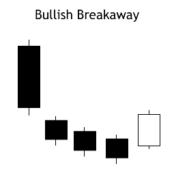
Recognition Criteria:
1. Market is characterized by downtrend.
2. We see a long black candlestick in the first day.
3. Then we see a black candlestick on the second day with a gap below the first day.
4. Bearish mood continues on the third and fourth days as evidenced by lower consecutive closes.
5. Finally however, we see a long white candlestick on the fifth day characterized by a closing price inside the gap caused by the first and second days.
Explanation:
The Bullish Breakaway Pattern appears during a downtrend and it shows that selling accelerated to the point of an oversold market. It starts with a long black day then involves a gap in the direction of the downtrend followed by three consecutively lower price days. So far, all days in this pattern are black with the exception of the third day, which can be either be black or white. The three days after the gap are similar to the Three Black Crows pattern since their highs and lows are each consecutively lower. It is by now apparent that the downtrend has accelerated with a big gap and then starts to fizzle, however it still continues. There is an evident slow deterioration of the downtrend suggested by this pattern. Finally, we see a burst in the opposite direction, which completely recovers the previous three days' price action. The gap is not filled which points out to the weakness of the reversal. This is a short-term reversal.
Important Factors:
A confirmation on the sixth day is recommended in the form of a white candlestick, a large gap up or a higher close, to be sure about the reversal.
Form 1-E AD, 1-E AD/A ~ SEC Filings Explained
Sales material filed pursuant to Rule 607 under Regulation E. (and amendment thereto)
CONCEALING BABY SWALLOW
This Bullish pattern is highlighted by two consecutive Black Marubozu. They are characterized by the fact that a gapping black candlestick trades into the body of the previous day and it is seen during a downtrend. Then there is another Black Marubozu on the third day showing sale of positions since it closes at a new low. However this may give incentive to the shorts to cover their positions implying that a bullish reversal is now possible.

Recognition Criteria:
1. Market is characterized by downtrend.
2. We see two consecutive Black Marubozu in the first and second days.
3. Then we see a black candlestick on the third day opening with a downward gap but trading into the body of the second day and it is characterized by a long upper shadow.
4. Finally we see another Black Marubozu on the fourth day that completely engulfs the candlestick of the third day including the shadow.
Explanation:
Two black Marubozu show that downtrend is continuing to the satisfaction of the bears. On the third day, we see a downward gap further confirming the downtrend. However, prices on the third day start going above the close of the previous day causing some doubts about the bearish direction even though the day closes at or near its low. The next day shows us a significantly higher gap in the opening. After the opening, however, prices again go down closing at a new low. This last day may be interpreted as a good chance for the short-sellers to cover their short positions.
Form 15F-15D, 15F-15D/A ~ SEC Filings Explained
Notice of a foreign private issuers suspension of duty to file reports pursuant to Section 13 and 15(d) of the Act (and amendment thereto)
Parabolic SAR
Introduction
Developed by Welles Wilder, the Parabolic SAR refers to a price and time based trading system. Wilder called this the "Parabolic Time/Price System". SAR stands for "stop and reverse", which is the actual indicator used in the system. SAR trails price as the trend extends over time. The indicator is below prices when prices are rising and above prices when prices are falling. In this regard, the indicator stops and reverses when the price trend reverses and breaks above or below the indicator.
Wilder introduced the Parabolic Time/Price System in his 1978 book, New Concepts in Technical Trading Systems. This book also includes RSI, Average True Range and the Directional Movement Concept (ADX). Despite being developed before the computer age, Wilder's indicators have stood the test of time and remain extremely popular.

Calculation
Calculation of SAR is complex with if/then variables that make it difficult to put in a spreadsheet. These examples will provide a general idea of how SAR is calculated. Because the formulas for rising and falling SAR are different, it is easier to divide the calculation into two parts. The first calculation covers rising SAR and the second covers falling SAR.
Rising SAR
Prior SAR: The SAR value for the previous period.
Extreme Point (EP): The highest high of the current uptrend.
Acceleration Factor (AF): Starting at .02, AF increases by .02 each
time the extreme point makes a new high. AF can reach a maximum
of .20, no matter how long the uptrend extends.
Current SAR = Prior SAR Prior AF(Prior EP - Prior SAR)
13-Apr-10 SAR = 48.28 = 48.13 .14(49.20 - 48.13)
The Acceleration Factor is multiplied by the difference between the
Extreme Point and the prior period's SAR. This is then added to the
prior period's SAR. Note however that SAR can never be above the
prior two periods' lows. Should SAR be above one of those lows, use
the lowest of the two for SAR.


Falling SAR
Prior SAR: The SAR value for the previous period.
Extreme Point (EP): The lowest low of the current downtrend.
Acceleration Factor (AF): Starting at .02, AF increases by .02 each
time the extreme point makes a new low. AF can reach a maximum
of .20, no matter how long the downtrend extends.
Current SAR = Prior SAR - Prior AF(Prior SAR - Prior EP)
9-Feb-10 SAR = 43.56 = 43.84 - .16(43.84 - 42.07)
The Acceleration Factor is multiplied by the difference between the
Prior period's SAR and the Extreme Point. This is then subtracted
from the prior period's SAR. Note however that SAR can never be
below the prior two periods' highs. Should SAR be below one of
those highs, use the highest of the two for SAR.


Interpretation
SAR follows price and can be considered a trend following indicator. Once a downtrend reverses and starts up, SAR follows prices like a trailing stop. The stop continuously rises as long as the uptrend remains in place. In other words, SAR never decreases in an uptrend and continuously protects profits as prices advance. The indicator acts as a guard against the propensity to lower a stop-loss. Once price stops rising and reverses below SAR, a downtrend starts and SAR is above the price. SAR follows prices lower like a trailing stop. The stop continuously falls as long as the downtrend extends. Because SAR never rises in a downtrend, it continuously protects profits on short positions.
Step Increments
The Acceleration Factor (AF), which is also referred to as the Step, dictates SAR sensitivity. SharpCharts users can set the Step and the Maximum Step. As shown in the spreadsheet example, the Step is a multiplier that influences the rate-of-change in SAR. That is why it is referred to as the Acceleration Factor. Step gradually increases as the trend extends until it hits a maximum. SAR sensitivity can be decreased by decreasing the Step. A lower step moves SAR further from price, which makes a reversal less likely.
SAR sensitivity can be increased by increasing the step. A higher step moves SAR closer to the price action, which makes a reversal more likely. The indicator will reverse too often if the step is set too high. This will produce whipsaws and fail to capture the trend. Chart 6 shows IBM with SAR (.01, .20). The step is .01 and the Maximum Step is .20. Chart 7 shows IBM with a higher Step (.03). SAR is more sensitive in chart 7 because there are more reversals. This is because the Step is higher in chart 7 (.03) than chart 6 (.01).


Maximum Step
The sensitivity of the indicator can also be adjusted using the Maximum Step. While the Maximum Step can influence sensitivity, the Step carries more weight because it sets the incremental rate-of-increase as the trend develops. Also note that increasing the Step insures that the Maximum Step will be hit quicker when a trend develops. Chart 8 shows Best Buy (BBY) with a Maximum Step (.10), which is lower than the default setting (.20). This lower Maximum Step decreases the sensitivity of the indicator and produces fewer reversals. Notice how this setting caught a two month downtrend and a subsequent two month uptrend. Chart 9 shows BBY with a higher Maximum Step (.20). This higher reading produced extra reversals in early February and early April.


Conclusions
The Parabolic SAR works best with trending securities, which occur roughly 30% of the time according to Wilder's estimates. This means the indicator will be prone to whipsaws over 50% of the time or when a security is not trending. After all, SAR is designed to catch the trend and follow it like a trailing stop. As with most indicators, the signal quality depends on the settings and the characteristics of the underlying security. The right settings combined with decent trends can produce a great trading system. The wrong settings will result in whipsaws, losses and frustration. There is no golden rule or one-size-fits-all setting. Each security should be evaluated based on its own characteristics. Parabolic SAR should also be used in conjunction with other indicators and technical analysis techniques. For example, Wilder's Average Directional Index can be used to estimate the strength of the trend before considering signals.
Scans
Break above falling SAR: This scan starts with stocks that have an average price of $10 or greater over the last three months and average volume greater than 40,000. The scan then filters for stocks that have a bullish SAR reversal (Parabolic SAR (.01,.20)). This scan is just meant as a starter for further refinement.
Break below rising SAR: This scans starts with stocks that have an average price of $10 or greater over the last three months and average volume greater than 40,000. The scan then filters for stocks that have a bearish SAR reversal (Parabolic SAR (.01,.20)). This scan is just meant as a starter for further refinement.
Form N-CSR ~ SEC Filings Explained
Certified annual shareholder report of registered management investment companies
|
Followers
|
3286
|
Posters
|
|
|
Posts (Today)
|
0
|
Posts (Total)
|
2804248
|
|
Created
|
08/22/10
|
Type
|
Free
|
| Moderator Nilbud | |||
| Assistants mick ManicTrader PhotoChick Kirimi $Pistol Pete$ | |||
   Investor Hub Alerts: Sign up for 'STOCKGOODIES PLAYS OF THE WEEK ' E-Mail List Investor Hub Alerts: Sign up for 'STOCKGOODIES PLAYS OF THE WEEK ' E-Mail ListUPDATE; 5-1-22 courtesy of charting /\ wit tweezer top calls /\ Tony @Montana_Trades Really good study sheet on Candlestick Patterns [-chart]pbs.twimg.com/media/FRn8188XMAAdZvk?format=jpg&name=small[/chart] 

02-07-2021
|
|
Posts Today
|
0
|
|
Posts (Total)
|
2804248
|
|
Posters
|
|
|
Moderator
|
|
|
Assistants
|
| Volume | |
| Day Range: | |
| Bid Price | |
| Ask Price | |
| Last Trade Time: |


