 News
News  Market Data
  Discover
Support: 888-992-3836
Copyright © 2023 InvestorsHub Inc.


Register for free to join our community of investors and share your ideas. You will also get access to streaming quotes, interactive charts, trades, portfolio, live options flow and more tools.
Daily Candlestick Chart for DUSS
[img]stockcharts.com/c-sc/sc?s=DUSS
Scale Settings
High points and low points appear to line up better for trend lines when prices are displayed using a semi-log scale. This is especially true when long-term trend lines are being drawn or when there is a large change in price. Most charting programs allow users to set the scale as arithmetic or semi-log. An arithmetic scale displays incremental values (5,10,15,20,25,30) evenly as they move up the y-axis. A $10 movement in price will look the same from $10 to $20 or from $100 to $110. A semi-log scale displays incremental values in percentage terms as they move up the y-axis. A move from $10 to $20 is a 100% gain, and would appear to be a much larger than a move from $100 to $110, which is only a 10% gain.

In the case of EMC, there was a large price change over a long period of time. While there were not any false breaks below the uptrend line on the arithmetic scale, the rate of ascent appears smoother on the semi-log scale. EMC doubled three times in less than two years. On the semi-log scale, the trend line fits all the way up. On the arithmetic scale, three different trend lines were required to keep pace with the advance.

In the case of Amazon.com (AMZN), there were two false breaks above the downtrend line as the stock declined during 2000 and 2001. These false break outs could have led to premature buying as the stock continued to decline after each one. The stock lost 60% of its value three times over a two year period. The semi-log scale reflects the percentage loss evenly, and the downtrend line was never broken.

Descending Trend Channel: Descending trend channels are basic chart patterns used in technical analysis. A descending trend channel is formed by drawing two trendlines, one through the high prices for an asset and one through the low prices for the asset. If the trend in prices is downward, then the space between the trend lines forms a descending trend channel.
Descending trend channels, like ascending trend channels, are a tool for determining whether the short-term trend in price will continue. As long as prices remain within the region defined by the trend channel, traders expect the overall trend to go on as it is. Once prices break out of the channel, a strong signal either to buy or sell is generated. If prices break upward out of the channel, the signal is bullish; if prices break downward, the signal is bearish.
Descending trend channels often appear within an overall uptrend in prices, and represent either a continuation of the trend or a reversal of the trend, depending on the direction of the break.

Daily Candlestick Chart for JGBO
[img]stockcharts.com/c-sc/sc?s=JGBO
The graph above shows the economic cycle in green, the stock market cycle in red and the best performing sectors at the top. The green economic cycle corresponds to the business cycle shown above. The centerline marks the contraction/expansion threshold for the economy. Notice how the red market cycle leads the business cycle. The market turns up and crosses the centerline before the economic cycle turns. Similarly, the market turns down and crosses below the centerline ahead of the economic cycle.
Appreciation: An increase in value of currency due to a market reaction or an increase in value of a general asset.
Daily Candlestick Chart for WCUI
[img]stockcharts.com/c-sc/sc?s=WCUI
What is a stock split and a reverse stock split?
A stock split is an increase in the number of outstanding shares of a stock. The price of the stock is immediately adjusted so that the total equity remains the same. For instance, if a $100/share stock splits 2 for 1, there will be twice as many shares but they only be worth $50 each now. This is usually done to make the stock more affordable to the public.
A reverse stock split is a decrease in the number of shares. This is usually done to raise the price per share to meet stock exchange requirements or simply to look more "healthy."
Daily Candlestick Chart for VTSI
[img]stockcharts.com/c-sc/sc?s=VTSI
Bank of Japan (BOJ) Monetary Policy Monthly Report: Release schedule : 6:00 (GMT); in the middle of the month
Revisions schedule : None
Source of report : Bank of Japan
Web Address : http://www.boj.or.jp/en/
Address of release : http://www.boj.or.jp/en/theme/seisaku/handan/gp/index.htm
An Oldie but Goodie
Much of our understanding of chart patterns can be attributed to the work of Richard Schabacker. His 1932 classic, Technical Analysis and Stock Market Profits, laid the foundations for modern pattern analysis. In Technical Analysis of Stock Trends (1948), Edwards and Magee credit Schabacker for most of the concepts put forth in the first part of their book. We would also like to acknowledge Messrs. Schabacker, Edwards and Magee, and John Murphy as the driving forces behind these articles and our understanding of chart patterns.
Pattern analysis may seem straightforward, but it is by no means an easy task. Schabacker states:
The science of chart reading, however, is not as easy as the mere memorizing of certain patterns and pictures and recalling what they generally forecast. Any general stock chart is a combination of countless different patterns and its accurate analysis depends upon constant study, long experience and knowledge of all the fine points, both technical and fundamental, and, above all, the ability to weigh opposing indications against each other, to appraise the entire picture in the light of its most minute and composite details as well as in the recognition of any certain and memorized formula.
Even though Schabacker refers to "the science of chart reading", technical analysis can at times be less science and more art. In addition, pattern recognition can be open to interpretation, which can be subject to personal biases. To defend against biases and confirm pattern interpretations, other aspects of technical analysis should be employed to verify or refute the conclusions drawn. While many patterns may seem similar in nature, no two patterns are exactly alike. False breakouts, bogus reads and exceptions to the rule are all part of the ongoing education.
Careful and constant study are required for successful chart analysis. On the AMZN chart above, the stock broke resistance from a head and shoulders reversal. While the trend is now bearish, analysis must continue to confirm the bearish trend.

Novellus Systems, Inc. (NVLS) chart patterns example chart from StockCharts.com
Novellus (NVLS)[Nvls]
Some analysts might have labeled the NVLS chart as a head and shoulders pattern with neckline support around 17.50. Whether or not this is robust remains open to debate. Even though the stock broke neckline support at 17.50, it repeatedly moved back above its support break. This refusal might have been taken as a sign of strength and justified a reassessment of the pattern.
Advance/Decline Index: A tool used confirm that a trend is continuing. If there are more declining issues, the trend might see a reversal in the near future. The Advance/Decline Index is calculated by subtracting the number of declining prices from the number of advancing security prices.
Daily Candlestick Chart for KDKN
[img]stockcharts.com/c-sc/sc?s=KDKN
Spacing of Points
The lows used to form an uptrend line and the highs used to form a downtrend line should not be too far apart, or too close together. The most suitable distance apart will depend on the time frame, the degree of price movement, and personal preferences. If the lows (highs) are too close together, the validity of the reaction low (high) may be in question. If the lows are too far apart, the relationship between the two points could be suspect. An ideal trend line is made up of relatively evenly spaced lows (or highs). The trend line in the above MSFT example represents well-spaced low points.

On the Wal-Mart (WMT) example, the second high point appears to be too close to the first high point for a valid trend line; however, it would be feasible to draw a trend line beginning at point 2 and extending down to the February reaction high.
ADX: The average directional index, or ADX, was developed by J. Welles Wilder as a measure of a current market trend's strength. The ADX is derived from two directional indicators, known as DI and DI-, which are in turn derived from the directional movement index (DMI).
ADX is calculated by finding the difference of DI and DI-, as well as the sum of DI and DI-. The difference is divided by the sum, and the resulting number multiplied by 100. The product is known as the directional index, or DX. A moving average is then taken of DX, typically over a fourteen-day period (although any number of periods can be used.) This final moving average is the ADX.
The ADX takes the form of a number from 0 to 100. A value of 0 indicates that the market is equally likely to move in either a positive or negative direction, meaning that there is no overall market trend. A value of 100 indicates that the market is exclusively moving in either a positive or negative direction, indicating an extremely strong trend. Values of greater than 60 are uncommon in practice, and any value of greater than 40 is considered to be a strong trend. Any value less than 20 is considered to be a weak trend, and may signal an upcoming reversal. Because the ADX is derived from both positive and negative directional indicators, it only measures the magnitude of a trend rather than its direction.
Daily Candlestick Chart for DROP
[img]stockcharts.com/c-sc/sc?s=DROP
Exhaustion Gaps
Exhaustion gaps are those that happen near the end of a good up- or downtrend. They are many times the first signal of the end of that move. They are identified by high volume and large price difference between the previous day's close and the new opening price. They can easily be mistaken for runaway gaps if one does not notice the exceptionally high volume.
It is almost a state of panic if the gap appears during a long down move where pessimism has set in. Selling all positions to liquidate holdings in the market is not uncommon. Exhaustion gaps are quickly filled as prices reverse their trend. Likewise, if they happen during a bull move, some bullish euphoria overcomes trades, and buyers cannot get enough of that stock. The prices gap up with huge volume; then, there is great profit taking and the demand for the stock totally dries up. Prices drop, and a significant change in trend occurs. Exhaustion gaps are probably the easiest to trade and profit from. In the chart, notice that there was one more day of trading to the upside before the stock plunged. The high volume was the giveaway that this was going to be, either, an exhaustion gap or a runaway gap. Because of the size of the gap and the near doubling of volume, an exhaustion gap was in the making here.

Delta Air Lines (DAL) Exhaustion Gap example chart from StockCharts.com
Bank of Japan (BOJ) Monetary Policy Meeting and Announcement: Release schedule : No set time, usually between 2:00 and 4:00 (GMT); monthly, in the middle of the month
Source of report : Bank of Japan
Web Address : http://www.boj.or.jp/en/index.htm
Address of Release : http://www.boj.or.jp/en/theme/seisaku/kettei/index.htm
Schedule of Meetings : http://www.boj.or.jp/en/theme/seisaku/index.htm
Daily Candlestick Chart for LYJN
[img]stockcharts.com/c-sc/sc?s=LYJN
Short Selling
The normal process of "going long" involves buying first and selling last, hopefully at a higher price. Short selling is the same concept of buying low and selling high, but in the reverse order. You borrow some stock from your brokerage and immediately sell it on the market. After the stock drops in price you must buy some shares from the market and return them to your brokerage. It sounds complicated at first, but it is really almost as easy as "going long."
Ask price: The price at which the market sells a currency. The trader can buy the base currency at this price.
Daily Candlestick Chart for VKML
[img]stockcharts.com/c-sc/sc?s=VKML
How do I know which stocks to buy?
That is a great question. With over 8,000 different stocks to choose from, it can be overwhelming to pick some possible winners.
Discretionary Trading: While other trading styles emphasize the reading of signals based on mathematical formulas or price action patterns, or fundamental analysis alone, discretionary traders are the "jack of all trades" of the Forex market and tend to incorporate all forms of analysis. These traders not only rely on their well developed trading processes and framework of the fundamentals and technicals to make a decision, but also sometimes intuition as well (i.e., years of market experience). Because of their experience, discretionary traders tend to be flexible with their trading rules and more adaptable to market changes.
The downside to the discretionary trading style is that trading decisions are more susceptible to the strong emotional effects of managing financial risk. Also, depending on the time frame, it requires more attention to the market than mechanical or automated trading methods.
Daily Candlestick Chart for HALB
[img]stockcharts.com/c-sc/sc?s=HALB
Economic Forecast
First and foremost in a top-down approach would be an overall evaluation of the general economy. The economy is like the tide and the various industry groups and individual companies are like boats. When the economy expands, most industry groups and companies benefit and grow. When the economy declines, most sectors and companies usually suffer. Many economists link economic expansion and contraction to the level of interest rates. Interest rates are seen as a leading indicator for the stock market as well. Below is a chart of the S
Beige Book: A summary of economic conditions around the United States compiled for the Federal Reserve Board. Each Federal Reserve Bank gathers anecdotal information on current economic condition in its District through reports from Bank and Branch directors and interviews with key businessmen, economists, market experts, and other sources. The Beige Book summarizes this information by District and sector. This report allows outsiders to know what the Fed governors are looking at as they prepare for their upcoming FOMC meeting.
Daily Candlestick Chart for ARCS
[img]stockcharts.com/c-sc/sc?s=ARCS
While technical analysts use charts almost exclusively, the use of charts is not limited to just technical analysis. Because charts provide an easy-to-read graphical representation of a security's price movement over a specific period of time, they can also be of great benefit to fundamental analysts. A graphical historical record makes it easy to spot the effect of key events on a security's price, its performance over a period of time and whether it's trading near its highs, near its lows, or in between.
Currency Peg: A currency peg, sometimes referred to as a fixed exchange rate, is a kind of exchange rate policy wherein a country’s domestic currency is only allowed to fluctuate within a narrow range (usually between -1% to 1%) against the value of another currency.
Currency pegging is usually done by countries who wish to stabilize their global trade operations. By using a currency peg, risk caused by exchange rate fluctuations of businesses involved in international trade is reduced. This kind of exchange rate policy is very useful for countries with robust trade industries.
China, the Bahamas, and Marshall Islands have pegged their currencies to the U.S. dollar; Niger and Senegal to the French franc; and Bangladesh, Czech Republic and Thailand to a basket of several select currencies.
Daily Candlestick Chart for ORMP
[img]stockcharts.com/c-sc/sc?s=ORMP
Contract: An agreement of trade.
What is a bear market?
A bear market occurs when stock prices are falling faster than their historical averages. It can last months or even years. It is the opposite of a bull market.
Big figure quote: The numbers to the left of the decimal point in an exchange rate
Key points on the benefits of arithmetic and semi-log scales:
Arithmetic scales are useful when the price range is confined within a relatively tight range.
Arithmetic scales are useful for short-term charts and trading. Price movements (particularly for stocks) are shown in absolute dollar terms and reflect movements dollar for dollar.
Semi-log scales are useful when the price has moved significantly, be it over a short or extended time frame
Trend lines tend to match lows better on semi-log scales.
Semi-log scales are useful for long-term charts to gauge the percentage movements over a long period of time. Large movements are put into perspective.
Stocks and many other securities are judged in relative terms through the use of ratios such as PE, Price/Revenues and Price/Book. With this in mind, it also makes sense to analyze price movements in percentage terms.
Breakaway gaps are the exciting ones. They occur when the price action is breaking out of their trading range or congestion area. To understand gaps, one has to understand the nature of congestion areas in the market. A congestion area is just a price range in which the market has traded for some period of time, usually a few weeks or so. The area near the top of the congestion area is usually resistance when approached from below. Likewise, the area near the bottom of the congestion area is support when approached from above. To break out of these areas requires market enthusiasm and, either, many more buyers than sellers for upside breakouts or more sellers than buyers for downside breakouts.
Trend Identification Using Moving Averages
The same signals can be generated using simple or exponential moving averages. As noted above, the preference depends on each individual. These examples below will use both simple and exponential moving averages. The term "moving average" applies to both simple and exponential moving averages.
The direction of the moving average conveys important information about prices. A rising moving average shows that prices are generally increasing. A falling moving average indicates that prices, on average, are falling. A rising long-term moving average reflects a long-term uptrend. A falling long-term moving average reflects a long-term downtrend.

The chart above shows 3M (MMM) with a 150-day exponential moving average. This example shows just how well moving averages work when the trend is strong. The 150-day EMA turned down in November 2007 and again in January 2008. Notice that it took a 15% decline to reverse the direction of this moving average. These lagging indicators identify trend reversals as they occur (at best) or after they occur (at worst). MMM continued lower into March 2009 and then surged 40-50%. Notice that the 150-day EMA did not turn up until after this surge. Once it did, however, MMM continued higher the next 12 months. Moving averages work brilliantly in strong trends.

Only enter a trade after the action of the market confirms your opinion and then enter promptly, but continue to watch your trade , these are penny stocks.
For All Your $SFEG DD ~ Use PennyStock Tweets
http://www.pennystocktweets.com/stocks/profile/SFEG

Stage 6 marks a deterioration in the economy as the business cycle prepares to move from an expansion phase to a contraction phase. Stocks have already been moving lower and commodities now turn lower in anticipation of decreased demand from the deteriorating economy

Engulfing Candlesticks
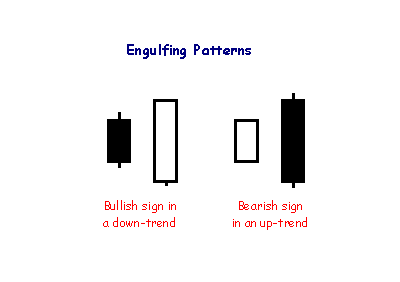
Engulfing patterns are where the body of the second candlestick 'engulfs' the first. They often follow or complete doji, hammer or gravestone patterns and signal reversal in the short-term trend.
Check Out $GAEC On PennyStock Tweets
http://www.pennystocktweets.com/stocks/profile/GAEC
Some penny stocks will only trade a few hundred shares a day while others will trade hundreds of thousands or more. To get an idea of how liquid a company is, multiply the amount of shares by the price to see how much money flows through the company each day. Penny stocks on major exchanges will generally have higher liquidity than Pink Sheets or other Over The Counter Bulletin Board trading. 
In his classic book on Intermarket Analysis, John Murphy notes that chartists can use these relationships to identify the stage of the business cycle and improve their forecasting abilities.
Falling Three Methods
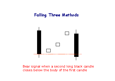
The bearish Falling Method consists of two long black lines bracketing 3 or 4 small ascending white candlesticks, the second black line forming a new closing low.
More On $GEGP At PennyStock Tweets
http://www.pennystocktweets.com/stocks/profile/GEGP
-An individual is categorized by the SEC as a 'Pattern Day Trader' or PDT when they buy and sell one or more securities (a stock for example) in the same trading day at least four times in a five day period.
Issuers of ETFs
? AdvisorShares issues actively managed ETFs.
? Bips Investment Managers issues Bips (Beta Investment Performance Securities).
? BNP Paribas issues EasyETFs.
? BlackRock issues iShares.
? Charles Schwab offers several commission-free ETFs for its clients.
? Deutsche Bank issues db x-trackers ETFs, as well as managing PowerShares DB commodity- and currency-based ETFs.
? ETF Securities issues ETFs or specialised commodity ETCs.
? Global X Funds issues ETFs.
? Guggenheim Funds issues specialty Guggenheim Funds ETFs.
? Invesco issues PowerShares ETFs, as well as BLDRS based on American Depositary Receipts.
? Lyxor Asset Management issues Lyxor ETFs.
? Merrill Lynch issues HOLDRs.
? Source UK Services, a European joint-venture between Bank of America Merrill Lynch, Goldman Sachs, Morgan Stanley, Nomura and J. P. Morgan issues ETFs and ETCs
? State Street Global Advisors issues SPDRs.
? Van Eck Global issues Market Vectors ETFs.
? Vanguard Group issues Vanguard ETFs, formerly known as VIPERs.
|
Followers
|
3286
|
Posters
|
|
|
Posts (Today)
|
0
|
Posts (Total)
|
2804248
|
|
Created
|
08/22/10
|
Type
|
Free
|
| Moderator Nilbud | |||
| Assistants mick ManicTrader PhotoChick Kirimi $Pistol Pete$ | |||
   Investor Hub Alerts: Sign up for 'STOCKGOODIES PLAYS OF THE WEEK ' E-Mail List Investor Hub Alerts: Sign up for 'STOCKGOODIES PLAYS OF THE WEEK ' E-Mail ListUPDATE; 5-1-22 courtesy of charting /\ wit tweezer top calls /\ Tony @Montana_Trades Really good study sheet on Candlestick Patterns [-chart]pbs.twimg.com/media/FRn8188XMAAdZvk?format=jpg&name=small[/chart] 

02-07-2021
|
|
Posts Today
|
0
|
|
Posts (Total)
|
2804248
|
|
Posters
|
|
|
Moderator
|
|
|
Assistants
|
| Volume | |
| Day Range: | |
| Bid Price | |
| Ask Price | |
| Last Trade Time: |


