 News
News  Market Data
  Discover
Support: 888-992-3836
Copyright © 2023 InvestorsHub Inc.


Register for free to join our community of investors and share your ideas. You will also get access to streaming quotes, interactive charts, trades, portfolio, live options flow and more tools.
$CTLE BarChart Trader's Cheat Sheet
http://www.barchart.com/cheatsheet.php?sym=CTLE
Narrow Within the Group
Once the industry group is chosen, an investor would need to narrow the list of companies before proceeding to a more detailed analysis. Investors are usually interested in finding the leaders and the innovators within a group. The first task is to identify the current business and competitive environment within a group as well as the future trends. How do the companies rank according to market share, product position and competitive advantage? Who is the current leader and how will changes within the sector affect the current balance of power? What are the barriers to entry? Success depends on an edge, be it marketing, technology, market share or innovation. A comparative analysis of the competition within a sector will help identify those companies with an edge, and those most likely to keep it.

Daily Candlestick Chart for EMWW
[img]stockcharts.com/c-sc/sc?s=EMWW
Cup With Handle: Resembles a cup and a handle on the chart. Hence the name "cup with handle." Shows where a bullish trend can possible begin.

$CONX BarChart Trader's Cheat Sheet
http://www.barchart.com/cheatsheet.php?sym=CONX
What Are Charts?
A price chart is a sequence of prices plotted over a specific time frame. In statistical terms, charts are referred to as time series plots.

On the chart, the y-axis (vertical axis) represents the price scale and the x-axis (horizontal axis) represents the time scale. Prices are plotted from left to right across the x-axis with the most recent plot being the furthest right. The price plot for IBM extends from January 1, 1999 to March 13, 2000.
Technicians, technical analysts and chartists use charts to analyze a wide array of securities and forecast future price movements. The word "securities" refers to any tradable financial instrument or quantifiable index such as stocks, bonds, commodities, futures or market indices. Any security with price data over a period of time can be used to form a chart for analysis.
While technical analysts use charts almost exclusively, the use of charts is not limited to just technical analysis. Because charts provide an easy-to-read graphical representation of a security's price movement over a specific period of time, they can also be of great benefit to fundamental analysts. A graphical historical record makes it easy to spot the effect of key events on a security's price, its performance over a period of time and whether it's trading near its highs, near its lows, or in between.
Daily Candlestick Chart for ATDN
[img]stockcharts.com/c-sc/sc?s=ATDN
$RFMK BarChart Trader's Cheat Sheet
http://www.barchart.com/cheatsheet.php?sym=RFMK
Chartest: One who uses charts and graphs to trade. Referred to as a technical trader.
Daily Candlestick Chart for SFEG
[img]stockcharts.com/c-sc/sc?s=SFEG
$UNDY BarChart Trader's Cheat Sheet
http://www.barchart.com/cheatsheet.php?sym=UNDY
Accumulative Swing Index: The accumulative swing index, or ASI, is a tool developed by J. Welles Wilder to measure the breakout potential of a given market.
The ASI takes the form of a number from 100 to -100, with positive values indicating an upward trend and negative values indicating a downward trend. Once calculated, the ASI can be charted in conjunction with a candlestick chart. The chief value of the ASI is that it's susceptible to the same technical analysis tools as a candlestick chart, allowing traders to use trendlines, wedges, triangles and other tools in order to determine support and resistance levels. However, ASI charts are much simpler and smoother than candlestick charts, making them both easier to analyze and less susceptible to indicating false breakouts. If the absolute value of the ASI for a given day exceeds the absolute value of the ASI at the time of a previous breakout, a new breakout from the trend is imminent, and traders can take positions accordingly.
The ASI is based on Wilder's swing index, which is an extremely complex calculation that incorporates high, low and close prices for an asset along with numerous other variables, some of them specific to certain kinds of markets. On its own, the swing index isn't particularly useful as a predictive tool, but the swing indexes for several successive days can be incorporated by another calculation into the ASI, which fulfills Wilder's original intention for the measure. Full instructions for calculating the swing index and ASI are available in Wilder's "New Concepts in Technical Trading Systems", and a number of popular pieces of trading software are able to calculate the ASI automatically.
Support: Areas of congestion or previous lows below the current price mark support levels. A break below support would be considered bearish.
Daily Candlestick Chart for SPOM
[img]stockcharts.com/c-sc/sc?s=SPOM
$SRCH BarChart Trader's Cheat Sheet
http://www.barchart.com/cheatsheet.php?sym=SRCH
Armenian Drams: The currency of Armenia. Currency code (AMD)
Daily Candlestick Chart for NPFT
[img]stockcharts.com/c-sc/sc?s=NPFT
$AQOGF BarChart Trader's Cheat Sheet
http://www.barchart.com/cheatsheet.php?sym=AQOGF
Derivative: A financial contract that depends on the commodity's value and properties.
Daily Candlestick Chart for RIGH
[img]stockcharts.com/c-sc/sc?s=RIGH
Internal Trend Lines
Sometimes there appears to be the possibility for drawing a trend line, but the exact points do not match up cleanly. The highs or lows might be out of whack, the angle might be too steep or the points might be too close together. If one or two points could be ignored, then a fitted trend line could be formed. With the volatility present in the market, prices can over-react, and produce spikes that distort the highs and lows. One method for dealing with over-reactions is to draw internal trend lines. Even though an internal trend line ignores price spikes, the ignoring should be within reason.

The long-term trend line for the S
Day Trading: Day trading with the foreign exchange market is in some ways vastly different to that in other markets, in addition to which, day trading in the currencies market does not suffer from the unpleasant connotation that may spring to mind when one thinks of such things with relation to the stock market.
That said, if you have previously traded in other markets, then many items styles utilized in forex, such as forwards, futures, options, spread betting, contracts for difference and also the spot market are very similar to those used in the equity markets, and often maintain a minimum trade sizes for the base currencies.
It is worth noting however that day trading, being a fast moving, highly challenging trading style may not be for everyone. Should decide that day trading is for you, then there are also many different styles and variations of day trading with the currency market that you may wish to sample before choosing the form that feels right for you, or maybe you will prefer to utilize a series of styles.
The best way to learn the day trading styles with regards to forex markets is the same as in learning and perfecting any other trading style, or indeed other skill; by practice.
Talking to you forex trading mentor and other experienced day traders to see what styles have worked best for them over the years, ask for any hints, tips and techniques that may be of benefit and try them out before making the definitive choice of which style will be right for you.
Daily Candlestick Chart for TAGE
[img]stockcharts.com/c-sc/sc?s=TAGE
$IMKI BarChart Trader's Cheat Sheet
http://www.barchart.com/cheatsheet.php?sym=IMKI
Daily Candlestick Chart for NWMT
[img]stockcharts.com/c-sc/sc?s=NWMT
Bank of Japan (BOJ) Monetary Policy Monthly Report: Release schedule : 6:00 (GMT); in the middle of the month
Revisions schedule : None
Source of report : Bank of Japan
Web Address : http://www.boj.or.jp/en/
Address of release : http://www.boj.or.jp/en/theme/seisaku/handan/gp/index.htm
What is Sector Rotation?
Unsurprisingly, the business cycle influences the rotation of stock market sectors and industry groups. Certain sectors perform better than others during specific phases of the business cycle. Knowing the stage of the business cycle can help investors position themselves in the right sectors and avoid the wrong sectors.
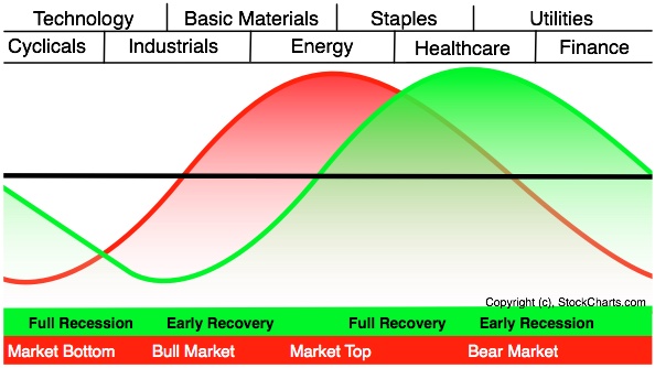
The graph above shows the economic cycle in green, the stock market cycle in red and the best performing sectors at the top. The green economic cycle corresponds to the business cycle shown above. The centerline marks the contraction/expansion threshold for the economy. Notice how the red market cycle leads the business cycle. The market turns up and crosses the centerline before the economic cycle turns. Similarly, the market turns down and crosses below the centerline ahead of the economic cycle.
Cyclicals, which is the same as the consumer discretionary sector, are the first to turn up in anticipation of a bottom in the economy. Technology stocks are not far behind. These two groups are the big leaders at the beginning of a bull run in the stock market.
The top of the market cycle is marked by relative strength in materials and energy. These sectors benefit from a rise in commodity prices and a rise in demand from an expanding economy. The tipping point for the market comes when leadership shifts from energy to consumer staples. This is a sign that commodity prices are starting to hurt the economy.
The market peak and downturn are followed by a contraction in the economy. At this stage, the Fed starts to lower interest rates and the yield curve steepens. Falling interest rates benefit debt-laden utilities and business at banks. The steepening yield curve also improves profitability at banks and encourages lending. Low interest rates and easy money eventually lead to a market bottom and the cycle repeats itself.
The two sector PerfCharts below show relative performance for the nine sector SPDRs near the 2007 peak and after the 2003 bottom. The S
Common Gaps
Sometimes referred to as a trading gap or an area gap, the common gap is usually uneventful. In fact, they can be caused by a stock going ex-dividend when the trading volume is low. These gaps are common (get it?) and usually get filled fairly quickly. "Getting filled" means that the price action at a later time (few days to a few weeks) usually retraces at the least to the last day before the gap. This is also known as closing the gap. Here is a chart of two common gaps that have been filled. Notice that after the gap the prices have come down to at least the beginning of the gap? That is called closing or filling the gap.

Microsoft Corp. (MSFT) Gap example chart from StockCharts.com
A common gap usually appears in a trading range or congestion area, and reinforces the apparent lack of interest in the stock at that time. Many times this is further exacerbated by low trading volume. Being aware of these types of gaps is good, but doubtful that they will produce a trading opportunities.
Breakaway Gaps

Daily Candlestick Chart for FMCC
[img]stockcharts.com/c-sc/sc?s=FMCC
What Is Resistance?
Resistance is the price level at which selling is thought to be strong enough to prevent the price from rising further. The logic dictates that as the price advances towards resistance, sellers become more inclined to sell and buyers become less inclined to buy. By the time the price reaches the resistance level, it is believed that supply will overcome demand and prevent the price from rising above resistance.

Resistance does not always hold and a break above resistance signals that the bulls have won out over the bears. A break above resistance shows a new willingness to buy and/or a lack of incentive to sell. Resistance breaks and new highs indicate buyers have increased their expectations and are willing to buy at even higher prices. In addition, sellers could not be coerced into selling until prices rose above resistance or above the previous high. Once resistance is broken, another resistance level will have to be established at a higher level.
Double Top: Any chart pattern similar to the one show below is known as a ‘Double Top’ and it is arguably one of the most widely recognized and compelling technical signals known amongst the forex trading community. It is considered a reliable test of a previous high or low.
The double top formation is identified as a distinctive chart pattern revealing a rally to new high followed by a moderate retreat which is then in turn followed by a second rally in which to test the new high.
The double top chart pattern classically reveals itself by occurring in the shape of the letter ‘M’. A third rally added to this would result in the occurrence of a triple top resulting in three peaks.
A double top is considered a bearish and is generally thought to be stronger when the equal points are further apart and the price objective usually occurs at an equal distance beyond the correction low.
Conclusion
Identification of key support and resistance levels is an essential ingredient to successful technical analysis. Even though it is sometimes difficult to establish exact support and resistance levels, being aware of their existence and location can greatly enhance analysis and forecasting abilities. If a security is approaching an important support level, it can serve as an alert to be extra vigilant in looking for signs of increased buying pressure and a potential reversal. If a security is approaching a resistance level, it can act as an alert to look for signs of increased selling pressure and potential reversal. If a support or resistance level is broken, it signals that the relationship between supply and demand has changed. A resistance breakout signals that demand (bulls) has gained the upper hand and a support break signals that supply (bears) has won the battle.
Daily Candlestick Chart for NNHE
[img]stockcharts.com/c-sc/sc?s=NNHE
Depression: The simple definition of a depression is a large scale recession that lasts an extended period of time. Some define a depression as a scenario where real GDP drops by over 10%. Another way to differentiate it from a recession is the period of time. Recessions are said to typically last one year while an economic depression lasts several years.
The term “depression” comes from the Great Depression of the 1930s. Before that event, any modest decline in economic activity was considered to be a depression. The term recession was then used to describe smaller economic downturns while the depression was used to describe major, longer lasting declines like the Great Depression.
Structural Factors of Irrational Exuberance
Robert Shiller identifies 12 structural factors that contributed to the unprecedented rise in stock prices from 1995 to 2000. Even after the big decline into the 2002 lows, valuations were again at relatively high levels a few years later.
1. The capitalist explosion and the ownership society encouraged stock investing. Societies built on communism and socialism opened up to capitalistic ways. Russia and China come to mind over the last 20 years. George W. Bush promoted the ownership society by advocating property and stocks for all. Corporate downsizing and the decline of labor unions prompted people to take their destiny into their own hands and spawned the entrepreneurial spirit. Corporations tied salaries to performance with stock options.
2. Cultural and political changes favor business success. There has been a significant rise in materialistic values over the year. Shiller reports that more people viewed money as important to success in the mid 90s than in the mid 70s. Society viewed successful businessmen more favorably than scientists or artists. The 1995 Republican congress proposed cutting the capital gains tax and it was cut in 1997. Further cuts were proposed soon thereafter. These tax cuts as well as the anticipation of future capital gains tax cuts provided incentives to buy stocks.
3. New information technology suggested that new era. The first cell phones appeared in the early 1980's, which is when the great bull market started. The Internet came of age in the mid 1990's and grew rapidly the next five years. Investors viewed this Internet revolution as a game changer that justified the stock market boom.
4. Monetary policy and the Greenspan put took perceived risk out of the equation. The Fed did nothing to stop the surging stock market from 1995 to 1999. Interest rates did not increase until August 1999. In addition to letting the bubble grow, the Fed indicated that it would be there to pick up the pieces should anything go wrong, just like in 1987 and 1998. Having the Fed on standby in the event of a market crash was like owning a put option.
5. The perceived effects of the baby boomer generation. There was indeed a baby boom after World War II and this boom resulted in a large number of people aged 35-55 in 2000. However, Shiller argues with data that there is no correlation between a baby boom and a surging stock market. Instead, Shiller argues that, as with the Internet, the public perceptions of the baby boom influence help inflate the stock market.
6. The 1990's surge in business media undoubtedly contributed to interest in the stock market. Not much explanation is needed here. Newspapers created big glossy business sections to attract readers. Good stories replaced hard news. Increased media exposure led to more advertising and this simply fed the public appetite for stocks. The media continues to pour it one with Mad Money debuting in 2005.
7. Analysts estimates were routinely overoptimistic in the last 1990's. Shiller notes that Zachs reported sell recommendations on 9.1% of stocks in 1989 and just 1% of stocks in late 1999. Analysts were hesitant to issue sell recommendations because many firms also had investment banking ties with the company. Analysts also did not want to offend the company because they might then be cut off from earnings guidance or key information.
8. Defined-Contribution Pension Plans grew and replaced many Defined-Benefit Plans. Among other things, the decline in unions and big manufacturing industries (autos) contributed to this trend. More people also wanted control over their retirement funds. Those with Defined-Benefit Plans must make their own investment choices and this increases the exposure to stocks.
9. The number of mutual funds surged. From 1982 to 1998, the number of mutual funds grew tenfold (340 to 3513). At one point, there were more mutual funds than stocks listed on the NYSE. Mutual funds became a regular part of 401K's. Money moving into these mutual funds from 401K's and individual investors found its way into the stock market to feed the bubble. Shiller also notes that widespread advertising compounded this growth and increased public awareness to new levels.
10. Benign inflation created the illusion of wealth and prosperity. After runaway inflation in the 70's, the inflation outlook steadily improved from 1982. Shiller's research found that the public associates inflation with economic prosperity and social welfare. Such perceptions promote positive expectations for the economy and the stock market.
11. The explosion of trading volume kept the bid in the bubble. Increased interest in the stock market and a dramatic decline in commissions facilitated a surge in trading volume on the exchanges. The growth in online trading also facilitated increased interest and made it easy to trade more frequently.
12. There was an increase in gambling over the years. Government sanctioned gambling (lotteries) and commercial gambling grew in popularity over the years. Poker players became stars. Lottery jackpots were heavily promoted. Slick adverts portrayed gambling as sophisticated and increased one's propensity to take risks. Online gambling facilitated growth as well.
$SIMH BarChart Trader's Cheat Sheet
http://www.barchart.com/cheatsheet.php?sym=SIMH
Daily Candlestick Chart for GMXS
[img]stockcharts.com/c-sc/sc?s=GMXS
Bulgarian Leva: The currency of Bulgaria. Currency code (BGN)
A technician believes that it is possible to identify a trend, invest or trade based on the trend and make money as the trend unfolds. Because technical analysis can be applied to many different time frames, it is possible to spot both short-term and long-term trends. The IBM chart illustrates Schwager's view on the nature of the trend. The broad trend is up, but it is also interspersed with trading ranges. In between the trading ranges are smaller uptrends within the larger uptrend. The uptrend is renewed when the stock breaks above the trading range. A downtrend begins when the stock breaks below the low of the previous trading range.
Daily Candlestick Chart for ABBY
[img]stockcharts.com/c-sc/sc?s=ABBY
Descending Triangle: A descending triangle is a simple chart pattern used in technical analysis. The descending triangle is formed from two trendlines, one for high prices and one for lows. The upper trendline of the triangle is a descending trendline, while the lower trendline is a horizontal trendline. The resulting shape is a right triangle whose hypotenuse moves downward over time.
In order to confirm a descending triangle on an asset's chart, traders must note two reaction lows of similar magnitude and two reaction highs, each declining in price over time. There should be a reasonable amount of distance between each low or high. Descending triangles usually form and develop over a one to three month period.
The descending triangle is always a bearish pattern, indicating a strong sell signal. Prices on the upper trendline continue to decline, narrowing the triangle formation, until the level of support represented by the lower trendline is broken. When a level of support is broken, it becomes a level of resistance, confirming the overall downward trend of the asset's price over time.
The Basis of Technical Analysis
At the turn of the century, the Dow Theory laid the foundations for what was later to become modern technical analysis. Dow Theory was not presented as one complete amalgamation, but rather pieced together from the writings of Charles Dow over several years. Of the many theorems put forth by Dow, three stand out:
Price Discounts Everything
Price Movements Are Not Totally Random
"What" Is More Important than "Why"
Daily Candlestick Chart for DTWB
[img]stockcharts.com/c-sc/sc?s=DTWB
$PRPM BarChart Trader's Cheat Sheet
http://www.barchart.com/cheatsheet.php?sym=PRPM
|
Followers
|
3287
|
Posters
|
|
|
Posts (Today)
|
0
|
Posts (Total)
|
2804248
|
|
Created
|
08/22/10
|
Type
|
Free
|
| Moderator Nilbud | |||
| Assistants mick ManicTrader PhotoChick Kirimi $Pistol Pete$ | |||
   Investor Hub Alerts: Sign up for 'STOCKGOODIES PLAYS OF THE WEEK ' E-Mail List Investor Hub Alerts: Sign up for 'STOCKGOODIES PLAYS OF THE WEEK ' E-Mail ListUPDATE; 5-1-22 courtesy of charting /\ wit tweezer top calls /\ Tony @Montana_Trades Really good study sheet on Candlestick Patterns [-chart]pbs.twimg.com/media/FRn8188XMAAdZvk?format=jpg&name=small[/chart] 

02-07-2021
|
|
Posts Today
|
0
|
|
Posts (Total)
|
2804248
|
|
Posters
|
|
|
Moderator
|
|
|
Assistants
|
| Volume | |
| Day Range: | |
| Bid Price | |
| Ask Price | |
| Last Trade Time: |


