 News
News  Market Data
  Discover

Support: 888-992-3836
Copyright © 2023 InvestorsHub Inc.


Register for free to join our community of investors and share your ideas. You will also get access to streaming quotes, interactive charts, trades, portfolio, live options flow and more tools.
Even though the MACD does not have upper and lower limits, chartists can estimate historical extremes with a simple visual assessment. It takes a strong move in the underlying security to push momentum to an extreme. Even though the move may continue, momentum is likely to slow and this will usually produce a signal line crossover at the extremities. Volatility in the underlying security can also increase the number of crossovers.
$NWPP BarChart Technical Analysis
http://www.barchart.com/technicals/stocks/NWPP
Bollinger Bands and the related indicators %b and bandwidth can be used to measure the "highness" or "lowness" of the price relative to previous trades. Bollinger Bands are a volatility indicator similar to the Keltner channel.
Form 11-KT, 11-KT/A ~ SEC Filings Explained
Transition report pursuant to Rule 13a-10 or 15d-10 (and amendment thereto)

$MSVS BarChart Technical Analysis
http://www.barchart.com/technicals/stocks/MSVS
Trix (or TRIX) is a technical analysis oscillator developed in the 1980s by Jack Hutson, editor of Technical Analysis of Stocks and Commodities magazine. It shows the slope (i.e. derivative) of a triple-smoothed exponential moving average. The name Trix is from "triple exponential."
BULLISH ENGULFING
Bullish Engulfing Pattern is a pattern characterized by a large white real body engulfing a preceding small black real body, which appears during a downtrend. The white body does not necessarily engulf the shadows of the black body but totally engulfs the body itself. The Bullish Engulfing Pattern is an important bottom reversal signal.
Recognition Criteria:
1. Market is characterized by downtrend.
2. Then we see a small black body.
3. Next day we see a white body that completely engulfs the black real body of the preceding day.
Explanation:
While the market sentiment is bearish; we see some subsided selling reflected by the short, black real body of the first day. Next day shows bull strength with a closing price at or above the previous day’s open. It means that the downtrend is now losing momentum and the bulls started to take the lead.
Important Factors:
The relative size of the bodies in the first and second days is important. If the first day of the Bullish Engulfing Pattern is characterized by a very small real body (it may even be a doji or nearly a doji) but the second day is characterized by a very long real body, this strongly indicates that the bearish power is diminishing and the disparity of white versus black body is indicative of the emerging bull power.
There is higher probability of a bullish reversal if there is heavy volume on the second real body or if the second day of the Bullish Engulfing Pattern engulfs more than one real body (which essentially means we see two or more small black bodies preceding the long white body).
The reversal of downtrend needs further confirmation on the third day. This confirmation may be in the form of a white candlestick, a large gap up or a higher close on the third day.
The Sharpe Ratio is used to measure risk-adjusted return. It is simply total return less the risk-free return divided by the standard deviation. As noted above, the standard deviation is considered inferior because it accounts for both upside and downside volatility. Long only investors are not concerned with upside volatility. It is the downside volatility that produces drawdowns and stomach ulcers.
$IXEH BarChart Technical Analysis
http://www.barchart.com/technicals/stocks/IXEH
Form 15-15D, 15-15D/A ~ SEC Filings Explained
Notice of suspension of duty to file reports pursuant to Section 13 and 15(d) of the Act (and amendment thereto)
$DIAAF BarChart Technical Analysis
http://www.barchart.com/technicals/stocks/DIAAF
As noted above, there are three elements to the Force Index. First, there is either a positive or negative price change. A positive price change signals that buyers were stronger than sellers, while a negative price change signals that sellers were stronger than buyers. Second, there is the extent of the price change, which is simply the current close less the prior close. The "extent" shows us just how far prices moved. A big advance shows strong buying pressure, while a big decline shows strong selling pressure.
Falling Three Methods
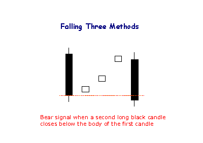
The bearish Falling Method consists of two long black lines bracketing 3 or 4 small ascending white candlesticks, the second black line forming a new closing low.
The RSI is classified as a momentum oscillator, measuring the velocity and magnitude of directional price movements. Momentum is the rate of the rise or fall in price. The RSI computes momentum as the ratio of higher closes to lower closes: stocks which have had more or stronger positive changes have a higher RSI than stocks which have had more or stronger negative changes.
$HAZH BarChart Technical Analysis
http://www.barchart.com/technicals/stocks/HAZH
Candlestick Charts
The Japanese have been using candlestick charts since the 17th century to analyze rice prices. Candlesticks were introduced into modern technical analysis by Steve Nison in his book Japanese Candlestick Charting Techniques.
Candlesticks contain the same data as a normal bar chart but highlight the relationship between opening and closing prices. The narrow stick represents the range of prices traded during the period (high to low) while the broad mid-section represents the opening and closing prices for the period.
If the close is higher than the open - the candlestick mid-section is hollow or shaded blue/green.
If the open is higher than the close - the candlestick mid-section is filled in or shaded red.
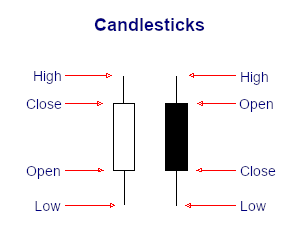
The advantage of candlestick charts is the ability to highlight trend weakness and reversal signals that may not be apparent on a normal bar chart.
$ZERO BarChart Technical Analysis
http://www.barchart.com/technicals/stocks/ZERO
Bandwidth tells how wide the Bollinger Bands are on a normalized basis. Writing the same symbols as before, and middleBB for the moving average, or middle Bollinger Band.
Form N-8F ~ SEC Filings Explained
Application for deregistration made on Form N-8F
The StockCharts Technical Rank (SCTR) - often pronounced "Scooter" - is a numerical score that ranks a stock within a group of stocks. The methodology for these rankings comes from the wisdom of John Murphy, author of many books on technical analysis and contributor to the Market Message at StockCharts.com.
$EVGI BarChart Technical Analysis
http://www.barchart.com/technicals/stocks/EVGI
Rising Three Methods
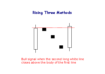
The Rising Method consists of two strong white lines bracketing 3 or 4 small declining black candlesticks. The final white line forms a new closing high. The pattern is definitely bullish.
Once working with a SCTR table, users can sort the columns with the double arrows. Sorting can be by industry group, SCTR, SCTR Change or Close. The SCTR change is the change in SCTR values from one period to the next. Sorting by this column will show chartists which stocks had the biggest changes in their technical rank. This feature can be used to spot big movers. Note that leveraged and inverse ETFs are excluded because above average volatility and inverse price movements skew the results. The VIX ETF (VXX) is also excluded because it moves inverse to the S
$AWNE BarChart Technical Analysis
http://www.barchart.com/technicals/stocks/AWNE
Form 13F-HR, 13F-HR/A ~ SEC Filings Explained
Initial Quarterly Form 13F Holdings report filed by institutional managers (and amendment thereto)
Chaikin Money Flow measures buying and selling pressure for a given period of time. A move into positive territory indicates buying pressure, while a move into negative territory indicates selling pressure. Chartists can use the absolute value of Chaikin Money Flow to confirm or question the price action of the underlying. Positive CMF would confirm an uptrend, but negative CMF would call into question the strength behind an uptrend. The reverse holds true for downtrends.
$BPWRF BarChart Technical Analysis
http://www.barchart.com/technicals/stocks/BPWRF
Standard Pivot Points
Standard Pivot Points begin with a base Pivot Point. This is a simple average of the high, low and close. The middle Pivot Point is shown as a solid line between the support and resistance pivots. Keep in mind that the high, low and close are all from the prior period.
Pivot Point (P) = (High Low Close)/3
Support 1 (S1) = (P x 2) - High
Support 2 (S2) = P - (High - Low)
Resistance 1 (R1) = (P x 2) - Low
Resistance 2 (R2) = P (High - Low)
The chart below shows the Nasdaq 100 ETF (QQQ) with Standard Pivot points on a 15 minute chart. At the start of trading on June 9th, the Pivot Point is in the middle, the resistance levels are above and the support levels are below. These levels remain constant throughout the day.

For signals, Bollinger Bands can be used to identify M-Tops and W-Bottoms or to determine the strength of the trend. Signals derived from narrowing BandWidth are discussed in the chart school article on BandWidth.
$DECN BarChart Technical Analysis
http://www.barchart.com/technicals/stocks/DECN
SEC Filings Explained ~ Form 3
Form 3 is an SEC filing filed with the US Securities and Exchange Commission to indicate a preliminary insider transaction by an officer, director, or beneficial (10%) owner of the company's securities. These are typically seen after a company IPOs when insiders make their first transactions. After a Form 3 is filed, future filings of the same nature are filed under Form 4 (standard disclosure) or Form 5 (annual disclosure).
TRIX Bullish Signal Line Cross: This scan reveals stocks that meet four criteria. First, they must be above their 200-day moving average to be in an overall up trend. Second, the TRIX must be negative to signal a pullback. Third, the TRIX crossed its signal line and turned up. Fourth, volume moved above the 250-day average to show an increase in buying pressure.
$GRYO BarChart Technical Analysis
http://www.barchart.com/technicals/stocks/GRYO
BULLISH MATCHING LOW
Bullish Matching Low Pattern occurs when two black days appear with equal closes in a downtrend. The pattern is suggestive of a short-term support, and it may cause a reversal on the next day of trading.
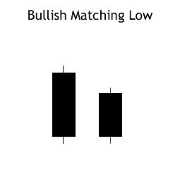
Recognition Criteria:
1. The market moves in downtrend.
2. We then see a long black candlestick on the first day.
3. Second day follows with another black candlestick whose closing price is equal or extremely close to the closing price of the first day.
Explanation:
Market continues to move down as evidenced by first black candlestick. Next day; prices open at a higher level, they then continue to go up during the day but the day closes at a price which is equal to the closing price of the previous day. This pattern suggests a short-term support. Shorts should be aware of this fact. If they ignore Bullish Matching Low Pattern as a possible reversal signal, they may pay for it soon. Two days closing at the same price is indicative of short-term support and this support may be followed by a reversal on the next day of trading.
Important Factors:
The reversal of downtrend requires a confirmation on the third day. The confirmation of the trend reversal may be in the form of a white candlestick, a large gap up or a higher close on the next trading day (on the third day).
Ulcer index indicator measure the stress of holding trade and investment by simply measuring the price retracements. Ulcer Index is based in the notion which downward volatility is bad, however upward volatility is good. Unlike the standard deviation, the economic industry benchmark way of measuring risks of the stock that equally weights both increase to upside volatility and the violent decrease to downside volatility.
$PNGB BarChart Technical Analysis
http://www.barchart.com/technicals/stocks/PNGB
BULLISH STICK SANDWICH
The Bullish Stick Sandwich Pattern is characterized by consecutive higher opens for three days, but results in an eventual close equal to the first day's close. It may warn that prices are now finding a support price. We may then see a reversal from this support level.

Recognition Criteria:
1. Market is characterized by downtrend.
2. We see a Black Closing Marubozu in the first day.
3. Then we see a white candlestick, which is above the close of the first day.
4. Then we again see a Black Closing Marubozu characterized with a close equal to the close of the first day.
Explanation:
In the Bullish Stick Sandwich Pattern, there is a downtrend going on. Then prices open higher on the next trading day and they reach to higher levels all day, closing at or near the high. This bullish act suggests that the previous downtrend may now reverse implying that the shorts need protection. The next day, prices open at a higher level leading some shorts to cover their positions initially but then the prices start moving lower to close at the same price as two days ago. This pattern shows that the market is finding a support level and now the trend may reverse from this support level.
Important Factors:
A confirmation on the fourth day is required to be sure that the downtrend is reversed. Confirmation may be in the form of a white candlestick, a large gap up or a higher close on the fourth day.
$GWBU BarChart Technical Analysis
http://www.barchart.com/technicals/stocks/GWBU
Speed resistance lines are similar in interpretation to the Fibonacci Fan indicator. Many traders will watch for a move below the two-thirds level to signal a continued retracement toward the one-third level. It is important to remember that other technical indicators should be used when the price of the asset is near the trendline to confirm the strength of the predicted support/resistance.
Bearish Falling Three Methods Candlestick
• Direction: Bearish
• Type: Continuation
• Reliability: Strong

• In a downtrend, a long red day occurs
• The second, third and fourth days are short blue days that fall within the range of the first day
• The fifth day continues the downtrend with a long red candle that creates new lows
The Falling Three Methods pattern occurs in a bear market, where during a downtrend the market rests before resuming the trend. The bearish trends break is reflected by small candles that all stick to a strict market range formed by the aggressive move on day one.
A typical explanation for this type of formation might that the market is slowly digesting the relatively larger move in day-one. These small daily ranges often precede significant economic reports. Such periods of relative inactivity and tight trading are common in markets. Falling Three Methods is confirmed where a red candle dives down to new lows reinstituting the bearish trend.
Number of Middle Candles - In a picture perfect formation the middle candles number three. But realistically the pattern may have two, four or even five candles. Individually each middle candle may be a star or doji, red or blue.
Middle Candle Wicks - Important to note is that each middle candle wick needs to stay within the first candles high/low range to signal a strong continuation signal. With the bearish Falling Three Methods this is especially important for the highs. Should a wick trade to a high above the first large red candles high, it casts doubt over the strength of the established down trend.
Indicators based on channels, bands and envelopes are designed to encompass most price action. Therefore, moves above or below the channel lines warrant attention because they are relatively rare. Trends often start with strong moves in one direction or another. A surge above the upper channel line shows extraordinary strength, while a plunge below the lower channel line shows extraordinary weakness. Such strong moves can signal the end of one trend and the beginning of another.
$AMBS BarChart Technical Analysis
http://www.barchart.com/technicals/stocks/AMBS
Keltner Channels
Introduction
Keltner Channels are volatility-based envelopes set above and below an exponential moving average. This indicator is similar to Bollinger Bands, which use the standard deviation to set the bands. Instead of using the standard deviation, Keltner Channels use the Average True Range (ATR) to set channel distance. The channels are typically set two Average True Range values above and below the 20-day EMA. The exponential moving average dictates direction and the Average True Range sets channel width. Keltner Channels are a trend following indicator used to identify reversals with channel breakouts and channel direction. Channels can also be used to identify overbought and oversold levels when the trend is flat.
In his 1960 book, How to Make Money in Commodities, Chester Keltner introduced the "Ten-Day Moving Average Trading Rule," which is credited as the original version of Keltner Channels. This original version started with a 10-day SMA of the typical price {(H L C)/3)} as the centerline. The 10-day SMA of the High-Low range was added and subtracted to set the upper and lower channel lines. Linda Bradford Raschke introduced the newer version of Keltner Channels in the 1980s. Like Bollinger Bands, this new version used a volatility based indicator, Average True Range (ATR), to set channel width. StockCharts.com uses this newer version of Keltner Channels.
Calculation
There are three steps to calculating Keltner Channels. First, select the length for the exponential moving average. Second, choose the time periods for the Average True Range (ATR). Third, choose the multiplier for the Average True Range.
Middle Line: 20-day exponential moving average
Upper Channel Line: 20-day EMA (2 x ATR(10))
Lower Channel Line: 20-day EMA - (2 x ATR(10)
Because moving averages lag price, a longer moving average will have more lag and a shorter moving average will have less lag. ATR is the basic volatility setting. Short timeframes, such as 10, produce a more volatile ATR that fluctuates as 10-period volatility ebbs and flows. Longer timeframes, such a 100, smooth these fluctuations to produce a more constant ATR reading. The multiplier has the most affect on the channel width. Simply changing from 2 to 1 will cut channel width in half. Increasing from 2 to 3 will increase channel width by 50%.

The chart above shows the default Keltner Channels in red, a wider channel in blue and a narrower channel in green. The blue channels were set three Average True Range values above and below (3 x ATR). The green channels used one ATR value. All three share the 20-day EMA, which is the dotted line in the middle. The indicator windows show differences in the Average True Range (ATR) for 10 periods, 50 periods and 100 periods. Notice how the short ATR (10) is more volatile and has the widest range. In contrast, 100-period ATR is much smoother with a less volatile range.
Interpretation
Indicators based on channels, bands and envelopes are designed to encompass most price action. Therefore, moves above or below the channel lines warrant attention because they are relatively rare. Trends often start with strong moves in one direction or another. A surge above the upper channel line shows extraordinary strength, while a plunge below the lower channel line shows extraordinary weakness. Such strong moves can signal the end of one trend and the beginning of another.
With an exponential moving average as its foundation, Keltner Channels are a trend following indicator. As with moving averages and trend following indicators, Keltner Channels lag price action. The direction of the moving average dictates the direction of the channel. In general, a downtrend is present when the channel moves lower, while an uptrend exists when the channel moves higher. The trend is flat when the channel moves sideways.
A channel upturn and break above the upper trendline can signal the start of an uptrend. A channel downturn and break below the lower trendline can signal the start a downtrend. Sometimes a strong trend does not take hold after a channel breakout and prices oscillate between the channel lines. Such trading ranges are marked by a relatively flat moving average. The channel boundaries can then be used to identify overbought and oversold levels for trading purposes.
Versus Bollinger Bands
There are two differences between Keltner Channels and Bollinger Bands. First, Keltner Channels are smoother than Bollinger Bands because the width of the Bollinger Bands is based on the standard deviation, which is more volatile than the Average True Range (ATR). Many consider this a plus because it creates a more constant width. This makes Keltner Channels well suited for trend following and trend identification. Second, Keltner Channels also use an exponential moving average, which is more sensitive than the simple moving average used in Bollinger Bands. The chart below shows Keltner Channels (blue), Bollinger Bands (pink), Average True Range (10), Standard Deviation (10) and Standard Deviation (20) for comparison. Notice how the Keltner Channels are smoother than the Bollinger Bands. Also notice how the Standard Deviation covers a larger range than the Average True Range (ATR).

Uptrend
The chart below shows Archer Daniels Midland (ADM) starting an uptrend as the Keltner Channels turn up and the stock surges above the upper channel line. ADM was in a clear downtrend in April-May as prices continued to pierce the lower channel. With a strong thrust up in June, prices exceeded the upper channel and the channel turned up to start a new uptrend. Notice that prices held above the lower channel on dips in early and late July.

Even with a new uptrend established, it is often prudent to wait for a pullback or better entry point to improve the reward-to-risk ratio. Momentum oscillators or other indicators can then be employed to define oversold readings. This chart shows StochRSI, one of the more sensitive momentum oscillators, dipping below .20 to become oversold at least three times during the uptrend. The subsequent crosses back above .20 signaled a resumption of the uptrend.
Downtrend
The second chart shows Nvidia (NVDA) starting a downtrend with a sharp decline below the lower channel line. After this initial break, the stock met resistance near the 20-day EMA (middle line) from mid May until early August. The inability to even come close to the upper channel line showed strong downside pressure.

A 10-period Commodity Channel Index (CCI) is shown as the momentum oscillator to identify short-term overbought conditions. A move above 100 is considered overbought. A subsequent move back below 100 signals a resumption of the downtrend. This signal worked well until September. These failed signals indicated a possible trend change that was subsequently confirmed with a break above the upper channel line.
Flat Trend
Once a trading range or flat trading environment has been identified, traders can use the Keltner Channels to identify overbought and oversold levels. A trading range can be identified with a flat moving average and the Average Directional Index (ADX). The chart below shows IBM fluctuating between support in the 120-122 area and resistance in the 130-132 area from February to late September. The 20-day EMA, middle line, lagged price action, but flattened out from April to September.
The indicator window shows ADX (black line) confirming a weak trend. Low and falling ADX shows a weak trend. High and rising ADX shows a strong trend. ADX was below 40 the entire time and below 30 most of the time. This reflects the absence of trend. Also, notice that ADX peaked in early June and fell until late August.

Armed with the prospects of a weak trend and trading range, traders can use Keltner Channels to anticipate reversals. In addition, notice that the channel lines often coincide with chart support and resistance. IBM dipped below the lower channel line three times from late May until late August. These dips provided low-risk entry points. The stock did not manage to reach the upper channel line, but did get close as it reversed in the resistance zone. The Disney chart shows a similar situation.

Conclusions
Keltner Channels are a trend following indicator designed to identify the underlying trend. Trend identification is more than half the battle. The trend can be up, down or flat. Using the methods described above, traders and investors can identify the trend to establish a trading preference. Bullish trades are favored in an uptrend and bearish trades are favored in a downtrend. A flat trend requires a more nimble approach because prices often peak at the upper channel line and trough at the lower channel line. As with all analysis techniques, Keltner Channels should be used in conjunction with other indicators and analysis. Momentum indicators offer a good complement to the trend-following Keltner Channels.
$GRMC BarChart Technical Analysis
http://www.barchart.com/technicals/stocks/GRMC
When the MACD is above zero, the short-term average is above the long-term average, which signals upward momentum. The opposite is true when the MACD is below zero. As you can see from the chart above, the zero line often acts as an area of support and resistance for the indicator.
Currency ETFs or ETCs
In 2005, Rydex Investments launched the first ever currency ETF called the Euro Currency Trust (NYSE: FXE) in New York. Since then Rydex has launched a series of funds tracking all major currencies under their brand CurrencyShares. In 2007Deutsche Bank's db x-trackers launched EONIA Total Return Index ETF in Frankfurt tracking the euro, and later in 2008 the Sterling Money Market ETF (LSE: XGBP) and US Dollar Money Market ETF (LSE: XUSD) in London. In 2009, ETF Securitieslaunched the world's largest FX platform tracking the MSFXSM Index covering 18 long or short USD ETC vs. single G10 currencies. The funds are total return products where the investor gets access to the FX spot change, local institutional interest rates and a collateral yield.
$BBDA BarChart Technical Analysis
http://www.barchart.com/technicals/stocks/BBDA
MACD (moving average convergence/divergence) is a technical analysis indicator created by Gerald Appel in the late 1970s.[1] It is used to spot changes in the strength, direction, momentum, and duration of a trend in a stock's price.
BEARISH BELT HOLT
The Bearish Belt Hold Pattern is a single candlestick pattern and it is basically a Black Opening Marubozu that occurs in an uptrend. The pattern shows that the day opens on its high, it then rallies against the trend of the market, and then closes near its low but not necessarily at its low. Longer bodies for Belt Hold are indicative of more resistance to the trend they are countering.

Recognition Criteria:
1. There is an overall uptrend in the market.
2. The day gaps up and prices open on their high but then prices move down closing near its low for the day.
3. We then see a black body characterized by the absence of upper shadow, which is called a Black Opening Marubozu.
Explanation:
We have a market that is trending up when a significant gap in the direction of trend occurs as the day opens. However; then prices reverse direction and all further price action of the day is the opposite of the previous trend. Such a move causes concern among the bulls and leads them to sell many positions. This strengthens the reversal and turns into a sell-off.
Important Factors:
A confirmation of the trend reversal with either a black candlestick, a large gap down or a lower close on the next trading day is required.
|
Followers
|
3289
|
Posters
|
|
|
Posts (Today)
|
0
|
Posts (Total)
|
2804248
|
|
Created
|
08/22/10
|
Type
|
Free
|
| Moderator Nilbud | |||
| Assistants mick ManicTrader PhotoChick Kirimi $Pistol Pete$ | |||
   Investor Hub Alerts: Sign up for 'STOCKGOODIES PLAYS OF THE WEEK ' E-Mail List Investor Hub Alerts: Sign up for 'STOCKGOODIES PLAYS OF THE WEEK ' E-Mail ListUPDATE; 5-1-22 courtesy of charting /\ wit tweezer top calls /\ Tony @Montana_Trades Really good study sheet on Candlestick Patterns [-chart]pbs.twimg.com/media/FRn8188XMAAdZvk?format=jpg&name=small[/chart] 

02-07-2021
|
|
Posts Today
|
0
|
|
Posts (Total)
|
2804248
|
|
Posters
|
|
|
Moderator
|
|
|
Assistants
|
| Volume | |
| Day Range: | |
| Bid Price | |
| Ask Price | |
| Last Trade Time: |


