Are you a global warming skeptic? There are plenty of good reasons why you might be.
As many as 757 stations in the United States recorded net surface-temperature cooling over the past century. Many are concentrated in the southeast, where some people attribute tornadoes and hurricanes to warming.
The temperature-station quality is largely awful. The most important stations in the U.S. are included in the Department of Energy's Historical Climatology Network. A careful survey of these stations by a team led by meteorologist Anthony Watts showed that 70% of these stations have such poor siting that, by the U.S. government's own measure, they result in temperature uncertainties of between two and five degrees Celsius or more. We do not know how much worse are the stations in the developing world.
Using data from all these poor stations, the U.N.'s Intergovernmental Panel on Climate Change estimates an average global 0.64ºC temperature rise in the past 50 years, "most" of which the IPCC says is due to humans. Yet the margin of error for the stations is at least three times larger than the estimated warming.
We know that cities show anomalous warming, caused by energy use and building materials; asphalt, for instance, absorbs more sunlight than do trees. Tokyo's temperature rose about 2ºC in the last 50 years. Could that rise, and increases in other urban areas, have been unreasonably included in the global estimates? That warming may be real, but it has nothing to do with the greenhouse effect and can't be addressed by carbon dioxide reduction.
Moreover, the three major temperature analysis groups (the U.S.'s NASA and National Oceanic and Atmospheric Administration, and the U.K.'s Met Office and Climatic Research Unit) analyze only a small fraction of the available data, primarily from stations that have long records. There's a logic to that practice, but it could lead to selection bias. For instance, older stations were often built outside of cities but today are surrounded by buildings. These groups today use data from about 2,000 stations, down from roughly 6,000 in 1970, raising even more questions about their selections.
On top of that, stations have moved, instruments have changed and local environments have evolved. Analysis groups try to compensate for all this by homogenizing the data, though there are plenty of arguments to be had over how best to homogenize long-running data taken from around the world in varying conditions. These adjustments often result in corrections of several tenths of one degree Celsius, significant fractions of the warming attributed to humans.
And that's just the surface-temperature record. What about the rest? The number of named hurricanes has been on the rise for years, but that's in part a result of better detection technologies (satellites and buoys) that find storms in remote regions. The number of hurricanes hitting the U.S., even more intense Category 4 and 5 storms, has been gradually decreasing since 1850. The number of detected tornadoes has been increasing, possibly because radar technology has improved, but the number that touch down and cause damage has been decreasing. Meanwhile, the short-term variability in U.S. surface temperatures has been decreasing since 1800, suggesting a more stable climate.
Without good answers to all these complaints, global-warming skepticism seems sensible. But now let me explain why you should not be a skeptic, at least not any longer.
Over the last two years, the Berkeley Earth Surface Temperature Project has looked deeply at all the issues raised above. I chaired our group, which just submitted four detailed papers on our results to peer-reviewed journals. We have now posted these papers online at www.BerkeleyEarth.org to solicit even more scrutiny.
Our work covers only land temperature—not the oceans—but that's where warming appears to be the greatest. Robert Rohde, our chief scientist, obtained more than 1.6 billion measurements from more than 39,000 temperature stations around the world. Many of the records were short in duration, and to use them Mr. Rohde and a team of esteemed scientists and statisticians developed a new analytical approach that let us incorporate fragments of records. By using data from virtually all the available stations, we avoided data-selection bias. Rather than try to correct for the discontinuities in the records, we simply sliced the records where the data cut off, thereby creating two records from one.
We discovered that about one-third of the world's temperature stations have recorded cooling temperatures, and about two-thirds have recorded warming. The two-to-one ratio reflects global warming. The changes at the locations that showed warming were typically between 1-2ºC, much greater than the IPCC's average of 0.64ºC.
To study urban-heating bias in temperature records, we used satellite determinations that subdivided the world into urban and rural areas. We then conducted a temperature analysis based solely on "very rural" locations, distant from urban ones. The result showed a temperature increase similar to that found by other groups. Only 0.5% of the globe is urbanized, so it makes sense that even a 2ºC rise in urban regions would contribute negligibly to the global average.
What about poor station quality? Again, our statistical methods allowed us to analyze the U.S. temperature record separately for stations with good or acceptable rankings, and those with poor rankings (the U.S. is the only place in the world that ranks its temperature stations). Remarkably, the poorly ranked stations showed no greater temperature increases than the better ones. The mostly likely explanation is that while low-quality stations may give incorrect absolute temperatures, they still accurately track temperature changes.
When we began our study, we felt that skeptics had raised legitimate issues, and we didn't know what we'd find. Our results turned out to be close to those published by prior groups. We think that means that those groups had truly been very careful in their work, despite their inability to convince some skeptics of that. They managed to avoid bias in their data selection, homogenization and other corrections.
Global warming is real. Perhaps our results will help cool this portion of the climate debate. How much of the warming is due to humans and what will be the likely effects? We made no independent assessment of that.
Mr. Muller is a professor of physics at the University of California, Berkeley, and the author of "Physics for Future Presidents" (W.W. Norton & Co., 2008).
and there's tons more, have a bunch of BEST/Muller-related links stashed, including conclusive that the warming is largely anthropogenic (which go with e.g. Soxfan's http://investorshub.advfn.com/boards/read_msg.aspx?message_id=68589250 earlier this string) -- leave it to you to find and seize on one of the remaining diehard cranks still resolutely and deliberately spewing utter crap in the face of the overwhelming actual evidence
We know you are a person who is willfully ignorant and refuses to look at what is presented to you but one more time as you seem to be rather thick.
Curry is like you delusional and cherry picking. She picked her data and should have excluded some data that skewed her numbers but then deceitful people and global warming deniers tend to be deceitful. Maybe they were raised and rewarded to be that way by their parents. But if you look at April and May of 2010 data it only represented 47 stations collected all in Antarctica. Do you think that might skew data considering there were 14,488 stations that they normally collected data from? If you look at the very last chart even you might able to discern the effect of being fracking stupid might have on reasoning capability but then I must know who I'm posting too don't I.
Hiding the Incline
The Daily Mail article containing the Curry interview includes a graph of BEST data originating from serial misinformation source GWPF, with a cherrypicked starting point of January 2001, through the final BEST data point in May 2010 (a period shy of a decade). Figure 1 highlights the magnitude of the cherrypick by comparing the full BEST record to the fraction of the record included in the article.
Figure 1: Entire BEST record vs. the data examined in the Judith Curry Daily Mail article
Eagle-eyed readers may notice a problem towards the end of the record, as tamino did: the April 2010 BEST anomaly is -1.04°C, which represents a sharp cooling of 1.9°C from the previous month, and is followed by a 2.1°C warming the following month (Figure 2).
Figure 2: BEST record since January 2001, with the April 2010 anomaly highlighted in red
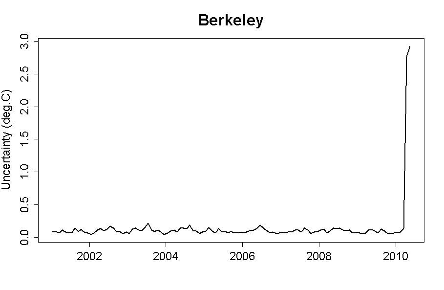
Was there really such a large temperature drop and rise between March and May 2010? It doesn't show up in any other surface temperature record. When we examine the BEST data, the problem is immediately apparent. The uncertainty levels in April and May 2010 are 2.8°C and 2.9°C, respectively. Going back to January 2001, the next-largest uncertainty level is 0.21°C, and the average uncertainty is less than 0.1°C. Tamino plots the monthly data hockey stick-like uncertainties (Figure 3).
Figure 3: BEST monthly uncertainties since 2001, with a huge spike in April and May 2010
So what happened with the April and May 2010 data? While the March 2010 anomaly was based on 14,488 stations, April and May were based on only 47 stations, all in the Antarctic (h/t Nick Stokes). In other words, April and May 2010 should be excluded from BEST data analysis because they are incomplete, their uncertainties are just too large, and April 2010 is quite obviously an anomalous outlier. Frankly they should not have been published in their current state
Here is what using that data that should not be used does to the the trend lines. Notice the difference?
 Market Data
  Markets