


| Followers | 686 |
| Posts | 142293 |
| Boards Moderated | 35 |
| Alias Born | 03/10/2004 |
Wednesday, July 06, 2022 8:08:30 AM
By: Rambus | July 5, 2022
My job is to give you the best unbiased opinion of the markets to the best of my ability. That means my opinion is my opinion and not someone else’s. Opinions are a dime a dozen when it comes to the markets including mine. There are some good analysts and some not so good market analyst which can become very confusing when one tries to read every stock market timer on the planet.
Most investor will gravitate to someone that says what they want to hear to reenforce what they think the markets should be doing. Keeping an open mind can be very hard when so much information is bombarding us each and everyday of our life especially in this day and age. Information overload can cause mental paralysis which can lead to unwanted mistakes.
The most important thing to have when trading the markets, which is the toughest game on the planet to win, is to have a game plan and the discipline to execute it. It all sounds so easy on paper, but in reality it is much harder to do because we are human beings who have survived by following the herd.
The markets are like a casino in Las Vegas, sometimes you win and sometimes you lose, but in the end they will end up with most of your money. In the markets you may get some good trades off, but eventually you will give your profits back and then some until you realize this game we choose to play is much harder than we thought. I’ve said this many times in the past, “we are going up against the greatest traders and trading systems in the world that want every penny you have and won’t feel bad if it is your “LAST PENNY.”
I’m going to focus exclusively on the PM complex tonight and lay out the groundwork for what is possible if one can keep an open mind. There are never any 100% guarantees when it comes to the markets, but if we can get the odds in our favor we have a fighting chance to be successful. When looking at the charts below please keep an open mind.
Many of the charts you will see were down loaded last Thursday which was the end of the month and end of the quarter with a few downloaded this weekend. Lets start with the long term monthly chart for Gold which shows the possible double H&S bottom with the right shoulder still under construction. If you look at the thumbnail on the right sidebar you will see that Gold closed the month of June just below the 20 month ema for the first time since neckline1 gave way. It was only by a small margin which doesn’t look that significant, but it was the first time in a couple of years.
The best way to understand the importance of the 20 month ema is to start at the beginning of the bull market back in 2000 by following the price action and the 20 month ema together. The only time that Gold closed below the 20 month ema was during the 2008 crash which ended up being the head of the H&S consolidation pattern and only lasted one month. The very next month Gold closed back above the 20 month ema and stayed above the 20 month ema until the top completed at the 2011 high. It is all about where Gold closes at the end of the month and not what it does during the month. For now this is a warning sign.
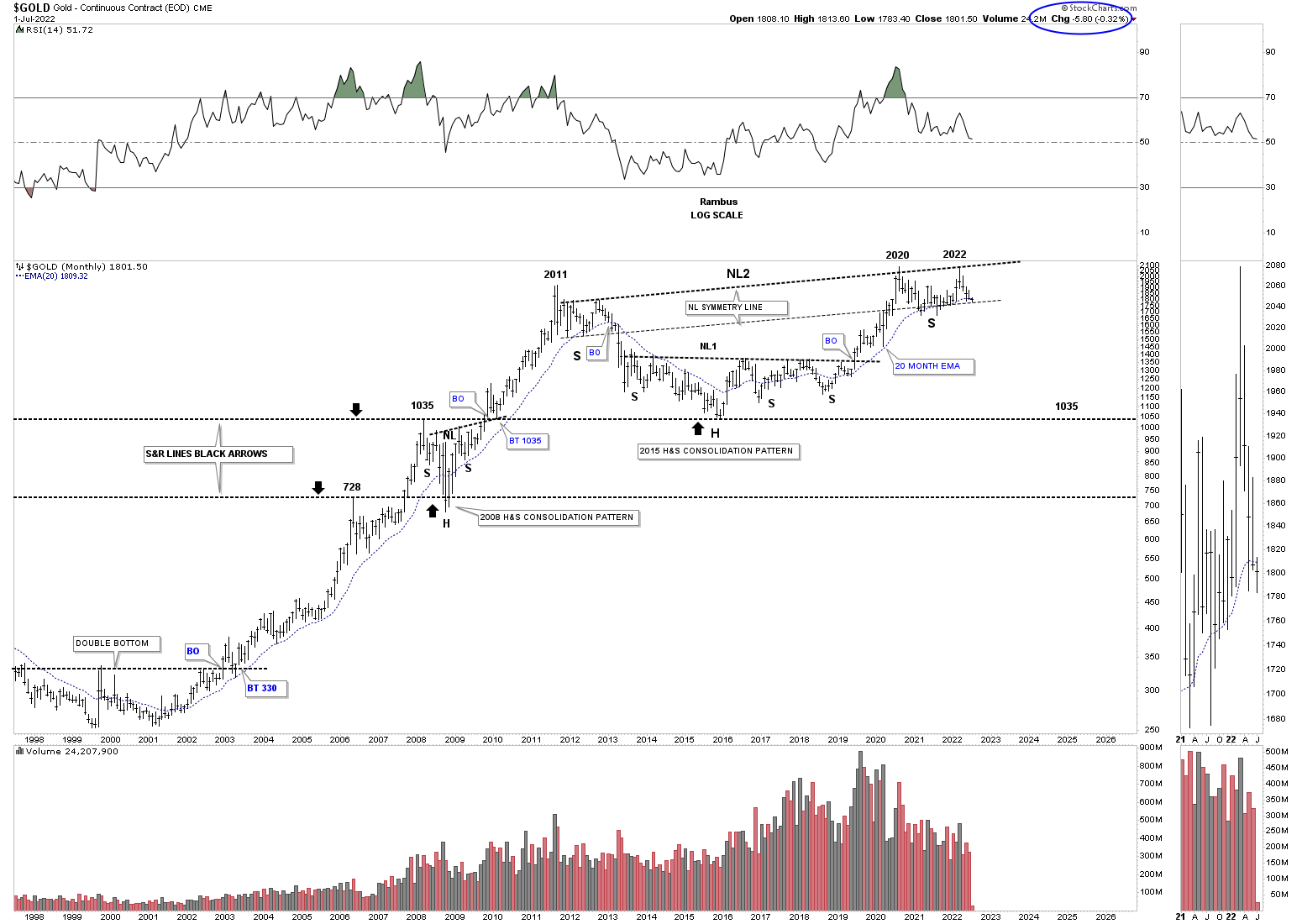
Next is the Gold fractal chart which shows the 2011 and 2020 trading ranges which are very similar in time and price. It is not the end of the world, but Gold was supposed to breakout one way or the other at the end of June and didn’t, calling the fractal into question. Again, it is not the end of the world just a warning sign.
Keeping an open mind this weekly chart shows how Gold could still be in a bull market, but could have one more leg down to the bottom rail of a very large rising wedge formation that began forming at the 2011 high. Currently Gold is in no mans land offering no low risk entry point from this long term perspective.
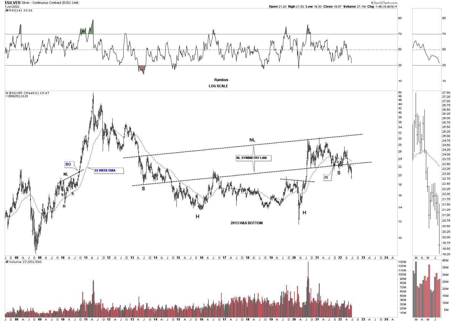
Lets move on to Silver which we know has been one of the laggards in the PM complex. After topping out in 2020 like everything else in the PM complex Silver has formed a flat top expanding triangle which gave way to the downside last week. Before breaking the bottom rail of the flat top expanding triangle, Silver put in the blue bearish expanding rising wedge which experienced a breakout and backtest to the bottom rail which strongly suggested the bottom rail of the 2020 trading range was going to give way. The blue circle shows weakness when Silver couldn’t rally all the way back to the top rail. We shouldn’t be surprised to see a backtest to the bottom rail of the flat top expanding triangle before the impulse move really takes hold to the downside.
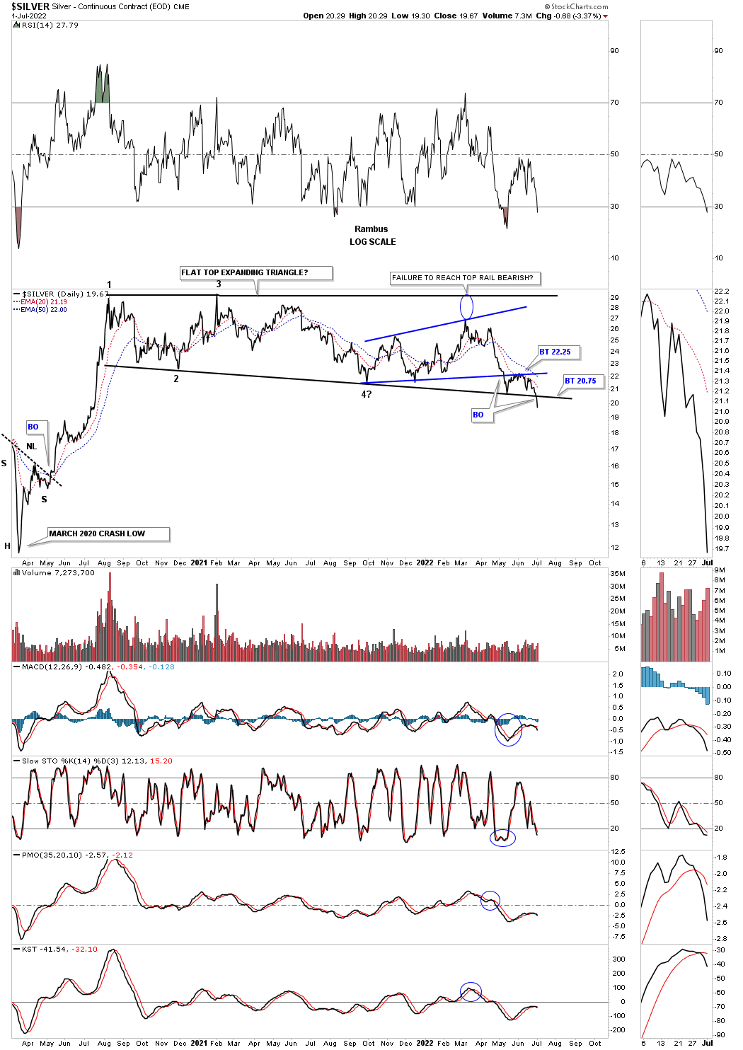
This next chart is an old chart I used during the bull market years charting the bull market in Silver. It is hard to see now but during each impulse move the price action would form a small red bullish rising wedge between each consolidation pattern.
Now look at the top rail of the 2011 falling wedge and how nicely the 2020 trading range, on the daily chart above, interacts with it. As you can see there is no gap at the 5th reversal point as the angle of the top rail takes care of it now. You can see last weeks bar traded the entire week below the bottom rail. Again, we should expect to see a backtest.
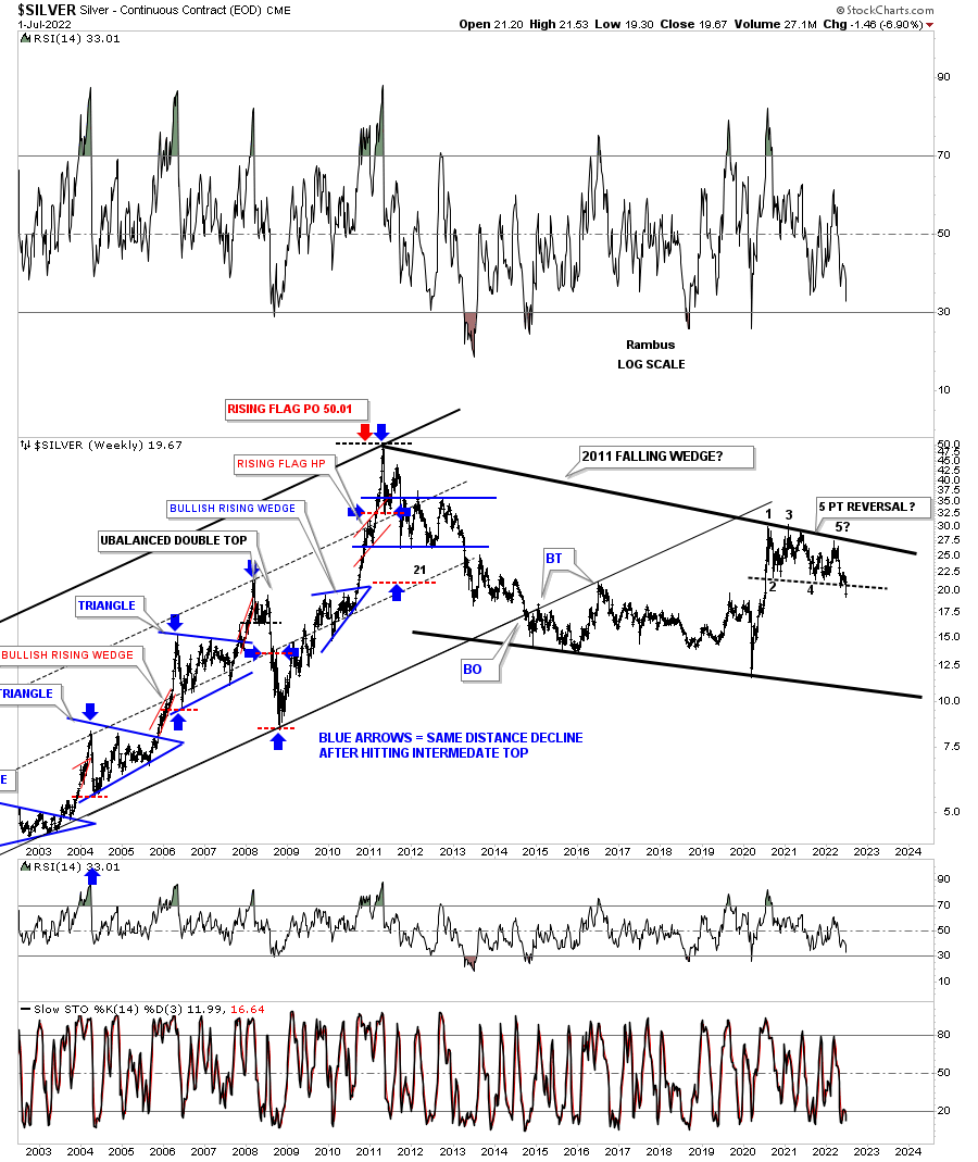
This slightly different version of the chart above shows the 2013 rectangle which was the first consolidation pattern in the 2011 bear market. Now look at the 2020 trading range and the similarity to the 2011 trading range. From strictly a support and resistance perspective you can see how the 2020 trading range has ran into resistance at the bottom of the 2013 trading range with just a bit of overlap. You can also see how the top of the 2016 trading range has been holding support. With Silver breaking below the bottom of its 2020 trading range the odds favor Silver moving lower leaving the 2020 trading range as a distribution pattern.
I realize that few can grasp what this big picture of Silver is strongly suggesting, but when the bottom rail of the 2020 trading range gave way the odds went way up that the top rail of the 2011 bear market downtrend channel is still hot and to be respected. The bulls had every chance in the world to hold support at the bottom blue rail, but they told us they are weaker than many think is possible.
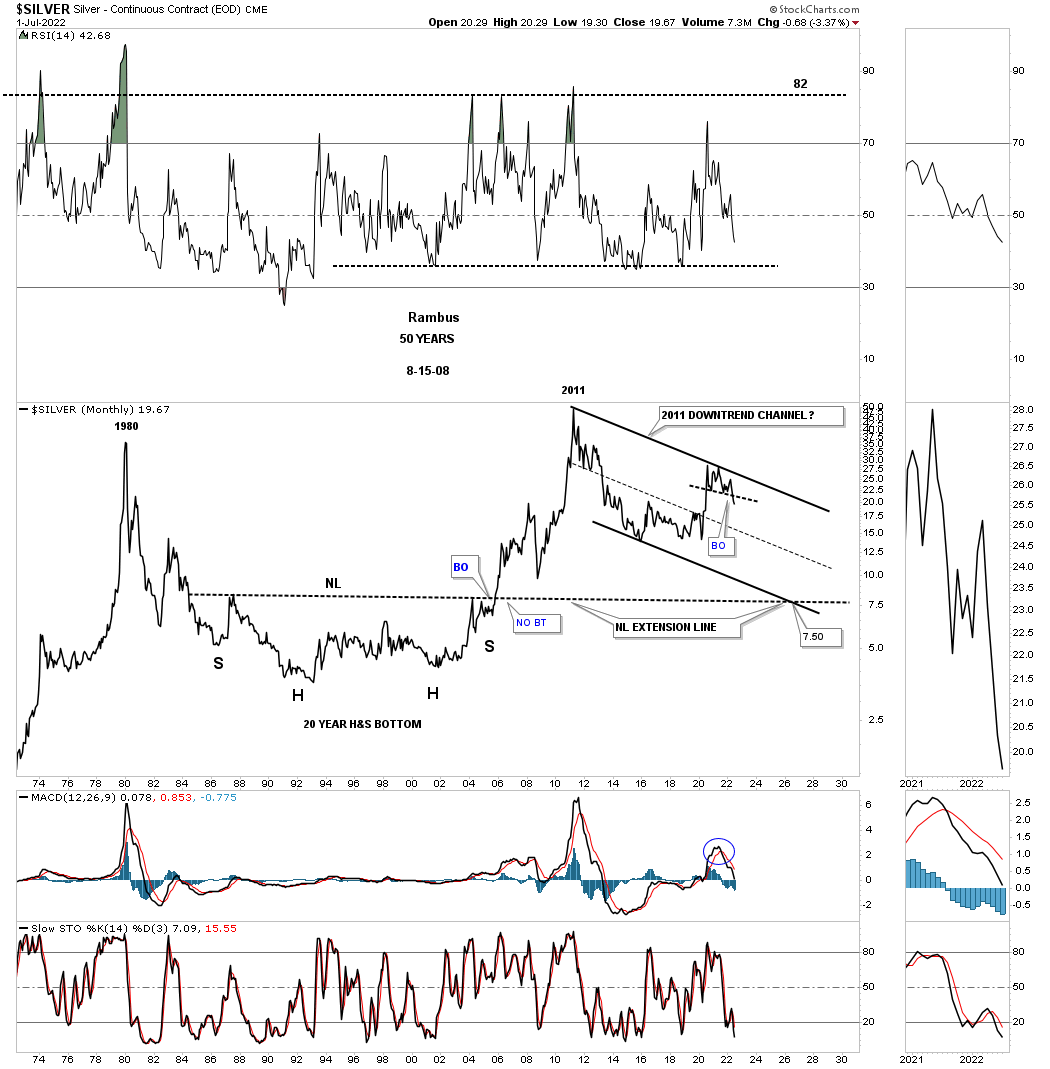
This 50 year monthly chart for Silver puts the 2011 downtrend channel in perspective. I know it seems impossible at this time, but the bulls are doing nothing to change this possible scenario. Until they do, it is what it is until it isn’t.
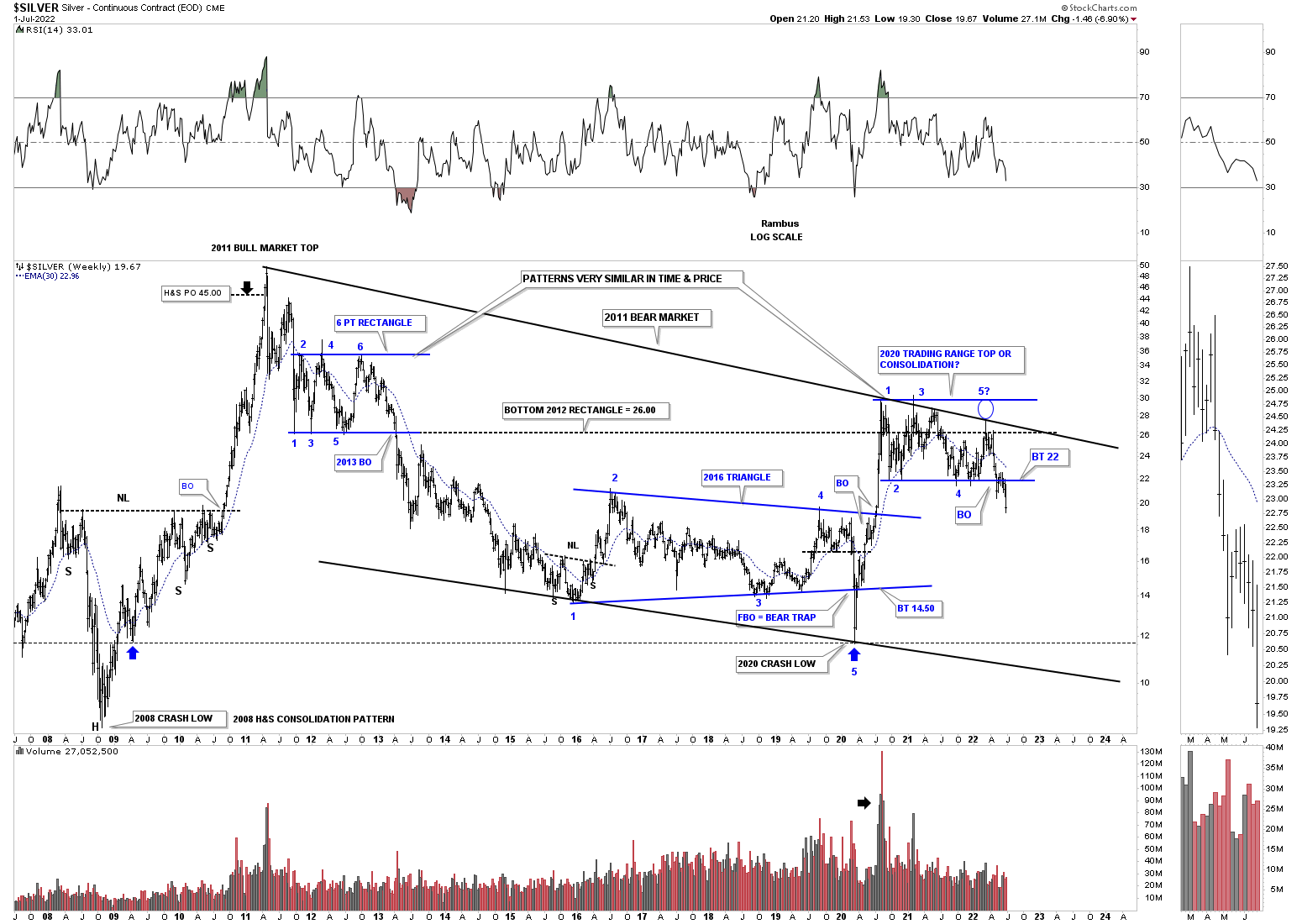
About ten months or so ago I showed this chart for Silver and the rest of the PM complex which were forming a possible massive H&S base with the neckline symmetry line holding support for the low of the right shoulder. As you can see that possible H&S bottom is fading fast as the price action is now trading below the neckline symmetry line which isn’t the end of the world of the possible H&S bottom, but it now puts it in question. It is not pretty and symmetrical anymore.
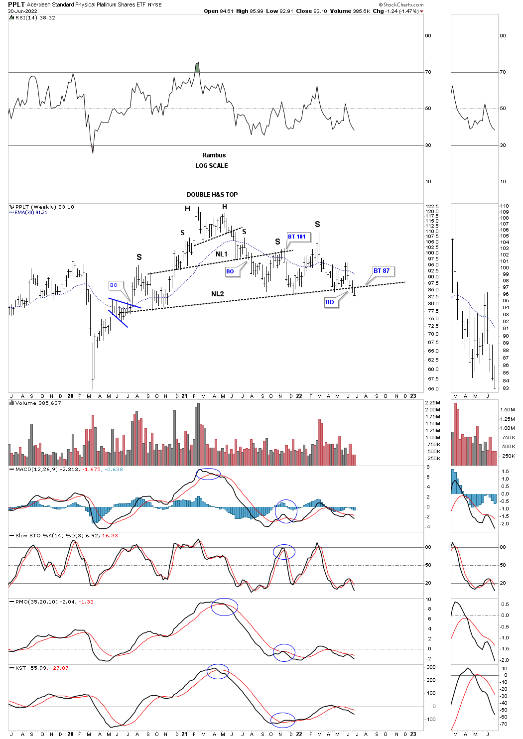
PPLT, Platinum, has now traded two weeks below its possible very large H&S top neckline. Now we’ll watch the neckline for a backtest to see what happens.
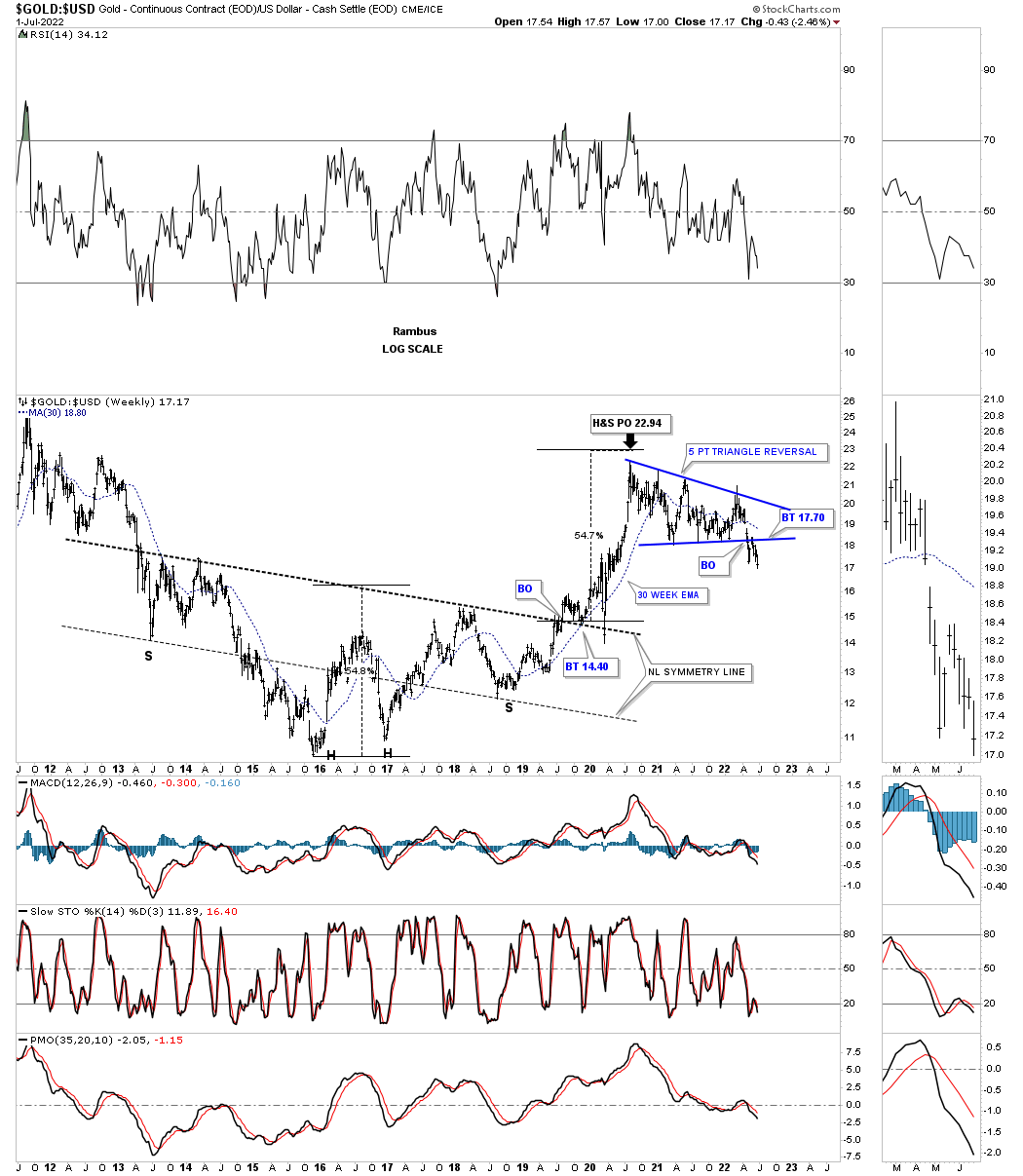
Now lets look at a couple of ratio charts to see if they can help us in determining the next important move in the PM complex. This first ratio chart compares Gold to the US dollar which shows the ratio built out a very large H&S bottom, meaning Gold was outperforming the US dollar into the 2020 high. As you can see the price action fell just shy of reaching the minimum price objective for the H&S bottom.
Since the high made in 2020 the ratio formed the five point blue triangle reversal pattern that shows a breakout and backtest that may be complete. I don’t want to sound like a broken record, but if the Gold bulls were in charge the triangle should have broken to the upside and not the downside.
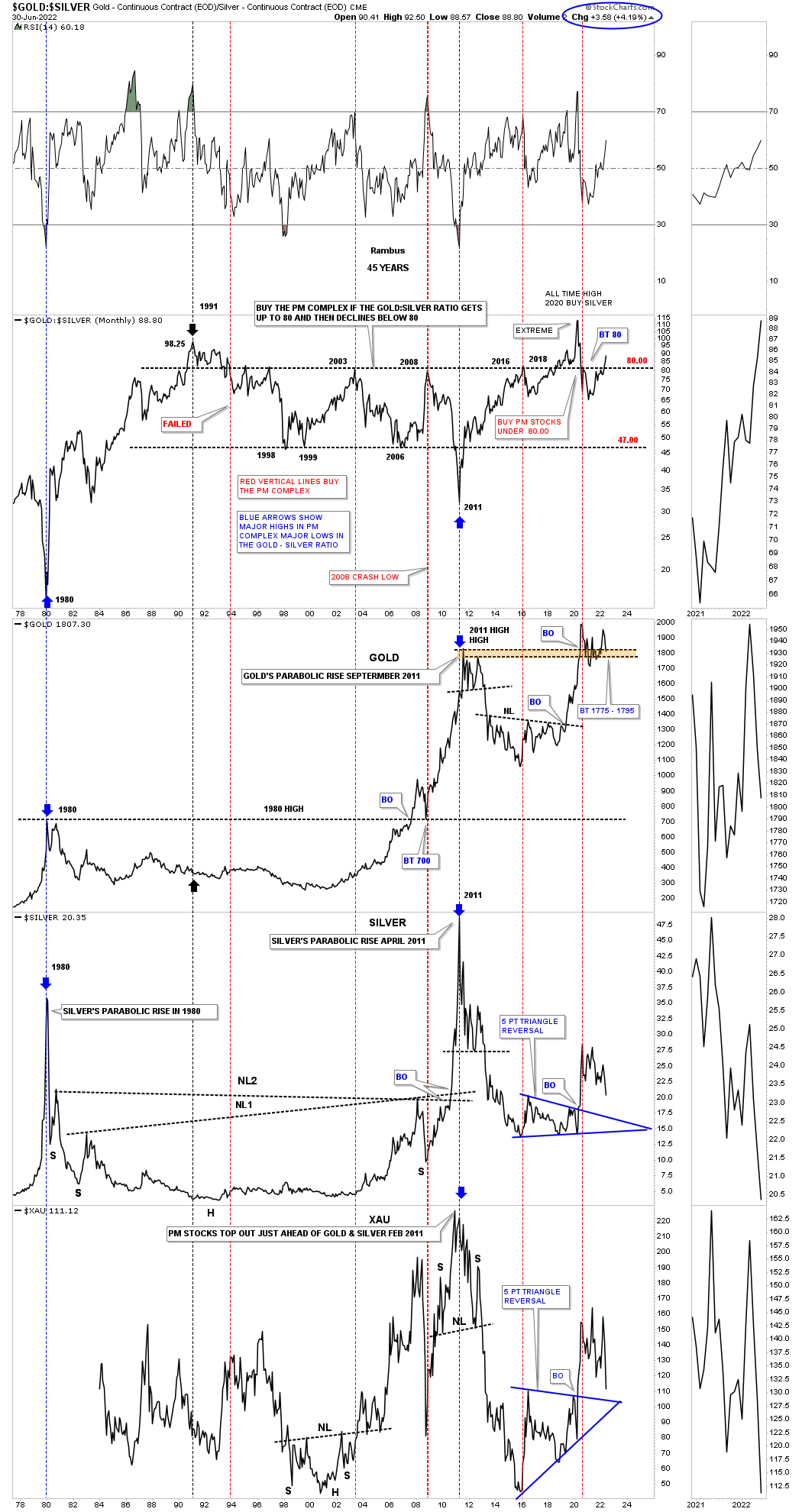
Everyone who follows the Gold:Silver ratio has their own interpretation of what it means. For me when the ratio is rising that is generally, but not always, not a good time to be in PM stocks. Since the 2020 low in the ratio and the high in the PM complex the ratio has broken back above 80 which is not a bullish sign if one is long the PM complex. Again, it is not the end of the world, but a huge warning sign to stay vigilant if one is thinking about entering the PM complex.
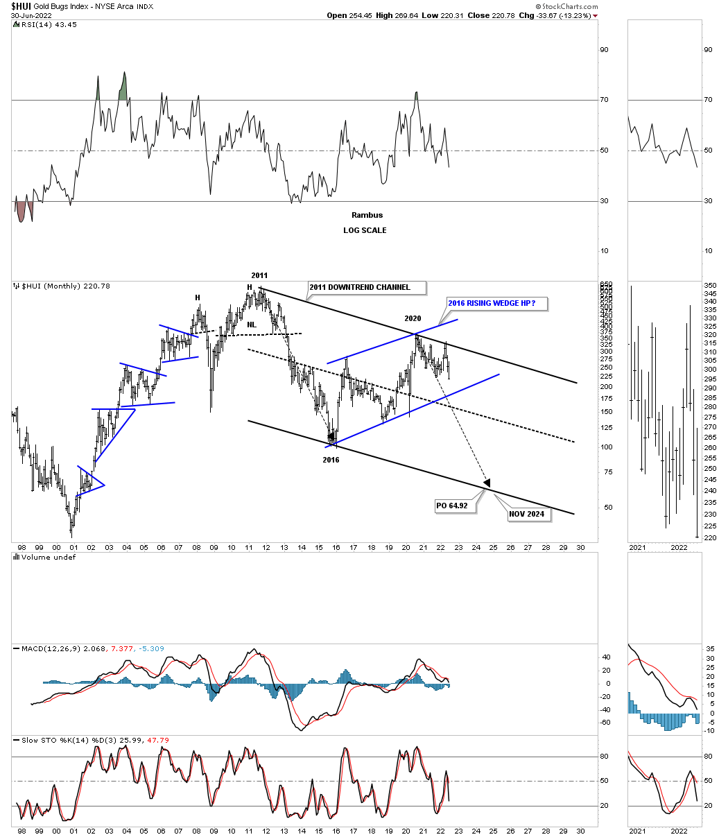
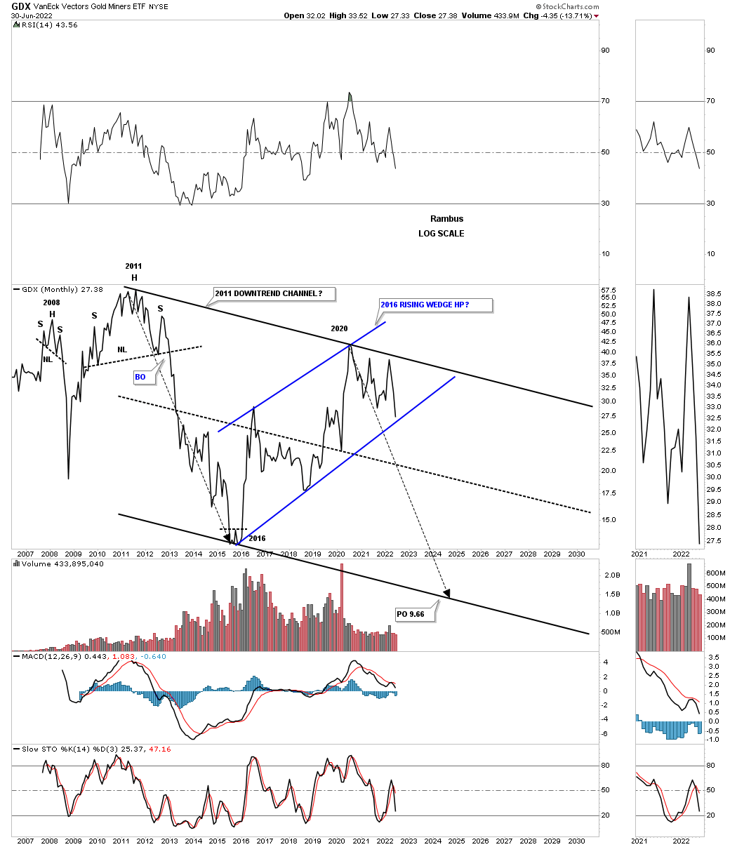
Lets look at a few PM stock indexes to see if they can give us any good clues on the next important direction for the PM stocks. Lets start with the long term monthly chart for the HUI which shows its 2000 bull market uptrend channel. The two black rectangles measure each half of the uptrend channel. The HUI could decline down to the bottom rail and the bull market would still be intact with no damage done, frustrating the bulls.
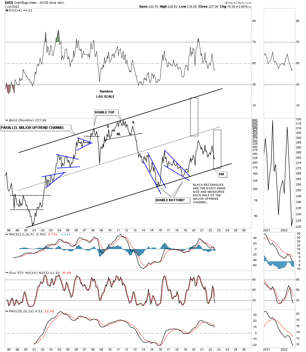
And then there is another possibility that few are even aware of which is the possible 2016 rising wedge formation. As you can see each important reversal point comes at an important top or bottom in the past five years or so. A touch of the bottom rail will complete the all important 4th reversal point in the rising wedge and is where the bulls need to step up and hold support. If they fail to do so the rising wedge will then be a consolidation pattern to the downside.
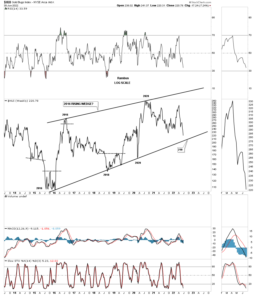
This longer term bar chart for the HUI shows how the 2016 rising wedge would look as a halfway pattern if the bottom blue trendline is broken to the downside.
This monthly chart for the GDX shows the 2013 brown shaded S&R zone, which has been holding support since the 2020 high, with the price action closing last week below it. During a strong impulse move down you will generally see a string of black candlesticks all in a row, with the end of June showing the third. Just the opposite in a strong impulse move up where you will see a string of white candlesticks.
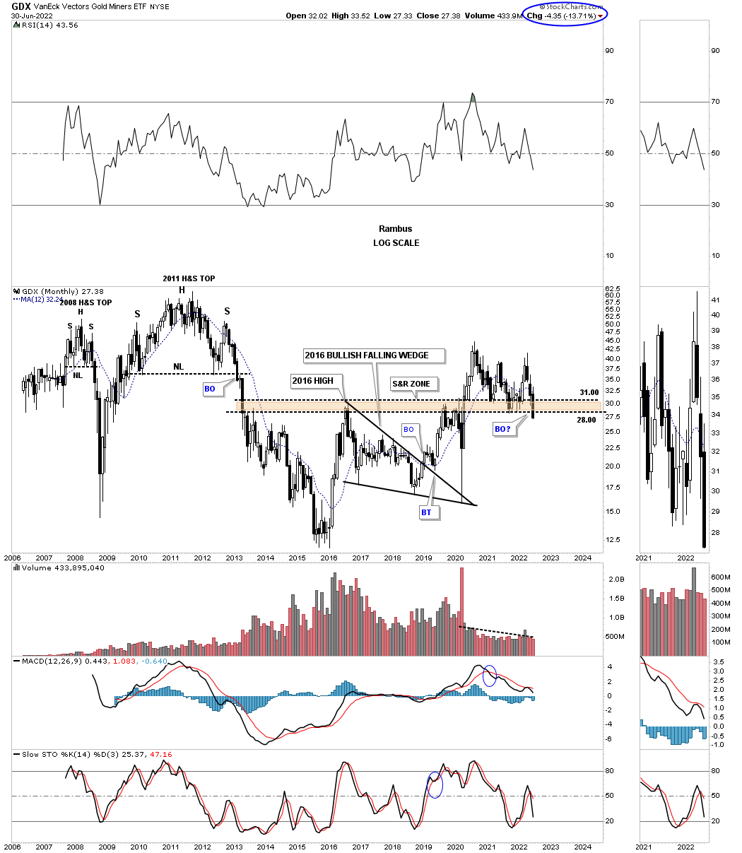
This next monthly chart for the GDX shows the price action hitting critical support last week where the bottom rail of the 2016 uptrend channel and the bottom rail of the possible blue bull flag intersect. The possible blue flag won’t be complete until the top rail is broken to the upside leaving the bulls with a lot of work on their hands if the 2016 trading range is going to be bullish. On the other hand if the bottom rail of the 2016 uptrend channel and the bottom rail of the possible blue bull flag give way then we’ll be left with a bearish rising channel.
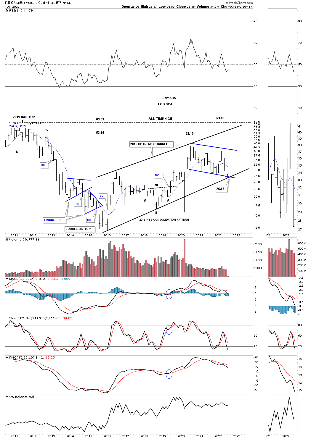
This monthly line chart shows how the blue rising channel would look in the 2011 downtrend channel as a possible halfway pattern to the downside.
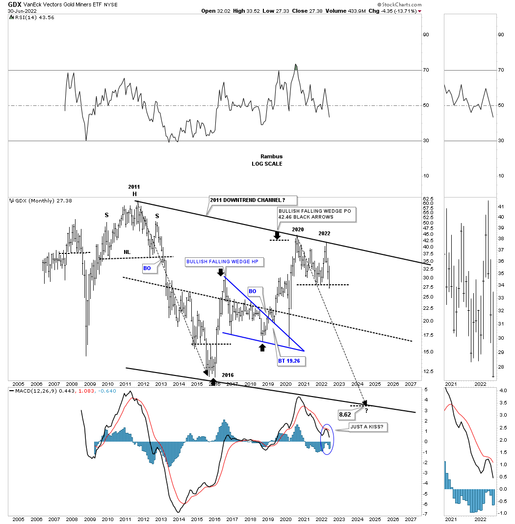
The monthly bar chart for the GDX.
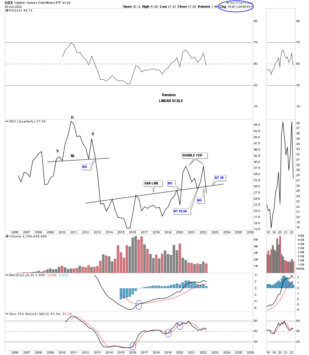
Something happened this quarter that I wasn’t excepting when the 2nd quarter began. This quarterly line chart for the GDX shows the price action closing the quarter below the S&R line going all the way back to 2013. I’ve been following that S&R line for many years and to see it give way like that was very interesting. As you can see I’ve labeled the price action above it as a double top reversal pattern which I have to admit I wasn’t expecting when the quarter began three months ago.
I’ve been mentioning for quite sometime that Silver and the GDXJ have been the weakest areas in the PM complex. This monthly line chart for the GDXJ, junior miners, closed the month of June below the bottom rail of its 2016 rising wedge formation. Now we’ll see if the bottom rail can hold resistance on the backtest...
* * *
Read Full Story »»»
 DiscoverGold
Information posted to this board is not meant to suggest any specific action, but to point out the technical signs that can help our readers make their own specific decisions. Caveat emptor!
• DiscoverGold
Recent GDX News
- YieldMax GDXY Name Change • GlobeNewswire Inc. • 01/25/2024 04:22:00 PM
- Surging S&P 500 Breadth • ValueWalk • 07/19/2023 03:16:37 PM
- S&P 500 Corrects In Breadth • ValueWalk • 07/18/2023 03:08:49 PM
- If The USDX Fell So Much, Why Didn’t Gold Truly Soar? • ValueWalk • 07/17/2023 05:16:20 PM
- USD’s Decline That’s… Bearish For Gold?! • ValueWalk • 07/12/2023 02:38:08 PM
- S&P 500 Late Day Reversal Worry • ValueWalk • 07/10/2023 03:17:34 PM
- Massive Gaming Celebrates Global Launch of House of Blackjack with USDC Earning Race • ValueWalk • 07/10/2023 02:44:17 PM
- Breathers In Mining Stocks Are Not Real Rallies • ValueWalk • 07/06/2023 05:20:55 PM
- S&P 500 Character Changes • ValueWalk • 07/06/2023 03:10:06 PM
- S&P 500 – As Bullish As It Gets • ValueWalk • 07/03/2023 04:01:21 PM
- The Great Gold Migration: How Asia Is Dominating The Global Gold Landscape • ValueWalk • 06/30/2023 05:07:35 PM
- S&P 500 Dip Buying And Tame PCE • ValueWalk • 06/30/2023 03:34:13 PM
- The Bullish Reversal In Gold Is Coming • ValueWalk • 06/29/2023 04:00:44 PM
FEATURED POET Wins "Best Optical AI Solution" in 2024 AI Breakthrough Awards Program • Jun 26, 2024 10:09 AM
HealthLynked Promotes Bill Crupi to Chief Operating Officer • HLYK • Jun 26, 2024 8:00 AM
Bantec's Howco Short Term Department of Defense Contract Wins Will Exceed $1,100,000 for the current Quarter • BANT • Jun 25, 2024 10:00 AM
ECGI Holdings Targets $9.7 Billion Equestrian Apparel Market with Allon Brand Launch • ECGI • Jun 25, 2024 8:36 AM
Avant Technologies Addresses Progress on AI Supercomputer-Driven Data Centers • AVAI • Jun 25, 2024 8:00 AM
Green Leaf Innovations, Inc. Expands International Presence with New Partnership in Dubai • GRLF • Jun 24, 2024 8:30 AM

