


Tuesday, March 08, 2022 9:27:32 AM
These charts have been posted before at times, but I think they deserve another.
Should you trust media bias charts?
These controversial charts claim to show the political lean and credibility of news organizations. Here’s what you need to know about them.
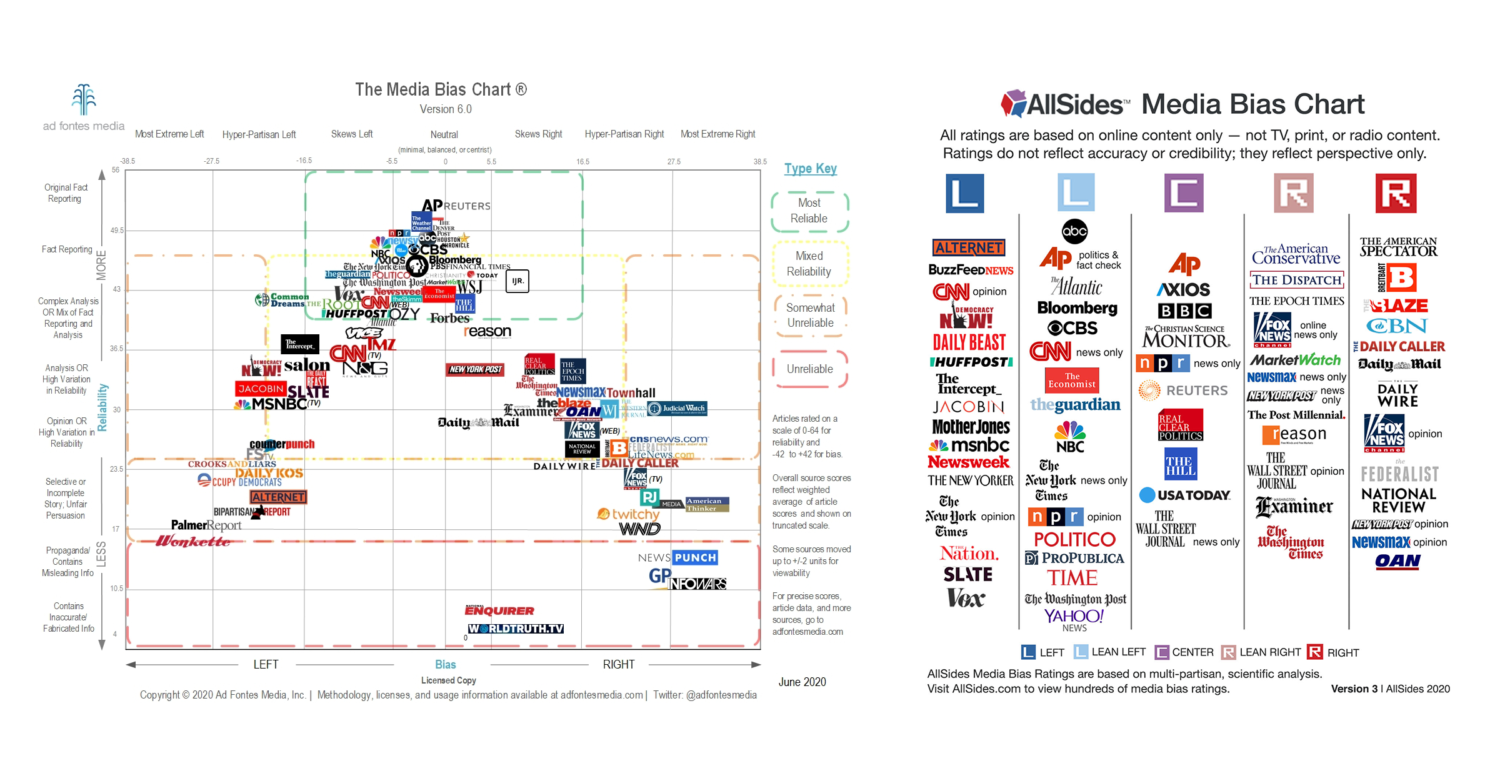
Ad Fontes' media bias chart, left, and AllSides' media bias chart, right. Larger versions are available to view below and on each organization's website.
By: Jake Sheridan
November 2, 2021
Impartial journalism is an impossible ideal. That is, at least, according to Julie Mastrine.
“Unbiased news doesn’t exist. Everyone has a bias: everyday people and journalists. And that’s OK,” Mastrine said. But it’s not OK for news organizations to hide those biases, she said.
“We can be manipulated into (a biased outlet’s) point of view and not able to evaluate it critically and objectively and understand where it’s coming from,” said Mastrine, marketing director for AllSides, a media literacy company focused on “freeing people from filter bubbles.”
That’s why she created a media bias chart.
As readers hurl claims of hidden bias towards outlets on all parts of the political spectrum, bias charts have emerged as a tool to reveal pernicious partiality.
Charts that use transparent methodologies to score political bias — particularly the AllSides chart and another from news literacy company Ad Fontes Media — are increasing in popularity and spreading across the internet. According to CrowdTangle, a social media monitoring platform, the homepages for these two sites and the pages for their charts have been shared tens of thousands of times.
But just because something is widely shared doesn’t mean it’s accurate. Are media bias charts reliable?
Why do media bias charts exist?
Traditional journalism values a focus on news reporting that is fair and impartial, guided by principles like truth, verification and accuracy. But those standards are not observed across the board in the “news” content that people consume.
Tim Groeling, a communications professor at the University of California Los Angeles, said some consumers take too much of the “news” they encounter as impartial.
When people are influenced by undisclosed political bias in the news they consume, “that’s pretty bad for democratic politics, pretty bad for our country to have people be consistently misinformed and think they’re informed,” Groeling said.
If undisclosed bias threatens to mislead some news consumers, it also pushes others away, he said.
“When you have bias that’s not acknowledged, but is present, that’s really damaging to trust,” he said.
Kelly McBride, an expert on journalism ethics and standards, NPR’s public editor and the chair of the Craig Newmark Center for Ethics and Leadership at Poynter, agrees.
“If a news consumer doesn’t see their particular bias in a story accounted for — not necessarily validated, but at least accounted for in a story — they are going to assume that the reporter or the publication is biased,” McBride said.
The growing public confusion about whether or not news outlets harbor a political bias, disclosed or not, is fueling demand for resources to sort fact from otherwise — resources like these media bias charts.
Bias and social media
Mastrine said the threat of undisclosed biases grows as social media algorithms create filter bubbles to feed users ideologically consistent content.
Could rating bias help? Mastrine and Vanessa Otero, founder of the Ad Fontes media bias chart, think so.
“It’ll actually make it easier for people to identify different perspectives and make sure they’re reading across the spectrum so that they get a balanced understanding of current events,” Mastrine said.
Otero said bias ratings could also be helpful to advertisers.
“There’s this whole ecosystem of online junk news, of polarizing misinformation, these clickbaity sites that are sucking up a lot of ad revenue. And that’s not to the benefit of anybody,” Otero said. “It’s not to the benefit of the advertisers. It’s not to the benefit of society. It’s just to the benefit of some folks who want to take advantage of people’s worst inclinations online.”
Reliable media bias ratings could allow advertisers to disinvest in fringe sites.
Groeling, the UCLA professor, said he could see major social media and search platforms using bias ratings to alter the algorithms that determine what content users see. Changes could elevate neutral content or foster broader news consumption.
But he fears the platforms’ sweeping power, especially after Facebook and Twitter censored a New York Post article purporting to show data from a laptop belonging to Hunter Biden, the son of President-elect Joe Biden. Groeling said social media platforms failed to clearly communicate how and why they stopped and slowed the spread of the article.
“(Social media platforms are) searching for some sort of arbiter of truth and news … but it’s actually really difficult to do that and not be a frightening totalitarian,” he said.
Is less more?
The Ad Fontes chart and the AllSides chart are each easy to understand: progressive publishers on one side, conservative ones on the other.
“It’s just more visible, more shareable. We think more people can see the ratings this way and kind of begin to understand them and really start to think, ‘Oh, you know, journalism is supposed to be objective and balanced,’” Mastrine said. AllSides has rated media bias since 2012. Mastrine first put them into chart form in early 2019.
Otero recognizes that accessibility comes at a price.
“Some nuance has to go away when it’s a graphic,” she said. “If you always keep it to, ‘people can only understand if they have a very deep conversation,’ then some people are just never going to get there. So it is a tool to help people have a shortcut.”
But perceiving the chart as distilled truth could give consumers an undue trust in outlets, McBride said.
“Overreliance on a chart like this is going to probably give some consumers a false level of faith,” she said. “I can think of a massive journalistic failure for just about every organization on this chart. And they didn’t all come clean about it.”
The necessity of getting people to look at the chart poses another challenge. Groeling thinks disinterest among consumers could hurt the charts’ usefulness.
“Asking people to go to this chart, asking them to take effort to understand and do that comparison, I worry would not actually be something people would do. Because most people don’t care enough about news,” he said. He would rather see a plugin that detects bias in users’ overall news consumption and offers them differing viewpoints.
McBride questioned whether bias should be the focus of the charts at all. Other factors — accountability, reliability and resources — would offer better insight into what sources of news are best, she said.
“Bias is only one thing that you need to pay attention to when you consume news. What you also want to pay attention to is the quality of the actual reporting and writing and the editing,” she said. It wouldn’t make sense to rate local news sources for bias, she added, because they are responsive to individual communities with different political ideologies.
The charts are only as good as their methodologies. Both McBride and Groeling shared praise for the stated methods for rating bias of AllSides and Ad Fontes, which can be found on their websites. Neither Ad Fontes nor AllSides explicitly rates editorial standards.
The AllSides Chart
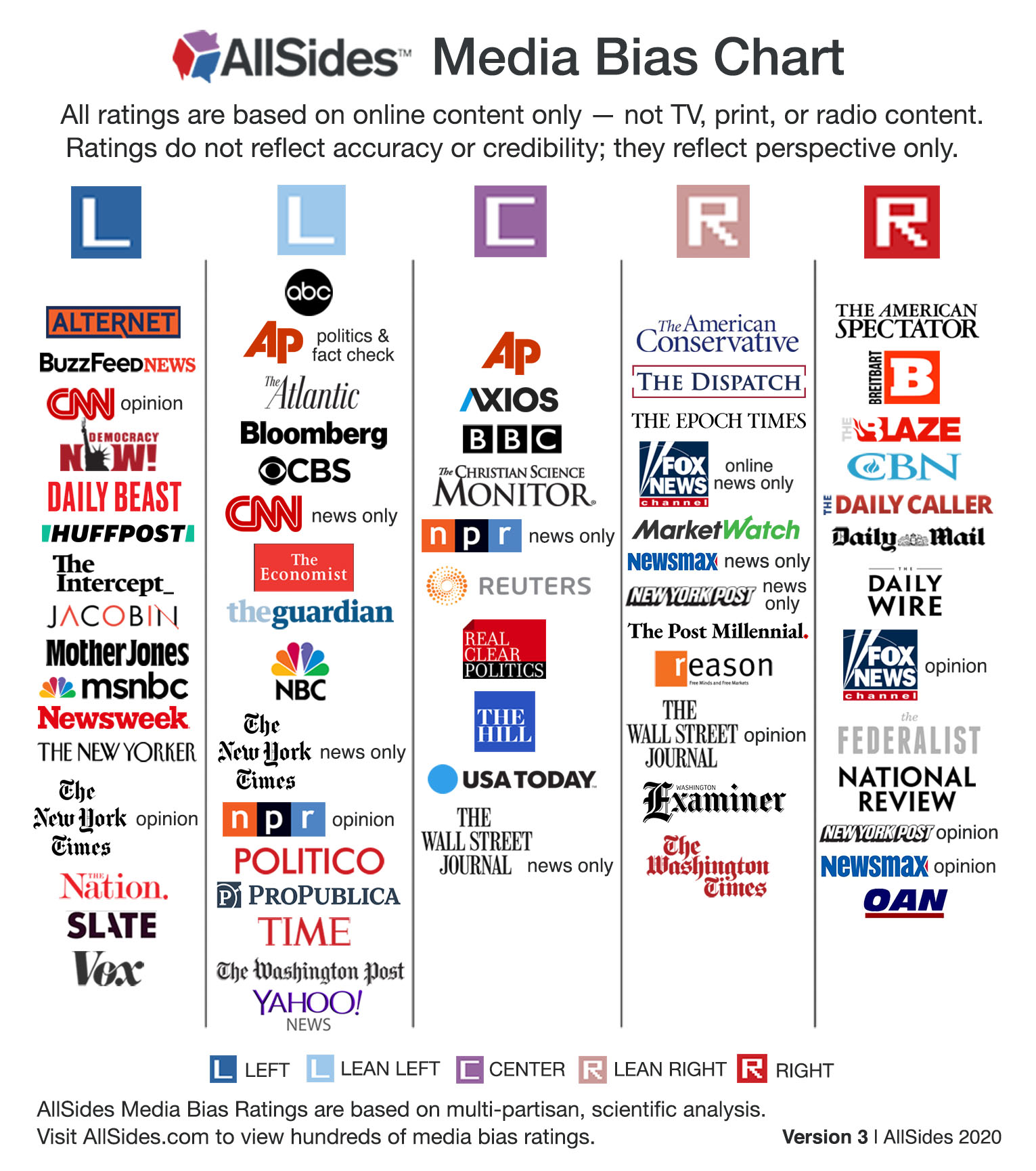
(Courtesy: AllSides)
The AllSides chart focuses solely on political bias. It places sources in one of five boxes — “Left,” “Lean Left,” “Center,” “Lean Right” and “Right.” Mastrine said that while the boxes allow the chart to be easily understood, they also don’t allow sources to be rated on a gradient.
“Our five-point scale is inherently limited in the sense that we have to put somebody in a category when, in reality, it’s kind of a spectrum. They might fall in between two of the ratings,” Mastrine said.
That also makes the chart particularly easy to understand, she said.
AllSides has rated more than 800 sources in eight years, focusing on online content only. Ratings are derived from a mix of review methods.
In the blind bias survey, which Mastrine called “one of (AllSides’) most robust bias rating methodologies,” readers from the public rate articles for political bias. Two AllSides staffers with different political biases pull articles from the news sites that are being reviewed. AllSides locates these unpaid readers through its newsletter, website, social media account and other marketing tools. The readers, who self-report their political bias after they use a bias rating test provided by the company, only see the article’s text and are not told which outlet published the piece. The data is then normalized to more closely reflect the composure of America across political groupings.
AllSides also uses “editorial reviews,” where staff members look directly at a source to contribute to ratings.
“That allows us to actually look at the homepage with the branding, with the photos and all that and kind of get a feel for what the bias is, taking all that into account,” Mastrine said.
She added that an equal number of staffers who lean left, right and center conduct each review together. The personal biases of AllSides’ staffers appear on their bio pages. Mastrine leans right.
She clarified that among the 20-person staff, many are part time, 14% are people of color, 38% are lean left or left, 29% are center, and 18% are lean right or right. Half of the staffers are male, half are female.
When a news outlet receives a blind bias survey and an editorial review, both are taken into account. Mastrine said the two methods aren’t weighted together “in any mathematical way,” but said they typically hold roughly equal weight. Sometimes, she added, the editorial review carries more weight.
AllSides also uses “independent research,” which Mastrine described as the “lowest level of bias verification.” She said it consists of staffers reviewing and reporting on a source to make a preliminary bias assessment. Sometimes third-party analyses — including academic research and surveys — are incorporated into ratings, too.
AllSides highlights the specific methodologies used to judge each source on its website and states its confidence in the ratings based on the methods used. In a separate white paper, the company details the process used for its August 2020 blind bias survey.
AllSides sometimes gives separate ratings to different sections of the same source. For example, it rates The New York Times’ opinion section “Left” and its news section “Lean Left.” AllSides also incorporates reader feedback into its system. People can mark that they agree or disagree with AllSides’ rating of a source. When a significant number of people disagree, AllSides often revisits a source to vet it once again, Mastrine said.
The AllSides chart generally gets good reviews, she said, and most people mark that they agree with the ratings. Still, she sees one misconception among the people that encounter it: They think center means better. Mastrine disagrees.
“The center outlets might be omitting certain stories that are important to people. They might not even be accurate,” she said. “We tell people to read across the spectrum.”
To make that easier, AllSides offers a curated “balanced news feed,” featuring articles from across the political spectrum, on its website.
AllSides makes money through paid memberships, one-time donations, media literacy training and online advertisements. It plans to become a public benefit corporation by the end of the year, she added, meaning it will operate both for profit and for a stated public mission.
The Ad Fontes chart
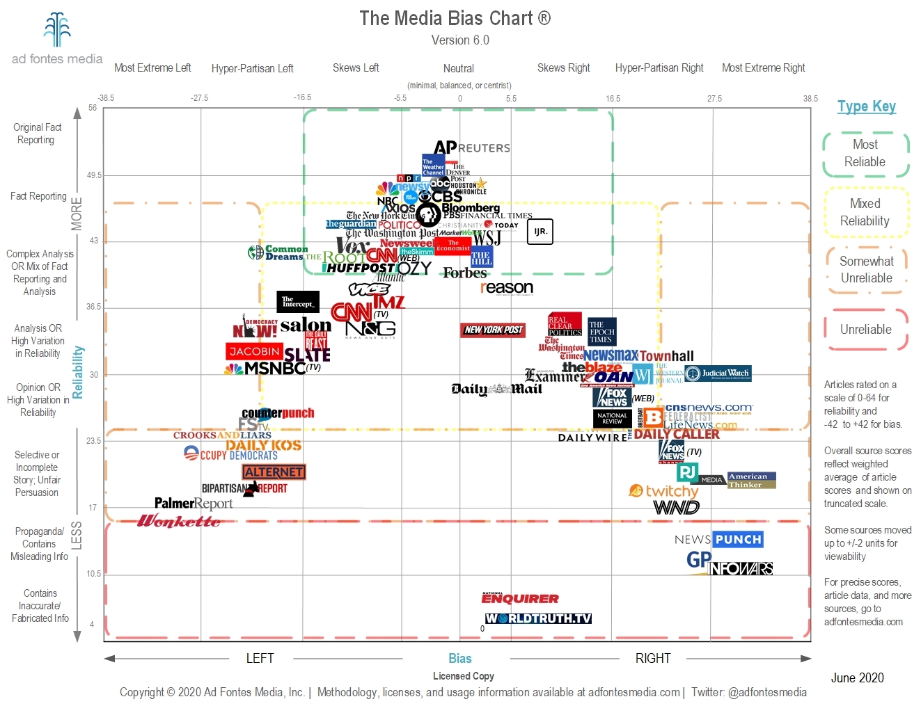
(Courtesy: Ad Fontes)
The Ad Fontes chart rates both reliability and political bias. It scores news sources — around 270 now, and an expected 300 in December — using bias and reliability as coordinates on its chart.
The outlets appear on a spectrum, with seven markers showing a range from “Most Extreme Left” to “Most Extreme Right” along the bias axis, and eight markers showing a range from “Original Fact Reporting” to “Contains Inaccurate/Fabricated Info” along the reliability axis.
The chart is a departure from its first version, back when founder Vanessa Otero, a patent attorney, said she put together a chart by herself as a hobby after seeing Facebook friends fight over the legitimacy of sources during the 2016 election. Otero said that when she saw how popular her chart was, she decided to make bias ratings her full-time job and founded Ad Fontes — Latin for “to the source” — in 2018.
“There were so many thousands of people reaching out to me on the internet about this,” she said. “Teachers were using it in their classrooms as a tool for teaching media literacy. Publishers wanted to publish it in textbooks.”
About 30 paid analysts rate articles for Ad Fontes. Listed on the company’s website, they represent a range of experience — current and former journalists, educators, librarians and similar professionals. The company recruits analysts through its email list and references and vets them through a traditional application process. Hired analysts are then trained by Otero and other Ad Fontes staff.
To start review sessions, a group of coordinators composed of senior analysts and the company’s nine staffers pulls articles from the sites being reviewed. They look for articles listed as most popular or displayed most prominently.
Part of the Ad Fontes analyst political bias test. The test asks analysts to rank their political bias on 18 different policy issues.
Ad Fontes administers an internal political bias test to analysts, asking them to rank their left-to-right position on about 20 policy positions. That information allows the company to attempt to create ideological balance by including one centrist, one left-leaning and one right-leaning analyst on each review panel. The panels review at least three articles for each source, but they may review as many as 30 for particularly prominent outlets, like The Washington Post, Otero said. More on their methodology, including how they choose which articles to review to create a bias rating, can be found here on the Ad Fontes website.
When they review the articles, the analysts see them as they appear online, “because that’s how people encounter all content. No one encounters content blind,” Otero said. The review process recently changed so that paired analysts discuss their ratings over video chat, where they are pushed to be more specific as they form ratings, Otero said.
Individual scores for an article’s accuracy, the use of fact or opinion, and the appropriateness of its headline and image combine to create a reliability score. The bias score is determined by the article’s degree of advocacy for a left-to-right political position, topic selection and omission, and use of language.
To create an overall bias and reliability score for an outlet, the individual scores for each reviewed article are averaged, with added importance given to more popular articles. That average determines where sources show up on the chart.
Ad Fontes details its ratings process in a white paper from August 2019.
While the company mostly reviews prominent legacy news sources and other popular news sites, Otero hopes to add more podcasts and video content to the chart in coming iterations. The chart already rates video news channel “The Young Turks” (which claims to be the most popular online news show with 250 million views per month and 5 million subscribers on YouTube), and Otero mentioned she next wants to examine videos from Prager University (which claims 4 billion lifetime views for its content, has 2.84 million subscribers on YouTube and 1.4 million followers on Instagram). Ad Fontes is working with ad agency Oxford Road and dental care company Quip to create ratings for the top 50 news and politics podcasts on Apple Podcasts, Otero said.
“It’s not strictly traditional news sources, because so much of the information that people use to make decisions in their lives is not exactly news,” Otero said.
She was shocked when academic textbook publishers first wanted to use her chart. Now she wants it to become a household tool.
“As we add more news sources on to it, as we add more data, I envision this becoming a standard framework for evaluating news on at least these two dimensions of reliability and bias,” she said.
She sees complaints about it from both ends of the political spectrum as proof that it works.
“A lot of people love it and a lot of people hate it,” Otero said. “A lot of people on the left will call us neoliberal shills, and then a bunch of people that are on the right are like, ‘Oh, you guys are a bunch of leftists yourselves.’”
The project has grown to include tools for teaching media literacy to school kids and an interactive version of the chart that displays each rated article. Otero’s company operates as a public benefit corporation with a stated public benefit mission: “to make news consumers smarter and news media better.” She didn’t want Ad Fontes to rely on donations.
“If we want to grow with a problem, we have to be a sustainable business. Otherwise, we’re just going to make a small difference in a corner of the problem,” she said.
Ad Fontes makes money by responding to specific research requests from advertisers, academics and other parties that want certain outlets to be reviewed. The company also receives non-deductible donations and operates on WeFunder, a grassroots crowdfunding investment site, to bring in investors. So far, Ad Fontes has raised $163,940 with 276 investors through the site.
Should you use the charts?
Media bias charts with transparent, rigorous methodologies can offer insight into sources’ biases. That insight can help you understand what perspectives sources bring as they share the news. That insight also might help you understand what perspectives you might be missing as a news consumer.
But use them with caution. Political bias isn’t the only thing news consumers should look out for. Reliability is critical, too, and the accuracy and editorial standards of organizations play an important role in sharing informative, useful news.
Media bias charts are a media literacy tool. They offer well-researched appraisals on the bias of certain sources. But to best inform yourself, you need a full toolbox. Check out Poynter’s MediaWise project for more media literacy tools.
This article was originally published on Dec. 14, 2020.
Support high-integrity, independent journalism that serves democracy. Make a gift to Poynter today. The Poynter Institute is a nonpartisan, nonprofit organization, and your gift helps us make good journalism better.
DONATE
https://www.poynter.org/fact-checking/media-literacy/2021/should-you-trust-media-bias-charts/
https://adfontesmedia.com/
https://www.allsides.com/media-bias/media-bias-chart
Kleptocrats: a ruler who uses political power to steal his or her country's resources.
Kleptocracy: government by those who seek chiefly status and personal gain at the expense of the governed.
Join the InvestorsHub Community
Register for free to join our community of investors and share your ideas. You will also get access to streaming quotes, interactive charts, trades, portfolio, live options flow and more tools.

