


Thursday, November 22, 2018 10:22:15 AM
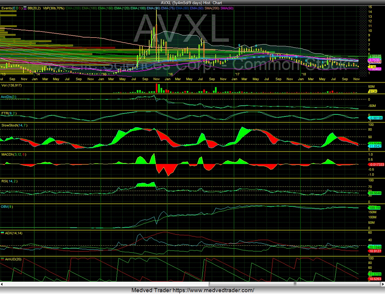
This is a 9 day chart...
Let's pretend it is a daily chart for a minute, what does it look like?
IMO it looks like consolidation. Narrowing bollinger bands and EMA ribbon. Note that the ADX remains largely positive with no major accumulation on the OBV since the index funds entered in late 2016.
Here's the same chart for AMRN as of August 15th of this year. Note that the EMA bands are more dispersed and the 200 (EMA of 9) is pretty much flat. Stock price is trending up.
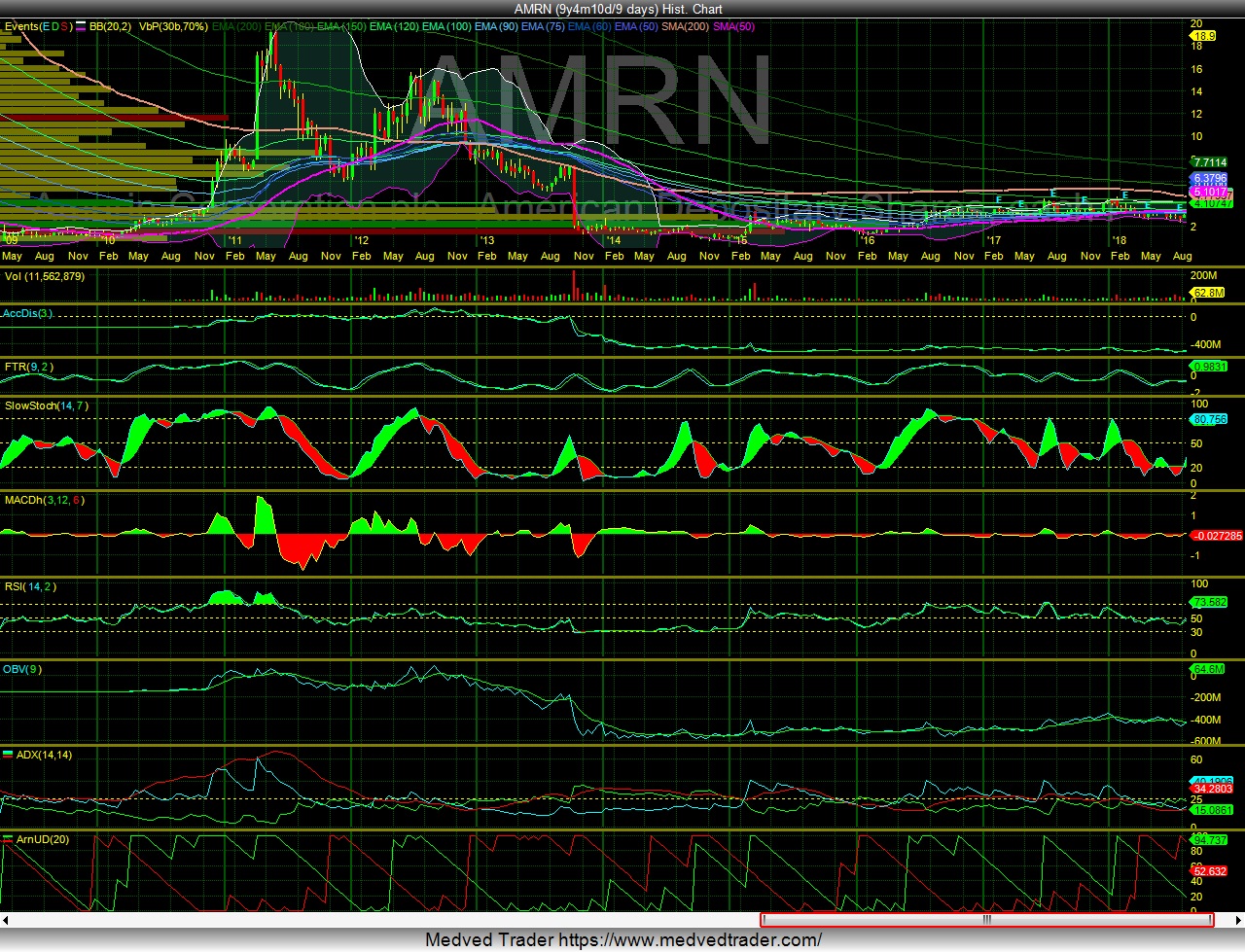
Note the change in institutional holdings:
12/31/13 .5%
12/31/14 18.6%
12/31/15 17.7%
12/31/16 35%
12/31/17 36.7%
06/30/18 39.3%
09/30/18 46.6%
Look at the current chart - interesting that the gap up made the 2011 buy and hold bunch whole...

Another interesting note - the same chart for NVDA - but first look at the 80+ percentage ownership in 2015 that has DECLINED as the stock has gone up. It was close to 90% at the end of March 2016 and currently the figure is 68.65%.


Let's pretend it is a daily chart for a minute, what does it look like?
IMO it looks like consolidation. Narrowing bollinger bands and EMA ribbon. Note that the ADX remains largely positive with no major accumulation on the OBV since the index funds entered in late 2016.

Here's the same chart for AMRN as of August 15th of this year. Note that the EMA bands are more dispersed and the 200 (EMA of 9) is pretty much flat. Stock price is trending up.

Note the change in institutional holdings:
12/31/13 .5%
12/31/14 18.6%
12/31/15 17.7%
12/31/16 35%
12/31/17 36.7%
06/30/18 39.3%
09/30/18 46.6%
Look at the current chart - interesting that the gap up made the 2011 buy and hold bunch whole...

Another interesting note - the same chart for NVDA - but first look at the 80+ percentage ownership in 2015 that has DECLINED as the stock has gone up. It was close to 90% at the end of March 2016 and currently the figure is 68.65%.


In Peace, In War
Recent AVXL News
- Form 8-K - Current report • Edgar (US Regulatory) • 05/22/2026 12:15:26 PM
- Anavex Life Sciences Receives Expected Nasdaq Delinquency Notification • GlobeNewswire Inc. • 05/22/2026 12:00:00 PM
- Form 8-K - Current report • Edgar (US Regulatory) • 05/15/2026 08:15:25 PM
- Form 3 - Initial statement of beneficial ownership of securities • Edgar (US Regulatory) • 05/14/2026 08:15:30 PM
- Form NT 10-Q - Notification of inability to timely file Form 10-Q or 10-QSB • Edgar (US Regulatory) • 05/11/2026 08:30:22 PM
- CEO Transition and Delayed SEC Filing Put Anavex (AVXL) Leadership Changes in Focus • IH Market News • 05/06/2026 02:52:36 PM
- Form 8-K - Current report • Edgar (US Regulatory) • 05/06/2026 11:04:59 AM
- Anavex Life Sciences Board of Directors Appoints Former Senior Vice President of Clinical Development Terrie Kellmeyer, PhD, as Interim Chief Executive Officer • GlobeNewswire Inc. • 05/06/2026 11:00:00 AM
- Form 3 - Initial statement of beneficial ownership of securities • Edgar (US Regulatory) • 05/01/2026 11:18:47 PM
- Anavex Life Sciences Highlights New Scientific Findings on Shared Biology Between Autism and Alzheimer’s Disease • GlobeNewswire Inc. • 04/14/2026 11:30:00 AM
- Anavex Life Sciences to Present at the 25th Annual Needham Virtual Healthcare Conference • GlobeNewswire Inc. • 04/07/2026 11:30:00 AM
- Anavex withdraws EU approval filing for Alzheimer’s therapy • IH Market News • 03/30/2026 12:39:26 PM
- Anavex Life Sciences Provides Comprehensive Regulatory Update • GlobeNewswire Inc. • 03/30/2026 11:30:00 AM
- Form 8-K - Current report • Edgar (US Regulatory) • 03/25/2026 08:06:00 PM
- Anavex withdraws EU marketing application for Alzheimer’s therapy blarcamesine • IH Market News • 03/25/2026 02:06:58 PM
- Anavex Life Sciences Provides Update on Regulatory Review in the EU for Blarcamesine to Treat Early Alzheimer’s Disease • GlobeNewswire Inc. • 03/25/2026 11:30:00 AM
- Anavex Life Sciences Presents New Data from its AD-004 Phase IIb/III Trial at AD/PD 2026 Conference Demonstrating Consistent Correlation Between the Treatment Effect of Oral Blarcamesine and Preservation of Brain Volume in Early Alzheimer’s Disease • GlobeNewswire Inc. • 03/23/2026 11:30:00 AM
- New Scientific Findings Highlight Hypothesis of Autophagy Failure as a Precursor of Amyloid Beta and Tau Pathology in Alzheimer’s Disease • GlobeNewswire Inc. • 03/20/2026 11:30:00 AM
- Anavex Life Sciences Presents Significant Treatment Effects of Blarcamesine in New Advanced Alpha-Synuclein Model of Parkinson’s Disease at AD/PD 2026 Conference • GlobeNewswire Inc. • 03/17/2026 11:30:00 AM
- Anavex Life Sciences to Present at the Citizens Life Sciences Conference • GlobeNewswire Inc. • 03/03/2026 12:30:00 PM
- Anavex Life Sciences to Present at the 46th TD Cowen Annual Health Care Conference • GlobeNewswire Inc. • 02/25/2026 12:30:00 PM
- Form 8-K - Current report • Edgar (US Regulatory) • 02/25/2026 11:07:01 AM
- Anavex Life Sciences Appoints Seasoned Healthcare Leader to Board of Directors • GlobeNewswire Inc. • 02/23/2026 12:30:00 PM
- Form 10-Q - Quarterly report [Sections 13 or 15(d)] • Edgar (US Regulatory) • 02/09/2026 09:40:27 PM
- Form 8-K - Current report • Edgar (US Regulatory) • 02/09/2026 12:31:17 PM


