


Friday, May 26, 2017 7:32:08 PM
2 AMFE charts showing strong supports:
AMFE 50 Day Chart and AMFE Bollinger Band Chart with commentary below.
The 50 Day Moving Average Chart
The first chart shows the last 50 days of trading. As Rocketstocks has pointed out, each passing day, we see one of the lower moving averages drop off, resulting in a rising 50 day moving average. There are 6 more days of .02’s falling off the 50 day moving average. And on top of that, another 8 days of low .03’s will drop off after that. So for another 14 trading days, the 50 day moving average will continue rising. And then some…just pointing out the lower price points for now.
Going further back, one can see the 50 day rarely gets tested, but when it has…the price per share has easily moved off this area of support and trended higher in the days ahead. A rising 50 day moving average is bullish. I use the 50, and even the 200 for the longer trend, as I see AMFE as a long hold. Both are moving in the direction any long investor wants to see.
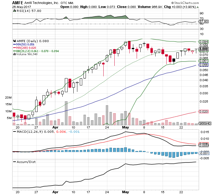
The Bollinger Band Chart
Looking at the lower bollinger band, one can see this has acted just as strongly of a support level as the 50 day moving average, and more recently a stronger support. Also take notice of the channel when the bands narrow and what follows. The bollinger bands have once again started to narrow. We may stay in this channel for a little longer, but based on the past patterns, I expect to break out of the current channel, just as we did the last two times.
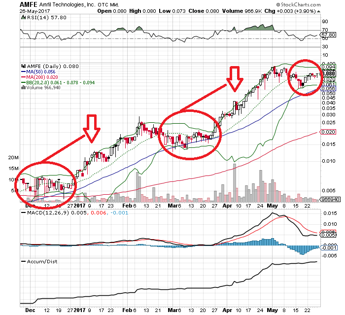
There are a number of other bullish technicals that are set up nicely that can be pointed out at various levels in the charts…A/D line, RSI, and MACD are some of the easy examples one can spot.
If you’re a technical trader, this chart is beautiful. If you’re not, but read this, thanks I guess ?
Go AMFE
Rec


