 News
News  Market Data
  Discover
Support: 888-992-3836
Copyright © 2023 InvestorsHub Inc.


Nilbud
![]()
![]()
Register for free to join our community of investors and share your ideas. You will also get access to streaming quotes, interactive charts, trades, portfolio, live options flow and more tools.
Register for free to join our community of investors and share your ideas. You will also get access to streaming quotes, interactive charts, trades, portfolio, live options flow and more tools.
Falling SAR
Prior SAR: The SAR value for the previous period.
Extreme Point (EP): The lowest low of the current downtrend.
Acceleration Factor (AF): Starting at .02, AF increases by .02 each
time the extreme point makes a new low. AF can reach a maximum
of .20, no matter how long the downtrend extends.
Current SAR = Prior SAR - Prior AF(Prior SAR - Prior EP)
9-Feb-10 SAR = 43.56 = 43.84 - .16(43.84 - 42.07)
The Acceleration Factor is multiplied by the difference between the
Prior period's SAR and the Extreme Point. This is then subtracted
from the prior period's SAR. Note however that SAR can never be
below the prior two periods' highs. Should SAR be below one of
those highs, use the highest of the two for SAR.


Rising SAR
Prior SAR: The SAR value for the previous period.
Extreme Point (EP): The highest high of the current uptrend.
Acceleration Factor (AF): Starting at .02, AF increases by .02 each
time the extreme point makes a new high. AF can reach a maximum
of .20, no matter how long the uptrend extends.
Current SAR = Prior SAR + Prior AF(Prior EP - Prior SAR)
13-Apr-10 SAR = 48.28 = 48.13 + .14(49.20 - 48.13)
The Acceleration Factor is multiplied by the difference between the
Extreme Point and the prior period's SAR. This is then added to the
prior period's SAR. Note however that SAR can never be above the
prior two periods' lows. Should SAR be above one of those lows, use
the lowest of the two for SAR.


Calculation
Calculation of SAR is complex with if/then variables that make it difficult to put in a spreadsheet. These examples will provide a general idea of how SAR is calculated. Because the formulas for rising and falling SAR are different, it is easier to divide the calculation into two parts. The first calculation covers rising SAR and the second covers falling SAR.
Parabolic SAR
Introduction
Developed by Welles Wilder, the Parabolic SAR refers to a price and time based trading system. Wilder called this the "Parabolic Time/Price System". SAR stands for "stop and reverse", which is the actual indicator used in the system. SAR trails price as the trend extends over time. The indicator is below prices when prices are rising and above prices when prices are falling. In this regard, the indicator stops and reverses when the price trend reverses and breaks above or below the indicator.
Wilder introduced the Parabolic Time/Price System in his 1978 book, New Concepts in Technical Trading Systems. This book also includes RSI, Average True Range and the Directional Movement Concept (ADX). Despite being developed before the computer age, Wilder's indicators have stood the test of time and remain extremely popular.

Conclusions
Keltner Channels are a trend following indicator designed to identify the underlying trend. Trend identification is more than half the battle. The trend can be up, down or flat. Using the methods described above, traders and investors can identify the trend to establish a trading preference. Bullish trades are favored in an uptrend and bearish trades are favored in a downtrend. A flat trend requires a more nimble approach because prices often peak at the upper channel line and trough at the lower channel line. As with all analysis techniques, Keltner Channels should be used in conjunction with other indicators and analysis. Momentum indicators offer a good complement to the trend-following Keltner Channels.
Flat Trend
Once a trading range or flat trading environment has been identified, traders can use the Keltner Channels to identify overbought and oversold levels. A trading range can be identified with a flat moving average and the Average Directional Index (ADX). The chart below shows IBM fluctuating between support in the 120-122 area and resistance in the 130-132 area from February to late September. The 20-day EMA, middle line, lagged price action, but flattened out from April to September.
The indicator window shows ADX (black line) confirming a weak trend. Low and falling ADX shows a weak trend. High and rising ADX shows a strong trend. ADX was below 40 the entire time and below 30 most of the time. This reflects the absence of trend. Also, notice that ADX peaked in early June and fell until late August.

Armed with the prospects of a weak trend and trading range, traders can use Keltner Channels to anticipate reversals. In addition, notice that the channel lines often coincide with chart support and resistance. IBM dipped below the lower channel line three times from late May until late August. These dips provided low-risk entry points. The stock did not manage to reach the upper channel line, but did get close as it reversed in the resistance zone. The Disney chart shows a similar situation.

Downtrend
The second chart shows Nvidia (NVDA) starting a downtrend with a sharp decline below the lower channel line. After this initial break, the stock met resistance near the 20-day EMA (middle line) from mid May until early August. The inability to even come close to the upper channel line showed strong downside pressure.

A 10-period Commodity Channel Index (CCI) is shown as the momentum oscillator to identify short-term overbought conditions. A move above 100 is considered overbought. A subsequent move back below 100 signals a resumption of the downtrend. This signal worked well until September. These failed signals indicated a possible trend change that was subsequently confirmed with a break above the upper channel line.
Uptrend
The chart below shows Archer Daniels Midland (ADM) starting an uptrend as the Keltner Channels turn up and the stock surges above the upper channel line. ADM was in a clear downtrend in April-May as prices continued to pierce the lower channel. With a strong thrust up in June, prices exceeded the upper channel and the channel turned up to start a new uptrend. Notice that prices held above the lower channel on dips in early and late July.

Even with a new uptrend established, it is often prudent to wait for a pullback or better entry point to improve the reward-to-risk ratio. Momentum oscillators or other indicators can then be employed to define oversold readings. This chart shows StochRSI, one of the more sensitive momentum oscillators, dipping below .20 to become oversold at least three times during the uptrend. The subsequent crosses back above .20 signaled a resumption of the uptrend.
Versus Bollinger Bands
There are two differences between Keltner Channels and Bollinger Bands. First, Keltner Channels are smoother than Bollinger Bands because the width of the Bollinger Bands is based on the standard deviation, which is more volatile than the Average True Range (ATR). Many consider this a plus because it creates a more constant width. This makes Keltner Channels well suited for trend following and trend identification. Second, Keltner Channels also use an exponential moving average, which is more sensitive than the simple moving average used in Bollinger Bands. The chart below shows Keltner Channels (blue), Bollinger Bands (pink), Average True Range (10), Standard Deviation (10) and Standard Deviation (20) for comparison. Notice how the Keltner Channels are smoother than the Bollinger Bands. Also notice how the Standard Deviation covers a larger range than the Average True Range (ATR).

Interpretation
Indicators based on channels, bands and envelopes are designed to encompass most price action. Therefore, moves above or below the channel lines warrant attention because they are relatively rare. Trends often start with strong moves in one direction or another. A surge above the upper channel line shows extraordinary strength, while a plunge below the lower channel line shows extraordinary weakness. Such strong moves can signal the end of one trend and the beginning of another.
With an exponential moving average as its foundation, Keltner Channels are a trend following indicator. As with moving averages and trend following indicators, Keltner Channels lag price action. The direction of the moving average dictates the direction of the channel. In general, a downtrend is present when the channel moves lower, while an uptrend exists when the channel moves higher. The trend is flat when the channel moves sideways.
A channel upturn and break above the upper trendline can signal the start of an uptrend. A channel downturn and break below the lower trendline can signal the start a downtrend. Sometimes a strong trend does not take hold after a channel breakout and prices oscillate between the channel lines. Such trading ranges are marked by a relatively flat moving average. The channel boundaries can then be used to identify overbought and oversold levels for trading purposes.
Calculation
There are three steps to calculating Keltner Channels. First, select the length for the exponential moving average. Second, choose the time periods for the Average True Range (ATR). Third, choose the multiplier for the Average True Range.
Middle Line: 20-day exponential moving average
Upper Channel Line: 20-day EMA + (2 x ATR(10))
Lower Channel Line: 20-day EMA - (2 x ATR(10)
Because moving averages lag price, a longer moving average will have more lag and a shorter moving average will have less lag. ATR is the basic volatility setting. Short timeframes, such as 10, produce a more volatile ATR that fluctuates as 10-period volatility ebbs and flows. Longer timeframes, such a 100, smooth these fluctuations to produce a more constant ATR reading. The multiplier has the most affect on the channel width. Simply changing from 2 to 1 will cut channel width in half. Increasing from 2 to 3 will increase channel width by 50%.

The chart above shows the default Keltner Channels in red, a wider channel in blue and a narrower channel in green. The blue channels were set three Average True Range values above and below (3 x ATR). The green channels used one ATR value. All three share the 20-day EMA, which is the dotted line in the middle. The indicator windows show differences in the Average True Range (ATR) for 10 periods, 50 periods and 100 periods. Notice how the short ATR (10) is more volatile and has the widest range. In contrast, 100-period ATR is much smoother with a less volatile range.
Keltner Channels
Introduction
Keltner Channels are volatility-based envelopes set above and below an exponential moving average. This indicator is similar to Bollinger Bands, which use the standard deviation to set the bands. Instead of using the standard deviation, Keltner Channels use the Average True Range (ATR) to set channel distance. The channels are typically set two Average True Range values above and below the 20-day EMA. The exponential moving average dictates direction and the Average True Range sets channel width. Keltner Channels are a trend following indicator used to identify reversals with channel breakouts and channel direction. Channels can also be used to identify overbought and oversold levels when the trend is flat.
In his 1960 book, How to Make Money in Commodities, Chester Keltner introduced the "Ten-Day Moving Average Trading Rule," which is credited as the original version of Keltner Channels. This original version started with a 10-day SMA of the typical price {(H+L+C)/3)} as the centerline. The 10-day SMA of the High-Low range was added and subtracted to set the upper and lower channel lines. Linda Bradford Raschke introduced the newer version of Keltner Channels in the 1980s. Like Bollinger Bands, this new version used a volatility based indicator, Average True Range (ATR), to set channel width. StockCharts.com uses this newer version of Keltner Channels.
Conclusions
The Ichimoku Cloud is a comprehensive indicator designed to produce clear signals. Chartists can first determine the trend by using the Cloud. Once the trend is established, appropriate signals can be determined using the price plot, Conversion Line and Base Line. The classic signal is to look for the Conversion Line to cross the Base Line. While this signal can be effective, it can also be rare in a strong trend. More signals can be found by looking for price to cross the Base Line (of even the Conversion Line).
It is important to look for signals in the direction of the bigger trend. With the Cloud offering support in an uptrend, traders should also be on alert for bullish signals when prices approach the Cloud on a pullback or consolidation. Conversely, in a bigger downtrend, traders should be on alert for bearish signals when prices approach the Cloud on an oversold bounce or consolidation.
The Ichimoku Cloud can also be used in conjunction with other indicators. Traders can identify the trend using the Cloud and then use classic momentum oscillators to identify overbought or oversold conditions
Bearish Signals:
Price moves below Cloud (trend)
Cloud turns from green to red (ebb-flow within trend)
Price Moves below Base Line (momentum)
Conversion Line moves below Base Line (momentum)
Bullish Signals:
Price moves above Cloud (trend)
Cloud turns from red to green (ebb-flow within trend)
Price Moves above the Base Line (momentum)
Conversion Line moves above Base Line (momentum)
Signal Summary
This article features four bullish and four bearish signals derived from the Ichimoku Cloud plots. The trend-following signals focus on the Cloud, while the momentum signals focus on the Turning and Base Lines. In general, movements above or below the cloud define the overall trend. Within that trend, the Cloud changes color as the trend ebbs and flows. Once the trend is identified, the Conversion Line and Base Line act similar to MACD for signal generation. And finally, simple price movements above or below the Base Line can be used to generate signals.
Price-Base Line Signals
Chart 6 shows Disney producing two bullish signals within an uptrend. With the stock trading above the green cloud, prices moved below the Base Line (red) to enable the setup. This move represented a short-term oversold situation within a bigger uptrend. The pullback ended when prices moved back above the Base Line to trigger the bullish signal.

Chart 7 shows DR Horton (DHI) producing two bearish signals within a downtrend. With the stock trading below the red cloud, prices bounced above the Base Line (red) to enable the setup. This move created a short-term overbought situation within a bigger downtrend. The bounce ended when prices moved back below the Base Line to trigger the bearish signal.

Conversion-Base Line Signals
Chart 4 shows Kimberly Clark (KMB) producing two bullish signals within an uptrend. First, the trend was up because the stock was trading above the Cloud and the Cloud was green. The Conversion Line dipped below the Base Line for a few days in late June to enable the setup. A bullish crossover signal was triggered when the Conversion Line moved back above the Base Line in July. The second signal occurred as the stock moved towards Cloud support. The Conversion Line moved below the Base Line in September to enable the setup. Another bullish crossover signal was triggered when the Conversion Line moved back above the Base Line in October. Sometimes it is hard to determine exact Conversion Line and Base Line levels on the price chart. For reference, these numbers are displayed in the upper left hand corner of each chart. As of the January 8 close, the Conversion Line was 62.62 (blue) and the Base Line was 63.71 (red).

Chart 5 shows AT&T (T) producing a bearish signal within a downtrend. First, the trend was down as the stock was trading below the Cloud and the Cloud was red. After a sideways bounce in August, the Conversion Line moved above the Base Line to enable the setup. This did not last long as the Conversion Line moved back below the Base Line to trigger a bearish signal on September 15th.

Trend and Signals
Price, the Conversion Line and the Base Line are used to identify faster, and more frequent, signals. It is important to remember that bullish signals are reinforced when prices are above the cloud and the cloud is green. Bearish signals are reinforced when prices are below the cloud and the cloud is red. In other words, bullish signals are preferred when the bigger trend is up (prices above green cloud), while bearish signals are preferred when the bigger trend is down (prices are below red cloud). This is the essence of trading in the direction of the bigger trend. Signals that are counter to the existing trend are deemed weaker. Short-term bullish signals within a long-term downtrend and short-term bearish signals within a long-term uptrend are less robust.
Ichimoku Clouds
Introduction
The Ichimoku Cloud, also known as Ichimoku Kinko Hyo, is a versatile indicator that defines support and resistance, identifies trend direction, gauges momentum and provides trading signals. Ichimoku Kinko Hyo translates into "one look equilibrium chart". With one look, chartists can identify the trend and look for potential signals within that trend. The indicator was developed by Goichi Hosoda, a journalist, and published in his 1969 book. Even though the Ichimoku Cloud may seem complicated when viewed on the price chart, it is really a straight forward indicator that is very usable. It was, after all, created by a journalist, not a rocket scientist! Moreover, the concepts are easy to understand and the signals are well-defined.
Calculation
Four of the five plots within the Ichimoku Cloud are based on the average of the high and low over a given period of time. For example, the first plot is simply an average of the 9-day high and 9-day low. Before computers were widely available, it would have been easier to calculate this high-low average rather than a 9-day moving average. The Ichimoku Cloud consists of five plots:
Tenkan-sen (Conversion Line): (9-period high + 9-period low)/2))
The default setting is 9 periods and can be adjusted. On a daily
chart, this line is the mid point of the 9 day high-low range,
which is almost two weeks.
Kijun-sen (Base Line): (26-period high + 26-period low)/2))
The default setting is 26 periods and can be adjusted. On a daily
chart, this line is the mid point of the 26 day high-low range,
which is almost one month).
Senkou Span A (Leading Span A): (Conversion Line + Base Line)/2))
This is the midpoint between the Conversion Line and the Base Line.
The Leading Span A forms one of the two Cloud boundaries. It is
referred to as "Leading" because it is plotted 26 periods in the future
and forms the faster Cloud boundary.
Senkou Span B (Leading Span B): (52-period high + 52-period low)/2))
On the daily chart, this line is the mid point of the 52 day high-low range,
which is a little less than 3 months. The default calculation setting is
52 periods, but can be adjusted. This value is plotted 26 periods in the future
and forms the slower Cloud boundary.
Chikou Span (Lagging Span): Close plotted 26 days in the past
The default setting is 26 periods, but can be adjusted.
This tutorial will use the English equivalents when explaining the various plots. The chart below shows the Dow Industrials with the Ichimoku Cloud plots. The Conversion Line (blue) is the fastest and most sensitive line. Notice that it follows price action the closest. The Base Line (red) trails the faster Conversion Line, but follows price action pretty well. The relationship between the Conversion Line and Base Line is similar to the relationship between a 9-day moving average and 26-day moving average. The 9-day is faster and more closely follows the price plot. The 26-day is slower and lags behind the 9-day. Incidentally, notice that 9 and 26 are the same periods used to calculate MACD.

Analyzing the Cloud
The Cloud (Kumo) is the most prominent feature of the Ichimoku Cloud plots. The Leading Span A (green) and Leading Span B (red) form the Cloud. The Leading Span A is the average of the Conversion Line and the Base Line. Because the Conversion Line and Base Line are calculated with 9 and 26 periods, respectively, the green Cloud boundary moves faster than the red Cloud boundary, which is the average of the 52-day high and the 52-day low. It is the same principle with moving averages. Shorter moving averages are more sensitive and faster than longer moving averages.
There are two ways to identify the overall trend using the Cloud. First, the trend is up when prices are above the Cloud, down when prices are below the Cloud and flat when prices are in the Cloud. Second, the uptrend is strengthened when the Leading Span A (green cloud line) is rising and above the Leading Span B (red cloud line). This situation produces a green Cloud. Conversely, a downtrend is reinforced when the Leading Span A (green cloud line) is falling and below the Leading Span B (red cloud line). This situation produces a red Cloud. Because the Cloud is shifted forward 26 days, it also provides a glimpse of future support or resistance.
Chart 2 shows IBM with a focus on the uptrend and the Cloud. First, notice that IBM was in an uptrend from June to January as it traded above the Cloud. Second, notice how the Cloud offered support in July, early October and early November. Third, notice how the Cloud provides a glimpse of future resistance. Remember, the entire Cloud is shifted forward 26 days. This means it is plotted 26 days ahead of the last price point to indicate future support or resistance.

Chart 3 shows Boeing (BA) with a focus on the downtrend and the cloud. The trend changed when Boeing broke below Cloud support in June. The Cloud changed from green to red when the Leading Span A (green) moved below the Leading Span B (red) in July. The cloud break represented the first trend change signal, while the color change represented the second trend change signal. Notice how the Cloud then acted as resistance in August and January.

Walking the Bands
Moves above or below the bands are not signals as such. As Bollinger puts it, moves that touch or exceed the bands are not signals, but rather "tags". On the face of it, a move to the upper band shows strength, while a sharp move to the lower band shows weakness. Momentum oscillators work much the same way. Overbought is not necessarily bullish. It takes strength to reach overbought levels and overbought conditions can extend in a strong uptrend. Similarly, prices can "walk the band" with numerous touches during a strong uptrend. Think about it for a moment. The upper band is 2 standard deviations above the 20-period simple moving average. It takes a pretty strong price move to exceed this upper band. An upper band touch that occurs after a Bollinger Band confirmed W-Bottom would signal the start of an uptrend. Just as a strong uptrend produces numerous upper band tags, it is also common for prices to never reach the lower band during an uptrend. The 20-day SMA sometimes acts as support. In fact, dips below the 20-day SMA sometimes provide buying opportunities before the next tag of the upper band.

The chart above shows Air Products (APD) with a surge and close above the upper band in mid July. First, notice that this is a strong surge that broke above two resistance levels. A strong upward thrust is a sign of strength, not weakness. Trading turned flat in August and the 20-day SMA moved sideways. The Bollinger Bands narrowed, but APD did not close below the lower band. Prices, and the 20-day SMA, turned up in September. Overall, APD closed above the upper band at least five times over a four month period. The indicator window shows the 10-period Commodity Channel Index (CCI). Dips below -100 are deemed oversold and moves back above -100 signal the start of an oversold bounce (green dotted line). The upper band tag and breakout started the uptrend. CCI then identified tradable pullbacks with dips below -100. This is an example of combining Bollinger Bands with a momentum oscillator for trading signals.
M-Tops Using Bollinger Bands
M-Tops were also part of Arthur Merrill's work that identified 16 patterns with a basic M shape. Bollinger uses these various M patterns with Bollinger Bands to identify M Bottoms. According to Bollinger, tops are usually more complicated and drawn out than bottoms. Double tops, head-and-shoulders patterns and diamonds represent evolving tops.
In its most basic form, an M-Top is similar to a double top. However, the reaction highs are not always equal. The first high can be higher or lower than the second high. Bollinger suggests looking for signs of non-confirmation when a security is making new highs. This is basically the opposite of the W-Bottom. A non-confirmation occurs with three steps. First, a security forges a reaction high above the upper band. Second, there is a pullback towards the middle band. Third, prices move above the prior high, but fail to reach the upper band. This is a warning sign. The inability of the second reaction high to reach the upper band shows waning momentum, which can foreshadow a trend reversal. Final confirmation comes with a support break or bearish indicator signal.

The chart shows Exxon Mobil (XOM) with an M-Top in April-May 2008. The stock moved above the upper band in April. There was a pullback in May and then another push above 90. Even though the stock moved above the upper band on an intraday basis, it did not CLOSE above the upper band. The M-Top was confirmed with a support break two weeks later. Also notice that MACD formed a bearish divergence and moved below its signal line for confirmation.
W-Bottoms Using Bollinger Bands
W-Bottoms were part of Arthur Merrill's work that identified 16 patterns with a basic W shape. Bollinger uses these various W patterns with Bollinger Bands to identify W-Bottoms. A "W-Bottom" forms in a downtrend and involves two reaction lows. In particular, Bollinger looks for W-Bottoms where the second low is lower than the first, but holds above the lower band. There are four steps to confirm a W-Bottom with Bollinger Bands. First, a reaction low forms. This low is usually, but not always, below the lower band. Second, there is a bounce towards the middle band. Third, there is a new price low in the security. This low holds above the lower band. The ability to hold above the lower band on the test shows less weakness on the last decline. Fourth, the pattern is confirmed with a strong move off the second low and a resistance break.

Nordstrom (JWN) with a W-Bottom in January-February 2010. First, the stock formed a reaction low in January (black arrow) and broke below the lower band. Second, there was a bounce back above the middle band. Third, the stock moved below its January low and held above the lower band. Even though the 5-Feb spike low broke the lower band, Bollinger Bands are calculated using closing prices so signals should also be based on closing prices. Fourth, the stock surged with expanding volume in late February and broke above the early February high.
Bollinger Bands aka Bollies
Developed by John Bollinger, Bollinger Bands® are volatility bands placed above and below a moving average. You will find that most of the time stocks will trade within the Bollies. Volatility is based on the standard deviation, which changes as volatility increases and decreases. The bands widen when volatility increases and narrow when volatility decreases. This dynamic nature of Bollinger Bands also means they can be used on different securities with the standard settings.
Note: Bollinger Bands® is a registered trademark of John Bollinger.
Below is a chart showing Bollinger Bands:
Pink line is the Upper Bollie or UBB
Blue line is the Lower Bollie or LBB
White line is the Middle Bollie or 20 SMA
Note how during the down trend the price stayed between the Lower & Middle Bollie. Once the price went above the middle bollie the downward trend was broken.

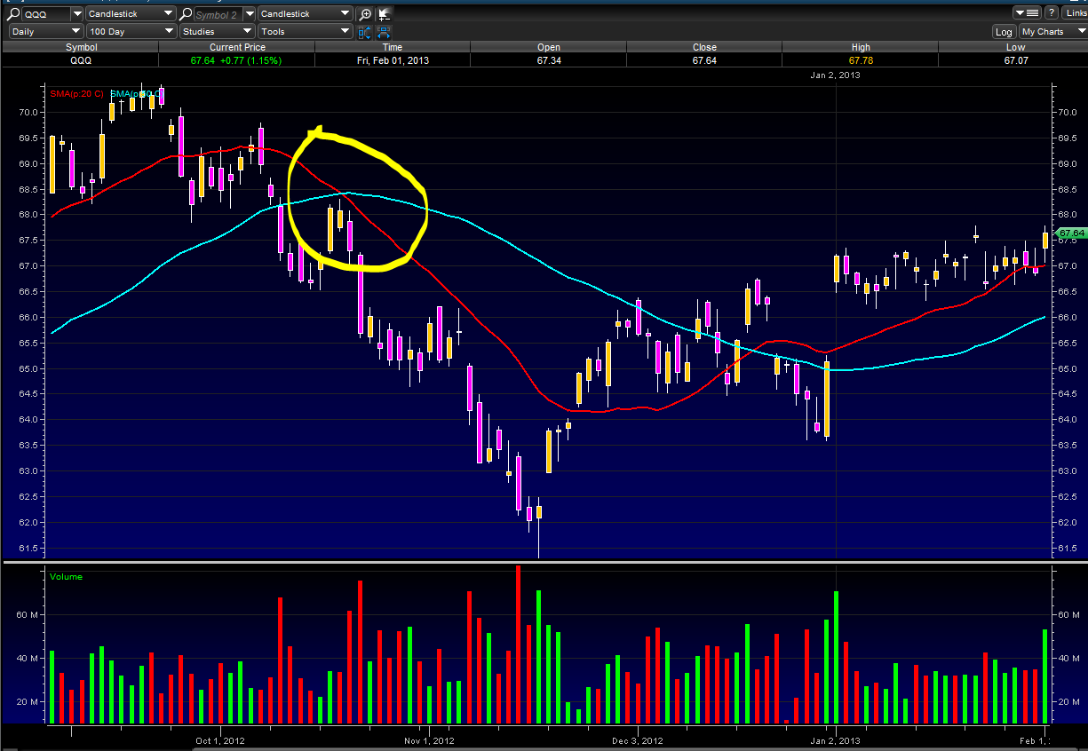
Death Cross
A Death Cross is when a shorter term moving average crosses below a longer term moving average, for example a 20 day SMA crossing under a 50 day SMA. A death cross indicates a bearish trend, especially when it is coupled with higher trading volume. As well as being a trend indicator, the longer term moving average becomes a resistance line as the price rises.
The chart below shows a 20/50 SMA Death cross:
20 SMA is in Red
50 SMA is in Blue
Golden Cross
A Golden Cross is when a shorter term moving average crosses above a longer term moving average, for example a 20 day SMA crossing over a 50 day SMA. A golden cross indicates a bullish trend, especially when it is coupled with higher trading volume. As well as being a trend indicator, the longer term moving average becomes a support line as the price rises.
The chart below shows a 20/50 SMA Golden cross:
20 SMA is in Red
50 SMA is in Blue

///
Using Moving Averages to Find Support and Resistance
Moving averages can also act as support in an uptrend and resistance in a downtrend. A short-term uptrend might find support near the 20-day simple moving average, which is also used in Bollinger Bands. A long-term uptrend might find support near the 200-day simple moving average, which is the most popular long-term moving average. If fact, the 200-day moving average may offer support or resistance simply because it is so widely used. It is almost like a self-fulfilling prophecy.

The chart above shows the NY Composite with the 200-day simple moving average from mid 2004 until the end of 2008. The 200-day provided support numerous times during the advance. Once the trend reversed with a double top support break, the 200-day moving average acted as resistance around 9500.
Do not expect exact support and resistance levels from moving averages, especially longer moving averages. Markets are driven by emotion, which makes them prone to overshoots. Instead of exact levels, moving averages can be used to identify support or resistance zones.
Price Crossovers using Moving Averages
Moving averages can also be used to generate signals with simple price crossovers. A bullish signal is generated when prices move above the moving average. A bearish signal is generated when prices move below the moving average. Price crossovers can be combined to trade within the bigger trend. The longer moving average sets the tone for the bigger trend and the shorter moving average is used to generate the signals. One would look for bullish price crosses only when prices are already above the longer moving average. This would be trading in harmony with the bigger trend. For example, if price is above the 200-day moving average, chartists would only focus on signals when price moves above the 50-day moving average. Obviously, a move below the 50-day moving average would precede such a signal, but such bearish crosses would be ignored because the bigger trend is up. A bearish cross would simply suggest a pullback within a bigger uptrend. A cross back above the 50-day moving average would signal an upturn in prices and continuation of the bigger uptrend.
The next chart shows Emerson Electric (EMR) with the 50-day EMA and 200-day EMA. The stock moved above and held above the 200-day moving average in August. There were dips below the 50-day EMA in early November and again in early February. Prices quickly moved back above the 50-day EMA to provide bullish signals (green arrows) in harmony with the bigger uptrend. MACD(1,50,1) is shown in the indicator window to confirm price crosses above or below the 50-day EMA. The 1-day EMA equals the closing price. MACD(1,50,1) is positive when the close is above the 50-day EMA and negative when the close is below the 50-day EMA.

Moving Averages - Double Crossovers
Two moving averages can be used together to generate crossover signals. In Technical Analysis of the Financial Markets, John Murphy calls this the "double crossover method". Double crossovers involve one relatively short moving average and one relatively long moving average. As with all moving averages, the general length of the moving average defines the timeframe for the system. A system using a 5-day EMA and 35-day EMA would be deemed short-term. A system using a 50-day SMA and 200-day SMA would be deemed medium-term, perhaps even long-term.
A bullish crossover occurs when the shorter moving average crosses above the longer moving average. This is also known as a golden cross. A bearish crossover occurs when the shorter moving average crosses below the longer moving average. This is known as a dead cross.
Moving average crossovers produce relatively late signals. After all, the system employs two lagging indicators. The longer the moving average periods, the greater the lag in the signals. These signals work great when a good trend takes hold. However, a moving average crossover system will produce lots of whipsaws in the absence of a strong trend.
There is also a triple crossover method that involves three moving averages. Again, a signal is generated when the shortest moving average crosses the two longer moving averages. A simple triple crossover system might involve 5-day, 10-day and 20-day moving averages.

The chart above shows Home Depot (HD) with a 10-day EMA (green dotted line) and 50-day EMA (red line). The black line is the daily close. Using a moving average crossover would have resulted in three whipsaws before catching a good trade. The 10-day EMA broke below the 50-day EMA in late October (1), but this did not last long as the 10-day moved back above in mid November (2). This cross lasted longer, but the next bearish crossover in January (3) occurred near late November price levels, resulting in another whipsaw. This bearish cross did not last long as the 10-day EMA moved back above the 50-day a few days later (4). After three bad signals, the fourth signal foreshadowed a strong move as the stock advanced over 20%.
There are two takeaways here. First, crossovers are prone to whipsaw. A price or time filter can be applied to help prevent whipsaws. Traders might require the crossover to last 3 days before acting or require the 10-day EMA to move above/below the 50-day EMA by a certain amount before acting. Second, MACD can be used to identify and quantify these crossovers. MACD (10,50,1) will show a line representing the difference between the two exponential moving averages. MACD turns positive during a golden cross and negative during a dead cross. The Percentage Price Oscillator (PPO) can be used the same way to show percentage differences. Note that MACD and the PPO are based on exponential moving averages and will not match up with simple moving averages.

This chart shows Oracle (ORCL) with the 50-day EMA, 200-day EMA and MACD(50,200,1). There were four moving average crossovers over a 2 1/2 year period. The first three resulted in whipsaws or bad trades. A sustained trend began with the fourth crossover as ORCL advanced to the mid 20s. Once again, moving average crossovers work great when the trend is strong, but produce losses in the absence of a trend.
Trend Identification Using Moving Averages
The same signals can be generated using simple or exponential moving averages. As noted above, the preference depends on each individual. These examples below will use both simple and exponential moving averages. The term "moving average" applies to both simple and exponential moving averages.
The direction of the moving average conveys important information about prices. A rising moving average shows that prices are generally increasing. A falling moving average indicates that prices, on average, are falling. A rising long-term moving average reflects a long-term uptrend. A falling long-term moving average reflects a long-term downtrend.

The chart above shows 3M (MMM) with a 150-day exponential moving average. This example shows just how well moving averages work when the trend is strong. The 150-day EMA turned down in November 2007 and again in January 2008. Notice that it took a 15% decline to reverse the direction of this moving average. These lagging indicators identify trend reversals as they occur (at best) or after they occur (at worst). MMM continued lower into March 2009 and then surged 40-50%. Notice that the 150-day EMA did not turn up until after this surge. Once it did, however, MMM continued higher the next 12 months. Moving averages work brilliantly in strong trends.
Moving Average Lengths and Timeframes
The length of the moving average depends on the analytical objectives. Short moving averages (5-20 periods) are best suited for short-term trends and trading. Chartists interested in medium-term trends would opt for longer moving averages that might extend 20-60 periods. Long-term investors will prefer moving averages with 100 or more periods.
Some moving average lengths are more popular than others. The 200-day moving average is perhaps the most popular. Because of its length, this is clearly a long-term moving average. Next, the 50-day moving average is quite popular for the medium-term trend. Many chartists use the 50-day and 200-day moving averages together. Short-term, a 10-day moving average was quite popular in the past because it was easy to calculate. One simply added the numbers and moved the decimal point.
Simple vs Exponential Moving Averages
Even though there are clear differences between simple moving averages and exponential moving averages, one is not necessarily better than the other. Exponential moving averages have less lag and are therefore more sensitive to recent prices - and recent price changes. Exponential moving averages will turn before simple moving averages. Simple moving averages, on the other hand, represent a true average of prices for the entire time period. As such, simple moving averages may be better suited to identify support or resistance levels.
Moving average preference depends on objectives, analytical style and time horizon. Chartists should experiment with both types of moving averages as well as different timeframes to find the best fit.
Below is an example of a chart with both the SMA & EMA plotted, so you can see the difference.
The SMA is in Yellow
The EMA is in Red

Simple Moving Average or (SMA)
The SMA does not predict the price direction but it smooths out the price action to give a trend indication.
Moving averages are lagging indicators because they are based on past prices. Despite this lag, moving averages help smooth price action and filter out the noise. They are also used to form the building blocks for many other technical indicators and overlays, such as Bollinger Bands, MACD and the McClellan Oscillator. Moving averages can be used to identify the direction of the trend or define potential support and resistance levels.
Here's a chart with a 5 day SMA on it:
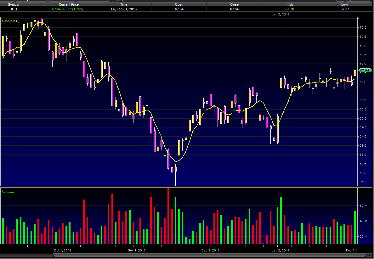
A simple moving average is made by calculating the average price of a security over a specific number of closing costs. The SMA will reflect the average closing cost, based on the time line of the chart you are looking at. i.e.: A 5 SMA on a daily chart will plot a line showing the average closing daily price, on a 60 minute chart that 5 SMA will plot a line showing the average hourly closing price. If the closing price changes so too does the SMA, hence the Moving part of Simple Moving Average. Old data is dropped and new data is added as it comes and goes, making the average move along the timeline. For those who need a visual take a look at how a SMA is plotted.
We will start our SMA on day 5
Daily Closing Prices:
Day 1 ------ 10
Day 2 ------ 12
Day 3 ------ 11
Day 4 ------ 14
Day 5 ------ 13
Day 6 ------ 15
Day 7 ------ 18
Day 8 ------ 19
SMA Plot points:
Day 5 ---- 10+12+11+14+13(closing price each day, 1 through 5) = 60 /5(# of days) = SMA of 12
Day 6 ---- Drop the 10 from day 1 and add the 15 from day 6 = 65 /5 = 13
Day 7 ---- Drop the 12 from day 2 and add 18 from day 7 = 71 /5 = 14.2
Day 8 ---- Drop the 11 from day 3 and add 19 from day 8 = 79 /5 = 15.8
Exponential Moving Average (EMA)
EMA helps with the lag we get on Simple Moving Averages (SMA) by giving more weight to the more recent price information. The weight given to the most recent price will depend on the number of periods in the moving average. EMA is calculated using 3 steps:
1st - get the SMA by adding the closing prices over the specified period i.e. 5 SMA on a daily chart is the closing price each day over a 5 day period, divided by 5.
2nd - Calculate the weighting multiplier by dividing 2 by the time period + 1 and multiplying that answer by 100 to get the percentage i.e. 5 EMA = 2/(5 + 1) = 0.3333 X 100 = 33.33%
3rd - Calculate the EMA using the % that applies to the time period you are using. Here is the formula:
EMA: {Close - EMA(previous day)} x multiplier + EMA(previous day).
Your head may be hurting right now, don't worry most trading platforms will calculate the EMA for you. The important thing is that you remember that the lagging we get with SMA is counteracted with the EMA, giving us a stronger trend indicator.
For those of you who are math freaks like myself, below is an example of how to calculate EMA:
A 10-period exponential moving average applies an 18.18% weighting to the most recent price. A 10-period EMA can also be called an 18.18% EMA. A 20-period EMA applies a 9.52% weighing to the most recent price (2/(20+1) = .0952). Notice that the weighting for the shorter time period is more than the weighting for the longer time period. In fact, the weighting drops by half every time the moving average period doubles.
Below is a spreadsheet example of a 10-day simple moving average and a 10-day exponential moving average for Intel. Simple moving averages are straight forward and require little explanation. The 10-day average simply moves as new prices become available and old prices drop off. The exponential moving average starts with the simple moving average value (22.22) in the first calculation. After the first calculation, the normal formula takes over. Because an EMA begins with a simple moving average, its true value will not be realized until 20 or so periods later. In other words, the value on the excel spreadsheet may differ from the chart value because of the short look-back period. This spreadsheet only goes back 30 periods, which means the affect of the simple moving average has had 20 periods to dissipate.

Below is an example of a chart with both the SMA & EMA plotted, so you can see the difference.
The SMA is in Yellow
The EMA is in Red
A great reason to consider ETFs is that they simplify index and sector investing in a way that is easy to understand. If you feel a turnaround is around the corner, go long. If, however, you think ominous clouds will be over the market for some time, you have the option of going short.
The combination of the instant diversification, low cost and the flexibility that ETFs offer, makes these instruments one of the most useful innovations and attractive pieces of financial engineering to date.
DIAMONDs
These ETF shares, Diamonds Trust Series I, track the Dow Jones Industrial Average. The fund is structured as a unit investment trust. The ticker symbol of the Dow Diamonds is (NYSE:DIA), and it trades on the New York Stock Exchange.
Direxion Daily Financial Bear 3X Shares (NYSE:FAZ)
Not all ETFs are designed to move in the same direction or even in the same amount as the index they are tracking. For example, this triple bear fund attempts to perform 300% in the opposite direction of the Russell 1000 Financial Services Index. This fund became popular in 2008 and 2009 when the financial crisis placed downward pressure on financial stocks.
Vipers
Just like iShares are Barclay's brand of ETFs, VIPERs are Vanguard's brand of the financial instrument. Vipers, or Vanguard Index Participation Receipts, are structured as share classes of open-end funds. Vanguard also offers dozens upon dozens of ETFs for many different areas of the market including the financial, healthcare and utilities sectors.
iShares MSCI Emerging Market Index (NYSE:EEM)
This investment attempts to mimic the returns seen in the MSCI Emerging Markets index which was created as an equity benchmark for international security performance. If you would like to gain some international exposure, specifically to emerging markets, this ETF might be for you.
United States Natural Gas (NYSE:UNG)
Funds can also provide a way to invest in natural resources. This investments gives a replication of natural gas prices , after expenses. It will try to follow the prices of natural gas by buying futures contracts on natural gas in the coming months. As with all funds you need to keep an eye on the total expense ratio before investing.

