 News
News  Market Data
  Discover
Support: 888-992-3836
Copyright © 2023 InvestorsHub Inc.


Register for free to join our community of investors and share your ideas. You will also get access to streaming quotes, interactive charts, trades, portfolio, live options flow and more tools.
Establish initial positions on strength in bull markets and on weakness in bear markets. The first "addition" should also be added on strength as the market shows the trend to be working. Henceforth, subsequent additions are to be added on retracements.
More On $DLKM At PennyStock Tweets
http://www.pennystocktweets.com/stocks/profile/DLKM

Three White Soldiers (Bullish)
Bullish Three White Soldiers Pattern is indicative of a strong reversal in the market. It is characterized by three long candlesticks stepping upward like a staircase. The opening of each day is slightly lower than previous close rallying then to a short term high.
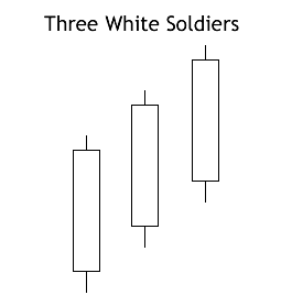
Recognition Criteria:
1. Market is characterized by downtrend.
2. We see three consecutive long white candlesticks.
3. Each candlestick closes at a new high.
4. The opening of each candlestick is within the body of the previous day.
5. Each consecutive day closes near or at its highs.
Explanation:
The Bullish Three White Soldiers Pattern appears in a context where the market stayed at a low price for too long. The market is still falling down and it is now approaching a bottom or already at bottom. Then we see a decisive attempt upward shown by the long white candlestick. Rally continues in the next two days characterized by higher closes. Bears are now forced to cover short positions.
Important Factors:
The opening prices of the second and third days can be anywhere within the previous day's body. However, it is better to see the opening prices above the middle of the previous day's body.
If the white candlesticks are very extended, one should be cautious about an overbought market.
The reliability of this pattern is very high, but still a confirmation in the form of a white candlestick with a higher close or a gap-up is suggested. 
While there are many methods and strategies to trade these low priced shares, the best tip is to do your own due diligence with each and every penny stock. Thus, you can be more sure that you are not simply the target of a “pump and dump” scheme. Companies with small market capitalization and few governing regulations are the playground of manipulative traders. If you are careful and do your homework, you will maybe, just maybe, find a hot penny stock to invest in. 
That's much the same in all endeavors. The only way to continue making money, to continue growing and keeping your profit margins healthy, is to constantly come up with new ideas.
More On $FXPT At PennyStock Tweets
http://www.pennystocktweets.com/stocks/profile/FXPT
Form 11-KT, 11-KT/A ~ SEC Filings Explained
Transition report pursuant to Rule 13a-10 or 15d-10 (and amendment thereto)
Sometimes it does not seem logical to consider a support level broken if the price closes 1/8 below the established support level. For this reason, some traders and investors establish support zones.
News sites such as Yahoo Finance and Google Finance serve as a great resource for new investors. By reading headline stories investors can expose themselves to different stock terms for example. Pulling quotes and observing fundamental data can also serve as another good source of exposure.
Check Out $JGBO On PennyStock Tweets
http://www.pennystocktweets.com/stocks/profile/JGBO
Form S-4 ~ SEC Filings Explained
Registration of securities issued in business combination transactions
Shiller notes that news of price changes is influential on investor behavior. In his survey after the crash on October 19th 1987, Shiller listed all the recent news events that seemed relevant and asked respondents to rate the stories.

More On $SHMX At PennyStock Tweets
http://www.pennystocktweets.com/stocks/profile/SHMX
Only enter a trade after the action of the market confirms your opinion and then enter promptly, but continue to watch your trade , these are penny stocks.
Staples/Discretionary Ratio
Chartists can also compare the performance of the consumer discretionary sector to the consumer staples sector for clues on the economy.
CONCEALING BABY SWALLOW
This Bullish pattern is highlighted by two consecutive Black Marubozu. They are characterized by the fact that a gapping black candlestick trades into the body of the previous day and it is seen during a downtrend. Then there is another Black Marubozu on the third day showing sale of positions since it closes at a new low. However this may give incentive to the shorts to cover their positions implying that a bullish reversal is now possible.

Recognition Criteria:
1. Market is characterized by downtrend.
2. We see two consecutive Black Marubozu in the first and second days.
3. Then we see a black candlestick on the third day opening with a downward gap but trading into the body of the second day and it is characterized by a long upper shadow.
4. Finally we see another Black Marubozu on the fourth day that completely engulfs the candlestick of the third day including the shadow.
Explanation:
Two black Marubozu show that downtrend is continuing to the satisfaction of the bears. On the third day, we see a downward gap further confirming the downtrend. However, prices on the third day start going above the close of the previous day causing some doubts about the bearish direction even though the day closes at or near its low. The next day shows us a significantly higher gap in the opening. After the opening, however, prices again go down closing at a new low. This last day may be interpreted as a good chance for the short-sellers to cover their short positions.
Use PennyStock Tweets For All Your $MONA DD
http://www.pennystocktweets.com/stocks/profile/MONA
While moving averages are typically used on daily intervals, they can also be applied to other timeframes to provide helpful charting roadmaps. Weekly charts often show interesting correlations - for example, a long-term uptrend might feature repeated bounces off the 22-week MA. Daytraders can also use the same techniques, applying MA's to intra-day intervals.
The more the data is compressed, the longer the time frame possible for displaying the data.
SEC Filings Explained ~ F-1
Registration statement for certain foreign private issuers.
Support and Resistance Zones
Because technical analysis is not an exact science, it is useful to create support and resistance zones. This is contrary to the strategy mapped out for Lucent Technologies (LU), but it is sometimes the case.
Trend Identification Using Moving Averages
The same signals can be generated using simple or exponential moving averages. As noted above, the preference depends on each individual. These examples below will use both simple and exponential moving averages. The term "moving average" applies to both simple and exponential moving averages.
The direction of the moving average conveys important information about prices. A rising moving average shows that prices are generally increasing. A falling moving average indicates that prices, on average, are falling. A rising long-term moving average reflects a long-term uptrend. A falling long-term moving average reflects a long-term downtrend.

The chart above shows 3M (MMM) with a 150-day exponential moving average. This example shows just how well moving averages work when the trend is strong. The 150-day EMA turned down in November 2007 and again in January 2008. Notice that it took a 15% decline to reverse the direction of this moving average. These lagging indicators identify trend reversals as they occur (at best) or after they occur (at worst). MMM continued lower into March 2009 and then surged 40-50%. Notice that the 150-day EMA did not turn up until after this surge. Once it did, however, MMM continued higher the next 12 months. Moving averages work brilliantly in strong trends.
NITE-LYNX $HRBR BarChart Technical Analysis
http://www.barchart.com/technicals/stocks/HRBR

Coppock used monthly data to identify buying opportunities when the indicator moved from negative territory to positive territory. Although Coppock did not use it for sell signals, many technical analysts consider a cross from positive to negative territory as a sell signal.
Feast thine eyes upon $ACDU BarChart Technical Analysis NITE-LYNX
http://www.barchart.com/technicals/stocks/ACDU
With its triple smoothing, TRIX is designed to filter insignificant price movements. Chartists can use TRIX to generate signals similar to MACD.
BarChart Technical Analysis NITE-LYNX $ABPR
http://www.barchart.com/technicals/stocks/ABPR
Keltner channel is a technical analysis indicator showing a central moving average line plus channel lines at a distance above and below. The indicator is named after Chester W. Keltner (1909–1998) who described it in his 1960 book How To Make Money in Commodities.
$EFIR BarChart Technical Analysis NITE-LYNX
http://www.barchart.com/technicals/stocks/EFIR
The FI is calculated by multiplying the difference between the last and previous closing prices by the volume of the commodity, yielding a momentum scaled by the volume. The strength of the force is determined by a larger price change or by a larger volume.
This link will help thou $ABCP BarChart Technical Analysis NITE-LYNX
http://www.barchart.com/technicals/stocks/ABCP
Many of today's traders use multiple monitors in order to display several charts and order entry windows. Even if six monitors are used, it should not be considered a green light to devote every square inch of screen space to technical indicators.
For thou convenience $PVSP BarChart Technical Analysis NITE-LYNX
http://www.barchart.com/technicals/stocks/PVSP
. The Force Index can be used to reinforce the overall trend, identify playable corrections or foreshadow reversals with divergences.
Feast thine eyes upon $HRBR BarChart Technical Analysis NITE-LYNX
http://www.barchart.com/technicals/stocks/HRBR
Keltner Channels also use an exponential moving average, which is more sensitive than the simple moving average used in Bollinger Bands. The chart below shows Keltner Channels (blue), Bollinger Bands (pink), Average True Range (10), Standard Deviation (10) and Standard Deviation (20) for comparison. Notice how the Keltner Channels are smoother than the Bollinger Bands. Also notice how the Standard Deviation covers a larger range than the Average True Range (ATR).
This link will help thou $HRDN BarChart Technical Analysis NITE-LYNX
http://www.barchart.com/technicals/stocks/HRDN
Divergences signal a potential reversal point because directional momentum does not confirm price. A bullish divergence occurs when the underlying security makes a lower low and RSI forms a higher low. RSI does not confirm the lower low and this shows strengthening momentum. A bearish divergence forms when the security records a higher high and RSI forms a lower high. RSI does not confirm the new high and this shows weakening momentum. Chart 5 shows Ebay (EBAY) with a bearish divergence in August-October. The stock moved to new highs in September-October, but RSI formed lower highs for the bearish divergence. The subsequent breakdown in mid October confirmed weakening momentum.
Behold the $MNTR BarChart Technical Analysis NITE-LYNX
http://www.barchart.com/technicals/stocks/MNTR
SCTRs take a predefined universe of stocks (initially the S
Feast thine eyes upon $RXMD BarChart Technical Analysis NITE-LYNX
http://www.barchart.com/technicals/stocks/RXMD
The MACD line is charted over time, along with an EMA of the MACD line, termed the "signal line" or "average line". The difference (or divergence) between the MACD line and the signal line is shown as a bar graph called the "histogram" time series (which should not be confused with the normal usage of histogram as an approximation of a probability distribution in statistics - the commonality is just in the visualization using a bar graph).
$JNSH BarChart Technical Analysis NITE-LYNX
http://www.barchart.com/technicals/stocks/JNSH
The MACD is only as useful as the context in which it is applied. An analyst might apply the MACD to a weekly scale before looking at a daily scale, in order to avoid making short term trades against the direction of the intermediate trend.[3] Analysts will also vary the parameters of the MACD to track trends of varying duration. One popular short-term set-up, for example, is the (5,35,5).
Feast thine eyes upon $SNGX BarChart Technical Analysis NITE-LYNX
http://www.barchart.com/technicals/stocks/SNGX
When the MACD falls below the signal line, it is a bearish signal, which indicates that it may be time to sell. Conversely, when the MACD rises above the signal line, the indicator gives a bullish signal, which suggests that the price of the asset is likely to experience upward momentum. Many traders wait for a confirmed cross above the signal line before entering into a position to avoid getting getting "faked out" or entering into a position too early, as shown by the first arrow.
For thou convenience $BRNE BarChart Technical Analysis NITE-LYNX
http://www.barchart.com/technicals/stocks/BRNE
Developed J. Welles Wilder, the Relative Strength Index (RSI) is a momentum oscillator that measures the speed and change of price movements. RSI oscillates between zero and 100.
Feast thine eyes upon $BRWC BarChart Technical Analysis NITE-LYNX
http://www.barchart.com/technicals/stocks/BRWC
Based on closing prices, the Ulcer Index measures volatility based on price depreciation from its high over a specific look-back period. The index is zero if prices close higher each period. This means there is no downside risk because prices are steadily rising. Prices, of course, do not steadily rise and there will be declines along the way. Using a default setting of 14 periods, the Ulcer Index reflects the expected percentage drawdown over this period. For the statistically inclined, the formula is shown in the box below and there is an excel spreadsheet example.
|
Followers
|
3289
|
Posters
|
|
|
Posts (Today)
|
0
|
Posts (Total)
|
2804248
|
|
Created
|
08/22/10
|
Type
|
Free
|
| Moderator Nilbud | |||
| Assistants mick ManicTrader PhotoChick Kirimi $Pistol Pete$ | |||
   Investor Hub Alerts: Sign up for 'STOCKGOODIES PLAYS OF THE WEEK ' E-Mail List Investor Hub Alerts: Sign up for 'STOCKGOODIES PLAYS OF THE WEEK ' E-Mail ListUPDATE; 5-1-22 courtesy of charting /\ wit tweezer top calls /\ Tony @Montana_Trades Really good study sheet on Candlestick Patterns [-chart]pbs.twimg.com/media/FRn8188XMAAdZvk?format=jpg&name=small[/chart] 

02-07-2021
|
|
Posts Today
|
0
|
|
Posts (Total)
|
2804248
|
|
Posters
|
|
|
Moderator
|
|
|
Assistants
|
| Volume | |
| Day Range: | |
| Bid Price | |
| Ask Price | |
| Last Trade Time: |


