 News
News  Market Data
  Discover
Support: 888-992-3836
Copyright © 2023 InvestorsHub Inc.


Register for free to join our community of investors and share your ideas. You will also get access to streaming quotes, interactive charts, trades, portfolio, live options flow and more tools.
BEARISH MEETING LINES
Market may gap up sharply as it opens but it closes unchanged from the prior session’s close during an uptrend. Such a pattern is called Bearish Meeting Lines Pattern, which is a pattern that reflects a balance between the bulls and the bears.

Recognition Criteria:
1. Market is characterized by uptrend.
2. We see a long white candlestick in the first day.
3. Then we see a long black candlestick, which has a body that is also higher than the previous trend on the second day.
4. The close of both days is same or almost same.
5. Both of the candlesticks are long but second day candlestick may be shorter than the first.
Explanation:
The Bearish Meeting Lines Pattern is a top reversal pattern suggesting a stall in uptrend. The first candlestick, a long white one, shows that the bullish momentum is going on. The next day opens higher with a gap but then the bears pull prices down to the prior day’s close. So the initial optimism on the second day’s opening now turns into concern of the longs.
Important Factors:
The Bearish Meeting Lines Pattern is similar to the Bearish Dark Cloud Cover Pattern. The Dark Cloud Cover has the same two-candlestick pattern. The main difference between the two is the fact that the bearish counterattack line does not usually move into the prior session’s white real body. It just gets back to prior session’s close. The Bearish Dark Cloud Cover Pattern’s second line pushes well into the white real body. So the Dark Cloud Cover Pattern is a more important top reversal signal than the Bearish Meeting Lines Pattern.
A confirmation on third day is required to be sure that the uptrend has reversed. This confirmation may be in the form a black candlestick, a large gap down or a lower close on the third day. 
Form N-8A ~ SEC Filings Explained
Initial notification of registration under section 8(a) filed on Form N-8A
BULLISH UNIQUE THREE RIVER BOTTOM
The Bullish Unique Three River Bottom Pattern is an extremely rare bottom reversal pattern. Its first candlestick is an extended black candlestick then followed by a second black real body closing higher than the first candlestick’s close, and the third candlestick is a white candlestick with a very small real body. The real white body shows that the market lost the selling pressure.

Recognition Criteria:
1. Market is characterized by a downtrend.
2. We see a long black candlestick in the first day.
3. Then we see a Hammer-like black candlestick on the second day.
4. The lower shadow of the second day sets a new low.
5. Then we see a short white candlestick, which is below the second day candlestick.
Explanation:
With the Unique Three River Bottom bull pattern, we first see a long black stick in a falling market. The next day opens at a higher level, however bearish sentiment is strong causing a new low during the day however the day closes near the high thus producing a small black body within the body of the first day. This rally questions the strength of bears. The increasing uncertainty is further strengthened when the third day opens lower, but not lower than the low of the second day. There is some stability on the third day as evidenced by its small white body. Third day ends by a rally closing below the close of the second day. If price rises to new high on the fourth day, then a reversal of trend is confirmed.
Important Factors:
A confirmation on fourth day is advisable to show that that the downtrend has reversed. This may be in the form of a white candlestick, a large gap up or a higher close on the fourth day.
SEC Filings Explained ~ Form 3
Form 3 is an SEC filing filed with the US Securities and Exchange Commission to indicate a preliminary insider transaction by an officer, director, or beneficial (10%) owner of the company's securities. These are typically seen after a company IPOs when insiders make their first transactions. After a Form 3 is filed, future filings of the same nature are filed under Form 4 (standard disclosure) or Form 5 (annual disclosure).
Dark Cloud
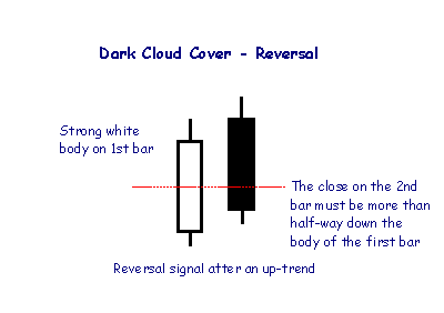
A Dark Cloud pattern encountered after an up-trend is a reversal signal, warning of "rainy days" ahead.
Candlestick Colors
For improved presentation, Incredible Charts uses colors such as red and blue/green to indicate filled or hollow candlesticks:
Blue (or green) candlestick if the close is higher than the open;
Red candlestick if the open is higher than the close (i.e. the candlestick is filled);
The same color as the previous day, if the open is equal to the close.
Form NT 11-Q ~ SEC Filings Explained
Notice under Rule 12b25 of inability to timely file all or part of a form 11-K
Form NT 10-K ~ SEC Filings Explained
Notice under Rule 12b25 of inability to timely file all or part of a Form 10-K, 10-KSB, or 10KT
Form TA-W ~ SEC Filings Explained
Notice of withdrawal from registration as transfer agent filed pursuant to the Securities Exchange Act of 1934
Form N-1A ~ SEC Filings Explained
Initial registration statement for open-end management investment companies
Doji Star
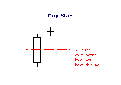
A Doji Star is weaker than the Morning or Evening Star: the doji represents indecision. The doji star requires confirmation from the next candlestick closing in the bottom half of the body of the first candlestick.
Hanging Man
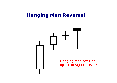
A hammer that occurs after an up trend is called a 'hanging man' and is a bearish signal.
Simple vs Exponential Moving Averages
Even though there are clear differences between simple moving averages and exponential moving averages, one is not necessarily better than the other. Exponential moving averages have less lag and are therefore more sensitive to recent prices - and recent price changes. Exponential moving averages will turn before simple moving averages. Simple moving averages, on the other hand, represent a true average of prices for the entire time period. As such, simple moving averages may be better suited to identify support or resistance levels.
Moving average preference depends on objectives, analytical style and time horizon. Chartists should experiment with both types of moving averages as well as different timeframes to find the best fit.
Below is an example of a chart with both the SMA
Doji Candlesticks (General)
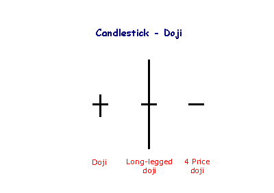
The doji candlestick occurs when the open and closing price are equal.
An open and close in the middle of the candlestick signal indecision. Long-legged dojis, when they occur after small candlesticks, indicate a surge in volatility and warn of a potential trend change. 4 Price dojis, where the high and low are equal, are normally only seen on thinly traded stocks.
Exponential Moving Average (EMA)
EMA helps with the lag we get on Simple Moving Averages (SMA) by giving more weight to the more recent price information. The weight given to the most recent price will depend on the number of periods in the moving average. EMA is calculated using 3 steps:
1st - get the SMA by adding the closing prices over the specified period i.e. 5 SMA on a daily chart is the closing price each day over a 5 day period, divided by 5.
2nd - Calculate the weighting multiplier by dividing 2 by the time period 1 and multiplying that answer by 100 to get the percentage i.e. 5 EMA = 2/(5 1) = 0.3333 X 100 = 33.33%
3rd - Calculate the EMA using the % that applies to the time period you are using. Here is the formula:
EMA: {Close - EMA(previous day)} x multiplier EMA(previous day).
Your head may be hurting right now, don't worry most trading platforms will calculate the EMA for you. The important thing is that you remember that the lagging we get with SMA is counteracted with the EMA, giving us a stronger trend indicator.
For those of you who are math freaks like myself, below is an example of how to calculate EMA:
A 10-period exponential moving average applies an 18.18% weighting to the most recent price. A 10-period EMA can also be called an 18.18% EMA. A 20-period EMA applies a 9.52% weighing to the most recent price (2/(20 1) = .0952). Notice that the weighting for the shorter time period is more than the weighting for the longer time period. In fact, the weighting drops by half every time the moving average period doubles.
Below is a spreadsheet example of a 10-day simple moving average and a 10-day exponential moving average for Intel. Simple moving averages are straight forward and require little explanation. The 10-day average simply moves as new prices become available and old prices drop off. The exponential moving average starts with the simple moving average value (22.22) in the first calculation. After the first calculation, the normal formula takes over. Because an EMA begins with a simple moving average, its true value will not be realized until 20 or so periods later. In other words, the value on the excel spreadsheet may differ from the chart value because of the short look-back period. This spreadsheet only goes back 30 periods, which means the affect of the simple moving average has had 20 periods to dissipate.

Below is an example of a chart with both the SMA
Bollinger Bands aka Bollies
Developed by John Bollinger, Bollinger Bands® are volatility bands placed above and below a moving average. You will find that most of the time stocks will trade within the Bollies. Volatility is based on the standard deviation, which changes as volatility increases and decreases. The bands widen when volatility increases and narrow when volatility decreases. This dynamic nature of Bollinger Bands also means they can be used on different securities with the standard settings.
Note: Bollinger Bands® is a registered trademark of John Bollinger.
Below is a chart showing Bollinger Bands:
Pink line is the Upper Bollie or UBB
Blue line is the Lower Bollie or LBB
White line is the Middle Bollie or 20 SMA
Note how during the down trend the price stayed between the Lower
Form 11-KT, 11-KT/A ~ SEC Filings Explained
Transition report pursuant to Rule 13a-10 or 15d-10 (and amendment thereto)
Bond ETFs
Exchange-traded funds that invest in bonds are known as bond ETFs. They thrive during economic recessions because investors pull their money out of the stock market and into bonds (for example, government treasury bonds or those issues by companies regarded as financially stable). Because of this cause and effect relationship, the performance of bond ETFs may be indicative of broader economic conditions.[22] There are several advantages to bond ETFs such as the reasonable trading commissions, but this benefit can be negatively offset by fees if bought and sold through a third party
Form 10-12B, 10-12B/A ~ SEC Filings Explained
Initial general form for registration of a class of securities pursuant to section 12(b) (and amendment thereto)
Three Black Crows (Bullish)
The Bearish Three Black Crows Pattern is indicative of a strong reversal during an uptrend. It consists of three long black candlesticks, which look like a stair stepping downward. The opening price of each day is higher than the previous day's closing price suggesting a move to a new short term low.

Recognition Criteria:
1. Market is characterized by uptrend.
2. Three consecutive long black candlesticks appear.
3. Each day closes at a new low.
4. Each day opens within the body of the previous day.
5. Each day closes near or at its lows.
Explanation:
The Bearish Three Black Crows Pattern is indicative of the fact that the market has been at a high price for too long and the market may be approaching a top or is already at the top. A decisive downward move is reflected by the first black candlestick. The next two days show further decline in prices due to profit taking. Bullish mood of the market cannot be sustained anymore.
Important Factors:
The opening prices of the second and third days can be anywhere within the previous day's body. However, it is better to see the opening prices below the middle of the previous day's body.
If the black candlesticks are very extended, one should be cautious about an oversold market.
The reliability of this pattern is very high, but still a confirmation in the form of a black candlestick with a lower close or a gap-down is suggested.
Actively managed ETFs
Actively managed ETFs (AMETFs) are quite recent in the United States. The first one was offered in March 2008, but it was liquidated in October 2008. The actively managed ETFs approved to date are fully transparent, publishing their current securities portfolios on their web sites daily. However, the SEC has indicated that it is willing to consider allowing actively managed ETFs that are not fully transparent in the future.[4]
The fully transparent nature of existing ETFs means that an actively managed ETF is at risk from arbitrage activities by market participants who might choose to front run its trades[citation needed]. The initial actively traded equity ETFs have addressed this problem by trading only weekly or monthly, however today, actively managed ETFs trade at the discretion of the manager and to date, there have been no instances of front running. Actively traded debt ETFs, which are less susceptible to front-running, trade their holdings more frequently.[30]
Actively managed ETFs have grown faster in their first three years of existence than index ETFs did in their first three years of existence. However, as track records develop, many see actively managed ETFs as a significant competitive threat to actively managed mutual funds
ARS~ SEC Filings Explained
Annual Report to Security Holders.
Rising Three Methods
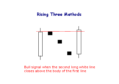
The Rising Method consists of two strong white lines bracketing 3 or 4 small declining black candlesticks. The final white line forms a new closing high. The pattern is definitely bullish.
Form N-8F ~ SEC Filings Explained
Application for deregistration made on Form N-8F
Form 10-D, 10-D/A ~ SEC Filings Explained
Periodic distribution reports by Asset-Backed issuers pursuant to Rule 13a-17 or 15d-17 (and amendment thereto)
SEC Filings Explained ~ Form13D
Schedule 13D is an SEC filing that must be submitted to the US Securities and Exchange Commission within 10 days, by anyone who acquires beneficial ownership of more than 5% of any class of publicly traded securities in a public company. A filer must promptly update its Schedule 13D filing to reflect any material change in the facts disclosed, including, among other things, the acquisition or disposition of 1% or more of the class of securities that are the subject of the filing.
Form Uses
13D filings allow the investing public to see who a public company's large shareholders are and, perhaps more importantly, why they have an interest in the company. These filings may be a precursor to hostile takeovers, company breakups, and other "change of control" events.
Reading the Form
Schedule 13D consists of seven different sections:
? Security and Issuer - This section contains basic information regarding the type and class the security and the contact information of the owner.
? Identity and Background - This section contains even more background into the owner, including if they were involved in any criminal activity in the past.
? Source and Amount of Funds or Other Considerations - This section lets investors know where the money is coming from. The most important use for this section is in determining if a buyout situation is overleveraged, when a majority of the purchase is leveraged or borrowed capital.
? Purpose of Transaction - This is the most important portion of the 13D filing. It allows you to see why they are buying shares in the company, whether it be for acquisition, hostile takeover, proxy war, or simply because they believe it is undervalued.
? Interest in Securities of the Issuer - This section states the express purpose of the transaction, which should be explained better in section 4 (Purpose of Transaction).
? Contracts, Arrangements, Understandings or Relationships with Respect to the Securities of the Issuer - This section contains any special relationships between the owner and the company. This is important to be sure that the buying is legitimate and not just a friend purchasing stock or the result of some other agreement.
? Materials to Be Filed as Exhibits - This is the second most important section. It contains any exhibits that may be filed along with the form. This is famously used for the filing of letters to management in the event of a hostile takeover. Exhibits can also elaborate on the Purpose of Transaction (Section 4).
Form N-23C3A ~ SEC Filings Explained
Notification of periodic repurchase offer Filed pursuant to Rule 23c-3(b) only
Form N-PX ~ SEC Filings Explained
Annual Report of Proxy Voting Record of Registered Management Investment Companies
Keltner Channels
Introduction
Keltner Channels are volatility-based envelopes set above and below an exponential moving average. This indicator is similar to Bollinger Bands, which use the standard deviation to set the bands. Instead of using the standard deviation, Keltner Channels use the Average True Range (ATR) to set channel distance. The channels are typically set two Average True Range values above and below the 20-day EMA. The exponential moving average dictates direction and the Average True Range sets channel width. Keltner Channels are a trend following indicator used to identify reversals with channel breakouts and channel direction. Channels can also be used to identify overbought and oversold levels when the trend is flat.
In his 1960 book, How to Make Money in Commodities, Chester Keltner introduced the "Ten-Day Moving Average Trading Rule," which is credited as the original version of Keltner Channels. This original version started with a 10-day SMA of the typical price {(H L C)/3)} as the centerline. The 10-day SMA of the High-Low range was added and subtracted to set the upper and lower channel lines. Linda Bradford Raschke introduced the newer version of Keltner Channels in the 1980s. Like Bollinger Bands, this new version used a volatility based indicator, Average True Range (ATR), to set channel width. StockCharts.com uses this newer version of Keltner Channels.
Calculation
There are three steps to calculating Keltner Channels. First, select the length for the exponential moving average. Second, choose the time periods for the Average True Range (ATR). Third, choose the multiplier for the Average True Range.
Middle Line: 20-day exponential moving average
Upper Channel Line: 20-day EMA (2 x ATR(10))
Lower Channel Line: 20-day EMA - (2 x ATR(10)
Because moving averages lag price, a longer moving average will have more lag and a shorter moving average will have less lag. ATR is the basic volatility setting. Short timeframes, such as 10, produce a more volatile ATR that fluctuates as 10-period volatility ebbs and flows. Longer timeframes, such a 100, smooth these fluctuations to produce a more constant ATR reading. The multiplier has the most affect on the channel width. Simply changing from 2 to 1 will cut channel width in half. Increasing from 2 to 3 will increase channel width by 50%.

The chart above shows the default Keltner Channels in red, a wider channel in blue and a narrower channel in green. The blue channels were set three Average True Range values above and below (3 x ATR). The green channels used one ATR value. All three share the 20-day EMA, which is the dotted line in the middle. The indicator windows show differences in the Average True Range (ATR) for 10 periods, 50 periods and 100 periods. Notice how the short ATR (10) is more volatile and has the widest range. In contrast, 100-period ATR is much smoother with a less volatile range.
Interpretation
Indicators based on channels, bands and envelopes are designed to encompass most price action. Therefore, moves above or below the channel lines warrant attention because they are relatively rare. Trends often start with strong moves in one direction or another. A surge above the upper channel line shows extraordinary strength, while a plunge below the lower channel line shows extraordinary weakness. Such strong moves can signal the end of one trend and the beginning of another.
With an exponential moving average as its foundation, Keltner Channels are a trend following indicator. As with moving averages and trend following indicators, Keltner Channels lag price action. The direction of the moving average dictates the direction of the channel. In general, a downtrend is present when the channel moves lower, while an uptrend exists when the channel moves higher. The trend is flat when the channel moves sideways.
A channel upturn and break above the upper trendline can signal the start of an uptrend. A channel downturn and break below the lower trendline can signal the start a downtrend. Sometimes a strong trend does not take hold after a channel breakout and prices oscillate between the channel lines. Such trading ranges are marked by a relatively flat moving average. The channel boundaries can then be used to identify overbought and oversold levels for trading purposes.
Versus Bollinger Bands
There are two differences between Keltner Channels and Bollinger Bands. First, Keltner Channels are smoother than Bollinger Bands because the width of the Bollinger Bands is based on the standard deviation, which is more volatile than the Average True Range (ATR). Many consider this a plus because it creates a more constant width. This makes Keltner Channels well suited for trend following and trend identification. Second, Keltner Channels also use an exponential moving average, which is more sensitive than the simple moving average used in Bollinger Bands. The chart below shows Keltner Channels (blue), Bollinger Bands (pink), Average True Range (10), Standard Deviation (10) and Standard Deviation (20) for comparison. Notice how the Keltner Channels are smoother than the Bollinger Bands. Also notice how the Standard Deviation covers a larger range than the Average True Range (ATR).

Uptrend
The chart below shows Archer Daniels Midland (ADM) starting an uptrend as the Keltner Channels turn up and the stock surges above the upper channel line. ADM was in a clear downtrend in April-May as prices continued to pierce the lower channel. With a strong thrust up in June, prices exceeded the upper channel and the channel turned up to start a new uptrend. Notice that prices held above the lower channel on dips in early and late July.

Even with a new uptrend established, it is often prudent to wait for a pullback or better entry point to improve the reward-to-risk ratio. Momentum oscillators or other indicators can then be employed to define oversold readings. This chart shows StochRSI, one of the more sensitive momentum oscillators, dipping below .20 to become oversold at least three times during the uptrend. The subsequent crosses back above .20 signaled a resumption of the uptrend.
Downtrend
The second chart shows Nvidia (NVDA) starting a downtrend with a sharp decline below the lower channel line. After this initial break, the stock met resistance near the 20-day EMA (middle line) from mid May until early August. The inability to even come close to the upper channel line showed strong downside pressure.

A 10-period Commodity Channel Index (CCI) is shown as the momentum oscillator to identify short-term overbought conditions. A move above 100 is considered overbought. A subsequent move back below 100 signals a resumption of the downtrend. This signal worked well until September. These failed signals indicated a possible trend change that was subsequently confirmed with a break above the upper channel line.
Flat Trend
Once a trading range or flat trading environment has been identified, traders can use the Keltner Channels to identify overbought and oversold levels. A trading range can be identified with a flat moving average and the Average Directional Index (ADX). The chart below shows IBM fluctuating between support in the 120-122 area and resistance in the 130-132 area from February to late September. The 20-day EMA, middle line, lagged price action, but flattened out from April to September.
The indicator window shows ADX (black line) confirming a weak trend. Low and falling ADX shows a weak trend. High and rising ADX shows a strong trend. ADX was below 40 the entire time and below 30 most of the time. This reflects the absence of trend. Also, notice that ADX peaked in early June and fell until late August.

Armed with the prospects of a weak trend and trading range, traders can use Keltner Channels to anticipate reversals. In addition, notice that the channel lines often coincide with chart support and resistance. IBM dipped below the lower channel line three times from late May until late August. These dips provided low-risk entry points. The stock did not manage to reach the upper channel line, but did get close as it reversed in the resistance zone. The Disney chart shows a similar situation.

Conclusions
Keltner Channels are a trend following indicator designed to identify the underlying trend. Trend identification is more than half the battle. The trend can be up, down or flat. Using the methods described above, traders and investors can identify the trend to establish a trading preference. Bullish trades are favored in an uptrend and bearish trades are favored in a downtrend. A flat trend requires a more nimble approach because prices often peak at the upper channel line and trough at the lower channel line. As with all analysis techniques, Keltner Channels should be used in conjunction with other indicators and analysis. Momentum indicators offer a good complement to the trend-following Keltner Channels.
Form TA-1 ~ SEC Filings Explained
Application for registration as a transfer agent filed pursuant to the Securities Exchange Act of 1934
Direxion Daily Financial Bear 3X Shares (NYSE:FAZ)
Not all ETFs are designed to move in the same direction or even in the same amount as the index they are tracking. For example, this triple bear fund attempts to perform 300% in the opposite direction of the Russell 1000 Financial Services Index. This fund became popular in 2008 and 2009 when the financial crisis placed downward pressure on financial stocks.
History of ETF’s
ETFs had their genesis in 1989 with Index Participation Shares, an S
Form N-14 8C ~ SEC Filings Explained
Initial registration statement filed on Form N14 by closed-end investment company (business combinations)
Candlestick Charts
The Japanese have been using candlestick charts since the 17th century to analyze rice prices. Candlesticks were introduced into modern technical analysis by Steve Nison in his book Japanese Candlestick Charting Techniques.
Candlesticks contain the same data as a normal bar chart but highlight the relationship between opening and closing prices. The narrow stick represents the range of prices traded during the period (high to low) while the broad mid-section represents the opening and closing prices for the period.
If the close is higher than the open - the candlestick mid-section is hollow or shaded blue/green.
If the open is higher than the close - the candlestick mid-section is filled in or shaded red.
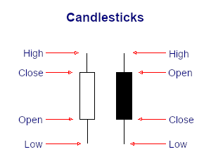
The advantage of candlestick charts is the ability to highlight trend weakness and reversal signals that may not be apparent on a normal bar chart.
Form S-8 ~ SEC Filings Explained
Initial registration statement for securities to be offered to employees pursuant to employee benefit plans
SEC Filings Explained ~ Form 5
Form 5 is an SEC filing submitted to the Securities and Exchange Commission on an annual basis by company officers, directors, or beneficial (10%) owners, which summarizes their insider trading activities. This form is simply a combination of year's Form 4 filings, which are mandatory filings made shortly after insiders make transactions.
Form N-30B-2 ~ SEC Filings Explained
Periodic and interim reports mailed to investment company shareholders
Form 2-E, 2-E/A ~ SEC Filings Explained
Sales material filed pursuant to Rule 609 under Regulation E. (and amendment thereto)
Moving Average Lengths and Timeframes
The length of the moving average depends on the analytical objectives. Short moving averages (5-20 periods) are best suited for short-term trends and trading. Chartists interested in medium-term trends would opt for longer moving averages that might extend 20-60 periods. Long-term investors will prefer moving averages with 100 or more periods.
Some moving average lengths are more popular than others. The 200-day moving average is perhaps the most popular. Because of its length, this is clearly a long-term moving average. Next, the 50-day moving average is quite popular for the medium-term trend. Many chartists use the 50-day and 200-day moving averages together. Short-term, a 10-day moving average was quite popular in the past because it was easy to calculate. One simply added the numbers and moved the decimal point.
Trading ETF’s
Trading
Perhaps the most important benefit of an ETF is the stock-like features offered. A mutual fund is bought or sold at the end of a day's trading, whereas ETFs can be traded whenever the market is open. Since ETFs trade on the market, investors can carry out the same types of trades that they can with a stock. For instance, investors can sell short, use a limit order, use a stop-loss order, buy on margin, and invest as much or as little money as they wish (there is no minimum investment requirement).[47]Also, many ETFs have the capability for options (puts and calls) to be written against them. Covered call strategies allow investors and traders to potentially increase their returns on their ETF purchases by collecting premiums (the proceeds of a call sale or write) on calls written against them. Mutual funds do not offer those features
Form N-CSR ~ SEC Filings Explained
Certified annual shareholder report of registered management investment companies
Vipers
Just like iShares are Barclay's brand of ETFs, VIPERs are Vanguard's brand of the financial instrument. Vipers, or Vanguard Index Participation Receipts, are structured as share classes of open-end funds. Vanguard also offers dozens upon dozens of ETFs for many different areas of the market including the financial, healthcare and utilities sectors.
Simple Moving Average or (SMA)
The SMA does not predict the price direction but it smooths out the price action to give a trend indication.
Moving averages are lagging indicators because they are based on past prices. Despite this lag, moving averages help smooth price action and filter out the noise. They are also used to form the building blocks for many other technical indicators and overlays, such as Bollinger Bands, MACD and the McClellan Oscillator. Moving averages can be used to identify the direction of the trend or define potential support and resistance levels.
Here's a chart with a 5 day SMA on it:
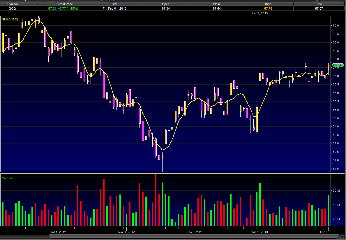
A simple moving average is made by calculating the average price of a security over a specific number of closing costs. The SMA will reflect the average closing cost, based on the time line of the chart you are looking at. i.e.: A 5 SMA on a daily chart will plot a line showing the average closing daily price, on a 60 minute chart that 5 SMA will plot a line showing the average hourly closing price. If the closing price changes so too does the SMA, hence the Moving part of Simple Moving Average. Old data is dropped and new data is added as it comes and goes, making the average move along the timeline. For those who need a visual take a look at how a SMA is plotted.
We will start our SMA on day 5
Daily Closing Prices:
Day 1 ------ 10
Day 2 ------ 12
Day 3 ------ 11
Day 4 ------ 14
Day 5 ------ 13
Day 6 ------ 15
Day 7 ------ 18
Day 8 ------ 19
SMA Plot points:
Day 5 ---- 10 12 11 14 13(closing price each day, 1 through 5) = 60 /5(# of days) = SMA of 12
Day 6 ---- Drop the 10 from day 1 and add the 15 from day 6 = 65 /5 = 13
Day 7 ---- Drop the 12 from day 2 and add 18 from day 7 = 71 /5 = 14.2
Day 8 ---- Drop the 11 from day 3 and add 19 from day 8 = 79 /5 = 15.8
Form 10-12G, 10-12G/A ~ SEC Filings Explained
Initial general form for registration of a class of securities pursuant to section 12(g) (and amendment thereto)
BEARISH ADVANCE BLOCK
It is a pattern characterized by three long white candlesticks with consecutively higher closes during an uptrend. The Bearish Advance Block Pattern is similar to the Bullish Three White Soldiers Pattern. The difference is the fact that each successive day is weaker than the one preceding it. This may suggest that the rally is losing strength and a reversal is possible.

Recognition Criteria:
1. Market is characterized by uptrend.
2. We see three adjacent white candlesticks with consecutively higher closes.
3. Each day opens within the previous day's body.
4. Each day’s body is significantly smaller than the body of the previous day.
Explanation:
If the second and the third candlesticks (particularly the third) show signs of weakening, this means that the rally is losing steam and longs must consider protecting their positions. Longs need especially to be careful about the Bearish Advance Block Pattern during a mature uptrend. Signs of weakening are the progressively smaller white real bodies or the relatively long upper shadows on the latter two white candlesticks.
Important Factors:
A definite deterioration in the upward strength is evidenced by long upper shadows on the second and third days.
The Bearish Advance Block Pattern is not normally a top reversal pattern, but it has the potential to precede a meaningful price decline. This pattern is more important at higher price levels. It suggests to liquidate long positions but it is yet early for short positions.
A confirmation of the reversal on the fourth day would provide the needed proof that the uptrend has reversed. A confirmation of the trend reversal by a black candlestick, a large gap down or by a lower close on the next trading day is suggested.
Leveraged ETFs
Leveraged exchange-traded funds (LETFs), or simply leveraged ETFs, are a special type of ETF that attempt to achieve returns that are more sensitive to market movements than non-leveraged ETFs.[33] Leveraged index ETFs are often marketed as bull or bear funds. A leveraged bull ETF fund might for example attempt to achieve daily returns that are 2x or 3x more pronounced than the Dow Jones Industrial Average or the S
Form 13F-HR, 13F-HR/A ~ SEC Filings Explained
Initial Quarterly Form 13F Holdings report filed by institutional managers (and amendment thereto)
Star Formations[/]
Stars are similar to gaps. A long body followed by a much shorter candlestick with a short body, where the bodies must not overlap -- though their shadows may.
13H, 13H-Q, 13H-A, 13H-I, 13H-R, 13H-T ~ SEC Filings Explained
Large Trader Registration Information Required of Large Traders Pursuant to the Securities Exchange Act of 1934 and Rule 13h-1 Thereunder. Initial Filing (13H), Amended Filing (13H-Q), Annual Filing (13H-A), Inactive Status (13H-I), Reactivated Status (13H-R), and Termination Filing (13H-T)
BULLISH TRI STAR
The Bullish Tri Star Pattern is a very rare but significant bottom reversal pattern. Three Dojis form this pattern. The middle Doji is a Doji Star.

Recognition Criteria:
1. Market is characterized by downtrend.
2. Then we see three consecutive Doji.
3. The second day Doji gaps below the first and third.
Explanation:
In the case of a Bullish Tri Star Pattern, we have a market, which is in a downtrend for a long time. However the weakening trend shows itself by the fact that the real bodies are probably becoming smaller. The first Doji is a matter of concern. The second Doji clearly indicates that market is losing its direction. Finally, the third Doji warns that the downtrend is over. This pattern indicates too much indecision leading to reversal of positions.
Important Factors:
A confirmation on fourth day is required to be sure that the downtrend has reversed. Confirmation may be in the form of a white candlestick, a large gap up or a higher close on the fourth day.
|
Followers
|
3286
|
Posters
|
|
|
Posts (Today)
|
0
|
Posts (Total)
|
2804248
|
|
Created
|
08/22/10
|
Type
|
Free
|
| Moderator Nilbud | |||
| Assistants mick ManicTrader PhotoChick Kirimi $Pistol Pete$ | |||
   Investor Hub Alerts: Sign up for 'STOCKGOODIES PLAYS OF THE WEEK ' E-Mail List Investor Hub Alerts: Sign up for 'STOCKGOODIES PLAYS OF THE WEEK ' E-Mail ListUPDATE; 5-1-22 courtesy of charting /\ wit tweezer top calls /\ Tony @Montana_Trades Really good study sheet on Candlestick Patterns [-chart]pbs.twimg.com/media/FRn8188XMAAdZvk?format=jpg&name=small[/chart] 

02-07-2021
|
|
Posts Today
|
0
|
|
Posts (Total)
|
2804248
|
|
Posters
|
|
|
Moderator
|
|
|
Assistants
|
| Volume | |
| Day Range: | |
| Bid Price | |
| Ask Price | |
| Last Trade Time: |


