 News
News  Market Data
  Discover
Support: 888-992-3836
Copyright © 2023 InvestorsHub Inc.


Register for free to join our community of investors and share your ideas. You will also get access to streaming quotes, interactive charts, trades, portfolio, live options flow and more tools.
Looking at Business Plans
The business plan, model or concept forms the bedrock upon which all else is built. If the plan, model or concepts stink, there is little hope for the business. For a new business, the questions may be these: Does its business make sense? Is it feasible? Is there a market? Can a profit be made? For an established business, the questions may be: Is the company's direction clearly defined? Is the company a leader in the market? Can the company maintain leadership?

Daily Candlestick Chart for TLFX
[img]stockcharts.com/c-sc/sc?s=TLFX
$VIZS BarChart Trader's Cheat Sheet
http://www.barchart.com/cheatsheet.php?sym=VIZS
Baltic Dry Index: The Baltic Dry Index covers dry bulk shipping rates, or the costs of moving raw materials by sea.
Shipping costs vary according to the type of commodity being shipped, the amount (supply and demand).
This index is managed by the Baltic Exchange in London and the data can be directly subscribed to by major financial news services as well as the Baltic Exchange.

Fat Tails and Trends
Historic stock returns are not normally distributed. What does this mean? If one were to measure the height of 1000 people and plot the distribution, this distribution would form the classic bell curve. The most recurring height (value) would be in the middle and the remaining heights would be equally distributed on either side. Furthermore, 68.5% of all values would fall within ±1 standard deviation of the mean, 95.4% would fall within ±2 standard deviations and 99.7% would fall within ±3 standard deviations. The solid black line shows a typical bell curve with a normal distribution.

Statisticians have found that a distribution of stock returns forms a curve with "fat tails". For example, this could be a distribution of the 1000 weekly returns for a basket of stocks. In a normal distribution, 99.7% of all these returns would be within ±3 standard deviations of the mean. This, however, is not the case for stock returns. Instead, the distribution has fat tails (black dotted lines). This means a relatively high number of returns fall outside the normal distribution. Some are lower and some are higher. These abnormal returns provide evidence of extended moves, outsized moves or trends. Note that the image above is just a hypothetical example to illustrate a point.
Daily Candlestick Chart for NFDS
[img]stockcharts.com/c-sc/sc?s=NFDS
$UNGS BarChart Trader's Cheat Sheet
http://www.barchart.com/cheatsheet.php?sym=UNGS
Bolivia Bolivianos: The currency of Bolivia. Currency code (BOB)
Focus on Price
If the objective is to predict the future price, then it makes sense to focus on price movements. Price movements usually precede fundamental developments. By focusing on price action, technicians are automatically focusing on the future. The market is thought of as a leading indicator and generally leads the economy by 6 to 9 months. To keep pace with the market, it makes sense to look directly at the price movements. More often than not, change is a subtle beast. Even though the market is prone to sudden knee-jerk reactions, hints usually develop before significant moves. A technician will refer to periods of accumulation as evidence of an impending advance and periods of distribution as evidence of an impending decline.
Daily Candlestick Chart for APLN
[img]stockcharts.com/c-sc/sc?s=APLN
$ARAH BarChart Trader's Cheat Sheet
http://www.barchart.com/cheatsheet.php?sym=ARAH
Botswana Pulas: The currency of Botswana. Currency code (BWP)
Daily Candlestick Chart for DEWM
[img]stockcharts.com/c-sc/sc?s=DEWM
$QBII BarChart Trader's Cheat Sheet
http://www.barchart.com/cheatsheet.php?sym=QBII
Cover on a Bounce: Occurs when a trader covers a short position after it has reached and "bounced" off a support level
Top-Down Technical Analysis
For each segment (market, sector and stock), an investor would analyze long-term and short-term charts to find those that meet specific criteria. Analysis will first consider the market in general, perhaps the S
Daily Candlestick Chart for KIRI
[img]stockcharts.com/c-sc/sc?s=KIRI
$CDFT BarChart Trader's Cheat Sheet
http://www.barchart.com/cheatsheet.php?sym=CDFT
Austerity: Austerity refers to the government's reduction of spending in order to lower their deficit. Austerity measures, which usually involve wage cuts and tax hikes, are implemented by the government to ensure their creditors that they will be able to pay back their loans.
Daily Candlestick Chart for FRGY
[img]stockcharts.com/c-sc/sc?s=FRGY
Double Top: Any chart pattern similar to the one show below is known as a ‘Double Top’ and it is arguably one of the most widely recognized and compelling technical signals known amongst the forex trading community. It is considered a reliable test of a previous high or low.
The double top formation is identified as a distinctive chart pattern revealing a rally to new high followed by a moderate retreat which is then in turn followed by a second rally in which to test the new high.
The double top chart pattern classically reveals itself by occurring in the shape of the letter ‘M’. A third rally added to this would result in the occurrence of a triple top resulting in three peaks.
A double top is considered a bearish and is generally thought to be stronger when the equal points are further apart and the price objective usually occurs at an equal distance beyond the correction low.
$ADVC BarChart Trader's Cheat Sheet
http://www.barchart.com/cheatsheet.php?sym=ADVC
Daily Candlestick Chart for HIIT
[img]stockcharts.com/c-sc/sc?s=HIIT
$GDGI BarChart Trader's Cheat Sheet
http://www.barchart.com/cheatsheet.php?sym=GDGI
What is Sector Rotation?
Unsurprisingly, the business cycle influences the rotation of stock market sectors and industry groups. Certain sectors perform better than others during specific phases of the business cycle. Knowing the stage of the business cycle can help investors position themselves in the right sectors and avoid the wrong sectors.
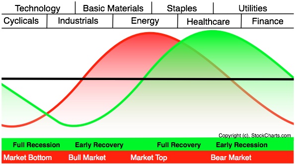
The graph above shows the economic cycle in green, the stock market cycle in red and the best performing sectors at the top. The green economic cycle corresponds to the business cycle shown above. The centerline marks the contraction/expansion threshold for the economy. Notice how the red market cycle leads the business cycle. The market turns up and crosses the centerline before the economic cycle turns. Similarly, the market turns down and crosses below the centerline ahead of the economic cycle.
Cyclicals, which is the same as the consumer discretionary sector, are the first to turn up in anticipation of a bottom in the economy. Technology stocks are not far behind. These two groups are the big leaders at the beginning of a bull run in the stock market.
The top of the market cycle is marked by relative strength in materials and energy. These sectors benefit from a rise in commodity prices and a rise in demand from an expanding economy. The tipping point for the market comes when leadership shifts from energy to consumer staples. This is a sign that commodity prices are starting to hurt the economy.
The market peak and downturn are followed by a contraction in the economy. At this stage, the Fed starts to lower interest rates and the yield curve steepens. Falling interest rates benefit debt-laden utilities and business at banks. The steepening yield curve also improves profitability at banks and encourages lending. Low interest rates and easy money eventually lead to a market bottom and the cycle repeats itself.
The two sector PerfCharts below show relative performance for the nine sector SPDRs near the 2007 peak and after the 2003 bottom. The S
Dealer: An individual or firm acting as a principal, rather than as an agent, in the purchase and/or sale of securities. Dealers trade for their own account and risk. This is in contrast to brokers who trade only on behalf of their clients.
Daily Candlestick Chart for HSCO
[img]stockcharts.com/c-sc/sc?s=HSCO
$LIGA BarChart Trader's Cheat Sheet
http://www.barchart.com/cheatsheet.php?sym=LIGA
Price Scaling
There are two methods for displaying the price scale along the y-axis: arithmetic and logarithmic. An arithmetic scale displays 10 points (or dollars) as the same vertical distance no matter what the price level. Each unit of measure is the same throughout the entire scale. If a stock advances from 10 to 80 over a 6-month period, the move from 10 to 20 will appear to be the same distance as the move from 70 to 80. Even though this move is the same in absolute terms, it is not the same in percentage terms.
A logarithmic scale measures price movements in percentage terms. An advance from 10 to 20 would represent an increase of 100%. An advance from 20 to 40 would also be 100%, as would an advance from 40 to 80. All three of these advances would appear as the same vertical distance on a logarithmic scale. Most charting programs refer to the logarithmic scale as a semi-log scale, because the time axis is still displayed arithmetically.

The chart above uses the 4th-Quarter performance of VeriSign to illustrate the difference in scaling. On the semi-log scale, the distance between 50 and 100 is the same as the distance between 100 and 200. However, on the arithmetic scale, the distance between 100 and 200 is significantly greater than the distance between 50 and 100.
Key points on the benefits of arithmetic and semi-log scales:
• Arithmetic scales are useful when the price range is confined within a relatively tight range.
• Arithmetic scales are useful for short-term charts and trading. Price movements (particularly for stocks) are shown in absolute dollar terms and reflect movements dollar for dollar.
• Semi-log scales are useful when the price has moved significantly, be it over a short or extended time frame
• Trend lines tend to match lows better on semi-log scales.
• Semi-log scales are useful for long-term charts to gauge the percentage movements over a long period of time. Large movements are put into perspective.
• Stocks and many other securities are judged in relative terms through the use of ratios such as PE, Price/Revenues and Price/Book. With this in mind, it also makes sense to analyze price movements in percentage terms.
Bretton Woods Agreement of 1944: The Bretton Woods Agreement is a pact that was made all the way back in the 1940's by the economic powers at that time to stabilize currencies. What it did was establish a fixed exchange rate for currencies in terms of gold to make trade among nations easier. This kind of exchange rate system lasted until 1971, before the US finally decided to end the convertibility of the dollar to gold.
Daily Candlestick Chart for GDAR
[img]stockcharts.com/c-sc/sc?s=GDAR
$PRPM BarChart Trader's Cheat Sheet
http://www.barchart.com/cheatsheet.php?sym=PRPM
ADX: The average directional index, or ADX, was developed by J. Welles Wilder as a measure of a current market trend's strength. The ADX is derived from two directional indicators, known as DI and DI-, which are in turn derived from the directional movement index (DMI).
ADX is calculated by finding the difference of DI and DI-, as well as the sum of DI and DI-. The difference is divided by the sum, and the resulting number multiplied by 100. The product is known as the directional index, or DX. A moving average is then taken of DX, typically over a fourteen-day period (although any number of periods can be used.) This final moving average is the ADX.
The ADX takes the form of a number from 0 to 100. A value of 0 indicates that the market is equally likely to move in either a positive or negative direction, meaning that there is no overall market trend. A value of 100 indicates that the market is exclusively moving in either a positive or negative direction, indicating an extremely strong trend. Values of greater than 60 are uncommon in practice, and any value of greater than 40 is considered to be a strong trend. Any value less than 20 is considered to be a weak trend, and may signal an upcoming reversal. Because the ADX is derived from both positive and negative directional indicators, it only measures the magnitude of a trend rather than its direction.
Daily Candlestick Chart for DECN
[img]stockcharts.com/c-sc/sc?s=DECN
$EWRL BarChart Trader's Cheat Sheet
http://www.barchart.com/cheatsheet.php?sym=EWRL
Analyst: When analyzing the market, analysts can generally be divided into two camps - fundamentals and technicals.
Fundamental analysts are those who mainly look at the fundamental aspects of an economy in forming their opinions. They stay on top of the markets by reading and analyzing what the current economic data say about current market conditions, what is fundamentally driving the market, and where it's headed.
Technical analysts are those who primarily rely on chart indicators and patterns to help predict where price will move next. Some tools that technical analysts use are Fibonacci retracement, candlesticks and momentum indicators.
Chart Patterns ~ An Oldie but Goodie
Much of our understanding of chart patterns can be attributed to the work of Richard Schabacker. His 1932 classic, Technical Analysis and Stock Market Profits, laid the foundations for modern pattern analysis. In Technical Analysis of Stock Trends (1948), Edwards and Magee credit Schabacker for most of the concepts put forth in the first part of their book. We would also like to acknowledge Messrs. Schabacker, Edwards and Magee, and John Murphy as the driving forces behind these articles and our understanding of chart patterns.
Pattern analysis may seem straightforward, but it is by no means an easy task. Schabacker states:
The science of chart reading, however, is not as easy as the mere memorizing of certain patterns and pictures and recalling what they generally forecast. Any general stock chart is a combination of countless different patterns and its accurate analysis depends upon constant study, long experience and knowledge of all the fine points, both technical and fundamental, and, above all, the ability to weigh opposing indications against each other, to appraise the entire picture in the light of its most minute and composite details as well as in the recognition of any certain and memorized formula.
Even though Schabacker refers to "the science of chart reading", technical analysis can at times be less science and more art. In addition, pattern recognition can be open to interpretation, which can be subject to personal biases. To defend against biases and confirm pattern interpretations, other aspects of technical analysis should be employed to verify or refute the conclusions drawn. While many patterns may seem similar in nature, no two patterns are exactly alike. False breakouts, bogus reads and exceptions to the rule are all part of the ongoing education.
Careful and constant study are required for successful chart analysis. On the AMZN chart above, the stock broke resistance from a head and shoulders reversal. While the trend is now bearish, analysis must continue to confirm the bearish trend.

Some analysts might have labeled the NVLS chart as a head and shoulders pattern with neckline support around 17.50. Whether or not this is robust remains open to debate. Even though the stock broke neckline support at 17.50, it repeatedly moved back above its support break. This refusal might have been taken as a sign of strength and justified a reassessment of the pattern.
Daily Candlestick Chart for GORXQ
[img]stockcharts.com/c-sc/sc?s=GORXQ
$PNGB BarChart Trader's Cheat Sheet
http://www.barchart.com/cheatsheet.php?sym=PNGB
Durable Goods Order: A key indicator of future manufacturing activity. This goverment index measures the dollar volume of orders, shipments, and unfilled orders of durable goods. Durable goods are new or used items generally with a normal life expectancy of three years or more.
Daily Candlestick Chart for RTXB
[img]stockcharts.com/c-sc/sc?s=RTXB
$GWBU BarChart Trader's Cheat Sheet
http://www.barchart.com/cheatsheet.php?sym=GWBU
Fundamental analysis
Fundamental analysis can be valuable, but it should be approached with caution. If you are reading research written by a sell-side analyst, it is important to be familiar with the analyst behind the report. We all have personal biases, and every analyst has some sort of bias. There is nothing wrong with this, and the research can still be of great value. Learn what the ratings mean and the track record of an analyst before jumping off the deep end. Corporate statements and press releases offer good information, but they should be read with a healthy degree of skepticism to separate the facts from the spin. Press releases don't happen by accident; they are an important PR tool for companies. Investors should become skilled readers to weed out the important information and ignore the hype.
Carry Trade: The Carry Trade is a trading strategy where investors/traders sell or borrow assets (such as currencies) with lower yielding interest rates to fund or buy higher yielding assets.
In the Foreign exchange, interest is debited or credit from a trader's account everyday on open positions.
The most popular Carry Trade in recent history has been to sell Japanese Yen and buy higher yielding currencies such as the Australian Dollar, New Zealand Dollar, and British Pound.
For example, if you buy the AUD/JPY, then you sell Japanese Yen (which yields 0.00% a year)and buy an equivalent amount of Australian Dollars (which yields 3.50% a year) simultaneously. So, for as long as you hold that position you would pay 0.00% interest a year for borrowing Japanese Yen, and receive 3.50% a year for holding Australian Dollars.
The interest rate differential of that position is 3.50 (3.50% - 0.00%). So you would receive approximately 3.50% a year on the value of the position, depending on the margin interest charged by the broker and on exchange rate volatility.
Daily Candlestick Chart for MRDDF
[img]stockcharts.com/c-sc/sc?s=MRDDF
|
Followers
|
3286
|
Posters
|
|
|
Posts (Today)
|
0
|
Posts (Total)
|
2804248
|
|
Created
|
08/22/10
|
Type
|
Free
|
| Moderator Nilbud | |||
| Assistants mick ManicTrader PhotoChick Kirimi $Pistol Pete$ | |||
   Investor Hub Alerts: Sign up for 'STOCKGOODIES PLAYS OF THE WEEK ' E-Mail List Investor Hub Alerts: Sign up for 'STOCKGOODIES PLAYS OF THE WEEK ' E-Mail ListUPDATE; 5-1-22 courtesy of charting /\ wit tweezer top calls /\ Tony @Montana_Trades Really good study sheet on Candlestick Patterns [-chart]pbs.twimg.com/media/FRn8188XMAAdZvk?format=jpg&name=small[/chart] 

02-07-2021
|
|
Posts Today
|
0
|
|
Posts (Total)
|
2804248
|
|
Posters
|
|
|
Moderator
|
|
|
Assistants
|
| Volume | |
| Day Range: | |
| Bid Price | |
| Ask Price | |
| Last Trade Time: |


