 News
News  Market Data
  Discover

Support: 888-992-3836
Copyright © 2023 InvestorsHub Inc.


Register for free to join our community of investors and share your ideas. You will also get access to streaming quotes, interactive charts, trades, portfolio, live options flow and more tools.
$ARCS BarChart Technical Analysis
http://www.barchart.com/technicals/stocks/ARCS
The force of every market movement is characterized by its direction, scale and volume. If the closing price of the current bar is higher than the preceding bar, the force is positive. If the current closing price if lower than the preceding one, the force is negative. The greater the difference in prices is, the greater the force is. The greater the transaction volume is, the greater the force is.
Pivot Points ~ Conclusion
Pivot Points offer chartists a methodology to determine price direction and then set support and resistance levels. It usually starts with a cross of the Pivot Point. Sometimes the market starts above or below the Pivot Point. Support and resistance come into play after the crossover. While originally designed for floor traders, the concepts behind Pivot Points can be applied across various timeframes. As with all indicators, it is important to confirm Pivot Point signals with other aspects of technical analysis. A bearish candlestick reversal pattern could confirm a reversal at second resistance. Oversold RSI could confirm oversold conditions at second support. An upturn in MACD could be used to confirm a successful support test. On a final note, sometimes the second or third support/resistance levels are not seen on the chart. This is simply because their levels exceed the price scale on the right. In other words, they are off the chart.

$LUSI BarChart Technical Analysis
http://www.barchart.com/technicals/stocks/LUSI
Direxion Daily Financial Bear 3X Shares (NYSE:FAZ)
Not all ETFs are designed to move in the same direction or even in the same amount as the index they are tracking. For example, this triple bear fund attempts to perform 300% in the opposite direction of the Russell 1000 Financial Services Index. This fund became popular in 2008 and 2009 when the financial crisis placed downward pressure on financial stocks.
Keltner Channels are a trend following indicator designed to identify the underlying trend. Trend identification is more than half the battle. The trend can be up, down or flat.
$FTCH BarChart Technical Analysis
http://www.barchart.com/technicals/stocks/FTCH
Exponential Moving Average (EMA)
EMA helps with the lag we get on Simple Moving Averages (SMA) by giving more weight to the more recent price information. The weight given to the most recent price will depend on the number of periods in the moving average. EMA is calculated using 3 steps:
1st - get the SMA by adding the closing prices over the specified period i.e. 5 SMA on a daily chart is the closing price each day over a 5 day period, divided by 5.
2nd - Calculate the weighting multiplier by dividing 2 by the time period 1 and multiplying that answer by 100 to get the percentage i.e. 5 EMA = 2/(5 1) = 0.3333 X 100 = 33.33%
3rd - Calculate the EMA using the % that applies to the time period you are using. Here is the formula:
EMA: {Close - EMA(previous day)} x multiplier EMA(previous day).
Your head may be hurting right now, don't worry most trading platforms will calculate the EMA for you. The important thing is that you remember that the lagging we get with SMA is counteracted with the EMA, giving us a stronger trend indicator.
For those of you who are math freaks like myself, below is an example of how to calculate EMA:
A 10-period exponential moving average applies an 18.18% weighting to the most recent price. A 10-period EMA can also be called an 18.18% EMA. A 20-period EMA applies a 9.52% weighing to the most recent price (2/(20 1) = .0952). Notice that the weighting for the shorter time period is more than the weighting for the longer time period. In fact, the weighting drops by half every time the moving average period doubles.
Below is a spreadsheet example of a 10-day simple moving average and a 10-day exponential moving average for Intel. Simple moving averages are straight forward and require little explanation. The 10-day average simply moves as new prices become available and old prices drop off. The exponential moving average starts with the simple moving average value (22.22) in the first calculation. After the first calculation, the normal formula takes over. Because an EMA begins with a simple moving average, its true value will not be realized until 20 or so periods later. In other words, the value on the excel spreadsheet may differ from the chart value because of the short look-back period. This spreadsheet only goes back 30 periods, which means the affect of the simple moving average has had 20 periods to dissipate.

Below is an example of a chart with both the SMA
The RSI is most typically used on a 14 day time-frame, measured on a scale from 0 to 100, with high and low levels marked at 70 and 30, respectively. Shorter or longer time frames are used for alternately shorter or longer outlooks. More extreme high and low levels—80 and 20, or 90 and 10—occur less frequently but indicate stronger momentum.
$CRCUF BarChart Technical Analysis
http://www.barchart.com/technicals/stocks/CRCUF
Form 13F-HR, 13F-HR/A ~ SEC Filings Explained
Initial Quarterly Form 13F Holdings report filed by institutional managers (and amendment thereto)
When the MACD rises dramatically - that is, the shorter moving average pulls away from the longer-term moving average - it is a signal that the security is overbought and will soon return to normal levels.
$VIZS BarChart Technical Analysis
http://www.barchart.com/technicals/stocks/VIZS
iShares
iShares is Barclay's (Barclay's Global Investors "BGI") brand of ETFs. In 2009 there were approximately 350 iShares trading with around $300 billion under management. Barclay has put out a number of iShares that follow many of the major indexes around the world including the Nasdaq, NYSE, Dow Jones, and Standard
The term "MACD" may be used to refer to the indicator as a whole, or specifically to the MACD line itself. The first line, called the "MACD line", equals the difference between a "fast" (short period) exponential moving average (EMA), and a "slow" (longer period) EMA.
$DLKM BarChart Technical Analysis
http://www.barchart.com/technicals/stocks/DLKM
BULLISH HOMING PIGEON
Bullish Homing Pigeon Pattern is a small black real body contained by a prior relatively long black real body.
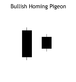
Recognition Criteria:
1. Market is in downtrend.
2. We see a black body in the first day.
3. Then we again see a black body in the second day where the real body of this second day is completely engulfed by the real body of the first day. It is not required that the shadows (high/low) of the second candlestick are contained within the first, though it's preferable if they are.
Explanation:
The Bullish Homing Pigeon Pattern is a signal of disparity. In a market characterized by downtrend, we first see heavy selling reflected by the long, black real body of the first day. However small body of second day points out to diminished power and enthusiasm of the sellers thus suggesting a trend reversal.
Important Factors:
The important fact about this pattern is the requirement that the second day has a minute real body relative to the prior candlestick and that this small body is completely contained by the larger one. The Bullish Homing Pigeon Pattern is not necessarily a signal for a rally. Market usually has a tendency to enter into a congestion phase following a Homing Pigeon.
We must check the third day to confirm that the downtrend has reversed. This confirmation may be in the form of a white candlestick, a large gap up or a higher close on the next trading day (on the third day).
$TECZ BarChart Technical Analysis
http://www.barchart.com/technicals/stocks/TECZ
The Force Index is an indicator that uses price and volume to assess the power behind a move or identify possible turning points. Developed by Alexander Elder, the Force Index was introduced in his classic book, Trading for a Living.
BEARISH BELT HOLT
The Bearish Belt Hold Pattern is a single candlestick pattern and it is basically a Black Opening Marubozu that occurs in an uptrend. The pattern shows that the day opens on its high, it then rallies against the trend of the market, and then closes near its low but not necessarily at its low. Longer bodies for Belt Hold are indicative of more resistance to the trend they are countering.

Recognition Criteria:
1. There is an overall uptrend in the market.
2. The day gaps up and prices open on their high but then prices move down closing near its low for the day.
3. We then see a black body characterized by the absence of upper shadow, which is called a Black Opening Marubozu.
Explanation:
We have a market that is trending up when a significant gap in the direction of trend occurs as the day opens. However; then prices reverse direction and all further price action of the day is the opposite of the previous trend. Such a move causes concern among the bulls and leads them to sell many positions. This strengthens the reversal and turns into a sell-off.
Important Factors:
A confirmation of the trend reversal with either a black candlestick, a large gap down or a lower close on the next trading day is required.
Ulcer index indicator measure the stress of holding trade and investment by simply measuring the price retracements. Ulcer Index is based in the notion which downward volatility is bad, however upward volatility is good. Unlike the standard deviation, the economic industry benchmark way of measuring risks of the stock that equally weights both increase to upside volatility and the violent decrease to downside volatility.
$BTHR BarChart Technical Analysis
http://www.barchart.com/technicals/stocks/BTHR
Dragonfly
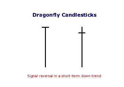
The dragonfly occurs when the open and close are near the top of the candlestick and signals reversal after a down-trend: control has shifted from sellers to buyers.
The Ulcer Index measures the "stress" of holding a trade or investment by measuring price retracements. The Ulcer Index is based on the notion that downward volatility is bad, but upward volatility is good.
$CLKTF BarChart Technical Analysis
http://www.barchart.com/technicals/stocks/CLKTF
Investment Use of ETF’s
ETFs generally provide the easy diversification, low expense ratios, and tax efficiency of index funds, while still maintaining all the features of ordinary stock, such as limit orders, short selling, and options. Because ETFs can be economically acquired, held, and disposed of, some investors invest in ETF shares as a long-term investment for asset allocation purposes, while other investors trade ETF shares frequently to implement market timing investment strategies.[5] Among the advantages of ETFs are the following:[8][17]
? Lower costs – ETFs generally have lower costs than other investment products because most ETFs are not actively managed and because ETFs are insulated from the costs of having to buy and sell securities to accommodate shareholder purchases and redemptions. ETFs typically have lower marketing, distribution and accounting expenses, and most ETFs do not have 12b-1 fees.
? Buying and selling flexibility – ETFs can be bought and sold at current market prices at any time during the trading day, unlike mutual funds and unit investment trusts, which can only be traded at the end of the trading day. As publicly traded securities, their shares can be purchased on margin and sold short, enabling the use of hedging strategies, and traded using stop orders and limit orders, which allow investors to specify the price points at which they are willing to trade.
? Tax efficiency – ETFs generally generate relatively low capital gains, because they typically have low turnover of their portfolio securities. While this is an advantage they share with other index funds, their tax efficiency is further enhanced because they do not have to sell securities to meet investor redemptions.
? Market exposure and diversification – ETFs provide an economical way to rebalance portfolio allocations and to "equitize" cash by investing it quickly. An index ETF inherently provides diversification across an entire index. ETFs offer exposure to a diverse variety of markets, including broad-based indices, broad-based international and country-specific indices, industry sector-specific indices, bond indices, and commodities.
? Transparency – ETFs, whether index funds or actively managed, have transparent portfolios and are priced at frequent intervals throughout the trading day.
Some of these advantages derive from the status of most ETFs as index funds.
With an exponential moving average as its foundation, Keltner Channels are a trend following indicator. As with moving averages and trend following indicators, Keltner Channels lag price action. The direction of the moving average dictates the direction of the channel. In general, a downtrend is present when the channel moves lower, while an uptrend exists when the channel moves higher. The trend is flat when the channel moves sideways.
$IXMD BarChart Technical Analysis
http://www.barchart.com/technicals/stocks/IXMD
Form N-Q ~ SEC Filings Explained
Quarterly Schedule of Portfolio Holdings of Registered Management Investment Company
Signal line crossovers are the most common TRIX signals. The signal line is a 9-day EMA of the TRIX. As a moving average of the indicator, it trails TRIX and makes it easier to spot turns. A bullish crossover occurs when TRIX turns up and crosses above the signal line. A bearish crossover occurs when TRIX turns down and crosses below the signal line. Crossovers can last a few days or a few weeks, it all depends on the strength of the move. Due diligence is required before relying on these frequent signals. Volatility in the underlying security can also increase the number of crossovers.
$DECN BarChart Technical Analysis
http://www.barchart.com/technicals/stocks/DECN
Piercing Line
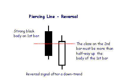
The Piercing Line is the opposite of the Dark Cloud pattern and is a reversal signal if it appears after a down-trend.
The MACD fluctuates above and below the zero line as the moving averages converge, cross and diverge. Traders can look for signal line crossovers, centerline crossovers and divergences to generate signals. Because the MACD is unbounded, it is not particularly useful for identifying overbought and oversold levels.
$SFEG BarChart Technical Analysis
http://www.barchart.com/technicals/stocks/SFEG
Form 11-KT, 11-KT/A ~ SEC Filings Explained
Transition report pursuant to Rule 13a-10 or 15d-10 (and amendment thereto)
A buy signal is generated when the indicator is below zero and turns upwards from a trough. No sell signals are generated (that not being its design), but turns at the top have their uses in signalling danger. The indicator is trend-following, and based on averages, so by its nature it doesn't pick a absolute market bottom like our TroughFinder product, but rather shows when a rally has become established.
$NSFE BarChart Technical Analysis
http://www.barchart.com/technicals/stocks/NSFE
Form N-CSR ~ SEC Filings Explained
Certified annual shareholder report of registered management investment companies
A negative reversal is the opposite of a positive reversal. RSI forms a higher high, but the security forms a lower high. Again, the higher high is usually just below overbought levels in the 50-70 area. Chart 12 shows Starbucks (SBUX) forming a lower high as RSI forms a higher high. Even though RSI forged a new high and momentum was strong, the price action failed to confirm as lower high formed. This negative reversal foreshadowed the big support break in late June and sharp decline.
$ATYG BarChart Technical Analysis
http://www.barchart.com/technicals/stocks/ATYG
Harami Candlestick
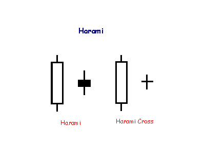
A Harami formation indicates loss of momentum and often warns of reversal after a strong trend. Harami means 'pregnant' which is quite descriptive. The second candlestick must be contained within the body of the first, though the shadows may protrude slightly.
The CMF formula creates an oscillator that fluctuates between -1 and 1. The CMF line will spend the majority of the time between extreme levels and it is fact extremely rare for the oscillator to reach these extremes. Just to clarify this point, for the CMF indicator to reach the top or bottom of the oscillator would take 20 consecutive data points on the high for a 20-day Chaikin Money Flow to reach 1 and the opposite to reach -1.
$PRTN BarChart Technical Analysis
http://www.barchart.com/technicals/stocks/PRTN
The purpose of the RSI roller-coaster is to harvest points from range-bound currency pairs. First and foremost, this setup works best in a range environment when overbought and oversold readings are far more likely to be true signals of a change in direction. The setup is also much more accurate on the daily charts than on smaller time frames like hourly charts. The primary reason for this difference is that daily charts incorporate far more data points into their subsets and, therefore, turns in momentum tend to be more meaningful on longer time frames.
Definitions For The Fifth Letter Of Ticker Symbols
Have you ever wondered what that fifth letter at the end of the stock symbol is? It signifies that the issuer may have additional circumstances involved with the stock. Most recognizable is the infamous "E".
Complete "Letter" list enclosed below. You may want to print it out for your own reference.
The Eligibility Rule protects investors by ensuring that they have access to companies current financial information when considering investments in OTCBB-eligible securities.
Nasdaq will continue to monitor the filing status of all OTCBB issuers. In the event of a filing delinquency, Nasdaq will append the trading symbol(s) of the delinquent issuer's security with an "E". The fifth character "E" will be removed from the symbol once Nasdaq receives notification that the security meets the requirements of the Eligibility Rule. After 30 days (60 days for non-SEC filers), if Nasdaq has not been notified that the appropriate filing has been made with the issuer's regulatory authority, the issuer's security will be removed from the OTCBB.
Code: Meaning
A: Class A.
B: Class B.
C: Exempt from Nasdaq listing requirements for a limited period of time.
D: A new issue of an existing stock. (Often the result of a reverse split.)
E: Delinquent in required filings with the SEC as determined by the NASD.
F: Foreign.
G: First Convertible Bond.
H: Second Convertible Bond, same company.
I: Third Convertible Bond, same company.
J: Voting.
K Non-voting.
L: Miscellaneous situations such as foreign preferred, preferred when-issued, a second class of units, a third class of warrants, or a sixth class of preferred stock.
M: Fourth preferred, same company.
N: Third preferred, same company.
O: Second preferred, same company.
P: First preferred.
Q: In bankruptcy proceedings.
R: Rights.
S: Beneficial interest.
T: With warrants or with rights.
U: Units.
V: When-issued and when-distributed.
W: Warrants.
X: Mutual Fund.
Y: ADR (American Depositary Receipts).
Z: Miscellaneous situations such as a second class of warrants, a fifth class of preferred stock, a stub, a foreign preferred when-issued, or any unit, receipt, or certificate representing a limited partnership interest."
$MINE BarChart Technical Analysis
http://www.barchart.com/technicals/stocks/MINE
Doji Candlesticks (General)
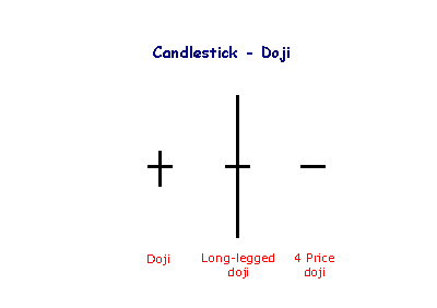
The doji candlestick occurs when the open and closing price are equal.
An open and close in the middle of the candlestick signal indecision. Long-legged dojis, when they occur after small candlesticks, indicate a surge in volatility and warn of a potential trend change. 4 Price dojis, where the high and low are equal, are normally only seen on thinly traded stocks.
The money flow index is similar to the relative strength index (RSI). The fundamental difference is that the MFI also accounts for volume, whereas the RSI only incorporates price. Many traders watch for opportunities that arise when the MFI moves in the opposite direction as the price. This divergence can often be a leading indicator of a change in the current trend.
$ALQA BarChart Technical Analysis
http://www.barchart.com/technicals/stocks/ALQA
As a volume-weighted version of RSI, the Money Flow Index (MFI) can be interpreted similar to RSI. The big difference is, of course, volume. Because volume is added to the mix, the Money Flow Index will act a little differently than RSI. Theories suggest that volume leads prices. RSI is a momentum oscillator that already leads prices. Incorporating volume can increase this lead time.
|
Followers
|
3287
|
Posters
|
|
|
Posts (Today)
|
0
|
Posts (Total)
|
2804248
|
|
Created
|
08/22/10
|
Type
|
Free
|
| Moderator Nilbud | |||
| Assistants mick ManicTrader PhotoChick Kirimi $Pistol Pete$ | |||
   Investor Hub Alerts: Sign up for 'STOCKGOODIES PLAYS OF THE WEEK ' E-Mail List Investor Hub Alerts: Sign up for 'STOCKGOODIES PLAYS OF THE WEEK ' E-Mail ListUPDATE; 5-1-22 courtesy of charting /\ wit tweezer top calls /\ Tony @Montana_Trades Really good study sheet on Candlestick Patterns [-chart]pbs.twimg.com/media/FRn8188XMAAdZvk?format=jpg&name=small[/chart] 

02-07-2021
|
|
Posts Today
|
0
|
|
Posts (Total)
|
2804248
|
|
Posters
|
|
|
Moderator
|
|
|
Assistants
|
| Volume | |
| Day Range: | |
| Bid Price | |
| Ask Price | |
| Last Trade Time: |


