 News
News  Market Data
  Discover
Support: 888-992-3836
Copyright © 2023 InvestorsHub Inc.


Register for free to join our community of investors and share your ideas. You will also get access to streaming quotes, interactive charts, trades, portfolio, live options flow and more tools.
Deficit: Shortfall in the balance of trade, balance of payments, or government budgets.

Daily Candlestick Chart for AAGC
[img]stockcharts.com/c-sc/sc?s=AAGC
Runaway Gaps
Runaway gaps are also called measuring gaps, and are best described as gaps that are caused by increased interest in the stock. For runaway gaps to the upside, it usually represents traders who did not get in during the initial move of the up trend and while waiting for a retracement in price, decided it was not going to happen. Increased buying interest happens all of a sudden, and the price gaps above the previous day's close. This type of runaway gap represents an almost panic state in traders. Also, a good uptrend can have runaway gaps caused by significant news events that cause new interest in the stock. In the chart below, note the significant increase in volume during and after the runaway gap.

Runaway gaps can also happen in downtrends. This usually represents increased liquidation of that stock by traders and buyers who are standing on the sidelines. These can become very serious as those who are holding onto the stock will eventually panic and sell – but sell to whom? The price has to continue to drop and gap down to find buyers. Not a good situation.
The term measuring gap is also used for runaway gaps. This is an interpretation that is hard to find examples for, but it is a way of helping one decide how much longer a trend will last. The theory is that the measuring gap will occur in the middle of, or half way through, the move.
Sometimes, the futures market will have runaway gaps that are caused by trading limits imposed by the exchanges. Getting caught on the wrong side of the trend when you have these limit moves in futures can be horrifying. The good news is that you can also be on the right side of them. These are not common occurrences in the futures market despite all the wrong information being touted by those who do not understand it, and are only repeating something they read from an uninformed reporter.

Doji: The doji is a type of candlestick and a warning sign of a pending reversal. The lack of a real body conveys a sense of indecision or tug-of-war between buyers and sellers and the balance of power may be shifting. The open and close are pretty much equal. The length of the upper and lower shadows can vary and the resulting candlestick looks like a cross, inverted cross or plus sign.
Daily Candlestick Chart for KDKN
[img]stockcharts.com/c-sc/sc?s=KDKN
Identification of key support and resistance levels is an essential ingredient to successful technical analysis. Even though it is sometimes difficult to establish exact support and resistance levels, being aware of their existence and location can greatly enhance analysis and forecasting abilities. If a security is approaching an important support level, it can serve as an alert to be extra vigilant in looking for signs of increased buying pressure and a potential reversal. If a security is approaching a resistance level, it can act as an alert to look for signs of increased selling pressure and potential reversal. If a support or resistance level is broken, it signals that the relationship between supply and demand has changed. A resistance breakout signals that demand (bulls) has gained the upper hand and a support break signals that supply (bears) has won the battle.
Clearing Price: The actual monetary value given to an asset. This value in a trade serves as a compromise at which a buyer agrees to buy and a seller agrees to sell
Daily Candlestick Chart for GGABF
[img]stockcharts.com/c-sc/sc?s=GGABF
Discretionary Account: An account in which the account holder gives power to a company or trading body to handle buy/sell transactions. The trading body also has power to choose which currencies to buy or sell.
This account type is also referred to as a managed or controlled account.
Daily Candlestick Chart for DEEL
[img]stockcharts.com/c-sc/sc?s=DEEL
EquiVolume Chart Reversals
High volume moves can also signal the beginning of a trend. Chart 6 shows Alcoa (AA) trending lower from early January to early March 2009. The stock firmed around 5-6 in March and then broke out with a wide EquiVolume box. This was by far the widest box in months. Such strong buying pressure confirmed the reversal and foreshadowed a rally back to the January highs.

The above chart shows Goldman Sachs (GS) reversing an uptrend with three red EquiVolume boxes. The stock surged above 345 in late October, but moved sharply lower with a long-red-wide EquiVolume box in early November. Two more long-red-wide EquiVolume boxes followed as the stock broke support at 210. Together, these three EquiVolume boxes showed selling pressure intensifying. Goldman Sachs managed to bounce back above 235, but these EquiVolume boxes were narrower because of lower volume. Upside volume on the bounce was weaker than downside volume on the support break. Lacking conviction, this bounce failed and the stock moved to new reaction lows over the coming months.

Currency Peg: A currency peg, sometimes referred to as a fixed exchange rate, is a kind of exchange rate policy wherein a country’s domestic currency is only allowed to fluctuate within a narrow range (usually between -1% to 1%) against the value of another currency.
Currency pegging is usually done by countries who wish to stabilize their global trade operations. By using a currency peg, risk caused by exchange rate fluctuations of businesses involved in international trade is reduced. This kind of exchange rate policy is very useful for countries with robust trade industries.
China, the Bahamas, and Marshall Islands have pegged their currencies to the U.S. dollar; Niger and Senegal to the French franc; and Bangladesh, Czech Republic and Thailand to a basket of several select currencies.
Daily Candlestick Chart for GDSI
[img]stockcharts.com/c-sc/sc?s=GDSI
Daily Candlestick Chart for LYJN
[img]stockcharts.com/c-sc/sc?s=LYJN
Day Trader: A person who makes and closes trades within the same trading day, or "flat" (no open positions) at the end of the session
Using Financial Analysis to pick a stock
The final step to this analysis process would be to take apart the financial statements and come up with a means of valuation. Below is a list of potential inputs into a financial analysis.
Accounts Payable
Accounts Receivable
Acid Ratio
Amortization
Assets - Current
Assets - Fixed
Book Value
Brand
Business Cycle
Business Idea
Business Model
Business Plan
Capital Expenses
Cash Flow
Cash on hand
Current Ratio
Customer Relationships
Days Payable
Days Receivable
Debt
Debt Structure
Debt:Equity Ratio
Depreciation
Derivatives-Hedging
Discounted Cash Flow
Dividend
Dividend Cover
Earnings
EBITDA
Economic Growth
Equity
Equity Risk Premium
Expenses Good Will
Gross Profit Margin
Growth
Industry
Interest Cover
International
Investment
Liabilities - Current
Liabilities - Long-term
Management
Market Growth
Market Share
Net Profit Margin
Pageview Growth
Pageviews
Patents
Price/Book Value
Price/Earnings
PEG
Price/Sales
Product
Product Placement
Regulations
R
Daily Candlestick Chart for NHVCF
[img]stockcharts.com/c-sc/sc?s=NHVCF
Cross Rate: An exchange rate between two currencies, usually constructed from the individual exchange rates of two currencies, as most currencies are quoted against the dollar
Subjectivity As A Weaknesses of Fundamental Analysis
Fair value is based on assumptions. Any changes to growth or multiplier assumptions can greatly alter the ultimate valuation. Fundamental analysts are generally aware of this and use sensitivity analysis to present a base-case valuation, an average-case valuation and a worst-case valuation. However, even on a worst-case valuation, most models are almost always bullish, the only question is how much so. The chart below shows how stubbornly bullish many fundamental analysts can be.

Counter Currency: The second currency in a currency pair.
Daily Candlestick Chart for ELTP
[img]stockcharts.com/c-sc/sc?s=ELTP
Exhaustion Gaps
Exhaustion gaps are those that happen near the end of a good up- or downtrend. They are many times the first signal of the end of that move. They are identified by high volume and large price difference between the previous day's close and the new opening price. They can easily be mistaken for runaway gaps if one does not notice the exceptionally high volume.
It is almost a state of panic if the gap appears during a long down move where pessimism has set in. Selling all positions to liquidate holdings in the market is not uncommon. Exhaustion gaps are quickly filled as prices reverse their trend. Likewise, if they happen during a bull move, some bullish euphoria overcomes trades, and buyers cannot get enough of that stock. The prices gap up with huge volume; then, there is great profit taking and the demand for the stock totally dries up. Prices drop, and a significant change in trend occurs. Exhaustion gaps are probably the easiest to trade and profit from. In the chart, notice that there was one more day of trading to the upside before the stock plunged. The high volume was the giveaway that this was going to be, either, an exhaustion gap or a runaway gap. Because of the size of the gap and the near doubling of volume, an exhaustion gap was in the making here.
stockcharts.com/school/data/media/chart_school/chart_analysis/gaps_and_gap_analysis/ExhaustionChart6.png
Analyst: When analyzing the market, analysts can generally be divided into two camps - fundamentals and technicals.
Fundamental analysts are those who mainly look at the fundamental aspects of an economy in forming their opinions. They stay on top of the markets by reading and analyzing what the current economic data say about current market conditions, what is fundamentally driving the market, and where it's headed.
Technical analysts are those who primarily rely on chart indicators and patterns to help predict where price will move next. Some tools that technical analysts use are Fibonacci retracement, candlesticks and momentum indicators.
Daily Candlestick Chart for RNGG
[img]stockcharts.com/c-sc/sc?s=RNGG
Daily Candlestick Chart for MEEC
[img]stockcharts.com/c-sc/sc?s=MEEC
Daily Chart: A graph that shows the past price movement of a security in which each bar or candlestick represents a day's worth of data
Inflationary Relationships
The intermarket relationships depend on the forces of inflation or deflation. In a "normal" inflationary environment, stocks and bonds are positively correlated. This means they both move in the same direction. The world was in an inflationary environment from the 1970's to the late 1990's. These are the key intermarket relationships in a inflationary environment:
A POSITIVE relationship between bonds and stocks
An INVERSE relationship between interest rates and stocks
Bonds usually change direction ahead of stocks
An INVERSE relationship between commodities and bonds
A POSITIVE relationship between commodities and interest rates
A POSITIVE relationship between stocks and commodities
Commodities usually change direction after stocks
An INVERSE relationship between the US Dollar and commodities
POSITIVE: When one goes up, the other goes up also. INVERSE: When one goes up, the other goes down. Interest rates move up when bonds move down

In an inflationary environment, stocks react positively to falling interest rates (rising bond prices). Low interest rates stimulate economic activity and boost corporate profits. As interest rates fall and the economy strengthens, demand for commodities increases and commodity prices rise. Keep in mind that an "inflationary environment" does not mean runaway inflation. It simply means that the inflationary forces are stronger than the deflationary forces.
Bahamas Dollars: The currency of the Bahamas. Currency code (BSD)
Daily Candlestick Chart for PRAY
[img]stockcharts.com/c-sc/sc?s=PRAY
Appreciation: An increase in value of currency due to a market reaction or an increase in value of a general asset.
Daily Candlestick Chart for WCUI
[img]stockcharts.com/c-sc/sc?s=WCUI
Ascending Triangle: An Ascending Triangle is a price action formation signal based on continuation pattern theory.
Continuation patterns also include symmetrical triangles, descending triangles, wedges, flags, rectangles and pennants and are essentially technical patterns that are expected to lead to the continuation of an existing trend. Continuation patterns are considered a powerful trading tool as they usually result in extremely low risk trading opportunities and spectacular returns.
An ascending triangle demonstrated within a chart pattern is recognized as having a bullish position and occurs as a result of price highs and price lows that have begun to converge so that they, in effect, form a point. If a line is drawn above and below the pattern the top line will appear straight whilst the bottom will slope upwards at an angle.
Ascending triangles are considered to be at their most reliable when occurring during an uptrend, and a buy order should be placed on a break above the upper resistance area of the triangle. If however, the pattern is proved to be false, or if the ascending triangle pattern should fail, then it is advisable to sell when the market breaks out and below the triangle.
Daily Candlestick Chart for ITKG
[img]stockcharts.com/c-sc/sc?s=ITKG
Central Bank: Central banks play a key role in the currency markets because of their power over monetary policy. They have a direct influence over money supply, which in turn affects demand and price of the currency. Through the use of different policies, central banks can try to manipulate the markets so that they can keep their currency at specific levels. Some countries and their central banks try to peg their currency to that of another currency or basket of currencies (for example, China to the U.S.).
The central bank can participate in the forex market by buying and selling their currency at the spot market in order to keep it from changing too much. Another motivation for central banks is to keep the local currency at a specific price in order to make their local economy more attractive for international trade. If a country’s currency appreciates too quickly, it could actually make it less appealing to importers.
Remember that many transactions have to use the local currency. Thus, if currency that is needed rises too quickly, it effectively makes goods more expensive to foreigners, which in turn, hurts trade. To counter this, the central bank may intervene in the market by selling its currency and buying up other major currencies. This in effect, weakens the local currency so as to make it more appealing to foreign importers.
While the exact value of what percentage such central bank transactions take up isn’t known, take note that because these are the banks of national governments, such interventions can have a much larger impact on the market than any single commercial bank.
Daily Candlestick Chart for GRYO
[img]stockcharts.com/c-sc/sc?s=GRYO
What is Sector Rotation?
Unsurprisingly, the business cycle influences the rotation of stock market sectors and industry groups. Certain sectors perform better than others during specific phases of the business cycle. Knowing the stage of the business cycle can help investors position themselves in the right sectors and avoid the wrong sectors.
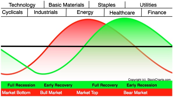
The graph above shows the economic cycle in green, the stock market cycle in red and the best performing sectors at the top. The green economic cycle corresponds to the business cycle shown above. The centerline marks the contraction/expansion threshold for the economy. Notice how the red market cycle leads the business cycle. The market turns up and crosses the centerline before the economic cycle turns. Similarly, the market turns down and crosses below the centerline ahead of the economic cycle.
Cyclicals, which is the same as the consumer discretionary sector, are the first to turn up in anticipation of a bottom in the economy. Technology stocks are not far behind. These two groups are the big leaders at the beginning of a bull run in the stock market.
The top of the market cycle is marked by relative strength in materials and energy. These sectors benefit from a rise in commodity prices and a rise in demand from an expanding economy. The tipping point for the market comes when leadership shifts from energy to consumer staples. This is a sign that commodity prices are starting to hurt the economy.
The market peak and downturn are followed by a contraction in the economy. At this stage, the Fed starts to lower interest rates and the yield curve steepens. Falling interest rates benefit debt-laden utilities and business at banks. The steepening yield curve also improves profitability at banks and encourages lending. Low interest rates and easy money eventually lead to a market bottom and the cycle repeats itself.
The two sector PerfCharts below show relative performance for the nine sector SPDRs near the 2007 peak and after the 2003 bottom. The S
Detrended Price Oscillator: The Detrended Price Oscillator (DPO), as the name indicates, is a technical analysis tool designed to give information about the price of an asset without taking into account existing price trends. The logic behind this is that detrended prices can help traders to understand the buying and selling pressure in a market based on short-term fluctuations in the price of an asset, without taking into account larger upswings or downswings in price.
The Detrended Price Oscillator can be calculated by declaring a period of time that could be said to indicate a trend in price (for example, if prices steadily increase over a twenty-day period, then one could take "20" as the period of time that indicates a trend.) Divide this period by two and add one to arrive at a number n. Then take the moving average of an asset's price n days before the period in question, and subtract this from the asset's closing price for that period. The resulting number is the period's DPO. This calculation method ensures that although short-term price trends are included in a DPO chart, longer-term trends are excluded.
One of the fundamental assumptions of the DPO is that long-term price trends are composed of short-term price trends, and that only by looking at short-term trends can long-term trends be understood. By this rationale, particularly severe peaks and troughs in the DPO indicate probable reversals in the overall trend of the asset price, and traders should take appropriate positions to take advantage of these reversals in either direction.
Daily Candlestick Chart for AMBS
[img]stockcharts.com/c-sc/sc?s=AMBS
Dealer: An individual or firm acting as a principal, rather than as an agent, in the purchase and/or sale of securities. Dealers trade for their own account and risk. This is in contrast to brokers who trade only on behalf of their clients.
Daily Candlestick Chart for GELV
[img]stockcharts.com/c-sc/sc?s=GELV
Account value: The account value is how much one's account is worth.
Daily Candlestick Chart for LNXGF
[img]stockcharts.com/c-sc/sc?s=LNXGF
Asset Purchases: In recent events, asset purchases usually pertains to the purchasing of government bonds to lower interest rates, inject capital into the economy or both. It is an unconventional monetary policy used by central banks to stimulate the economy, otherwise know as "quantitative easing."
|
Followers
|
3288
|
Posters
|
|
|
Posts (Today)
|
0
|
Posts (Total)
|
2804248
|
|
Created
|
08/22/10
|
Type
|
Free
|
| Moderator Nilbud | |||
| Assistants mick ManicTrader PhotoChick Kirimi $Pistol Pete$ | |||
   Investor Hub Alerts: Sign up for 'STOCKGOODIES PLAYS OF THE WEEK ' E-Mail List Investor Hub Alerts: Sign up for 'STOCKGOODIES PLAYS OF THE WEEK ' E-Mail ListUPDATE; 5-1-22 courtesy of charting /\ wit tweezer top calls /\ Tony @Montana_Trades Really good study sheet on Candlestick Patterns [-chart]pbs.twimg.com/media/FRn8188XMAAdZvk?format=jpg&name=small[/chart] 

02-07-2021
|
|
Posts Today
|
0
|
|
Posts (Total)
|
2804248
|
|
Posters
|
|
|
Moderator
|
|
|
Assistants
|
| Volume | |
| Day Range: | |
| Bid Price | |
| Ask Price | |
| Last Trade Time: |


