Register for free to join our community of investors and share your ideas. You will also get access to streaming quotes, interactive charts, trades, portfolio, live options flow and more tools.
Daily Candlestick Chart for PUBNF
[img]stockcharts.com/c-sc/sc?s=PUBNF
$TRTC BarChart Trader's Cheat Sheet
http://www.barchart.com/cheatsheet.php?sym=TRTC
Daily Candlestick Chart for IWSY
[img]stockcharts.com/c-sc/sc?s=IWSY
Interpretation of Kagi Charts
The simplest way to interpret Kagi charts can be summed up by Steve Nison's expression Buy on yang, sell on yin. When the Kagi line goes from thin to thick, prices have just exceeded their previous important high – that's a bullish signal. The opposite is also true. When the Kagi line goes from thick to thin, prices have just fallen below their previous low, not a good sign for things to come.
Standard support/resistance, trend and chart pattern analysis techniques can also be used with Kagi charts. In fact it is often easier to locate strong support or resistance levels on Kagi charts because of their "clean" appearance.
Another interpretation technique mentioned by Steve Nison is to look for a sequence of nine (mostly consecutive) shoulders or waists. Traders look for strong counter-moves soon after the ninth shoulder or waist appears.

$ADFS BarChart Trader's Cheat Sheet
http://www.barchart.com/cheatsheet.php?sym=ADFS
$EVPH BarChart Trader's Cheat Sheet
http://www.barchart.com/cheatsheet.php?sym=EVPH
Gaps and Gap Analysis
Have you ever wondered what causes gaps in price charts and what they mean? Well, you've come to the right place. Just in case, a gap is an area on a price chart in which there were no trades. Normally this occurs between the close of the market on one day and the next day's open. Lot's of things can cause this, such as an earnings report coming out after the stock market has closed for the day. If the earnings were significantly higher than expected, many investors might place buy orders for the next day. This could result in the price opening higher than the previous day's close. If the trading that day continues to trade above that point, a gap will exist in the price chart. Gaps can offer evidence that something important has happened to the fundamentals or the psychology of the crowd that accompanies this market movement. Before we get into the different types of gaps, here is a chart showing a gap so you will know what we are talking about.

Gaps appear more frequently on daily charts, where every day is an opportunity to create an opening gap. Gaps on weekly or monthly charts are fairly rare: the gap would have to occur between Friday's close and Monday's open for weekly charts and between the last day of the month's close and the first day of the next month's for the monthly charts. Gaps can be subdivided into four basic categories: Common, Breakaway, Runaway, and Exhaustion.

Daily Candlestick Chart for ASOLF
[img]stockcharts.com/c-sc/sc?s=ASOLF
Double Top: Any chart pattern similar to the one show below is known as a ‘Double Top’ and it is arguably one of the most widely recognized and compelling technical signals known amongst the forex trading community. It is considered a reliable test of a previous high or low.
The double top formation is identified as a distinctive chart pattern revealing a rally to new high followed by a moderate retreat which is then in turn followed by a second rally in which to test the new high.
The double top chart pattern classically reveals itself by occurring in the shape of the letter ‘M’. A third rally added to this would result in the occurrence of a triple top resulting in three peaks.
A double top is considered a bearish and is generally thought to be stronger when the equal points are further apart and the price objective usually occurs at an equal distance beyond the correction low.

Runaway Gaps
Runaway gaps are also called measuring gaps, and are best described as gaps that are caused by increased interest in the stock. For runaway gaps to the upside, it usually represents traders who did not get in during the initial move of the up trend and while waiting for a retracement in price, decided it was not going to happen. Increased buying interest happens all of a sudden, and the price gaps above the previous day's close. This type of runaway gap represents an almost panic state in traders. Also, a good uptrend can have runaway gaps caused by significant news events that cause new interest in the stock. In the chart below, note the significant increase in volume during and after the runaway gap.

Ford Motor Co. (F) Runaway Gap example chart from StockCharts.com
Runaway gaps can also happen in downtrends. This usually represents increased liquidation of that stock by traders and buyers who are standing on the sidelines. These can become very serious as those who are holding onto the stock will eventually panic and sell – but sell to whom? The price has to continue to drop and gap down to find buyers. Not a good situation.
The term measuring gap is also used for runaway gaps. This is an interpretation that is hard to find examples for, but it is a way of helping one decide how much longer a trend will last. The theory is that the measuring gap will occur in the middle of, or half way through, the move.
Sometimes, the futures market will have runaway gaps that are caused by trading limits imposed by the exchanges. Getting caught on the wrong side of the trend when you have these limit moves in futures can be horrifying. The good news is that you can also be on the right side of them. These are not common occurrences in the futures market despite all the wrong information being touted by those who do not understand it, and are only repeating something they read from an uninformed reporter.
Daily Candlestick Chart for RDUFF
[img]stockcharts.com/c-sc/sc?s=RDUFF
Trend Lines
Technical analysis is built on the assumption that prices trend. Trend Lines are an important tool in technical analysis for both trend identification and confirmation. A trend line is a straight line that connects two or more price points and then extends into the future to act as a line of support or resistance. Many of the principles applicable to support and resistance levels can be applied to trend lines as well. It is important that you understand all of the concepts presented in Support and Resistance before you continue.

Chicago PMI: This report is created by The National Association of Purchasing Management. It rates the level of factory health in the upper Midwest. It is also known as the Business Barometer. Announced at the end of the month in The Chicago Report. Because it is released on the last day of the reporting month, it is used to predict the ISM Report. The Chicago PMI is based on a level of 50. Any level higher is considered expansion. Naturally, any level lower is a sign of contraction.

Fundie Research Conclusions
Fundamental analysis can be valuable, but it should be approached with caution. If you are reading research written by a sell-side analyst, it is important to be familiar with the analyst behind the report. We all have personal biases, and every analyst has some sort of bias. There is nothing wrong with this, and the research can still be of great value. Learn what the ratings mean and the track record of an analyst before jumping off the deep end. Corporate statements and press releases offer good information, but they should be read with a healthy degree of skepticism to separate the facts from the spin. Press releases don't happen by accident; they are an important PR tool for companies. Investors should become skilled readers to weed out the important information and ignore the hype.
Daily Candlestick Chart for CDXC
[img]stockcharts.com/c-sc/sc?s=CDXC
Fat Tails and Trends
Historic stock returns are not normally distributed. What does this mean? If one were to measure the height of 1000 people and plot the distribution, this distribution would form the classic bell curve. The most recurring height (value) would be in the middle and the remaining heights would be equally distributed on either side. Furthermore, 68.5% of all values would fall within ±1 standard deviation of the mean, 95.4% would fall within ±2 standard deviations and 99.7% would fall within ±3 standard deviations. The solid black line shows a typical bell curve with a normal distribution.

Statisticians have found that a distribution of stock returns forms a curve with "fat tails". For example, this could be a distribution of the 1000 weekly returns for a basket of stocks. In a normal distribution, 99.7% of all these returns would be within ±3 standard deviations of the mean. This, however, is not the case for stock returns. Instead, the distribution has fat tails (black dotted lines). This means a relatively high number of returns fall outside the normal distribution. Some are lower and some are higher. These abnormal returns provide evidence of extended moves, outsized moves or trends. Note that the image above is just a hypothetical example to illustrate a point.

$ABBY BarChart Trader's Cheat Sheet
http://www.barchart.com/cheatsheet.php?sym=ABBY
Derivatives: Derivatives are financial instruments that acquires the majority of their value from the price of the underlying asset they are tracking such as commodities and currencies, or from securities such as stocks and bonds.
Swaps, futures, forwards, and options are the most common derivatives. Investors trade them on exchange or over-the-counter usually as an alternative to speculating in the underlying asset, or to hedge their risk on a position in the underlying asset.

Daily Candlestick Chart for RFMK
[img]stockcharts.com/c-sc/sc?s=RFMK
$SDRG BarChart Trader's Cheat Sheet
http://www.barchart.com/cheatsheet.php?sym=SDRG
What is Sector Rotation?
Unsurprisingly, the business cycle influences the rotation of stock market sectors and industry groups. Certain sectors perform better than others during specific phases of the business cycle. Knowing the stage of the business cycle can help investors position themselves in the right sectors and avoid the wrong sectors.
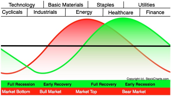
The graph above shows the economic cycle in green, the stock market cycle in red and the best performing sectors at the top. The green economic cycle corresponds to the business cycle shown above. The centerline marks the contraction/expansion threshold for the economy. Notice how the red market cycle leads the business cycle. The market turns up and crosses the centerline before the economic cycle turns. Similarly, the market turns down and crosses below the centerline ahead of the economic cycle.
Cyclicals, which is the same as the consumer discretionary sector, are the first to turn up in anticipation of a bottom in the economy. Technology stocks are not far behind. These two groups are the big leaders at the beginning of a bull run in the stock market.
The top of the market cycle is marked by relative strength in materials and energy. These sectors benefit from a rise in commodity prices and a rise in demand from an expanding economy. The tipping point for the market comes when leadership shifts from energy to consumer staples. This is a sign that commodity prices are starting to hurt the economy.
The market peak and downturn are followed by a contraction in the economy. At this stage, the Fed starts to lower interest rates and the yield curve steepens. Falling interest rates benefit debt-laden utilities and business at banks. The steepening yield curve also improves profitability at banks and encourages lending. Low interest rates and easy money eventually lead to a market bottom and the cycle repeats itself.
The two sector PerfCharts below show relative performance for the nine sector SPDRs near the 2007 peak and after the 2003 bottom. The S
Daily Candlestick Chart for BLIBQ
[img]stockcharts.com/c-sc/sc?s=BLIBQ
Volume will (should) pick up significantly, for not only the increased enthusiasm, but many are holding positions on the wrong side of the breakout and need to cover or sell them. It is better if the volume does not happen until the gap occurs. This means that the new change in market direction has a chance of continuing. The point of breakout now becomes the new support (if an upside breakout) or resistance (if a downside breakout). Don't fall into the trap of thinking this type of gap, if associated with good volume, will be filled soon. It might take a long time. Go with the fact that a new trend in the direction of the stock has taken place, and trade accordingly. Notice in the chart below how prices spent over 2 months without going lower than about 41. When they did, it was with increased volume and a downward breakaway gap.

General Motors Corp. (GM) Breakaway Gap example chart from StockCharts.com
A good confirmation for trading gaps is if they are associated with classic chart patterns. For example, if an ascending triangle suddenly has a breakout gap to the upside, this can be a much better trade than a breakaway gap without a good chart pattern associated with it. The chart below shows the normally bullish ascending triangle (flat top and rising, lower trend line) with a breakaway gap to the upside, as you would expect with an ascending triangle.

Ambac Financial Group, Inc. (ABK) Breakaway Gap example chart from StockCharts.com
Daily Candlestick Chart for RNDR
[img]stockcharts.com/c-sc/sc?s=RNDR
$WMIH BarChart Trader's Cheat Sheet
http://www.barchart.com/cheatsheet.php?sym=WMIH
Daily Candlestick Chart for AAGC
[img]stockcharts.com/c-sc/sc?s=AAGC
$UYMG BarChart Trader's Cheat Sheet
http://www.barchart.com/cheatsheet.php?sym=UYMG
Dollar and Commodities
While the Dollar and currency markets are part of intermarket analysis, the Dollar is a bit of a wild card. As far as stocks are concerned, a weak Dollar is not bearish unless accompanied by a serious advance in commodity prices. Obviously, a big advance in commodities would be bearish for bonds. By extension, a weak Dollar is also generally bearish for bonds. A weak Dollar acts an economic stimulus by making US exports more competitive. This benefits large multinational stocks that derive a large portion of their sales overseas.

What are the effects of a rising Dollar? A countries currency is a reflection of its economy and national balance sheet. Countries with strong economies and strong balance sheets have stronger currencies. Countries with weak economies and big debt burdens are subject to weaker currencies. A rising Dollar puts downward pressure on commodity prices because many commodities are priced in Dollars, such as oil. Bonds benefit from a decline in commodity prices because this reduces inflationary pressures. Stocks can also benefit from a decline in commodity prices because this reduces the costs for raw materials.

Daily Candlestick Chart for GGABF
[img]stockcharts.com/c-sc/sc?s=GGABF
What is a mutual fund?
A mutual fund is a fund created by an investment company which combines money from many investors and invests it in a group of stocks, bonds, or other investment vehicles. The investment company actively manages the portfolio to meet a desired goal, such as long-term growth or steady dividends. One major benefit is diversification. Many mutual funds also charge a fee when someone buys or sells shares.
When someone buys shares of a mutual fund, they are not directly buying shares of the underlying companies. Instead, they are entitled to a proportional amount of the fund's profits, which are usually distributed two or three times per year.
Deflationary Relationships
Murphy notes that the world shifted from an inflationary environment to a deflationary environment around 1998. It started with the collapse of the Thai Baht in the summer of 1997 and quickly spread to neighboring countries to become known as Asian currency crisis. Asian central bankers raised interest rates to support their currencies, but high interest rates choked their economies and compounded the problems. The subsequent threat of global deflation pushed money out of stocks and into bonds. Stocks fell sharply, Treasury bonds rose sharply and US interest rates decline. This marked a decoupling between stocks and bonds that would last for many years. Big deflationary events continued as the Nasdaq bubble burst in 2000, the housing bubble burst in 2006 and the financial crisis hit in 2007.

The intermarket relationships during a deflationary environment are largely the same except for one. Stocks and bonds are inversely correlated during a deflationary environment. This means stocks rise when bonds fall and visa versa. By extension, this also means that stocks have a positive relationship with interest rates. Yes, stocks and interest rates rise together.


Obviously, deflationary forces change the whole dynamic. Deflation is negative for stocks and commodities, but positive for bonds. A rise in bond prices and fall in interest rates increases the deflationary threat and this puts downward pressure on stocks. Conversely, a decline in bond prices and rise in interest rates decreases the deflationary threat and this is positive for stocks. The list below summarizes the key intermarket relationships during a deflationary environment.
An INVERSE relationship between bonds and stocks
A POSITIVE relationship between interest rates and stocks
An INVERSE relationship between commodities and bonds
A POSITIVE relationship between commodities and interest rates
A POSITIVE relationship between stocks and commodities
An INVERSE relationship between the US Dollar and commodities

Daily Candlestick Chart for TGLO
[img]stockcharts.com/c-sc/sc?s=TGLO
$PVSP BarChart Trader's Cheat Sheet
http://www.barchart.com/cheatsheet.php?sym=PVSP
Daily Candlestick Chart for MMAB
[img]stockcharts.com/c-sc/sc?s=MMAB
Carry Trade: The Carry Trade is a trading strategy where investors/traders sell or borrow assets (such as currencies) with lower yielding interest rates to fund or buy higher yielding assets.
In the Foreign exchange, interest is debited or credit from a trader's account everyday on open positions.
The most popular Carry Trade in recent history has been to sell Japanese Yen and buy higher yielding currencies such as the Australian Dollar, New Zealand Dollar, and British Pound.
For example, if you buy the AUD/JPY, then you sell Japanese Yen (which yields 0.00% a year)and buy an equivalent amount of Australian Dollars (which yields 3.50% a year) simultaneously. So, for as long as you hold that position you would pay 0.00% interest a year for borrowing Japanese Yen, and receive 3.50% a year for holding Australian Dollars.
The interest rate differential of that position is 3.50 (3.50% - 0.00%). So you would receive approximately 3.50% a year on the value of the position, depending on the margin interest charged by the broker and on exchange rate volatility.

$USDC BarChart Trader's Cheat Sheet
http://www.barchart.com/cheatsheet.php?sym=USDC
|
Followers
|
3269
|
Posters
|
|
|
Posts (Today)
|
0
|
Posts (Total)
|
2804248
|
|
Created
|
08/22/10
|
Type
|
Free
|
| Moderator Nilbud | |||
| Assistants mick ManicTrader PhotoChick Kirimi $Pistol Pete$ | |||
   Investor Hub Alerts: Sign up for 'STOCKGOODIES PLAYS OF THE WEEK ' E-Mail List Investor Hub Alerts: Sign up for 'STOCKGOODIES PLAYS OF THE WEEK ' E-Mail ListUPDATE; 5-1-22 courtesy of charting /\ wit tweezer top calls /\ Tony @Montana_Trades Really good study sheet on Candlestick Patterns [-chart]pbs.twimg.com/media/FRn8188XMAAdZvk?format=jpg&name=small[/chart]  

02-07-2021
|
|
Posts Today
|
0
|
|
Posts (Total)
|
2804248
|
|
Posters
|
|
|
Moderator
|
|
|
Assistants
|
| Volume | |
| Day Range: | |
| Bid Price | |
| Ask Price | |
| Last Trade Time: |
