 News
News  Market Data
  Discover

Support: 888-992-3836
Copyright © 2023 InvestorsHub Inc.


Register for free to join our community of investors and share your ideas. You will also get access to streaming quotes, interactive charts, trades, portfolio, live options flow and more tools.
$GGABF BarChart Technical Analysis
http://www.barchart.com/technicals/stocks/GGABF
Candlestick Colors
For improved presentation, Incredible Charts uses colors such as red and blue/green to indicate filled or hollow candlesticks:
Blue (or green) candlestick if the close is higher than the open;
Red candlestick if the open is higher than the close (i.e. the candlestick is filled);
The same color as the previous day, if the open is equal to the close. 
MACD Bullish Signal Line Cross: This scan reveals stocks that are trading above their 200-day moving average and have a bullish signal line crossover in MACD. Also notice that MACD is required to be negative to insure this upturn occurs after a pullback. This scan is just meant as a starter for further refinement.
Commodity ETFs or ETCs
Commodity ETFs (ETCs or CETFs) invest in commodities, such as precious metals and futures. Among the first commodity ETFs were gold exchange-traded funds, which have been offered in a number of countries. The idea of a Gold ETF was first officially conceptualised by Benchmark Asset Management Company Private Ltd in India when they filed a proposal with the SEBI in May 2002.[24] The first gold exchange-traded fund was Gold Bullion Securities launched on the ASX in 2003, and the firstsilver exchange-traded fund was iShares Silver Trust launched on the NYSE in 2006. As of November 2010 a commodity ETF, namely SPDR Gold Shares, was the second-largest ETF by market capitalization.[25]
However, generally commodity ETFs are index funds tracking non-security indices. Because they do not invest in securities, commodity ETFs are not regulated as investment companies under the Investment Company Act of 1940 in the United States, although their public offering is subject to SEC review and they need an SEC no-action letter under the Securities Exchange Act of 1934. They may, however, be subject to regulation by the Commodity Futures Trading Commission.[26][27]
Exchange-traded commodities (ETCs) are investment vehicles (asset backed bonds, fully collateralised) that track the performance of an underlying commodity index including total return indices based on a single commodity. Similar to ETFs and traded and settled exactly like normal shares on their own dedicated segment, ETCs have market maker support with guaranteed liquidity, enabling investors to gain exposure to commodities, on-exchange, during market hours.
The earliest commodity ETFs (e.g., GLD and SLV) actually owned the physical commodity (e.g., gold and silver bars). Similar to these are NYSE: PALL (palladium) and NYSE: PPLT (platinum). However, most ETCs implement a futures tradingstrategy, which may produce quite different results from owning the commodity.
Commodity ETFs trade just like shares, are simple and efficient and provide exposure to an ever-increasing range of commodities and commodity indices, including energy, metals, softs and agriculture. However, it is important for an investor to realize that there are often other factors that affect the price of a commodity ETF that might not be immediately apparent. For example, buyers of an oil ETF such as USO might think that as long as oil goes up, they will profit roughly linearly. What isn't clear to the novice investor is the method by which these funds gain exposure to their underlying commodities. In the case of many commodity funds, they simply roll so-called front-month futures contracts from month to month. This does give exposure to the commodity, but subjects the investor to risks involved in different prices along the term structure, such as a high cost to roll
$CLKTF BarChart Technical Analysis
http://www.barchart.com/technicals/stocks/CLKTF
The Coppock Curve can be found in the Indicators section under the chart. Users can adjust the settings by changing the numbers in the Parameters box. The indicator can then be positioned "behind price," "above" the main window or "below" the main window. It helps to change the color when placing it behind the price. Chartists can also add a moving average using the "advanced" options. This moving average acts like a signal line, similar to MACD.
Bullish Morning Doji Star
• Direction: Bullish
• Type: Reversal
• Reliability: Strong

• After an established down trending day-one is a long red day
• Day-two is a doji where the open and close are equal.
• Day-three is a blue day
Bullish Morning Doji Stars are a rare reversal pattern that offers one of the strongest bullish reversal signals in the Forex Market. Morning Star formations are characterized by a continuation of a bearish trend followed by a Doji, reflecting uncertainty in the strength of trend.
Up to day two we actually have a Doji Star formation, a moderate strength bullish pattern. After the day of indecision, the trend reversal is confirmed when a rally creates the large bullish candle. The stronger the move up on day-three, the stronger the reversal signal. Watch for additional bullish price action in the next few days.
In FX this formation practically identical to the bullish Abandoned baby. In non-FX markets candlestick analysts traditionally look for gaps to signal the strength of the Morning Doji Star pattern. Gaps between the close price and open price are very common outside efficient FX markets, since exchanges are traditionally limited to very short trading periods. Because Foreign Exchange trades 24 hours, gaps are very uncommon and need to be ignored in identifying Morning Star patterns.
$ONCI BarChart Technical Analysis
http://www.barchart.com/technicals/stocks/ONCI
TRIX oscillates around a zero line so like most oscillating indicators a positive value indicates an overbought market and a negative value indicates an oversold market. Thus when the TRIX crosses above the zero line it gives a buy signal, and when it closes below the zero line, it gives a sell signal.
BULLISH MEETING LINES
We sometimes see that market gaps sharply lower when it opens and then closes at the same level as the prior session’s close. This is seen following a black candlestick in a downtrend. Such an occurrence is called Bullish Meeting Lines Pattern that is a pattern reflecting a stalemate between bulls and bears.

Recognition Criteria:
1. Market is characterized by downtrend.
2. We see a black candlestick on the first day.
3. Then we see a long white candlestick on the second day. Its body is lower than the previous trend.
4. The closing prices are same or almost same on both days.
5. Both candlesticks are long but the second candlestick may be shorter than the first.
Explanation:
This pattern appears during a decline. The first candlestick of this pattern is long and black. However the next session opens sharply lower causing the bears to feel confident. Then the bulls start a counterattack pushing the prices up and leading to a close equal to previous close. The downtrend is now breached.
Important Factors:
The Bullish Meeting Lines Pattern is a pattern that is comparable to the Bullish Piercing Line Pattern. The Piercing Line has the same two-candlestick pattern. The main difference between the two is the fact that the bullish counterattack does not carry the prices up to the prior session’s white real body in the case of Bullish Meeting Lines Pattern. It can only get back to prior session’s close while The Piercing Line Pattern’s second line pushes well into the black real body. Consequently the Piercing Line Pattern is a more significant bottom reversal. Nonetheless, the Bullish Meeting Lines Pattern should also be respected.
The Bullish Meeting Lines Pattern requires confirmation of the reversal on the third day. This confirmation may be in the form of a white candlestick, a large gap up or a higher close on the third day.
$GLHV BarChart Technical Analysis
http://www.barchart.com/technicals/stocks/GLHV
SCTRs take a predefined universe of stocks (initially the S
Nasdaq-100 Index Tracking Stock (Nasdaq:QQQQ)
This ETF represents the Nasdaq-100 Index, which consists of the 100 largest and most actively traded non-financial stocks on the Nasdaq, QQQQ offers broad exposure to the tech sector. Because it curbs the risk that comes with investing in individual stocks, the QQQQ is a great way to invest in the long-term prospects of the technology industry. The diversification it offers can be a huge advantage when there's volatility in the markets. If a tech company falls short of projected earnings, it will likely be hit hard. Between 2000 and 2004, QQQQ was by far the most heavily traded index fund.
$WSHE BarChart Technical Analysis
http://www.barchart.com/technicals/stocks/WSHE
Keltner Channels are a trend following indicator designed to identify the underlying trend. Trend identification is more than half the battle. The trend can be up, down or flat.
BULLISH HOMING PIGEON
Bullish Homing Pigeon Pattern is a small black real body contained by a prior relatively long black real body.
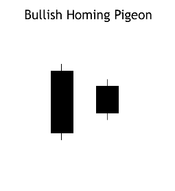
Recognition Criteria:
1. Market is in downtrend.
2. We see a black body in the first day.
3. Then we again see a black body in the second day where the real body of this second day is completely engulfed by the real body of the first day. It is not required that the shadows (high/low) of the second candlestick are contained within the first, though it's preferable if they are.
Explanation:
The Bullish Homing Pigeon Pattern is a signal of disparity. In a market characterized by downtrend, we first see heavy selling reflected by the long, black real body of the first day. However small body of second day points out to diminished power and enthusiasm of the sellers thus suggesting a trend reversal.
Important Factors:
The important fact about this pattern is the requirement that the second day has a minute real body relative to the prior candlestick and that this small body is completely contained by the larger one. The Bullish Homing Pigeon Pattern is not necessarily a signal for a rally. Market usually has a tendency to enter into a congestion phase following a Homing Pigeon.
We must check the third day to confirm that the downtrend has reversed. This confirmation may be in the form of a white candlestick, a large gap up or a higher close on the next trading day (on the third day).
$GLDG BarChart Technical Analysis
http://www.barchart.com/technicals/stocks/GLDG
Chaikin Money Flow Turns Positive and RSI Moves Above 50: This scan starts with a base of stocks that are averaging at least $10 in price and 100,000 in daily volume over the last 60 days. Accumulation and buying pressure is identified when Chaikin Money Flow moves into positive territory. Price momentum confirms when RSI moves above 50, its centerline. This scan is meant as a starting point for further analysis and due diligence.
Form 11-KT, 11-KT/A ~ SEC Filings Explained
Transition report pursuant to Rule 13a-10 or 15d-10 (and amendment thereto)
$MSVS BarChart Technical Analysis
http://www.barchart.com/technicals/stocks/MSVS
RSI tends to fluctuate between 10 and 60 in a bear market (downtrend) with the 50-60 zone acting as resistance. Chart 10 shows 14-day RSI for the US Dollar Index ($USD) during its 2009 downtrend. RSI moved to 30 in March to signal the start of a bear range. The 40-50 zone subsequently marked resistance until a breakout in December.
Form 20-F, 20-F/A ~ SEC Filings Explained
Annual and transition report of foreign private issuerspursuant to sections 13 or 15(d) (and amendment thereto)
$TECZ BarChart Technical Analysis
http://www.barchart.com/technicals/stocks/TECZ
. The Force Index can be used to reinforce the overall trend, identify playable corrections or foreshadow reversals with divergences.
Form 11-K, 11-K/A ~ SEC Filings Explained
Annual report of employee stock purchase, savings and similar plans (and amendment thereto)
$ELRA BarChart Technical Analysis
http://www.barchart.com/technicals/stocks/ELRA
Keltner Channels are volatility-based envelopes set above and below an exponential moving average. This indicator is similar to Bollinger Bands, which use the standard deviation to set the bands. Instead of using the standard deviation, Keltner Channels use the Average True Range (ATR) to set channel distance.
A great reason to consider ETFs is that they simplify index and sector investing in a way that is easy to understand. If you feel a turnaround is around the corner, go long. If, however, you think ominous clouds will be over the market for some time, you have the option of going short.
The combination of the instant diversification, low cost and the flexibility that ETFs offer, makes these instruments one of the most useful innovations and attractive pieces of financial engineering to date.
$LAWEQ BarChart Technical Analysis
http://www.barchart.com/technicals/stocks/LAWEQ
The MACD is only as useful as the context in which it is applied. An analyst might apply the MACD to a weekly scale before looking at a daily scale, in order to avoid making short term trades against the direction of the intermediate trend.[3] Analysts will also vary the parameters of the MACD to track trends of varying duration. One popular short-term set-up, for example, is the (5,35,5).
BLACK SPINNING TOP
The Black Spinning Top is a single candlestick pattern. Its shape is a small black body with upper and lower shadows having a greater length than the body's length.
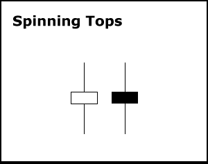
Recognition Criteria:
1. The real body of the pattern is black and small.
2. The upper and lower shadows are longer than the real body's length.
Explanation:
The market moves higher and then sharply lower, or vice versa. It then closes below the opening price creating a black body. This represents complete indecision between the bulls and the bears. The actual length of the shadows is not important. The small body relative to the shadows is what makes the spinning top.
Important Factors:
If a Black Spinning Top is observed after a long rally or long white candlestick, this implies weakness among the bulls and it is a warning about a potential change or interruption in trend.
If a Black Spinning Top is observed after a long decline or a long black candlestick, this implies weakness among the bears and it is a warning about a potential change or interruption in trend.
Like most other single candlestick patterns, the Black Spinning Top has low reliability. It reflects only one day's trading and can be interpreted both as a continuation and a reversal pattern. This pattern must be used with other candlesticks for a better and healthier confirmation of a trend.
$SEGI BarChart Technical Analysis
http://www.barchart.com/technicals/stocks/SEGI
Bandwidth tells how wide the Bollinger Bands are on a normalized basis. Writing the same symbols as before, and middleBB for the moving average, or middle Bollinger Band.
Doji Star
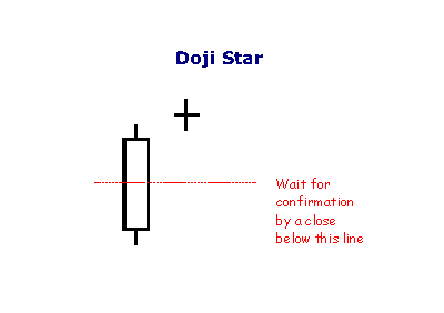
A Doji Star is weaker than the Morning or Evening Star: the doji represents indecision. The doji star requires confirmation from the next candlestick closing in the bottom half of the body of the first candlestick.
$SELR BarChart Technical Analysis
http://www.barchart.com/technicals/stocks/SELR
A crossing of the MACD line through zero happens when there is no difference between the fast and slow EMAs. A move from positive to negative is bearish and from negative to positive, bullish. Zero crossovers provide evidence of a change in the direction of a trend but less confirmation of its momentum than a signal line crossover.
$CRPZ BarChart Technical Analysis
http://www.barchart.com/technicals/stocks/CRPZ
The RSI formula normalizes RS and turns it into an oscillator that fluctuates between zero and 100. In fact, a plot of RS looks exactly the same as a plot of RSI. The normalization step makes it easier to identify extremes because RSI is range bound. RSI is 0 when the Average Gain equals zero. Assuming a 14-period RSI, a zero RSI value means prices moved lower all 14 periods. There were no gains to measure. RSI is 100 when the Average Loss equals zero. This means prices moved higher all 14 periods. There were no losses to measure.
Form N-4 ~ SEC Filings Explained
Initial registration statement on Form N-4 for separate accounts (unit investment trusts)
$NHVCF BarChart Technical Analysis
http://www.barchart.com/technicals/stocks/NHVCF
Ulcer index indicator measure the stress of holding trade and investment by simply measuring the price retracements. Ulcer Index is based in the notion which downward volatility is bad, however upward volatility is good. Unlike the standard deviation, the economic industry benchmark way of measuring risks of the stock that equally weights both increase to upside volatility and the violent decrease to downside volatility.
Form 1-E AD, 1-E AD/A ~ SEC Filings Explained
Sales material filed pursuant to Rule 607 under Regulation E. (and amendment thereto)
$MXDHF BarChart Technical Analysis
http://www.barchart.com/technicals/stocks/MXDHF
Form TA-W ~ SEC Filings Explained
Notice of withdrawal from registration as transfer agent filed pursuant to the Securities Exchange Act of 1934
Chaikin Money Flow measures buying and selling pressure for a given period of time. A move into positive territory indicates buying pressure, while a move into negative territory indicates selling pressure. Chartists can use the absolute value of Chaikin Money Flow to confirm or question the price action of the underlying. Positive CMF would confirm an uptrend, but negative CMF would call into question the strength behind an uptrend. The reverse holds true for downtrends.
$UCHC BarChart Technical Analysis
http://www.barchart.com/technicals/stocks/UCHC
BEARISH GRAVESTONE DOJI
Gravestone Doji is a pattern in which the opening and closing prices are at the low of the day. The Bearish Gravestone Doji Pattern is a top reversal pattern. It appears during an uptrend representing a possible reversal of trend just like its cousin Bearish Shooting Star Pattern.

Recognition Criteria:
1. Market is characterized by uptrend.
2. We see a white candlestick at the higher end of the trading range in the first day.
3. Prices open with a gap and we see a Doji with no lower (or almost no) shadow on the second day.
4. Upper shadow of the doji is usually long.
Explanation:
Gravestone Doji after a rally has bearish implications for the following reason. The market opens on the low of the day. Then prices start to rally (preferably to a new high). The rally cannot be sustained during the day and prices plummet to the day’s lows meaning trouble for longs. The Gravestone Doji represents the graves of those bulls that have died defending their territory.
Important Factors:
The Bearish Gravestone Doji Pattern has more bearish implications than a Bearish Shooting Star Pattern.
The longer the upper shadow and the higher the price level, the more bearish the implications of the Bearish Gravestone Doji Pattern will be.
A confirmation is required on the following day to be more certain about the bearish implications of the Bearish Gravestone Doji Pattern. Confirmation may be in the form of the next day opening below the Gravestone Doji. The larger the gap the stronger the confirmation will be. A black candlestick with lower prices can also be another form of confirmation.
The force index is calculated by subtracting yesterday’s close from today’s close and multiplying the result by today’s volume. Force Index = (Today’s Closing Price – Yesterday’s Closing Price) * Today’s Volume.
$HYDI BarChart Technical Analysis
http://www.barchart.com/technicals/stocks/HYDI
RSI in Technical Analysis for the Trading Professional, Constance Brown suggests that oscillators do not travel between 0 and 100. This also happens to be the name of the first chapter. Brown identifies a bull market range and a bear market for RSI. RSI tends to fluctuate between 40 and 90 in a bull market (uptrend) with the 40-50 zones acting as support. These ranges may vary depending on RSI parameters, strength of trend and volatility of the underlying security.
|
Followers
|
3287
|
Posters
|
|
|
Posts (Today)
|
0
|
Posts (Total)
|
2804248
|
|
Created
|
08/22/10
|
Type
|
Free
|
| Moderator Nilbud | |||
| Assistants mick ManicTrader PhotoChick Kirimi $Pistol Pete$ | |||
   Investor Hub Alerts: Sign up for 'STOCKGOODIES PLAYS OF THE WEEK ' E-Mail List Investor Hub Alerts: Sign up for 'STOCKGOODIES PLAYS OF THE WEEK ' E-Mail ListUPDATE; 5-1-22 courtesy of charting /\ wit tweezer top calls /\ Tony @Montana_Trades Really good study sheet on Candlestick Patterns [-chart]pbs.twimg.com/media/FRn8188XMAAdZvk?format=jpg&name=small[/chart] 

02-07-2021
|
|
Posts Today
|
0
|
|
Posts (Total)
|
2804248
|
|
Posters
|
|
|
Moderator
|
|
|
Assistants
|
| Volume | |
| Day Range: | |
| Bid Price | |
| Ask Price | |
| Last Trade Time: |


