


| Followers | 689 |
| Posts | 143817 |
| Boards Moderated | 35 |
| Alias Born | 03/10/2004 |
Friday, February 17, 2017 1:00:21 PM
There Are Mixed Signals In Commodities
By Greg Schnell
* February 17, 2017
"We simply attempt to be fearful when others are greedy and to be greedy only when others are fearful" - Warren Buffett
With the current fire lit under the Equities markets and no fire truck in sight, it seems that everyone is unabashedly bullish. Various breadth indicators including the Net New Highs, the Advance Decline lines, the McClellan Summation Indexes, the Volume Summation Indexes, Bullish Percent Indexes, and the Percent of stocks above the 200 DMA are all screamingly bullish. While the market soars, these charts continue to support the data.
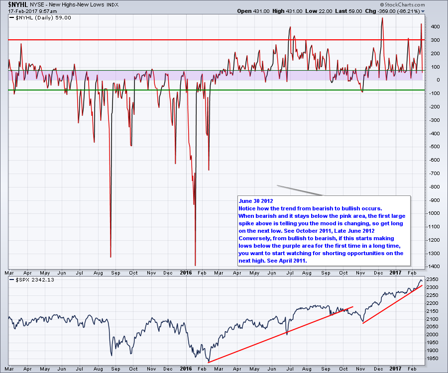
The Net New Highs ($NYHL) chart is wonderfully bullish.
Similarly the McClellan Summation Index ($NYSI) is very bullish.

My favorite display of breadth information is the Bullish Percent Index in concert with the percentage above the 200 DMA and today I'll show the index for the $SPX.($BPSPX). Everything is super strong at a level that pullbacks can occur from, but we don't usually see a final market top. Barring Geo-Political issues, the market is working its way higher.

So animal spirits are fully intact. Does the rally continue forever? One question I get a lot is: So we must be near a market top? The market does not usually make a final top from this level of bullishness. You would expect some market rotation to start showing up where Consumer Staples and Utilities stocks are starting to rise from the ashes. Looking at those charts, it might be starting but at this point it looks more like they are joining the party. Starting with Utilities, it is begrudgingly going to 4-month highs.

For Consumer Staples, (XLP) it is a much better chart.

It looks like the selling is done in these hated sectors and the buyers are starting to push things to higher ground. Animal spirits in the other sectors still seem to be strong enough that the defensive stocks have not moved to the fore. I do provide a little ballast for bullishness when I reviewed the $RUT on the Commodities Countdown Webinar 20170216.
I mentioned some things about the charts of NVDA, TECK, MU on the webinar and some indicators that suggest those market leaders are taking a break. Here is the link to the Commodities Countdown Webinar 20170216. I had some screen troubles at the beginning so the first two minutes are talking and then the screen finally comes in. I actually went twenty minutes without showing my screen but that has been deleted and redone. Oops!
Why are NVDA and MU part of the Commodities Countdown? It was a discussion regarding MACD's.
But the focus for my webinar is: Why have the Commodities not enjoyed the Trump Jump? The $USD pulled back all of January, and the $CRB still didn't move. Without question, it's coiling...

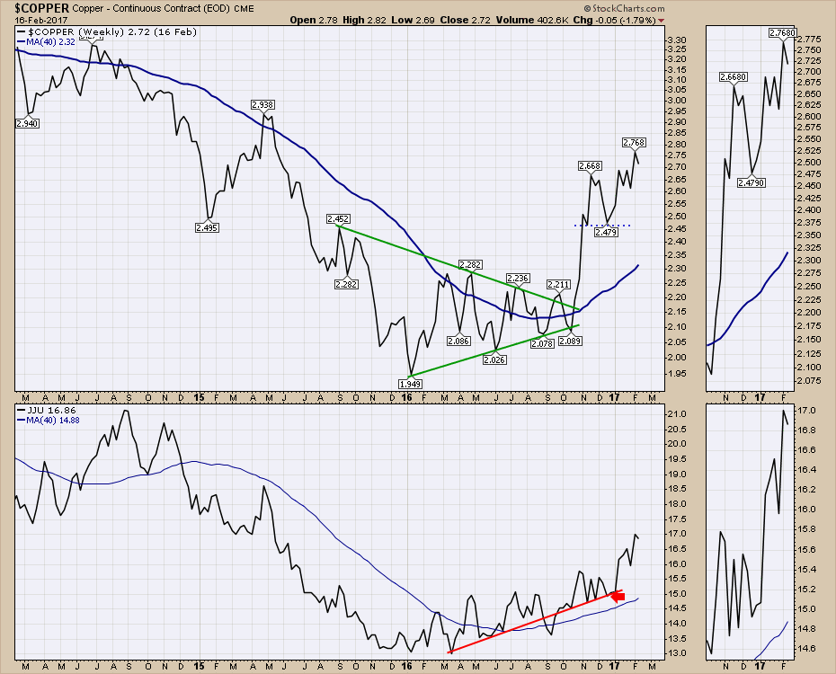
I do want people to see the changes in $COPPER and Aluminum (JJU). This looks more bullish.
Here is Gold and Silver. Jogging sideways on the daily and still struggling near the 40 WMA.

The XLE continues to sputter. Thursday's price action wiped out all the positive sentiment built over the previous five days.

If you want to get the whole Commodity review, I suggest you watch the Commodities Countdown 20170216.
For the education portion of my article, I want to discuss the 'performance' display tool which is what I used for the $CRB chart in the article above. Members have the ability to set up these charts to keep track of how things are moving. If you want to save Performance charts in your chartlists, this is one way to do it.
Below is an example of a performance chart. You can click on the chart to see the settings, but let's work through how and why.

Looking at the chart control panel, there are a huge number of options for setting the data display type. For the chart above, we want to use the 'performance' option under Chart Attributes / Type. Normally it says candlesticks to start. Use the drop down menu.

The next thing you need to select is on the Overlays dropdown. Select "Price- (Same Scale)".

The advantage to using this type of chart scale is to see the total change in one ticker symbol over another. Chart packages always adjust the scale on the Right Hand Side to maximize the view. The problem is the scale changes for every chart. When we use performance and then overlay another symbol on the same percentage scale it clearly shows the change. In the example above we can see SLX clearly soaring above everything else.
You can also use this feature for things like comparing international bonds.

Good trading,
Greg Schnell, CMT, MFTA.
http://stockcharts.com/articles/commodities/2017/02/there-are-mixed-signals-in-commodities.html
• DiscoverGold
Click on "In reply to", for Authors past commentaries
By Greg Schnell
* February 17, 2017
"We simply attempt to be fearful when others are greedy and to be greedy only when others are fearful" - Warren Buffett
With the current fire lit under the Equities markets and no fire truck in sight, it seems that everyone is unabashedly bullish. Various breadth indicators including the Net New Highs, the Advance Decline lines, the McClellan Summation Indexes, the Volume Summation Indexes, Bullish Percent Indexes, and the Percent of stocks above the 200 DMA are all screamingly bullish. While the market soars, these charts continue to support the data.
The Net New Highs ($NYHL) chart is wonderfully bullish.

Similarly the McClellan Summation Index ($NYSI) is very bullish.

My favorite display of breadth information is the Bullish Percent Index in concert with the percentage above the 200 DMA and today I'll show the index for the $SPX.($BPSPX). Everything is super strong at a level that pullbacks can occur from, but we don't usually see a final market top. Barring Geo-Political issues, the market is working its way higher.

So animal spirits are fully intact. Does the rally continue forever? One question I get a lot is: So we must be near a market top? The market does not usually make a final top from this level of bullishness. You would expect some market rotation to start showing up where Consumer Staples and Utilities stocks are starting to rise from the ashes. Looking at those charts, it might be starting but at this point it looks more like they are joining the party. Starting with Utilities, it is begrudgingly going to 4-month highs.

For Consumer Staples, (XLP) it is a much better chart.

It looks like the selling is done in these hated sectors and the buyers are starting to push things to higher ground. Animal spirits in the other sectors still seem to be strong enough that the defensive stocks have not moved to the fore. I do provide a little ballast for bullishness when I reviewed the $RUT on the Commodities Countdown Webinar 20170216.
I mentioned some things about the charts of NVDA, TECK, MU on the webinar and some indicators that suggest those market leaders are taking a break. Here is the link to the Commodities Countdown Webinar 20170216. I had some screen troubles at the beginning so the first two minutes are talking and then the screen finally comes in. I actually went twenty minutes without showing my screen but that has been deleted and redone. Oops!
Why are NVDA and MU part of the Commodities Countdown? It was a discussion regarding MACD's.
But the focus for my webinar is: Why have the Commodities not enjoyed the Trump Jump? The $USD pulled back all of January, and the $CRB still didn't move. Without question, it's coiling...

I do want people to see the changes in $COPPER and Aluminum (JJU). This looks more bullish.

Here is Gold and Silver. Jogging sideways on the daily and still struggling near the 40 WMA.

The XLE continues to sputter. Thursday's price action wiped out all the positive sentiment built over the previous five days.

If you want to get the whole Commodity review, I suggest you watch the Commodities Countdown 20170216.
For the education portion of my article, I want to discuss the 'performance' display tool which is what I used for the $CRB chart in the article above. Members have the ability to set up these charts to keep track of how things are moving. If you want to save Performance charts in your chartlists, this is one way to do it.
Below is an example of a performance chart. You can click on the chart to see the settings, but let's work through how and why.

Looking at the chart control panel, there are a huge number of options for setting the data display type. For the chart above, we want to use the 'performance' option under Chart Attributes / Type. Normally it says candlesticks to start. Use the drop down menu.

The next thing you need to select is on the Overlays dropdown. Select "Price- (Same Scale)".

The advantage to using this type of chart scale is to see the total change in one ticker symbol over another. Chart packages always adjust the scale on the Right Hand Side to maximize the view. The problem is the scale changes for every chart. When we use performance and then overlay another symbol on the same percentage scale it clearly shows the change. In the example above we can see SLX clearly soaring above everything else.
You can also use this feature for things like comparing international bonds.

Good trading,
Greg Schnell, CMT, MFTA.
http://stockcharts.com/articles/commodities/2017/02/there-are-mixed-signals-in-commodities.html
• DiscoverGold
Click on "In reply to", for Authors past commentaries
Information posted to this board is not meant to suggest any specific action, but to point out the technical signs that can help our readers make their own specific decisions. Your Due Dilegence is a must!
• DiscoverGold
Join the InvestorsHub Community
Register for free to join our community of investors and share your ideas. You will also get access to streaming quotes, interactive charts, trades, portfolio, live options flow and more tools.

