 News
News  Market Data
  Discover

Support: 888-992-3836
Copyright © 2023 InvestorsHub Inc.


Register for free to join our community of investors and share your ideas. You will also get access to streaming quotes, interactive charts, trades, portfolio, live options flow and more tools.
Involving yourself in a downward as well as in upward is important. When stocks are climbing up, most of the investors wholly trade. Learning to make a profit on both downtrend and uptrend moves is essentials to be winning trader. 
Check Out $GAEC On PennyStock Tweets
http://www.pennystocktweets.com/stocks/profile/GAEC

Even though there is a long black candlestick indicating an open at 59, the stock fell so fast that it was impossible to exit above 44.
NITE-LYNX $MLER BarChart Trader's Cheat Sheet
http://www.barchart.com/cheatsheet.php?sym=MLER

Feast thine eyes upon $PUDA BarChart Trader's Cheat Sheet NITE-LYNX
http://www.barchart.com/cheatsheet.php?sym=PUDA
Conclusions
Even though many different charting techniques are available, one method is not necessarily better than the other.
$CRNJF BarChart Technical Analysis
http://www.barchart.com/technicals/stocks/CRNJF
Criticism of ETF’s
John C. Bogle, founder of the Vanguard Group, a leading issuer of index mutual funds (and, since Bogle's retirement, of ETFs), has argued that ETFs represent short-term speculation, that their trading expenses decrease returns to investors, and that most ETFs provide insufficient diversification. He concedes that a broadly diversified ETF that is held over time can be a good investment.
ETFs are dependent on the efficacy of the arbitrage mechanism in order for their share price to track net asset value. While the average deviation between the daily closing price and the daily NAV of ETFs that track domestic indices is generally less than 2%, the deviations may be more significant for ETFs that track certain foreign indices. The Wall Street Journal reported in November 2008, during a period of market turbulence, that some lightly traded ETFs frequently had deviations of 5% or more, exceeding 10% in a handful of cases, although even for these niche ETFs, the average deviation was only a little more than 1%. The trades with the greatest deviations tended to be made immediately after the market opened.
According to a study on ETF returns in 2009 by Morgan Stanley, ETFs missed in 2009 their targets by an average of 1.25 percentage points, a gap more than twice as wide as the 0.52-percentage-point average they posted in 2008. Part of this so-called tracking error is attributed to the proliferation of ETFs targeting exotic investments or areas where trading is less frequent, such as emerging-market stocks, future-contracts based commodity indices and junk bonds.[citation needed]
The tax advantages of ETFs are of no relevance for investors using tax-deferred accounts (or indeed, investors who are tax-exempt in the first place). However, the lower expense ratios are proving difficult for the proponents of traditional mutual funds to overcome.
In a survey of investment professionals, the most frequently cited disadvantage of ETFs was the unknown, untested indices used by many ETFs, followed by the overwhelming number of choices.
Some critics claim that ETFs can be, and have been, used to manipulate market prices, including having been used for short selling that has been asserted by some observers (including Jim Cramer of theStreet.com) to have contributed to the market collapse of 2008

The force of every market movement is characterized by its direction, scale and volume. If the closing price of the current bar is higher than the preceding bar, the force is positive. If the current closing price if lower than the preceding one, the force is negative. The greater the difference in prices is, the greater the force is. The greater the transaction volume is, the greater the force is.
$TIRXF BarChart Technical Analysis
http://www.barchart.com/technicals/stocks/TIRXF
Form NT 10-K ~ SEC Filings Explained
Notice under Rule 12b25 of inability to timely file all or part of a Form 10-K, 10-KSB, or 10KT
Three factors affect Force Index values. First, the Force Index is positive when the current close is above the prior close. The Force Index is negative when the current close is below the prior close. Second, the extent of the move determines the volume multiplier.
SEC Filings Explained ~ POS AM Form
Post-effective amendments to provide updated prospectus information.
$PDOS BarChart Technical Analysis
http://www.barchart.com/technicals/stocks/PDOS
The Ulcer Index measures the "stress" of holding a trade or investment by measuring price retracements. The Ulcer Index is based on the notion that downward volatility is bad, but upward volatility is good.
$ARNH BarChart Technical Analysis
http://www.barchart.com/technicals/stocks/ARNH
Form N-14 ~ SEC Filings Explained
Initial registration statement for open-end investment company
MFI Oversold: This scan searches for stocks that are above $20 per share, trade over 100,000 shares per day and have oversold Money Flow Index (<10). Consider this a starting point for further analysis and due diligence.
SEC Filings Explained ~ Form 5
Form 5 is an SEC filing submitted to the Securities and Exchange Commission on an annual basis by company officers, directors, or beneficial (10%) owners, which summarizes their insider trading activities. This form is simply a combination of year's Form 4 filings, which are mandatory filings made shortly after insiders make transactions.
The Ulcer index can also be charted over time and used as a kind of technical analysis indicator, to show stocks going into ulcer-forming territory (for one's chosen time-frame), or to compare volatility in different stocks.[3] As with the Sharpe Ratio, a higher value is better than a lower value (investors prefer more return for less risk).
$ABBY BarChart Technical Analysis
http://www.barchart.com/technicals/stocks/ABBY
Trend Identification Using Moving Averages
The same signals can be generated using simple or exponential moving averages. As noted above, the preference depends on each individual. These examples below will use both simple and exponential moving averages. The term "moving average" applies to both simple and exponential moving averages.
The direction of the moving average conveys important information about prices. A rising moving average shows that prices are generally increasing. A falling moving average indicates that prices, on average, are falling. A rising long-term moving average reflects a long-term uptrend. A falling long-term moving average reflects a long-term downtrend.

The chart above shows 3M (MMM) with a 150-day exponential moving average. This example shows just how well moving averages work when the trend is strong. The 150-day EMA turned down in November 2007 and again in January 2008. Notice that it took a 15% decline to reverse the direction of this moving average. These lagging indicators identify trend reversals as they occur (at best) or after they occur (at worst). MMM continued lower into March 2009 and then surged 40-50%. Notice that the 150-day EMA did not turn up until after this surge. Once it did, however, MMM continued higher the next 12 months. Moving averages work brilliantly in strong trends.
The Ulcer Index is based on an N day rolling time window, and captures all of the drawdowns within that period. It’s defined by the following equations.
$MNLU BarChart Technical Analysis
http://www.barchart.com/technicals/stocks/MNLU
Bollinger Bands is a versatile tool combining moving averages and standard deviations and is one of the most popular technical analysis tools available for traders.
M-Tops Using Bollinger Bands
M-Tops were also part of Arthur Merrill's work that identified 16 patterns with a basic M shape. Bollinger uses these various M patterns with Bollinger Bands to identify M Bottoms. According to Bollinger, tops are usually more complicated and drawn out than bottoms. Double tops, head-and-shoulders patterns and diamonds represent evolving tops.
In its most basic form, an M-Top is similar to a double top. However, the reaction highs are not always equal. The first high can be higher or lower than the second high. Bollinger suggests looking for signs of non-confirmation when a security is making new highs. This is basically the opposite of the W-Bottom. A non-confirmation occurs with three steps. First, a security forges a reaction high above the upper band. Second, there is a pullback towards the middle band. Third, prices move above the prior high, but fail to reach the upper band. This is a warning sign. The inability of the second reaction high to reach the upper band shows waning momentum, which can foreshadow a trend reversal. Final confirmation comes with a support break or bearish indicator signal.

The chart shows Exxon Mobil (XOM) with an M-Top in April-May 2008. The stock moved above the upper band in April. There was a pullback in May and then another push above 90. Even though the stock moved above the upper band on an intraday basis, it did not CLOSE above the upper band. The M-Top was confirmed with a support break two weeks later. Also notice that MACD formed a bearish divergence and moved below its signal line for confirmation.
$DISK BarChart Technical Analysis
http://www.barchart.com/technicals/stocks/DISK
The TRIX is available on many trading and charting platforms, and is added to existing charts in the same fashion as other popular technical analysis tools. However, the TRIX may require some customization appropriate for the time frame being traded. Active traders may desire a TRIX that is more sensitive to price changes. A common default is a 9-period setting, which analyzes less than two weeks of data when applied to a daily chart. As an alternative, a 30-period configuration is more appropriate for investors with a longer time frame in mind.
THREE INSIDE DOWN (Bearish)
The Bearish Three Inside Down Pattern is another name for the Confirmed Bearish Harami Pattern. The third day confirms the bearish trend reversal.
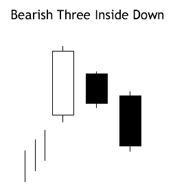
Recognition Criteria:
1. Market is characterized by uptrend.
2. We see a Bearish Harami Pattern in the first two days.
3. We then see a black candlestick on the third day with a lower close than the second day.
Explanation:
The first two days of this three-day pattern is a Bearish Harami Pattern, and the third day confirms the reversal suggested by Bearish Harami Pattern since it is a black candlestick closing with a new low for the three days.
Important Factors:
The reliability of this pattern is very high, but still a confirmation in the form of a black candlestick with a lower close or a gap-down is suggested.
$PEFDF BarChart Technical Analysis
http://www.barchart.com/technicals/stocks/PEFDF
The MACD can be set as an indicator above, below or behind a security's price plot. Placing the MACD "behind" the price plot makes it easy to compare momentum movements with price movements. Once the indicator is chosen from the drop-down menu, the default parameter setting appears: (12,26,9). These parameters can be adjusted to increase sensitivity or decrease sensitivity.
Stock ETFs
The first and most popular ETFs track stocks. Many funds track national indexes; for example, Vanguard Total Stock Market ETF NYSE: VTI tracks the MSCI US Broad Market Index, and several funds track the S
The Force Index is an indicator that uses price and volume to assess the power behind a move or identify possible turning points. Developed by Alexander Elder, the Force Index was introduced in his classic book, Trading for a Living.
$MYFT BarChart Technical Analysis
http://www.barchart.com/technicals/stocks/MYFT
Form N-30D ~ SEC Filings Explained
Initial annual and semi-annual reports mailed to investment company shareholders
When the MACD crosses over from below the signal and rises above the signal, this is a sign to buy. Conversely, when the MACD crosses over from above and drops below the signal, this is a sign to sell.
$AMBE BarChart Technical Analysis
http://www.barchart.com/technicals/stocks/AMBE
THREE INSIDE UP (Bullish)
The Bullish Three Inside Up Pattern is another name for the Confirmed Bullish Harami Pattern. The third day is confirmation of the bullish trend reversal.
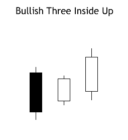
Recognition Criteria:
1. Market is characterized by downtrend.
2. We see a Bullish Harami Pattern in the first two days.
3. Then we see a white candlestick on the third day with a higher close than the second day.
Explanation:
The first two days of this pattern is simply the Bullish Harami Pattern, and the third day confirms the reversal suggested by the Bullish Harami Pattern, since it is a white candlestick closing with a new high for the last three days.
Important Factors:
The reliability of this pattern is very high, but still a confirmation in the form of a white candlestick with a higher close or a gap-up is suggested.
The Rate-of-Change indicator is a momentum oscillator that oscillates above and below the zero line. Coppock used 11 and 14 periods because, according to an Episcopal priest, this was the average mourning period when grieving the loss of a loved one. Coppock theorized that the recovery period for stock market losses would be similar to this time frame.
$NFDS BarChart Technical Analysis
http://www.barchart.com/technicals/stocks/NFDS
Candlestick Colors
For improved presentation, Incredible Charts uses colors such as red and blue/green to indicate filled or hollow candlesticks:
Blue (or green) candlestick if the close is higher than the open;
Red candlestick if the open is higher than the close (i.e. the candlestick is filled);
The same color as the previous day, if the open is equal to the close.
Chaikin Money Flow (CMF) is an oscillator that fluctuates between -1 and 1. Rarely, if ever, will the indicator reach these extremes. It would take 20 consecutive closes on the high (low) for 20-day Chaikin Money Flow to reach 1 (-1). Typically, this oscillator fluctuates between -.50 and .50 with zero as the center-line.
$ONCI BarChart Technical Analysis
http://www.barchart.com/technicals/stocks/ONCI
Walking the Bands
Moves above or below the bands are not signals as such. As Bollinger puts it, moves that touch or exceed the bands are not signals, but rather "tags". On the face of it, a move to the upper band shows strength, while a sharp move to the lower band shows weakness. Momentum oscillators work much the same way. Overbought is not necessarily bullish. It takes strength to reach overbought levels and overbought conditions can extend in a strong uptrend. Similarly, prices can "walk the band" with numerous touches during a strong uptrend. Think about it for a moment. The upper band is 2 standard deviations above the 20-period simple moving average. It takes a pretty strong price move to exceed this upper band. An upper band touch that occurs after a Bollinger Band confirmed W-Bottom would signal the start of an uptrend. Just as a strong uptrend produces numerous upper band tags, it is also common for prices to never reach the lower band during an uptrend. The 20-day SMA sometimes acts as support. In fact, dips below the 20-day SMA sometimes provide buying opportunities before the next tag of the upper band.

The chart above shows Air Products (APD) with a surge and close above the upper band in mid July. First, notice that this is a strong surge that broke above two resistance levels. A strong upward thrust is a sign of strength, not weakness. Trading turned flat in August and the 20-day SMA moved sideways. The Bollinger Bands narrowed, but APD did not close below the lower band. Prices, and the 20-day SMA, turned up in September. Overall, APD closed above the upper band at least five times over a four month period. The indicator window shows the 10-period Commodity Channel Index (CCI). Dips below -100 are deemed oversold and moves back above -100 signal the start of an oversold bounce (green dotted line). The upper band tag and breakout started the uptrend. CCI then identified tradable pullbacks with dips below -100. This is an example of combining Bollinger Bands with a momentum oscillator for trading signals.
TRIX is negative as long as the triple-smoothed 15-day EMA is moving lower. TRIX turns positive when the triple-smoothed 15-day EMA turns up. The extra smoothing insures that up turns and down turns are kept to a minimum. In other words, it takes more than a one-day advance to reverse a downtrend.
$WSHE BarChart Technical Analysis
http://www.barchart.com/technicals/stocks/WSHE
iShares
iShares is Barclay's (Barclay's Global Investors "BGI") brand of ETFs. In 2009 there were approximately 350 iShares trading with around $300 billion under management. Barclay has put out a number of iShares that follow many of the major indexes around the world including the Nasdaq, NYSE, Dow Jones, and Standard
$SLIO BarChart Technical Analysis
http://www.barchart.com/technicals/stocks/SLIO
The MACD is calculated by subtracting the 26-day exponential moving average (EMA) from the 12-day EMA. A nine-day EMA of the MACD, called the "signal line", is then plotted on top of the MACD, functioning as a trigger for buy and sell signals.
Leveraged ETFs
Leveraged exchange-traded funds (LETFs), or simply leveraged ETFs, are a special type of ETF that attempt to achieve returns that are more sensitive to market movements than non-leveraged ETFs.[33] Leveraged index ETFs are often marketed as bull or bear funds. A leveraged bull ETF fund might for example attempt to achieve daily returns that are 2x or 3x more pronounced than the Dow Jones Industrial Average or the S
|
Followers
|
3289
|
Posters
|
|
|
Posts (Today)
|
0
|
Posts (Total)
|
2804248
|
|
Created
|
08/22/10
|
Type
|
Free
|
| Moderator Nilbud | |||
| Assistants mick ManicTrader PhotoChick Kirimi $Pistol Pete$ | |||
   Investor Hub Alerts: Sign up for 'STOCKGOODIES PLAYS OF THE WEEK ' E-Mail List Investor Hub Alerts: Sign up for 'STOCKGOODIES PLAYS OF THE WEEK ' E-Mail ListUPDATE; 5-1-22 courtesy of charting /\ wit tweezer top calls /\ Tony @Montana_Trades Really good study sheet on Candlestick Patterns [-chart]pbs.twimg.com/media/FRn8188XMAAdZvk?format=jpg&name=small[/chart] 

02-07-2021
|
|
Posts Today
|
0
|
|
Posts (Total)
|
2804248
|
|
Posters
|
|
|
Moderator
|
|
|
Assistants
|
| Volume | |
| Day Range: | |
| Bid Price | |
| Ask Price | |
| Last Trade Time: |


