 News
News  Market Data
  Discover
Support: 888-992-3836
Copyright © 2023 InvestorsHub Inc.


Register for free to join our community of investors and share your ideas. You will also get access to streaming quotes, interactive charts, trades, portfolio, live options flow and more tools.
Indicators based on channels, bands and envelopes are designed to encompass most price action. Therefore, moves above or below the channel lines warrant attention because they are relatively rare. Trends often start with strong moves in one direction or another. A surge above the upper channel line shows extraordinary strength, while a plunge below the lower channel line shows extraordinary weakness. Such strong moves can signal the end of one trend and the beginning of another.
SEC Filings Explained ~ Form 5
Form 5 is an SEC filing submitted to the Securities and Exchange Commission on an annual basis by company officers, directors, or beneficial (10%) owners, which summarizes their insider trading activities. This form is simply a combination of year's Form 4 filings, which are mandatory filings made shortly after insiders make transactions.

$ASIBY BarChart Technical Analysis
http://www.barchart.com/technicals/stocks/ASIBY
The Money Flow Index is a rather unique indicator that combines momentum and volume with an RSI formula. RSI momentum generally favors the bulls when the indicator is above 50 and the bears when below 50. Even though MFI is considered a volume-weighted RSI, using the centerline to determine a bullish or bearish bias does not work as well. Instead, MFI is better suited to identify potential reversals with overbought/oversold levels, bullish/bearish divergences and bullish/bearish failure swings. As with all indicators, MFI should not be used by itself. A pure momentum oscillator, such as RSI, or pattern analysis can be combined with MFI to increase signal robustness.
Candlestick Colors
For improved presentation, Incredible Charts uses colors such as red and blue/green to indicate filled or hollow candlesticks:
Blue (or green) candlestick if the close is higher than the open;
Red candlestick if the open is higher than the close (i.e. the candlestick is filled);
The same color as the previous day, if the open is equal to the close.
$ABOT BarChart Technical Analysis
http://www.barchart.com/technicals/stocks/ABOT
Three Black Crows (Bullish)
The Bearish Three Black Crows Pattern is indicative of a strong reversal during an uptrend. It consists of three long black candlesticks, which look like a stair stepping downward. The opening price of each day is higher than the previous day's closing price suggesting a move to a new short term low.

Recognition Criteria:
1. Market is characterized by uptrend.
2. Three consecutive long black candlesticks appear.
3. Each day closes at a new low.
4. Each day opens within the body of the previous day.
5. Each day closes near or at its lows.
Explanation:
The Bearish Three Black Crows Pattern is indicative of the fact that the market has been at a high price for too long and the market may be approaching a top or is already at the top. A decisive downward move is reflected by the first black candlestick. The next two days show further decline in prices due to profit taking. Bullish mood of the market cannot be sustained anymore.
Important Factors:
The opening prices of the second and third days can be anywhere within the previous day's body. However, it is better to see the opening prices below the middle of the previous day's body.
If the black candlesticks are very extended, one should be cautious about an oversold market.
The reliability of this pattern is very high, but still a confirmation in the form of a black candlestick with a lower close or a gap-down is suggested.
$DRNK Like I said before, it is all for the benefit of $DRNK shareholders. It’s like an Elon Musk strategy when he use the proceeds from Pay-Pal to fund his other companies such as Tesla, Solar City, and SpaceX.
CEO’s response to my email back in November:
https://investorshub.advfn.com/boards/m_read_msg.aspx?message_id=136334119
$DRNK Mersky mentioning the NOHO brand and the FDA clinically-studied drug on the radio broadcast. Listen from 17:25.
http://businessradiox.com/podcast/phoenixbusinessradio/zoltan-kemeny-david-mersky/
$DRNK Just 5 Months ago $DRNK news about SNNC Sibannac.
Phoenix, AZ - July 7, 2017 - InvestorsHub NewsWire - NOHO, Inc. (OTC PINK: DRNK), a Wyoming corporation (the "Company"), announced the following:
Sibannac, Inc.
NOHO, Inc.'s CEO, David Mersky, has become the Chief Executive Officer of Sibbanac, Inc. (OTC: SNNC). Mr. Mersky will remain in his role in NOHO and at this time the acquisition by SNNC of IMBUTEK HOLDINGS, CORP., will have no effect on the NOHO shareholders. "While we had originally intended to change the name of NOHO to IMBUTEK to pursue new acquisitions, we have now determined that the NOHO brand is too valuable and must stand alone, in light of recent product distribution and the new FDA registered and clinically tested medicine that is going into production. Sibbanac will change its name to IMBUTEK HOLDINGS CORP, which will allow us to expedite our original plan. Sibbanac is fully reporting and we are catching it up on its filings, which we'll have completed very quickly." The company looks forward to updating NOHO shareholders about the impact of Sibannac's recent developments. For further information, please see the latest 8-K from Sibbanac, Inc.
Last week, Sibannac SNNC 8-k December 4, 2017
Sibannac, Inc. (Filer) CIK: 0001313938 (see all company filings)
IRS No.: 330903494 | State of Incorp.: NV | Fiscal Year End: 0831
Type: 8-K | Act: 34 | File No.: 000-55578 | Film No.: 171237780
SIC: 2834 Pharmaceutical Preparations
https://www.sec.gov/Archives/edgar/data/1313938/000168316817003225/0001683168-17-003225-index.htm
Chaikin Money Flow Turns Negative and RSI Moves Below 45: This scan starts with a base of stocks that are averaging at least $10 in price and 100,000 in daily volume over the last 60 days. Distribution and selling pressure are identified when Chaikin Money Flow moves into negative territory. Price momentum confirms when RSI moves below 50, its centerline. This scan is meant as a starting point for further analysis and due diligence.
$REVO BarChart Technical Analysis
http://www.barchart.com/technicals/stocks/REVO
Actively managed ETFs
Actively managed ETFs (AMETFs) are quite recent in the United States. The first one was offered in March 2008, but it was liquidated in October 2008. The actively managed ETFs approved to date are fully transparent, publishing their current securities portfolios on their web sites daily. However, the SEC has indicated that it is willing to consider allowing actively managed ETFs that are not fully transparent in the future.[4]
The fully transparent nature of existing ETFs means that an actively managed ETF is at risk from arbitrage activities by market participants who might choose to front run its trades[citation needed]. The initial actively traded equity ETFs have addressed this problem by trading only weekly or monthly, however today, actively managed ETFs trade at the discretion of the manager and to date, there have been no instances of front running. Actively traded debt ETFs, which are less susceptible to front-running, trade their holdings more frequently.[30]
Actively managed ETFs have grown faster in their first three years of existence than index ETFs did in their first three years of existence. However, as track records develop, many see actively managed ETFs as a significant competitive threat to actively managed mutual funds
This index can be used as it is, but it is better to approximate it with the help of Moving Average. Approximation with the help a short moving average (the author proposes to use 2 intervals) contributes to finding the best opportunity to open and close positions.
$HAZH BarChart Technical Analysis
http://www.barchart.com/technicals/stocks/HAZH
BULLISH HOMING PIGEON
Bullish Homing Pigeon Pattern is a small black real body contained by a prior relatively long black real body.
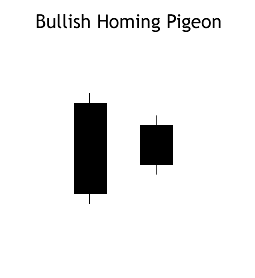
Recognition Criteria:
1. Market is in downtrend.
2. We see a black body in the first day.
3. Then we again see a black body in the second day where the real body of this second day is completely engulfed by the real body of the first day. It is not required that the shadows (high/low) of the second candlestick are contained within the first, though it's preferable if they are.
Explanation:
The Bullish Homing Pigeon Pattern is a signal of disparity. In a market characterized by downtrend, we first see heavy selling reflected by the long, black real body of the first day. However small body of second day points out to diminished power and enthusiasm of the sellers thus suggesting a trend reversal.
Important Factors:
The important fact about this pattern is the requirement that the second day has a minute real body relative to the prior candlestick and that this small body is completely contained by the larger one. The Bullish Homing Pigeon Pattern is not necessarily a signal for a rally. Market usually has a tendency to enter into a congestion phase following a Homing Pigeon.
We must check the third day to confirm that the downtrend has reversed. This confirmation may be in the form of a white candlestick, a large gap up or a higher close on the next trading day (on the third day).
The 125-day Rate-of-Change is the second long-term indicator. This is a simple indicator that measures the percentage price change over the last 125 days, which is around six months. Strong stocks will show the largest gains, while weak stocks will show the largest losses. It is a straight-forward indicator designed to measure pure strength or weakness.
$ANDI BarChart Technical Analysis
http://www.barchart.com/technicals/stocks/ANDI
$STAU BarChart Technical Analysis
http://www.barchart.com/technicals/stocks/STAU
TRIX Bearish Signal Line Cross: This scan reveals stocks that meet four criteria. First, they must be below their 200-day moving average to be in an overall down trend. Second, the TRIX must be positive to signal a bounce. Third, the TRIX crossed its signal line and turned down. Fourth, volume moved above the 250-day average to show an increase in selling pressure.
THREE INSIDE DOWN (Bearish)
The Bearish Three Inside Down Pattern is another name for the Confirmed Bearish Harami Pattern. The third day confirms the bearish trend reversal.
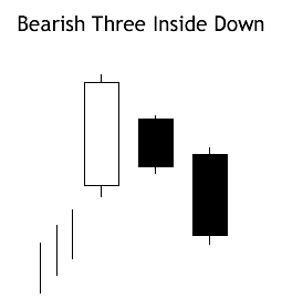
Recognition Criteria:
1. Market is characterized by uptrend.
2. We see a Bearish Harami Pattern in the first two days.
3. We then see a black candlestick on the third day with a lower close than the second day.
Explanation:
The first two days of this three-day pattern is a Bearish Harami Pattern, and the third day confirms the reversal suggested by Bearish Harami Pattern since it is a black candlestick closing with a new low for the three days.
Important Factors:
The reliability of this pattern is very high, but still a confirmation in the form of a black candlestick with a lower close or a gap-down is suggested.
Form N-6 ~ SEC Filings Explained
Registration statement for separate accounts
$HKWO BarChart Technical Analysis
http://www.barchart.com/technicals/stocks/HKWO
MACD (moving average convergence/divergence) is a technical analysis indicator created by Gerald Appel in the late 1970s.[1] It is used to spot changes in the strength, direction, momentum, and duration of a trend in a stock's price.
Ichimoku Clouds
Introduction
The Ichimoku Cloud, also known as Ichimoku Kinko Hyo, is a versatile indicator that defines support and resistance, identifies trend direction, gauges momentum and provides trading signals. Ichimoku Kinko Hyo translates into "one look equilibrium chart". With one look, chartists can identify the trend and look for potential signals within that trend. The indicator was developed by Goichi Hosoda, a journalist, and published in his 1969 book. Even though the Ichimoku Cloud may seem complicated when viewed on the price chart, it is really a straight forward indicator that is very usable. It was, after all, created by a journalist, not a rocket scientist! Moreover, the concepts are easy to understand and the signals are well-defined.
Calculation
Four of the five plots within the Ichimoku Cloud are based on the average of the high and low over a given period of time. For example, the first plot is simply an average of the 9-day high and 9-day low. Before computers were widely available, it would have been easier to calculate this high-low average rather than a 9-day moving average. The Ichimoku Cloud consists of five plots:
Tenkan-sen (Conversion Line): (9-period high 9-period low)/2))
The default setting is 9 periods and can be adjusted. On a daily
chart, this line is the mid point of the 9 day high-low range,
which is almost two weeks.
Kijun-sen (Base Line): (26-period high 26-period low)/2))
The default setting is 26 periods and can be adjusted. On a daily
chart, this line is the mid point of the 26 day high-low range,
which is almost one month).
Senkou Span A (Leading Span A): (Conversion Line Base Line)/2))
This is the midpoint between the Conversion Line and the Base Line.
The Leading Span A forms one of the two Cloud boundaries. It is
referred to as "Leading" because it is plotted 26 periods in the future
and forms the faster Cloud boundary.
Senkou Span B (Leading Span B): (52-period high 52-period low)/2))
On the daily chart, this line is the mid point of the 52 day high-low range,
which is a little less than 3 months. The default calculation setting is
52 periods, but can be adjusted. This value is plotted 26 periods in the future
and forms the slower Cloud boundary.
Chikou Span (Lagging Span): Close plotted 26 days in the past
The default setting is 26 periods, but can be adjusted.
This tutorial will use the English equivalents when explaining the various plots. The chart below shows the Dow Industrials with the Ichimoku Cloud plots. The Conversion Line (blue) is the fastest and most sensitive line. Notice that it follows price action the closest. The Base Line (red) trails the faster Conversion Line, but follows price action pretty well. The relationship between the Conversion Line and Base Line is similar to the relationship between a 9-day moving average and 26-day moving average. The 9-day is faster and more closely follows the price plot. The 26-day is slower and lags behind the 9-day. Incidentally, notice that 9 and 26 are the same periods used to calculate MACD.

Analyzing the Cloud
The Cloud (Kumo) is the most prominent feature of the Ichimoku Cloud plots. The Leading Span A (green) and Leading Span B (red) form the Cloud. The Leading Span A is the average of the Conversion Line and the Base Line. Because the Conversion Line and Base Line are calculated with 9 and 26 periods, respectively, the green Cloud boundary moves faster than the red Cloud boundary, which is the average of the 52-day high and the 52-day low. It is the same principle with moving averages. Shorter moving averages are more sensitive and faster than longer moving averages.
There are two ways to identify the overall trend using the Cloud. First, the trend is up when prices are above the Cloud, down when prices are below the Cloud and flat when prices are in the Cloud. Second, the uptrend is strengthened when the Leading Span A (green cloud line) is rising and above the Leading Span B (red cloud line). This situation produces a green Cloud. Conversely, a downtrend is reinforced when the Leading Span A (green cloud line) is falling and below the Leading Span B (red cloud line). This situation produces a red Cloud. Because the Cloud is shifted forward 26 days, it also provides a glimpse of future support or resistance.
Chart 2 shows IBM with a focus on the uptrend and the Cloud. First, notice that IBM was in an uptrend from June to January as it traded above the Cloud. Second, notice how the Cloud offered support in July, early October and early November. Third, notice how the Cloud provides a glimpse of future resistance. Remember, the entire Cloud is shifted forward 26 days. This means it is plotted 26 days ahead of the last price point to indicate future support or resistance.

Chart 3 shows Boeing (BA) with a focus on the downtrend and the cloud. The trend changed when Boeing broke below Cloud support in June. The Cloud changed from green to red when the Leading Span A (green) moved below the Leading Span B (red) in July. The cloud break represented the first trend change signal, while the color change represented the second trend change signal. Notice how the Cloud then acted as resistance in August and January.

Trend and Signals
Price, the Conversion Line and the Base Line are used to identify faster, and more frequent, signals. It is important to remember that bullish signals are reinforced when prices are above the cloud and the cloud is green. Bearish signals are reinforced when prices are below the cloud and the cloud is red. In other words, bullish signals are preferred when the bigger trend is up (prices above green cloud), while bearish signals are preferred when the bigger trend is down (prices are below red cloud). This is the essence of trading in the direction of the bigger trend. Signals that are counter to the existing trend are deemed weaker. Short-term bullish signals within a long-term downtrend and short-term bearish signals within a long-term uptrend are less robust.
Conversion-Base Line Signals
Chart 4 shows Kimberly Clark (KMB) producing two bullish signals within an uptrend. First, the trend was up because the stock was trading above the Cloud and the Cloud was green. The Conversion Line dipped below the Base Line for a few days in late June to enable the setup. A bullish crossover signal was triggered when the Conversion Line moved back above the Base Line in July. The second signal occurred as the stock moved towards Cloud support. The Conversion Line moved below the Base Line in September to enable the setup. Another bullish crossover signal was triggered when the Conversion Line moved back above the Base Line in October. Sometimes it is hard to determine exact Conversion Line and Base Line levels on the price chart. For reference, these numbers are displayed in the upper left hand corner of each chart. As of the January 8 close, the Conversion Line was 62.62 (blue) and the Base Line was 63.71 (red).

Chart 5 shows AT
$RDUFF BarChart Technical Analysis
http://www.barchart.com/technicals/stocks/RDUFF
There are two differences between Keltner Channels and Bollinger Bands. First, Keltner Channels are smoother than Bollinger Bands because the width of the Bollinger Bands is based on the standard deviation, which is more volatile than the Average True Range (ATR). Many consider this a plus because it creates a more constant width. This makes Keltner Channels well suited for trend following and trend identification.
$INAR BarChart Technical Analysis
http://www.barchart.com/technicals/stocks/INAR
Harami Candlestick
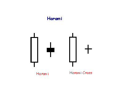
A Harami formation indicates loss of momentum and often warns of reversal after a strong trend. Harami means 'pregnant' which is quite descriptive. The second candlestick must be contained within the body of the first, though the shadows may protrude slightly.
Three factors affect Force Index values. First, the Force Index is positive when the current close is above the prior close. The Force Index is negative when the current close is below the prior close. Second, the extent of the move determines the volume multiplier.
$FTEG BarChart Technical Analysis
http://www.barchart.com/technicals/stocks/FTEG
MORNING DOJI STAR
This is also a three-candlestick formation signaling a major bottom reversal. It is composed of a long black candlestick followed by a doji, which characteristically gaps down to form a doji star. Then we have a third white candlestick whose closing is well into the first session’s black real body. This is a meaningful bottom pattern.
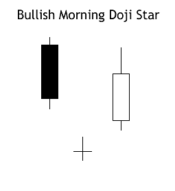
Recognition Criteria:
1. Market is characterized by downtrend.
2. We see a long black candlestick in the first day.
3. Then we see a Doji on the second day that gaps in the direction of the previous downtrend.
4. The white candlestick on the third day confirms the reversal.
Explanation:
Black real body while market is falling down may suggest that the bears are in command. Then a Doji appears showing the diminishing capacity of sellers to drive the market lower. Confirmation of bull ascendancy is the third day’s strong white real body. An ideal Bullish Morning Doji Star Pattern must have a gap before and after the middle line’s real body. The second gap is rare, but lack of it does not take away from the power of this formation.
Important Factors:
The Doji may be more than one, two or even three.
Doji’s gaps are not important.
. The Force Index can be used to reinforce the overall trend, identify playable corrections or foreshadow reversals with divergences.
$LIQT BarChart Technical Analysis
http://www.barchart.com/technicals/stocks/LIQT
Form 20-F, 20-F/A ~ SEC Filings Explained
Annual and transition report of foreign private issuerspursuant to sections 13 or 15(d) (and amendment thereto)
Chaikin Money Flow sometimes only briefly crosses the zero line with a move that turns the indicator barely positive or negative. There is no follow through and this zero line cross ends up becoming a whipsaw (bad signal). Chartists can filter these signals with buffers by setting the bullish threshold a little above zero ( .05) and the bearish threshold a little below zero (-.05). These thresholds will not entirely eliminate bad signals, but can help reduce whipsaws and filter out weaker signals.
$GTGP BarChart Technical Analysis
http://www.barchart.com/technicals/stocks/GTGP
Form N-8B-2 ~ SEC Filings Explained
Initial registration statement for unit investment trusts
$MNGGF BarChart Technical Analysis
http://www.barchart.com/technicals/stocks/MNGGF
An asset is deemed to be overbought once the RSI approaches the 70 level, meaning that it may be getting overvalued and is a good candidate for a pullback. Likewise, if the RSI approaches 30, it is an indication that the asset may be getting oversold and therefore likely to become undervalued.
Form N-14/A ~ SEC Filings Explained
Initial registration statement for open-end investment company (Amendment)
The triple-smoothed EMA is very different from a plain EMA. In a plain EMA the latest few days dominate and the EMA follows recent prices quite closely; however, applying it three times results in weightings spread much more broadly, and the weights for the latest few days are in fact smaller than those of days further past. The following graph shows the weightings for an N=10 triple EMA (most recent days at the left).
$XCHO BarChart Technical Analysis
http://www.barchart.com/technicals/stocks/XCHO
Nasdaq-100 Index Tracking Stock (Nasdaq:QQQQ)
This ETF represents the Nasdaq-100 Index, which consists of the 100 largest and most actively traded non-financial stocks on the Nasdaq, QQQQ offers broad exposure to the tech sector. Because it curbs the risk that comes with investing in individual stocks, the QQQQ is a great way to invest in the long-term prospects of the technology industry. The diversification it offers can be a huge advantage when there's volatility in the markets. If a tech company falls short of projected earnings, it will likely be hit hard. Between 2000 and 2004, QQQQ was by far the most heavily traded index fund.
$GLHV BarChart Technical Analysis
http://www.barchart.com/technicals/stocks/GLHV
With an exponential moving average as its foundation, Keltner Channels are a trend following indicator. As with moving averages and trend following indicators, Keltner Channels lag price action. The direction of the moving average dictates the direction of the channel. In general, a downtrend is present when the channel moves lower, while an uptrend exists when the channel moves higher. The trend is flat when the channel moves sideways.
Form NT 10-Q ~ SEC Filings Explained
Notice under Rule 12b25 of inability to timely file all or part of a form 10-Q or 10-QSB
$FTCH BarChart Technical Analysis
http://www.barchart.com/technicals/stocks/FTCH
MFI is used as an oscillator. A value of 80 is generally considered overbought, or a value of 20 oversold. Divergences between MFI and price action are also considered significant, for instance if price makes a new rally high but the MFI high is less than its previous high then that may indicate a weak advance, likely to reverse.
Form 15F-12G, 15F-12G/A ~ SEC Filings Explained
Notice of termination of a foreign private issuer's registration of a class of securities under Section 12(g) (and amendment thereto)
$NPFT BarChart Technical Analysis
http://www.barchart.com/technicals/stocks/NPFT
Chaikin Money Flow (CMF) is an oscillator that fluctuates between -1 and 1. Rarely, if ever, will the indicator reach these extremes. It would take 20 consecutive closes on the high (low) for 20-day Chaikin Money Flow to reach 1 (-1). Typically, this oscillator fluctuates between -.50 and .50 with zero as the center-line.
|
Followers
|
3289
|
Posters
|
|
|
Posts (Today)
|
0
|
Posts (Total)
|
2804248
|
|
Created
|
08/22/10
|
Type
|
Free
|
| Moderator Nilbud | |||
| Assistants mick ManicTrader PhotoChick Kirimi $Pistol Pete$ | |||
   Investor Hub Alerts: Sign up for 'STOCKGOODIES PLAYS OF THE WEEK ' E-Mail List Investor Hub Alerts: Sign up for 'STOCKGOODIES PLAYS OF THE WEEK ' E-Mail ListUPDATE; 5-1-22 courtesy of charting /\ wit tweezer top calls /\ Tony @Montana_Trades Really good study sheet on Candlestick Patterns [-chart]pbs.twimg.com/media/FRn8188XMAAdZvk?format=jpg&name=small[/chart] 

02-07-2021
|
|
Posts Today
|
0
|
|
Posts (Total)
|
2804248
|
|
Posters
|
|
|
Moderator
|
|
|
Assistants
|
| Volume | |
| Day Range: | |
| Bid Price | |
| Ask Price | |
| Last Trade Time: |


