btw, this month marks 18 years of no global warming – the longest continuous period with no warming ever recorded since the satellite system was first launched in 1979, despite the amount of carbon dioxide being released into the atmosphere increasing significantly over that time
Hey look! A female teabag dingbat who thinks exactly like you. Instead of changing our energy policies, she wants Robert Kennedy to give up his cell phone. lol
From the comments......
Will she give up her brain just because she is advocating against thinking??
RFK Jr. Destroys Conservative Reporter at Climate March
Oh, the The Mail on Sunday. Is there no limit to your denial of climate change?
Phil Plait writes Slate’s Bad Astronomy blog and is an astronomer, public speaker, science evangelizer, and author of Death From the Skies!
The Mail on Sunday is a sister publication of the UK tabloid Daily Mail, and has a history of running ridiculously misleading claims downplaying the reality of climate change. Probably the worst offender is David Rose .. http://www.sourcewatch.org/index.php?title=David_Rose, who has been constantly hammering the idea—despite all the evidence against it—that the Earth has not been getting warmer for the past 16 years. To make this claim he has to egregiously cherry-pick his data, choosing where to look on a graph of temperatures to make it look like warming has slowed.
Unfortunately, because he is so loud and given a venue in the The Mail, people who prefer fiction to reality use Rose’s claims to bolster their own. Big names in climate denial then write fact-free OpEd letters to venues like the Wall Street Journal .. http://www.slate.com/blogs/bad_astronomy/2012/12/03/climate_change_deniers_write_another_fact_free_op_ed.html, which get read by even more people, fooling them into thinking climate change isn’t happening.
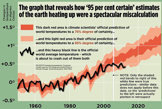
The graph of temperatures versus predictions that is the source of all this misleading woe. Image credit: The Mail On Sunday via IPCC/MET Office (and Ed Hawkins)
The graph shows the temperature anomaly—the difference in temperature from an average temperature—compared to predictions of surface air temperatures made by climate scientists. The graph is actually real; Rose claims it’s from the UK Met Office and the IPCC reports, though it looks very much like it was taken from climatologist Ed Hawkins’ blog .. http://www.climate-lab-book.ac.uk/2013/updated-comparison-of-simulations-and-observations/#more-1104. Either way, Rose starts flinging accusations that are remarkable only by how much they miss their marks.
First, the graph is showing air temperatures. These are not the best representation of global warming, since a huge amount of the extra heat is going into the oceans .. http://www.skepticalscience.com/graphics.php?g=12. So right away, you have to be very careful extrapolating this graph to global heat content overall.
Where's the heat? Click to entropenate. Image credit: Skeptical Science
Also, you have to note what the graph Rose uses is actually showing you, and not what Rose is claiming. The light red band is the temperature prediction with a 90 percent confidence interval—this is a way of showing how much you trust measurements or predictions. In this case, it means there is a 10% chance (5% off the top or 5% off the bottom) that the measurements are likely to fall out of the predicted region.*
Now look again at the graph, and note the measured temperatures are still within that band. Sure, it’s at the low end, but even if the temperatures fell outside the band it doesn’t mean “the world isn’t getting warmer” as Rose so incorrectly claims. It just means the temperatures weren’t quite as high as predicted. They are still within the expected range, though, and still running at a high confidence level.
Global surface temperature measurements and predictions over time. Image credit: RealClimate
So, as usual, what Rose is showing you is misleading. But we’re not done.
What we've seen is that Rose isn't interpreting the graph correctly, and even if he were his claim of global warming having “stopped” is wrong because he’s only looking at surface air temperatures. But his problems go even deeper than that: He’s also only looking at the past few years of data. But you have to be very, very careful when looking at short-period fluctuations! They can fool you, and extrapolating them is very dangerous if you don’t know what you’re doing.
That’s because you expect to see ups and downs from year to year. Looking over the graph makes that pretty obvious. Sometimes you get more downs than ups, sometimes it’s the other way. It’s a bit like throwing a pair of dice: Do it enough times and you’ll get a few snake eyes in a row just by random statistics. But if the dice are off-balance, just a bit, then over time you’ll see there are way more bad throws than you’d expect if the dice were fair.
Perhaps even more importantly, Rose is also not accounting for global climate effects due to La Niña. This is the name given to a seasonal cooling of ocean surface temperatures in the Pacific, which affects temperatures and weather across the globe. It provides a cooling trend on average, so temperatures measured in La Niña years will be lower. It’s important to know that while the surface of the oceans cool, the heat from global warming goes into deeper waters .. http://www.skepticalscience.com/nuccitelli-et-al-2012.html, so the temperatures measured in La Niña years are doubly misleading when it comes to warming.
He also says, “The graph confirms there has been no statistically significant increase in the world’s average temperature since January 1997 – as this newspaper first disclosed last year” which again was wrong last year and just as wrong now.
After all this I haven’t even said anything about the text of his article, which pretty much follows the same misleading path. I know a few other climate bloggers will be tackling this, so I’ll leave it to them to debunk, and I’ll update this post with links as they go online. [UPDATE (Mar. 19): As promised, Skeptical Science now has a takedown of David Rose's claims .. http://skepticalscience.com/david-rose-hides-rise-global-warming.html .]
* Correction (Mar. 19, 2013): It's come to my attention that my original phrasing about statistics in this graph was technically incorrect. This was due partially to a difference between the way astronomers and climatologists talk about statistics, but also because I was trying to simplify a complicated mathematical discussion to make it understandable, and I oversimplified (not only that, but Rose himself messed this up in his article and I followed what he said; a mistake on my part). I originally said, "The light red band is the temperature prediction with a 5 percent – 95 percent confidence. Confidence levels are a statistical way of measuring how well you can trust the data you see. Something at the 95 percent level means there’s only a 5 percent chance the numbers are due to random noise, for example." There is a difference between confidence intervals and certainty ranges, and that's what I oversimplified. I corrected the affected text above. The last sentence about random noise was just an error on my part, though; it's also fixed in the text above. My thanks to Dave Cade at Oregon State for straightening me out, and any remaining errors are my own.
Please note this doesn't really change anything in my post; Rose is still wrong, and the Earth is still suffering global warming. I may have more about this later; the modest slowing of warming is interesting .. http://www.climate-lab-book.ac.uk/2012/global-temperatures-over-the-past-decade/, even if it is not an indication that global warming has stopped.
 Market Data
  Markets