| Followers | 691 |
| Posts | 144827 |
| Boards Moderated | 34 |
| Alias Born | 03/10/2004 |
Friday, November 09, 2012 9:47:30 AM
Apple Walking In RCA’s Footsteps
By Tom McClellan
* Thursday, November 8, 2012


Apple's share price was leading the stock market's rally earlier this year, and lately it has been leading the correction. This fall from grace for the stock of Apple has a lot of analysts puzzled, because Apple the company still appears to be doing great. It has huge sales on smart phones and tablets, which are things that barely existed just a few years ago, and which thanks to Apple are now becoming ubiquitous.
But regardless of what any person says about the company's prospects, the message from the share price is that something is wrong. We don't have to know what that something is in order to receive that message, and often the revelation of what the trouble really is comes months after the trouble shows up in the share price.
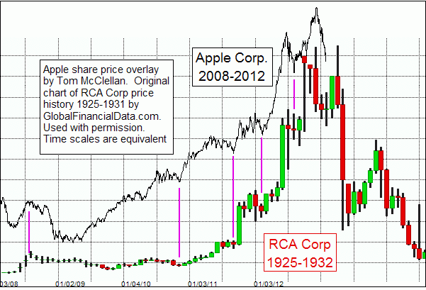
Of greater interest to me than Apple's performance over the past 2 months is the shape of its price plot over the past few years. It strongly resembles the share price pattern of one of the tech darlings from a few decades ago, namely the Radio Corporation of America (RCA). Radio was the hot new technology of the 1920s, after the US government released restrictions on its use following World War I. In a very short amount of time, radio stations sprang up around the country, and most homes owned a radio to listen to programs like Rudy Vallée, Your Hit Parade, and Amos 'n' Andy. RCA was born out of General Electric, as opposed to being born in a garage in California like Apple, but its rise was just as meteoric as Apple's has been lately. And that's where the worry comes.
This week's chart is one which appeared in the Sep. 26, 2012 issue of our twice monthly McClellan Market Report newsletter. That was when Apple's share price was just making its top above $700, and analysts were arguing about how long it would take to get to $1000. People are not arguing about that as much now.
To create this week's chart, I used (with permission) a chart created by Dr. Bryan Taylor, of Global Financial Data. For those who may be unfamiliar with that firm, they have one of the most extensive historical databases of financial and market price data, in some cases going back several centuries. If you have a need for some historical data that you cannot seem to find elsewhere, it is a good bet that Global Financial Data can help you out.
Overlaid on Global's chart of RCA's share price from the 1920s and 1930s is a plot of Apple's share price from the current period. The time scales are equivalent in each of the charts. It took a little bit of graphical magic to get two images to appear together this way, and with the proper X-axis scaling so that time was not stretched or compressed. But such work can be worth the effort when it yields an insight that is as interesting as this one is.
The pattern correlation on the way up is pretty obvious, and pretty compelling. And it leads us to the conclusion that if the correlation continues into the future, then Apple's share price could get into real trouble next year.
That big decline in RCA's share price did not happen in a vacuum. It was part of the overall decline in the stock market following the Oct. 29, 1929 crash. So that is one big reason to argue against seeing the exact same sort of behavior in Apple's share price in 2013, unless one believes that we are actually headed for a 1930-style market meltdown during 2013. Based on other research that we do, I cannot discount the possibility of such a decline in 2013, especially after May 2013. Subscribers to our newsletter and Daily Edition, who have seen my eurodollar Commitment of Traders leading indication, know why May 2013 is such an important time point for the stock market.
We'll know better in a few weeks whether this price pattern analog for Apple is on the right track, or if it was just an interesting anomaly that won't work going forward. If we see Apple's share price build a big right-shoulder structure over the next couple of months and then roll over, it will be time to conclude that it is continuing to dance the same dance that RCA displayed 8 decades ago.
For what it's worth, the collapse of RCA's share price in 1930 from its big bubble top was far from the end of the story for that company. It continued producing radio equipment for many years thereafter, and was a leader in the development of television technology, including color TV. So if Apple really is the next RCA in more ways than just matching the shape of its 1920s price advance, then a potential selloff in 2013 should not necessarily mean a complete fall from grace for the company.
Tom McClellan
Editor, The McClellan Market Report
http://www.mcoscillator.com/learning_center/weekly_chart/apple_walking_in_rcas_footsteps/
George.
Click on "In reply to", for Authors past commentaries.
By Tom McClellan
* Thursday, November 8, 2012


Apple's share price was leading the stock market's rally earlier this year, and lately it has been leading the correction. This fall from grace for the stock of Apple has a lot of analysts puzzled, because Apple the company still appears to be doing great. It has huge sales on smart phones and tablets, which are things that barely existed just a few years ago, and which thanks to Apple are now becoming ubiquitous.
But regardless of what any person says about the company's prospects, the message from the share price is that something is wrong. We don't have to know what that something is in order to receive that message, and often the revelation of what the trouble really is comes months after the trouble shows up in the share price.
Of greater interest to me than Apple's performance over the past 2 months is the shape of its price plot over the past few years. It strongly resembles the share price pattern of one of the tech darlings from a few decades ago, namely the Radio Corporation of America (RCA). Radio was the hot new technology of the 1920s, after the US government released restrictions on its use following World War I. In a very short amount of time, radio stations sprang up around the country, and most homes owned a radio to listen to programs like Rudy Vallée, Your Hit Parade, and Amos 'n' Andy. RCA was born out of General Electric, as opposed to being born in a garage in California like Apple, but its rise was just as meteoric as Apple's has been lately. And that's where the worry comes.
This week's chart is one which appeared in the Sep. 26, 2012 issue of our twice monthly McClellan Market Report newsletter. That was when Apple's share price was just making its top above $700, and analysts were arguing about how long it would take to get to $1000. People are not arguing about that as much now.
To create this week's chart, I used (with permission) a chart created by Dr. Bryan Taylor, of Global Financial Data. For those who may be unfamiliar with that firm, they have one of the most extensive historical databases of financial and market price data, in some cases going back several centuries. If you have a need for some historical data that you cannot seem to find elsewhere, it is a good bet that Global Financial Data can help you out.
Overlaid on Global's chart of RCA's share price from the 1920s and 1930s is a plot of Apple's share price from the current period. The time scales are equivalent in each of the charts. It took a little bit of graphical magic to get two images to appear together this way, and with the proper X-axis scaling so that time was not stretched or compressed. But such work can be worth the effort when it yields an insight that is as interesting as this one is.
The pattern correlation on the way up is pretty obvious, and pretty compelling. And it leads us to the conclusion that if the correlation continues into the future, then Apple's share price could get into real trouble next year.
That big decline in RCA's share price did not happen in a vacuum. It was part of the overall decline in the stock market following the Oct. 29, 1929 crash. So that is one big reason to argue against seeing the exact same sort of behavior in Apple's share price in 2013, unless one believes that we are actually headed for a 1930-style market meltdown during 2013. Based on other research that we do, I cannot discount the possibility of such a decline in 2013, especially after May 2013. Subscribers to our newsletter and Daily Edition, who have seen my eurodollar Commitment of Traders leading indication, know why May 2013 is such an important time point for the stock market.
We'll know better in a few weeks whether this price pattern analog for Apple is on the right track, or if it was just an interesting anomaly that won't work going forward. If we see Apple's share price build a big right-shoulder structure over the next couple of months and then roll over, it will be time to conclude that it is continuing to dance the same dance that RCA displayed 8 decades ago.
For what it's worth, the collapse of RCA's share price in 1930 from its big bubble top was far from the end of the story for that company. It continued producing radio equipment for many years thereafter, and was a leader in the development of television technology, including color TV. So if Apple really is the next RCA in more ways than just matching the shape of its 1920s price advance, then a potential selloff in 2013 should not necessarily mean a complete fall from grace for the company.
Tom McClellan
Editor, The McClellan Market Report
http://www.mcoscillator.com/learning_center/weekly_chart/apple_walking_in_rcas_footsteps/
George.
Click on "In reply to", for Authors past commentaries.
Join the InvestorsHub Community
Register for free to join our community of investors and share your ideas. You will also get access to streaming quotes, interactive charts, trades, portfolio, live options flow and more tools.


