Thursday, February 17, 2011 1:51:02 PM
The 10 economic charts that you are about to see are completely and totally shocking. If you know anyone that still does not believe that the United States is in the midst of a long-term economic decline, just show them these charts. Sometimes you can quote economic statistics to people until you are blue in the face and it won't do any good, but when those same people see charts and pictures suddenly it all sinks in. What is great about charts is that you can very easily demonstrate what has been happening to the economy over an extended period of time. As you examine the economic charts below, pay special attention to what has been happening to the U.S. economy over the last 30 or 40 years. The truth is that what is wrong with the U.S. economy is not a great mystery. All of the economic problems that we are experiencing now have taken decades to develop. Hopefully the charts in this article will help people realize just how nightmarish our economic problems have become, because until people start realizing how incredibly bad things have gotten they will never be willing to accept the dramatic solutions that are necessary to fix our financial system.
The sad fact of the matter is that we have been living in the biggest debt bubble in the history of the world over the last 40 years. All of this debt has purchased a wonderful standard of living for the vast majority of us, but all of this debt has also destroyed the economic future of our children and our grandchildren. Someday future generations will look back on what we have done in absolute horror.
The 10 economic charts posted below are meant to shock you. Most Americans today need to be shocked before they will be motivated to take action. Please share these charts with as many people as you can. Hopefully we can wake enough people up that something will be done about all of these problems while there is still time.
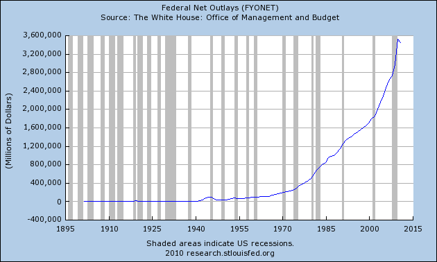
1 - Government spending is expanding at an exponential rate. As you can see from the chart below, federal spending is almost 18 times higher than it was back in 1970. Now Barack Obama has proposed a budget that would increase U.S. government spending to 5.6 trillion dollars in 2021. Just imagine what the following chart would look like if that happens....
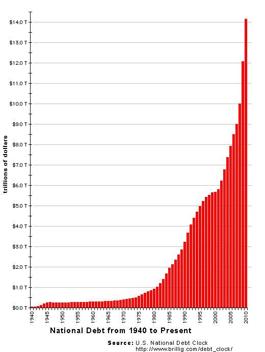
2 - U.S. government debt is absolutely exploding. The U.S. national debt is currently $14,081,561,324,681.83. It is more than 14 times larger than it was back in 1980. Unfortunately, the national debt continues to grow at breathtaking speed. In fact, the Obama administration is projecting that the federal budget deficit for this year will be an all-time record 1.6 trillion dollars. Can we afford to continue to accumulate debt at this rate?....
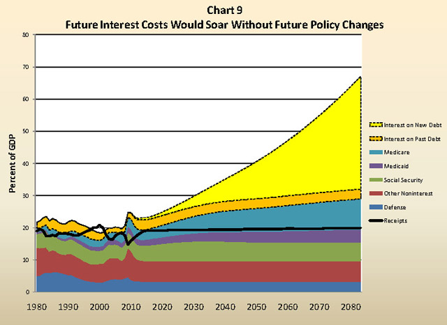
3 - Unless something changes right now, the outlook for U.S. government finances in future years is downright apocalyptic. The chart posted below is from an official U.S. government report to Congress. As you can see, it is projected that interest on our exploding national debt is absolutely going to spiral out of control if we continue on the path that we are currently on....
4 - Household debt has soared to almost unbelievable levels over the last 30 years. The sad truth is that it is not just the U.S. government that has a massive debt problem. U.S. households have also been accumulating debt at a staggering rate. Total U.S. household debt did not pass the 2 trillion dollar mark until the mid-1980s, but now total U.S. household debt is well over 13 trillion dollars....

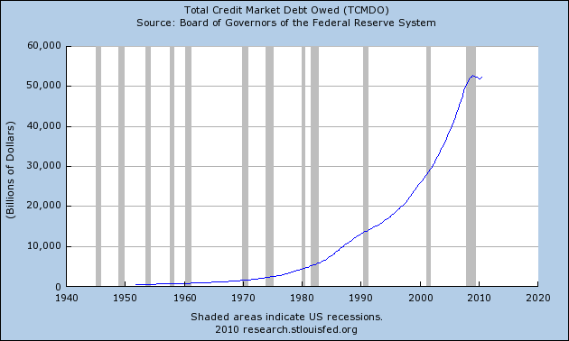
5 - The total of all debt (government, business and consumer) in the United States is now well over 50 trillion dollars. For the past couple of years this figure has been hovering around a level that is equivalent to approximately 360 percent of GDP. This is a debt bubble that is absolutely unprecedented in U.S. history....
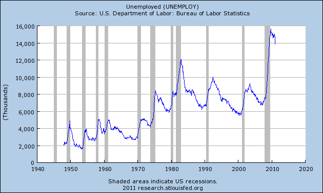
6 - As tens of thousands of U.S. factories get shut down and as millions of our jobs get shipped overseas, the number of unemployed Americans continues to go up and up and up. As you can see from the chart below, there has been a long-term trend of increasing unemployment in the United States. In fact, there are about 3 and a half times as many unemployed workers in the United States today as there were when 1970 began. These jobs losses are going to continue as long as we allow our corporations to pay slave labor wages to workers on the other side of the globe. All of the major trends in global trade are very bad for the U.S. middle class. For example, the U.S. trade deficit with China for 2010 was 27 times larger than it was back in 1990. How long will our politicians stand by as our nation bleeds jobs?....
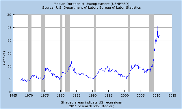
7 - The median duration of unemployment in the United States is in unprecedented territory. For most of the post-World War 2 era, when the median duration of unemployment in America reached 10 weeks that was considered a national crisis. Well, today competition for jobs is so intense that the median duration of unemployment is now well over 20 weeks....
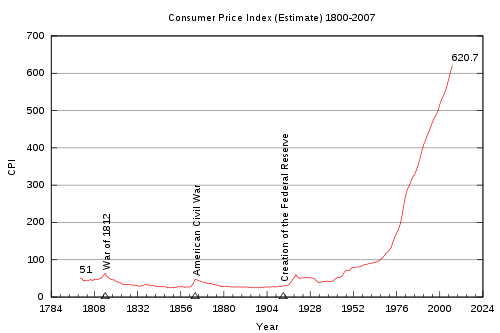
8 - Since the Federal Reserve was created in 1913, the value of the U.S. dollar has declined by over 95 percent. One of the reasons given for the existence of the Federal Reserve is that the Fed helps control inflation. But that is a huge lie. The truth is that the United States never had consistently rampant inflation until the Federal Reserve took control. In particular, once the U.S. totally went off the gold standard in the 1970s inflation really started escalating out of control....
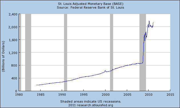
9 - Now the Federal Reserve says that the solution to our current economic problems is to print even more money out of thin air. The games that the Federal Reserve is playing with our money supply are simply inexcusable. Just look at what the Federal Reserve has done to the monetary base since the beginning of the recession....
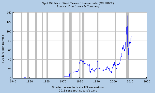
10 - All of this new money is creating tremendous inflation. In particular, the price of oil is now ridiculously high. A high price for oil is very, very bad for the U.S. economy. Our entire economic system is based on being able to use massive quantities of very cheap oil. Unfortunately, that paradigm is starting to break down and the consequences will be very bitter. Back in mid-2008, the price of oil hit an all-time record of $147 a barrel and subsequently the world financial system imploded a few months later. Well, the price of oil is on the march again and that is very bad news for the U.S. economy....
Needless to say, if the economic trends documented by the charts above continue the U.S. economy will be totally wiped out. The U.S. economy as it currently exists is unsustainable by definition. It is only a matter of time before we slam into an economic brick wall.
We have developed an economy that cannot function without debt, and at this point it seems like almost everyone is drowning in red ink. The federal government is massively overextended, most of our state and local governments are massively overextended, most of our major corporations are massively overextended and the majority of U.S. consumers are massively overextended.
The only way that the game can continue is for the Federal Reserve to print increasingly larger amounts of paper money out of thin air and for everyone in the economic food chain to go into increasingly larger amounts of debt.
But no debt spiral can go on forever. At some point this entire house of cards is going to collapse.
When that happens, there is going to be economic pain that is greater than anything that this country has ever seen before.
Someday we will all desperately wish that we could go back to the "good times" of 2011. A great economic collapse is coming, and all of us had better get ready.
http://theeconomiccollapseblog.com/archives/what-is-wrong-with-the-u-s-economy-here-are-10-economic-charts-that-will-blow-your-mind
The sad fact of the matter is that we have been living in the biggest debt bubble in the history of the world over the last 40 years. All of this debt has purchased a wonderful standard of living for the vast majority of us, but all of this debt has also destroyed the economic future of our children and our grandchildren. Someday future generations will look back on what we have done in absolute horror.
The 10 economic charts posted below are meant to shock you. Most Americans today need to be shocked before they will be motivated to take action. Please share these charts with as many people as you can. Hopefully we can wake enough people up that something will be done about all of these problems while there is still time.
1 - Government spending is expanding at an exponential rate. As you can see from the chart below, federal spending is almost 18 times higher than it was back in 1970. Now Barack Obama has proposed a budget that would increase U.S. government spending to 5.6 trillion dollars in 2021. Just imagine what the following chart would look like if that happens....

2 - U.S. government debt is absolutely exploding. The U.S. national debt is currently $14,081,561,324,681.83. It is more than 14 times larger than it was back in 1980. Unfortunately, the national debt continues to grow at breathtaking speed. In fact, the Obama administration is projecting that the federal budget deficit for this year will be an all-time record 1.6 trillion dollars. Can we afford to continue to accumulate debt at this rate?....

3 - Unless something changes right now, the outlook for U.S. government finances in future years is downright apocalyptic. The chart posted below is from an official U.S. government report to Congress. As you can see, it is projected that interest on our exploding national debt is absolutely going to spiral out of control if we continue on the path that we are currently on....

4 - Household debt has soared to almost unbelievable levels over the last 30 years. The sad truth is that it is not just the U.S. government that has a massive debt problem. U.S. households have also been accumulating debt at a staggering rate. Total U.S. household debt did not pass the 2 trillion dollar mark until the mid-1980s, but now total U.S. household debt is well over 13 trillion dollars....

5 - The total of all debt (government, business and consumer) in the United States is now well over 50 trillion dollars. For the past couple of years this figure has been hovering around a level that is equivalent to approximately 360 percent of GDP. This is a debt bubble that is absolutely unprecedented in U.S. history....

6 - As tens of thousands of U.S. factories get shut down and as millions of our jobs get shipped overseas, the number of unemployed Americans continues to go up and up and up. As you can see from the chart below, there has been a long-term trend of increasing unemployment in the United States. In fact, there are about 3 and a half times as many unemployed workers in the United States today as there were when 1970 began. These jobs losses are going to continue as long as we allow our corporations to pay slave labor wages to workers on the other side of the globe. All of the major trends in global trade are very bad for the U.S. middle class. For example, the U.S. trade deficit with China for 2010 was 27 times larger than it was back in 1990. How long will our politicians stand by as our nation bleeds jobs?....

7 - The median duration of unemployment in the United States is in unprecedented territory. For most of the post-World War 2 era, when the median duration of unemployment in America reached 10 weeks that was considered a national crisis. Well, today competition for jobs is so intense that the median duration of unemployment is now well over 20 weeks....

8 - Since the Federal Reserve was created in 1913, the value of the U.S. dollar has declined by over 95 percent. One of the reasons given for the existence of the Federal Reserve is that the Fed helps control inflation. But that is a huge lie. The truth is that the United States never had consistently rampant inflation until the Federal Reserve took control. In particular, once the U.S. totally went off the gold standard in the 1970s inflation really started escalating out of control....

9 - Now the Federal Reserve says that the solution to our current economic problems is to print even more money out of thin air. The games that the Federal Reserve is playing with our money supply are simply inexcusable. Just look at what the Federal Reserve has done to the monetary base since the beginning of the recession....

10 - All of this new money is creating tremendous inflation. In particular, the price of oil is now ridiculously high. A high price for oil is very, very bad for the U.S. economy. Our entire economic system is based on being able to use massive quantities of very cheap oil. Unfortunately, that paradigm is starting to break down and the consequences will be very bitter. Back in mid-2008, the price of oil hit an all-time record of $147 a barrel and subsequently the world financial system imploded a few months later. Well, the price of oil is on the march again and that is very bad news for the U.S. economy....

Needless to say, if the economic trends documented by the charts above continue the U.S. economy will be totally wiped out. The U.S. economy as it currently exists is unsustainable by definition. It is only a matter of time before we slam into an economic brick wall.
We have developed an economy that cannot function without debt, and at this point it seems like almost everyone is drowning in red ink. The federal government is massively overextended, most of our state and local governments are massively overextended, most of our major corporations are massively overextended and the majority of U.S. consumers are massively overextended.
The only way that the game can continue is for the Federal Reserve to print increasingly larger amounts of paper money out of thin air and for everyone in the economic food chain to go into increasingly larger amounts of debt.
But no debt spiral can go on forever. At some point this entire house of cards is going to collapse.
When that happens, there is going to be economic pain that is greater than anything that this country has ever seen before.
Someday we will all desperately wish that we could go back to the "good times" of 2011. A great economic collapse is coming, and all of us had better get ready.
http://theeconomiccollapseblog.com/archives/what-is-wrong-with-the-u-s-economy-here-are-10-economic-charts-that-will-blow-your-mind
I may not agree with what you say, but have fought and will continue to fight for your right to say it. USArmy 1966-1975
Join the InvestorsHub Community
Register for free to join our community of investors and share your ideas. You will also get access to streaming quotes, interactive charts, trades, portfolio, live options flow and more tools.


