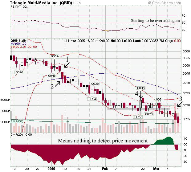
Arrow #1 is where I sold. Why? Because it dropped below the middle bollinger band (dotted line).
Arrow #2 indicates a further drop when it not only dropped below the bottom bollinger band, but below the 50DMA! (Bad sign!)
Arrow #3 is where it has to get to to possibly start the uptrend. Roughly about .0030. But notice it went below the bottom band again, more lower prices to come. No support anywhere!
Arrow #4 shows it did pass the middle bollinger band but not by much, but the reason why it didn't continue to go up is because if you noticed the day before, QBID dropped below the support line, so the next day it closed below the dotted line, indicating lower prices to come.
Now thats how you help people!! And for those that say you can't use charts on pinks or OTC's, GO ____ yourselves.
Register for free to join our community of investors and share your ideas. You will also get access to streaming quotes, interactive charts, trades, portfolio, live options flow and more tools.
 News
News  Market Data
  Discover