


| Followers | 219 |
| Posts | 247348 |
| Boards Moderated | 2 |
| Alias Born | 04/06/2006 |
Sunday, July 11, 2010 3:38:57 PM
Stock Market Head and Shoulders Pattern: A Time Symmetry Pattern?
Stock-Markets / Stock Markets 2010 Jul 11, 2010 - 03:36 AM
By: JD_Rosendahl
The stock market rebounded quite strongly all week and took the bearish tone off the market for now. Something I wrote about a few days ago was the theory of the Time Symmetry Head and Shoulders Pattern. See the daily chart of the DOW below.
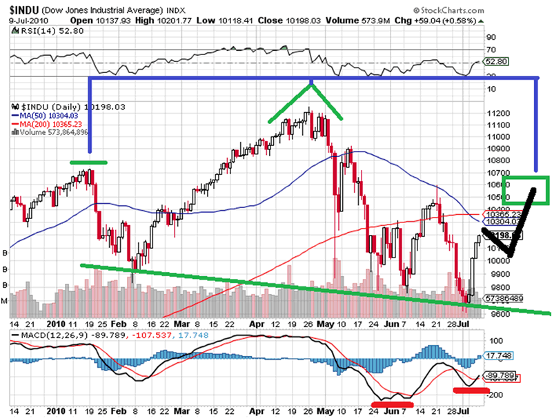
The Time Symmetry H&S pattern, Bearish Case 1: In the daily chart above we have bullish divergences on the MACD, with the recent cross up and turning to the upside with price. That's pointing to a higher market near term.
A more bearish place for the MACD to roll over into a greater price decline is slightly above the zero line. It's going to take a couple weeks for price to move the MACD into that position, which also fits the time symmetry H&S pattern.
The move higher in this view should be an Elliott Wave Zig Zag. The first leg up looks impulsive, which leads me to the Zig Zag pattern.
The blue lines represent the time symmetry head and shoulders pattern. If it turns out to be this view, than we should see a right shoulder forming around the end of July 2010.
I've added a 50% and 62% retracement box as the target for the pattern. This is my primary bearish view for the time being.
Bearish Case 2: The alternative count is something I'm sure a lot of you have seen, which is identified in the chart below.
[img]www.marketoracle.co.uk/images/2010/Jul/stocks-11-2.gif
[/img]
Personally, I don't care for this view all that much. Yes, it could happen, but this count by Elliott Wave analysts only takes into consideration price without indicators like MACD. If this is the case though, there is very little time left before we rollover very hard because it's green wave 3 of black 3.
Note: The bullish view is we've bottomed for the summer and we'll seek out a new high later this year. Or, the down move from April just expands mostly sideways.
The weekly chart is below. We see the weekly MACD has a little bearish divergence working off the April top, and has only just reached the zero line. There's plenty of time and room for the market to bounce into a right shoulder and still allow the weekly MACD to continue lower over time. Markets don't really sell off hard until the MACD is below zero. Price has returned to the 50 week MA, and price is really in no man's land for the weekly chart.
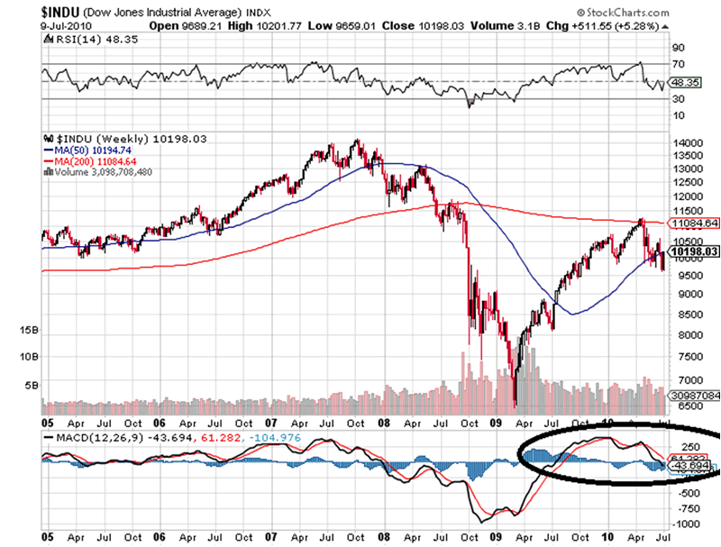
If it's the bearish case 2: The market should fail and roll hard very soon.
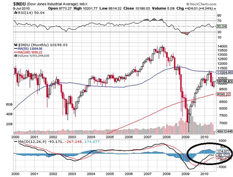
The monthly chart is below, and this is the true wild card in the bull bear debate. A low volume bounce for July supports the bearish case 1 for a right shoulder of the H&S pattern. Look closely at the monthly MACD, this needs to roll over to support either bearish case, otherwise it could turn higher and support one more new high.
That completes the my view of where we are on the market, the next few days and weeks should add clarity to the market.
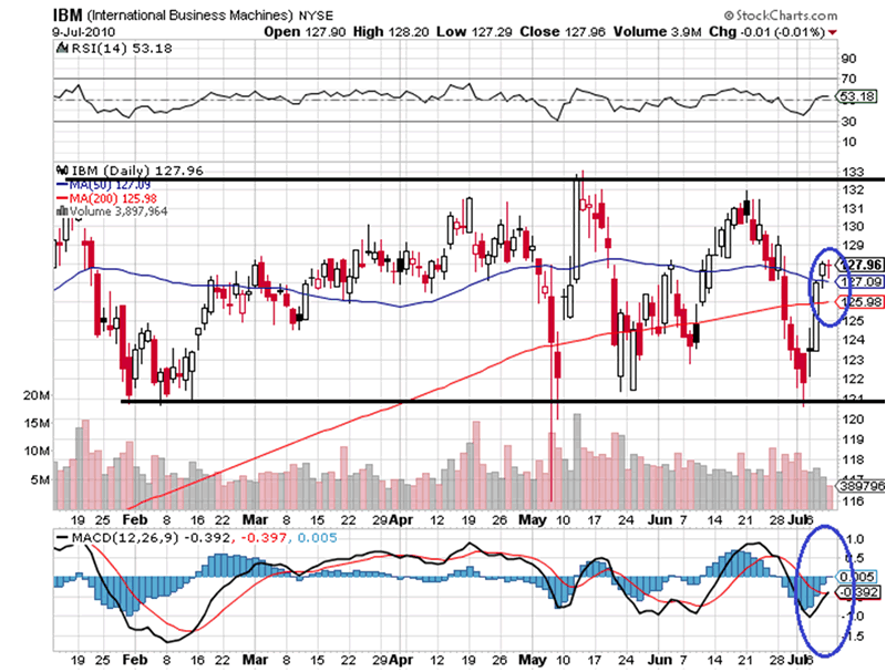
IBM: The stock has been on quite a strong move from the recent bottom, it looks impulsive so far, so even with a little pull back there should be more upside in IBM. The bigger question has to be will it break out to the upside of its range? That has implications for the overall stock market.
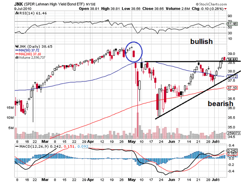
JNK: The junk bond market recently broke above resistance. I still believe the junk bond market is a great indicator of stock market health. It's bullish above the top black line and there's a little gap in price to cover just above. It's bearish below the bottom black trend line.
Gold & Silver:
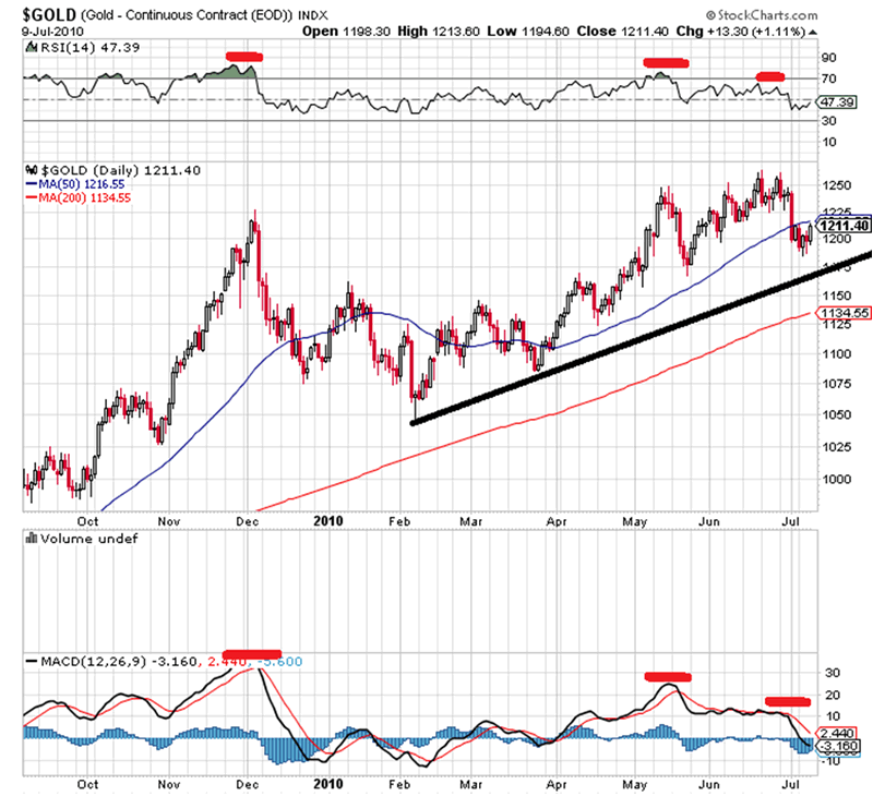
$GOLD: The price of gold has rolled over just a tad but no serious technical damage has been done yet. That would require a breach of the trend line. We do have bearish divergences on both the RSI and MACD.
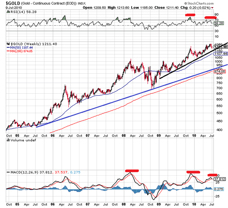
The weekly chart below shows clear bearish divergences on the MACD with the current peak about to roll over. A break below the black trend line would support the idea of price moving down to the blue trend line.
The monthly chart of gold below reflects the monthly MACD has yet to roll over, so this is the one chart the allows for further advances, maybe up to $1,300-1,500. The one thing I get from this chart is the monthly MACD reflects no bearish divergence with the recent spike with price highs. Even if we get the correction I think we are due, I don't think it's the end of the secular bull market in gold.
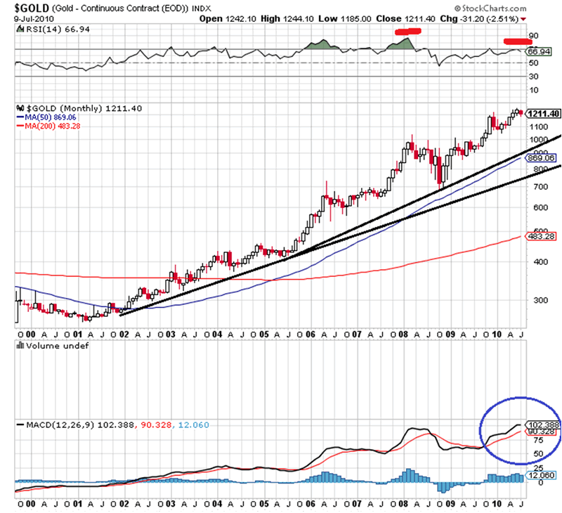
If the gold market is ready for a correction and the MACD is going to turn lower, it will take months maybe a couple of years for it to bottom out. A correction in this view could be both price and time. My correctional target for now is $700-900.
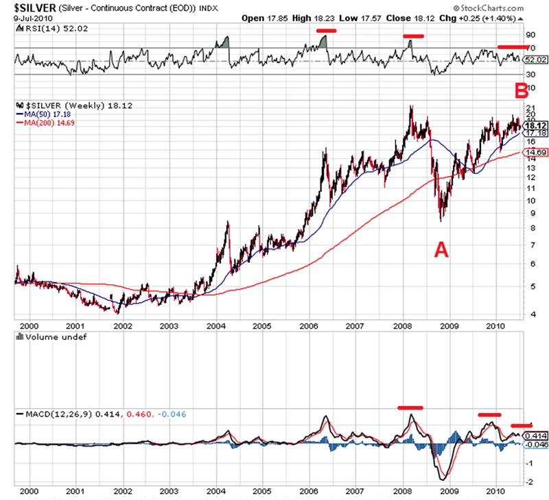
$Silver: The weekly chart reflects the silver market looks a lot more tired than gold. I've labeled what looks like an ABC pattern in silver with price targets from $7-14, yes it's that wide. The MACD and RSI reflect divergences, and the weekly MACD is about to roll over.
From My Trading Desk: For more charts on individual stocks, trades, and things we are watching for future trades come to http://roseysoutlook.blogspot.com/
Hope all is well.
By J.D. Rosendahl
www.roseysoutlook.blogspot.com
J.D. Rosendahl was a former stock broker/investment consultant (currently not licensed) before becoming a Commercial Banker for the past 14 years. He manages his family's wealth, helping them avoid the high tech bubble and the real estate bubble melt downs and preserving wealth.
http://www.marketoracle.co.uk/Article21003.html
Stock-Markets / Stock Markets 2010 Jul 11, 2010 - 03:36 AM
By: JD_Rosendahl
The stock market rebounded quite strongly all week and took the bearish tone off the market for now. Something I wrote about a few days ago was the theory of the Time Symmetry Head and Shoulders Pattern. See the daily chart of the DOW below.

The Time Symmetry H&S pattern, Bearish Case 1: In the daily chart above we have bullish divergences on the MACD, with the recent cross up and turning to the upside with price. That's pointing to a higher market near term.
A more bearish place for the MACD to roll over into a greater price decline is slightly above the zero line. It's going to take a couple weeks for price to move the MACD into that position, which also fits the time symmetry H&S pattern.
The move higher in this view should be an Elliott Wave Zig Zag. The first leg up looks impulsive, which leads me to the Zig Zag pattern.
The blue lines represent the time symmetry head and shoulders pattern. If it turns out to be this view, than we should see a right shoulder forming around the end of July 2010.
I've added a 50% and 62% retracement box as the target for the pattern. This is my primary bearish view for the time being.
Bearish Case 2: The alternative count is something I'm sure a lot of you have seen, which is identified in the chart below.
[img]www.marketoracle.co.uk/images/2010/Jul/stocks-11-2.gif
[/img]
Personally, I don't care for this view all that much. Yes, it could happen, but this count by Elliott Wave analysts only takes into consideration price without indicators like MACD. If this is the case though, there is very little time left before we rollover very hard because it's green wave 3 of black 3.
Note: The bullish view is we've bottomed for the summer and we'll seek out a new high later this year. Or, the down move from April just expands mostly sideways.
The weekly chart is below. We see the weekly MACD has a little bearish divergence working off the April top, and has only just reached the zero line. There's plenty of time and room for the market to bounce into a right shoulder and still allow the weekly MACD to continue lower over time. Markets don't really sell off hard until the MACD is below zero. Price has returned to the 50 week MA, and price is really in no man's land for the weekly chart.

If it's the bearish case 2: The market should fail and roll hard very soon.
The monthly chart is below, and this is the true wild card in the bull bear debate. A low volume bounce for July supports the bearish case 1 for a right shoulder of the H&S pattern. Look closely at the monthly MACD, this needs to roll over to support either bearish case, otherwise it could turn higher and support one more new high.

That completes the my view of where we are on the market, the next few days and weeks should add clarity to the market.
IBM: The stock has been on quite a strong move from the recent bottom, it looks impulsive so far, so even with a little pull back there should be more upside in IBM. The bigger question has to be will it break out to the upside of its range? That has implications for the overall stock market.

JNK: The junk bond market recently broke above resistance. I still believe the junk bond market is a great indicator of stock market health. It's bullish above the top black line and there's a little gap in price to cover just above. It's bearish below the bottom black trend line.

Gold & Silver:
$GOLD: The price of gold has rolled over just a tad but no serious technical damage has been done yet. That would require a breach of the trend line. We do have bearish divergences on both the RSI and MACD.

The weekly chart below shows clear bearish divergences on the MACD with the current peak about to roll over. A break below the black trend line would support the idea of price moving down to the blue trend line.

The monthly chart of gold below reflects the monthly MACD has yet to roll over, so this is the one chart the allows for further advances, maybe up to $1,300-1,500. The one thing I get from this chart is the monthly MACD reflects no bearish divergence with the recent spike with price highs. Even if we get the correction I think we are due, I don't think it's the end of the secular bull market in gold.

If the gold market is ready for a correction and the MACD is going to turn lower, it will take months maybe a couple of years for it to bottom out. A correction in this view could be both price and time. My correctional target for now is $700-900.

$Silver: The weekly chart reflects the silver market looks a lot more tired than gold. I've labeled what looks like an ABC pattern in silver with price targets from $7-14, yes it's that wide. The MACD and RSI reflect divergences, and the weekly MACD is about to roll over.
From My Trading Desk: For more charts on individual stocks, trades, and things we are watching for future trades come to http://roseysoutlook.blogspot.com/
Hope all is well.
By J.D. Rosendahl
www.roseysoutlook.blogspot.com
J.D. Rosendahl was a former stock broker/investment consultant (currently not licensed) before becoming a Commercial Banker for the past 14 years. He manages his family's wealth, helping them avoid the high tech bubble and the real estate bubble melt downs and preserving wealth.
http://www.marketoracle.co.uk/Article21003.html
Your World Is As BIG as You Make It!!!
Join the InvestorsHub Community
Register for free to join our community of investors and share your ideas. You will also get access to streaming quotes, interactive charts, trades, portfolio, live options flow and more tools.

