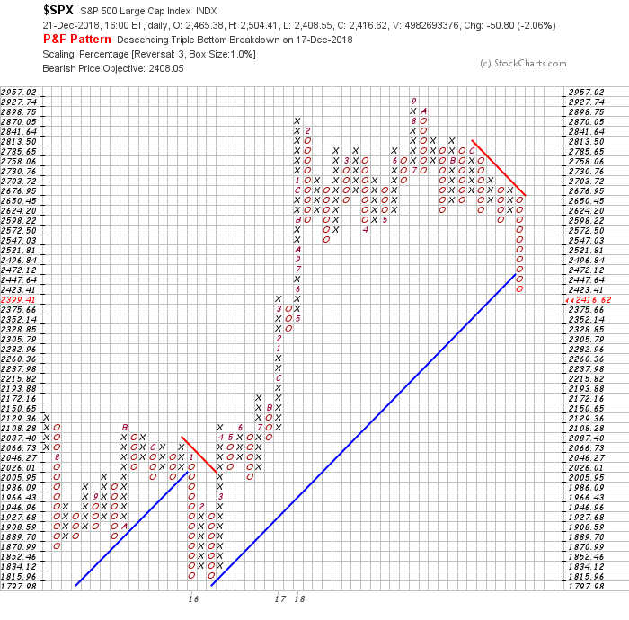
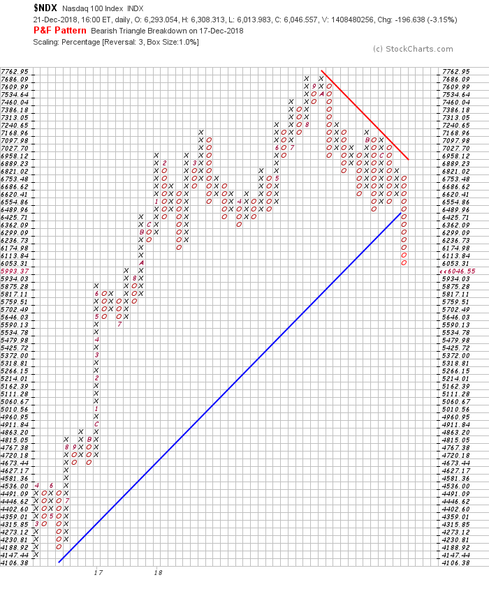
With the ongoing market turmoil, it seems that the P&F charts are plummeting. This style of charting does a great job of clearly illustrating support - you can see when price break downs as support is broken. The chart below demonstrates how well the price has been supported at 2600.
The second-to-last column of O's briefly broke below the two prior lows, forming a pattern called a triple bottom breakdown.
After a small bounce up, the price failed to make a higher high. When the final column of O's formed, the price plummeted lower.
After the price reached the up-sloping blue line, that level became support. Now that price has broken below that level, it has switched and drawn a red line on the top, indicating a bear market.
Register for free to join our community of investors and share your ideas. You will also get access to streaming quotes, interactive charts, trades, portfolio, live options flow and more tools.
 News
News  Market Data
  Discover