Sector Trading Range Screen By: Bespoke | December 7, 2017
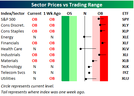
Below is one of the many charts included in this week’s Sector Snapshot, which highlights our trading range screen for the S&P 500 and ten sectors. The dot represents where each sector is currently trading in its range, while the tail end represents where it was trading one week ago. As shown, all but the Telecom sector has moved lower within its range over the last week, with the biggest drops coming in Energy, Health Care, and Utilities.
Information posted to this board is not meant to suggest any specific action, but to point out the technical signs that can help our readers make their own specific decisions. Your Due Dilegence is a must! • DiscoverGold
Register for free to join our community of investors and share your ideas. You will also get access to streaming quotes, interactive charts, trades, portfolio, live options flow and more tools.


 News
News  Market Data
  Discover