Yes, it's not only a positive figure indicating risk is rising but it is a relatively large number meaning fairly rapid rise, too. A negative figure suggests risk is declining.
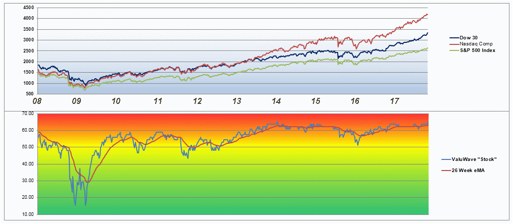
Since the v-Wave was already bearish, this didn't help things any. The underlying Value Line data is showing a "appreciation potential" of just 25% for the next 3-5 years. Historically this is as low as it has ever been since 1982. This graph is up-to-date through this week:
Except for very brief periods the v-Wave has been above 60 (bearish) since the start of 2014. This is an extremely long time for this indicator to remain so bearish. 50 is about the long term average and anything down around 40 is exceedingly bullish by historical standards. I tried to make the color gradients show how it has varied over time.
2014 was also when the Nasdaq, Dow 30 and the S&P500 started to diverge. The NASDAQ has been rising faster than the other two indexes. There have been other times when these three have decoupled. NASDAQ leading the other two seems to go on for quite a while but doesn't end well.
Personally I feel the current v-Wave calculation is very conservative in its suggested cash. However the group decision was to let the 1974 high point in Price Appreciation Potential be used as a gauge for when the v-Wave ran to zero suggested cash. It's been a good general indicator, but I think it's about 10 points too conservative right now. I would like to rescale it so that the 2009 low point showed zero suggested cash be reserved (100% invested). Value Line currently feels there's very little appreciation to be seen over the next 3-5 years, so they, too are being very conservative.
Register for free to join our community of investors and share your ideas. You will also get access to streaming quotes, interactive charts, trades, portfolio, live options flow and more tools.
 News
News  Market Data
  Discover