


Saturday, July 22, 2017 8:46:47 AM
The fundamentals of this stock are for another day. From what I have read in the PR’s, I take all PR’s from OTC stocks with a grain of salt… or two, but what I do see is a company that, if you analyze the technical side and fundamentals together, is not selling stock to pay for everything they need to pay for. Like I said fundamentals are for another day but they are going hand in hand with the technicals.
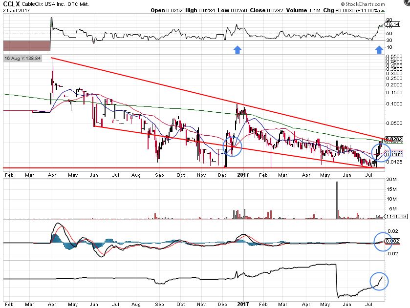
This is the easy chart. I have another more technical one I will post later.
So, any data you see prior to April 2016 is worthless. I’ve look at a 3-year chart. Nothing. No volume. Literally nothing to speak of and nothing to do with anything after April 2016. So literally this stock, as a stock only, was born April 2016.
First is the upper trend line. Technically we haven’t broken out… but we will. Much to look at even in this simple chart. First is the jump out of a trend but you can’t see it here. It’s in the more detailed chart you’ll see later.
The blue circles are the key here.
First blue circle. That’s where the 20ma crosses over the 50ma and the lower trend line. That’s where we broke the trend but there are issues here with this crossover. The 200ma (top line, not the trend line) is way too far away as well as the upper trend line and .10 is a natural resistance point for OTC’s. It would have taken phenomenal news to keep it going. MACD was a little too low when it started. It took a lot just to cross the 200ma and try to hold but it just ran out of steam. Why? Another day perhaps but I’ve discussed it in prior posts.
Second blue circle. Freaking awesome when you look at the whole picture. There’s another trend line. The horizontal red at .01. Touched there three times at .01. It isn’t going lower. RSI (the top graph) is in the sweet spot. Compared to last time, blue arrows, it took getting to the upper trend line last time to hit it. We are now at the upper trend line and in the sweet spot. Volume is increasing and so is the SP. We also closed above the 200ma. Well, you’ll say, last time we closed above the 200ma and then it fell. Like I said it took a lot just to get there last time. This time we are there right now and the 20ma and 50ma are so much closer to the 200ma. The 20 and 50 could easily cross the 200 now. That’s a double moving average crossover and a very bullish signal.
With the volume increasing and the upward pps movement I have almost no doubt we’ll see the 20ma (blue line) cross the 50ma again but this time we are in so much of a better position. The 200ma is sitting right there and we closed above it. The upper trendline is sitting right there for the taking. MACD is above 0 and primed for a jump.
Look at the accumulation (bottom graph). It’s off the hook. Those 18 million shares on that volume spike have been sucked up with most holding for a higher price.
This chart, to me anyway, is screaming… buy me, right now.
Avant Technologies Equipping AI-Managed Data Center with High Performance Computing Systems • AVAI • May 10, 2024 8:00 AM
VAYK Discloses Strategic Conversation on Potential Acquisition of $4 Million Home Service Business • VAYK • May 9, 2024 9:00 AM
Bantec's Howco Awarded $4.19 Million Dollar U.S. Department of Defense Contract • BANT • May 8, 2024 10:00 AM
Element79 Gold Corp Successfully Closes Maverick Springs Option Agreement • ELEM • May 8, 2024 9:05 AM
Kona Gold Beverages, Inc. Achieves April Revenues Exceeding $586,000 • KGKG • May 8, 2024 8:30 AM
Epazz plans to spin off Galaxy Batteries Inc. • EPAZ • May 8, 2024 7:05 AM

