Ending How It Began (Parabolically)? By Tom McClellan | January 18, 2018
There is a lot of talk lately about the market “going parabolic”. Most of the time when that term is used, people are thinking about prices swooping upward like the main cable on a suspension bridge, with each additional lateral increment seeing increasing vertical increments.
But a parabola can also be seen in the path of a bouncing ball, which goes up the fastest at first, and then stalls out at the apex of its rise. If you turn upside down a plot of a bouncing ball, you’ll get a pattern resembling a suspension bridge. Parabolas are the same, even if turned upside down.
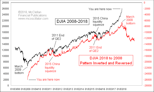
That’s the point behind this week’s chart, which I created this week just because it occurred to me that the pattern of the DJIA looked like it was repeating itself now, but upside down and backwards.
It has long been rumored that if you play certain Beatles songs backwards, a technique known as “backmasking”, you can hear secret messages, including the revelation that “Paul is dead” (he’s not, by the way, last I checked). This led to the joke that if you play a country music song backwards, your wife will come back to you, your truck will start running again, and your dog will come back to life.
When I was a kid I took violin lessons and my teacher Mr. Conway had me play a Beethoven duet with him that was a musical joke. The single sheet of music was placed on a table between two violinists, each of whom reads the music from what they saw as the top of the sheet, and ending up at the bottom which was the other guy’s top, but with the notes in the score upside down. Beethoven could make that work musically, and in the top chart I pay homage to Beethoven by playing the DJIA’s song backward.
If you look closely, you can see lots of moments of coincidence in the minor price patterns, which makes this comparison really interesting. There are also a few instances of pattern inversion, which is pretty normal in any analog comparison. By this way of looking at the DJIA’s pattern, the current blowoff upward in prices is the echo of the up move out of the 2009 bottom. That up move ended when QE1 was shut down, and it led to the Flash Crash of 2010. The implication is that the 2015-16 correction was the corollary to the Flash Crash, and now we are playing back the rally out of the 2009 bottom.
This is admittedly an irregular way of portraying a price analog, and full of peril in drawing conclusions about what we see continuing. But it is still a fun chart. I do not have prior evidence that this is a legitimate form of chart analysis. It just seems to be working at the moment. And as I reveal it now to the world, I remind myself of my #1 Rule of Technical Analysis, which holds that “A phenomenon will remain in effect only until noticed”. The bulls had better hope that rule works this time.
Click on "In reply to", for Authors past commentaries
Information posted to this board is not meant to suggest any specific action, but to point out the technical signs that can help our readers make their own specific decisions. Your Due Dilegence is a must! • DiscoverGold
Register for free to join our community of investors and share your ideas. You will also get access to streaming quotes, interactive charts, trades, portfolio, live options flow and more tools.


 News
News  Market Data
  Discover