Stock Charts I think uses a little different color scheme than the provider you are using. Stock Charts uses this method.
 Hollow C > O
 Filled C < O
Then they use color to mark where the close was today compared to yday CT=close today CY=close yday
 For Hollow:  white means CT>CY  red means CT<CY
 For Filled:  black means CT>CY  red means CT<CY
I have to admit that until you put up your post I never really paid that much attention to the red filled vs black filled candles. Of course if they are red filled that is worse case as it says the market is moving downward.
But today's black filled candle indicated that the CT was higher than the CY while the C was lower than the O.
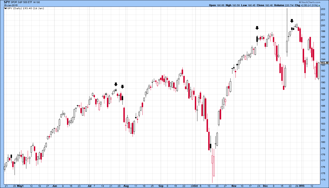
You made the statement A black candle after a significant rise should be treated as a bearish signal
I looked back over several months of SPY and your statement does seem to be very true. The PB is not always that large, but there is almost always some size of a pb.
Here are some good examples for late 2014
Trade the Charts and not the Heart - Expect the trend to continue until it doesn't - Realtime is the real deal
Register for free to join our community of investors and share your ideas. You will also get access to streaming quotes, interactive charts, trades, portfolio, live options flow and more tools.
 News
News  Market Data
  Discover