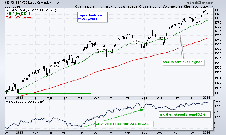
Many analysts are comparing the current market decline with the taper tantrum so I thought it would be a good time to looks at the key charts then and now. The first chart shows the S&P 500 and the 30-yr T-Yield ($UST30Y) in 2013. The taper tantrum occurred on May 21st when Fed Chairman Bernanke suggested a "tapering" of monetary policy. The 30-yr yield has already bounced the first three weeks of May and extended its gains into August. Overall, the yield moved from 2.8% to 3.8%, which is a HUGE move
The S&P 500 fell sharply from mid May to late June with a 7.5% decline from high to low. This decline started right when Bernanke suggested tapering. The decline broke the 50-day EMA and may have seemed drastic at the time, but the index was clearly entitled to a pullback after a 20% advance. Notice that the index did not break the April lows and did not test the 200-day EMA. This "tantrum" turned out to be a fairly normal correction as the S&P 500 bottomed in late June and resumed its zigzag advance the rest of the year. The 30-yr yield held near 3.8%, but this DID NOT deter the S&P 500. Moral of the story: Correlation is not the same as causation. Watch the S&P 500 if you are interested in stocks and the 30-yr T-yield if you are interested in bonds.
Register for free to join our community of investors and share your ideas. You will also get access to streaming quotes, interactive charts, trades, portfolio, live options flow and more tools.
 News
News  Market Data
  Discover